Harry is now getting used to the power of data visualizations. His team has been creating several charts, gauges and maps to monitor metrics for his SuperMart. As part of a design iteration, his team wants to redesign the UI of all the internal and external applications, to unify the experience. This means that all charts will also have to adhere to the new design guide.
At this point, Harry’s team has 2 options:
- Manually change cosmetic attributes in each chart’s JSON. This requires manual effort and is time consuming. Also, if the design changes again, they will have to redo the effort.
- Or, centralize all their cosmetic related information in a single file, and use this to style all the charts. They can achieve this using the ThemeManager functionality of FusionCharts Suite XT.
Introduction to Themes
Using Themes, Harry’s developers can separate data and presentation for charts. The chart’s data file now only contains the relevant data to build the chart, and all the cosmetic information is moved to this external theme file. This theme file can be used across various charts, gauges or maps across all of Harry’s applications.
The theme files are defined in pre-defined JSON format called the FusionCharts ThemeManager format. It lets you centralize the following aspects for a chart, gauge or map:
- Visual appearance e.g., colors, fonts, plot cosmetics
- Behavior e.g., hover effects
- Intelligence e.g., conditional colors for negative and positive data points
FusionCharts Suite XT ships with 3 themes - zune, ocean and carbon. You can find them in your fusioncharts/themes/ folder.
In all the examples that we have built for Harry till now, we have already been using fint (FusionCharts Suite XT internal) theme. If you look at any of the chart’s data, you would find “theme”:”fint” attribute as part of that data.
<html>
<head>
<title>My first chart using FusionCharts Suite XT</title>
<script type="text/javascript" src="fusioncharts/fusioncharts.js"></script>
<script type="text/javascript" src="fusioncharts/themes/fusioncharts.theme.fint.js"></script>
<script type="text/javascript">
FusionCharts.ready(function () {
var revenueChart = new FusionCharts({
"type": "column2d",
"renderAt": "chartContainer",
"width": "500",
"height": "300",
"dataFormat": "json",
"dataSource": {
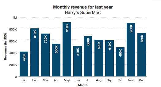
"chart": {
"caption": "Monthly revenue for last year",
"subCaption": "Harry's SuperMart",
"xAxisName": "Month",
"yAxisName": "Revenues (In USD)",
"theme": "fint"
},
"data": [
{
"label": "Jan",
"value": "420000"
},
{
"label": "Feb",
"value": "810000"
},
{
"label": "Mar",
"value": "720000"
},
{
"label": "Apr",
"value": "550000"
},
{
"label": "May",
"value": "910000"
},
{
"label": "Jun",
"value": "510000"
},
{
"label": "Jul",
"value": "680000"
},
{
"label": "Aug",
"value": "620000"
},
{
"label": "Sep",
"value": "610000"
},
{
"label": "Oct",
"value": "490000"
},
{
"label": "Nov",
"value": "900000"
},
{
"label": "Dec",
"value": "730000"
}
]
}
});
revenueChart.render();
});
</script>
</head>
<body>
<div id="chartContainer">FusionCharts XT will load here!</div>
</body>
</html>
Applying the new theme
For this example, we will switch the theme for all of Harry’s visualizations that we’ve created from fint to ocean.
Before we apply the new theme, there are a few basic things that you should know of:
Since themes centralize the cosmetic and functional properties, make sure that you do not provide them in each chart’s JSON/XML
The only exception to the aforementioned point would be, if you want to specifically override a property for that chart
To change the theme from fint to ocean, it’s a two step process:
Include the
oceantheme file (themes/fusioncharts.themes.ocean.js) in the HTML page. Place the include script afterfusioncharts.js, as the theme file uses initialization functions defined infusioncharts.js. Else, you will get a script error. Also, we recommend using a relative path to the theme file, hosted on the same domain as your web application to avoid cross-domain security issues.For each chart, gauge and map that needs to use the new theme, change the
themeattribute in the chart’s JSON/XML data toocean.
Shown below is how they would appear with the new theme applied.
Simple. Isn't it? If you are curious to know how the theme file is structured, shown below is the content of ocean theme JSON file.
FusionCharts.register('theme', {
name: 'ocean',
theme: {
base: {
chart: {
paletteColors: '#04476c,#4d998d,#77be99,#a7dca6,#cef19a,#0e948c,#64ad93,#8fcda0,#bbe7a0,#dcefc1',
labelDisplay: 'auto',
baseFontColor: '#333333',
baseFont: 'Helvetica Neue,Arial',
captionFontSize: '14',
subcaptionFontSize: '14',
subcaptionFontBold: '0',
showBorder: '0',
bgColor: '#ffffff',
showShadow: '0',
canvasBgColor: '#ffffff',
showCanvasBorder: '0',
useplotgradientcolor: '0',
useRoundEdges: '0',
showPlotBorder: '0',
showAlternateHGridColor: '0',
showAlternateVGridColor: '0',
toolTipColor: '#ffffff',
toolTipBorderThickness: '0',
toolTipBgColor: '#000000',
toolTipBgAlpha: '80',
toolTipBorderRadius: '2',
toolTipPadding: '5',
legendBgAlpha: '0',
legendBorderAlpha: '0',
legendShadow: '0',
legendItemFontSize: '10',
legendItemFontColor: '#666666',
legendCaptionFontSize: '9',
divlineAlpha: '100',
divlineColor: '#999999',
divlineThickness: '1',
divLineDashed: '1',
divLineDashLen: '1',
divLineGapLen: '1',
scrollheight: '10',
flatScrollBars: '1',
scrollShowButtons: '0',
scrollColor: '#cccccc',
showHoverEffect: '1',
valueFontSize: '10',
showXAxisLine: '1',
xAxisLineThickness: '1',
xAxisLineColor: '#999999'
},
dataset: [{}],
trendlines: [{}]
},
geo: {
chart: {
showLabels: '0',
fillColor: '#04476c',
showBorder: '1',
borderColor: '#eeeeee',
borderThickness: '1',
borderAlpha: '50',
entityFillhoverColor: '#04476c',
entityFillhoverAlpha: '80'
}
},
pie2d: {
chart: {
placeValuesInside: '0',
use3dlighting: '0',
valueFontColor: '#333333',
captionPadding: '15'
},
data: function (index, dataItem, dataLength) {
var math = window.Math,
alphaSlab = dataLength > 50 ?
math.round(100 / math.ceil(dataLength / 10)) : 20,
alpha = 100 - alphaSlab * math.floor(index / 10);
return {alpha: alpha};
}
},
doughnut2d: {
chart: {
placeValuesInside: '0',
use3dlighting: '0',
valueFontColor: '#333333',
centerLabelFontSize: '12',
centerLabelBold: '1',
centerLabelFontColor: '#333333',
captionPadding: '15'
},
data: function (index, dataItem, dataLength) {
var math = window.Math,
alphaSlab = dataLength > 50 ?
math.round(100 / math.ceil(dataLength / 10)) : 20,
alpha = 100 - alphaSlab * math.floor(index / 10);
return {alpha: alpha};
}
},
line: {
chart: {
lineThickness: '2'
}
},
spline: {
chart: {
lineThickness: '2'
}
},
column2d: {
chart: {
paletteColors: '#04476c',
valueFontColor: '#ffffff',
placeValuesInside: '1',
rotateValues: '1'
}
},
bar2d: {
chart: {
paletteColors: '#04476c',
valueFontColor: '#ffffff',
placeValuesInside: '1'
}
},
column3d: {
chart: {
paletteColors: '#04476c',
valueFontColor: '#ffffff',
placeValuesInside: '1',
rotateValues: '1'
}
},
bar3d: {
chart: {
paletteColors: '#04476c',
valueFontColor: '#ffffff',
placeValuesInside: '1'
}
},
area2d: {
chart: {
valueBgColor: '#ffffff',
valueBgAlpha: '90',
valueBorderPadding: '-2',
valueBorderRadius: '2'
}
},
splinearea: {
chart: {
valueBgColor: '#ffffff',
valueBgAlpha: '90',
valueBorderPadding: '-2',
valueBorderRadius: '2'
}
},
mscolumn2d: {
chart: {
valueFontColor: '#ffffff',
placeValuesInside: '1',
rotateValues: '1'
}
},
mscolumn3d: {
chart: {
showValues: '0'
}
},
msstackedcolumn2dlinedy: {
chart: {
showValues: '0'
}
},
stackedcolumn2d: {
chart: {
showValues: '0'
}
},
stackedarea2d: {
chart: {
valueBgColor: '#ffffff',
valueBgAlpha: '90',
valueBorderPadding: '-2',
valueBorderRadius: '2'
}
},
stackedbar2d: {
chart: {
showValues: '0'
}
},
msstackedcolumn2d: {
chart: {
showValues: '0'
}
},
mscombi3d: {
chart: {
showValues: '0'
}
},
mscombi2d: {
chart: {
showValues: '0'
}
},
mscolumn3dlinedy: {
chart: {
showValues: '0'
}
},
stackedcolumn3dline: {
chart: {
showValues: '0'
}
},
stackedcolumn2dline: {
chart: {
showValues: '0'
}
},
scrollstackedcolumn2d: {
chart: {
valueFontColor: '#ffffff'
}
},
scrollcombi2d: {
chart: {
showValues: '0'
}
},
scrollcombidy2d: {
chart: {
showValues: '0'
}
},
logstackedcolumn2d: {
chart: {
showValues: '0'
}
},
logmsline: {
chart: {
showValues: '0'
}
},
logmscolumn2d: {
chart: {
showValues: '0'
}
},
msstackedcombidy2d: {
chart: {
showValues: '0'
}
},
scrollcolumn2d: {
chart: {
valueFontColor: '#ffffff',
placeValuesInside: '1',
rotateValues: '1'
}
},
pareto2d: {
chart: {
paletteColors: '#04476c',
showValues: '0'
}
},
pareto3d: {
chart: {
paletteColors: '#04476c',
showValues: '0'
}
},
angulargauge: {
chart: {
pivotFillColor: '#ffffff',
pivotRadius: '4',
gaugeFillMix: '{light+0}',
showTickValues: '1',
majorTMHeight: '12',
majorTMThickness: '2',
majorTMColor: '#000000',
minorTMNumber: '0',
tickValueDistance: '10',
valueFontSize: '24',
valueFontBold: '1',
gaugeInnerRadius: '50%',
showHoverEffect: '0'
},
dials: {
dial: [{
baseWidth: '10',
rearExtension: '7',
bgColor: '#000000',
bgAlpha: '100',
borderColor: '#666666',
bgHoverAlpha: '20'
}]
}
},
hlineargauge: {
chart: {
pointerFillColor: '#ffffff',
gaugeFillMix: '{light+0}',
showTickValues: '1',
majorTMHeight: '3',
majorTMColor: '#000000',
minorTMNumber: '0',
valueFontSize: '18',
valueFontBold: '1'
},
pointers: {
pointer: [{}]
}
},
bubble: {
chart: {
use3dlighting: '0',
showplotborder: '0',
showYAxisLine: '1',
yAxisLineThickness: '1',
yAxisLineColor: '#999999',
showAlternateHGridColor: '0',
showAlternateVGridColor: '0'
},
categories: [{
verticalLineDashed: '1',
verticalLineDashLen: '1',
verticalLineDashGap: '1',
verticalLineThickness: '1',
verticalLineColor: '#000000',
category: [{}]
}],
vtrendlines: [{
line: [{
alpha: '0'
}]
}]
},
scatter: {
chart: {
use3dlighting: '0',
showYAxisLine: '1',
yAxisLineThickness: '1',
yAxisLineColor: '#999999',
showAlternateHGridColor: '0',
showAlternateVGridColor: '0'
},
categories: [{
verticalLineDashed: '1',
verticalLineDashLen: '1',
verticalLineDashGap: '1',
verticalLineThickness: '1',
verticalLineColor: '#000000',
category: [{}]
}],
vtrendlines: [{
line: [{
alpha: '0'
}]
}]
},
boxandwhisker2d: {
chart: {
valueBgColor: '#ffffff',
valueBgAlpha: '90',
valueBorderPadding: '-2',
valueBorderRadius: '2'
}
},
thermometer: {
chart: {
gaugeFillColor: '#04476c'
}
},
cylinder: {
chart: {
cylFillColor: '#04476c'
}
},
sparkline: {
chart: {
linecolor: '#04476c'
}
},
sparkcolumn: {
chart: {
plotFillColor: '#04476c'
}
},
sparkwinloss: {
chart: {
winColor: '#04476c',
lossColor: '#4d998d',
drawColor: '#77be99',
scoreLessColor: '#a7dca6'
}
},
hbullet: {
chart: {
plotFillColor: '#04476c',
targetColor: '#4d998d'
}
},
vbullet: {
chart: {
plotFillColor: '#04476c',
targetColor: '#4d998d'
}
}
}
});
Do note that you are not restricted to using an existing theme only. You can create your own themes, or extend any of the existing themes to modify the colors, fonts and properties to suit your designs. Just make sure you keep a copy of the original file.