FusionCharts Suite XT supports two types of legends for the heat map chart - the gradient legend and the icon legend.
In this section, you will be show how you can work with:
Icon legend and its interactivity
Gradient legend and its interactivity
Percentage mapping
Working with the Icon Legend
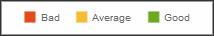
Icon legend allows us to display single color icons for the numeric ranges. By default, a heat map chart is rendered with an icon legend.
A simple icon legend looks as shown in the image below:
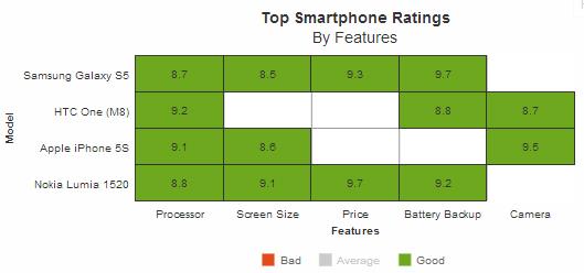
A simple heat map chart rendered with an icon legend looks like this:
Given below is a brief description of the attribute used to specify the color for each icon in the legend:
| Attribute Name | Description |
|---|---|
color |
It is used to specify the hex code of the color that will be used to represent a color range in the icon legend. This attribute belongs to the colorRange object. |
The data structure needed to render a heat map chart with an icon legend is given below:
Interactivity using the Icon Legend
Icon legends are interactive too. You can click a legend item to show/hide the data plots mapped to that item. You can click on a legend item to hide or show all the cells mapped with the color range represented by the legend item. For example, if you want to hide all data plots mapped to the range 5-8.5, click the "Average" legend icon.
A heat map chart rendered with all "average" ratings hidden looks as shown in the image below:
Working with the Gradient Legend
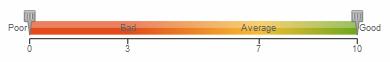
Gradient legend is a pane of blended colors derived from the colorRange definitions. A linear scale is drawn with two drag-able pointers. Each color defined for a numeric range blends with the next color, thus forming a gradient strip. Each point on the gradient scale represents a unique color and value. So, all different values in the chart will appear in unique colors as per the position on the gradient scale.
A simple gradient legend is looks as shown in the image below:
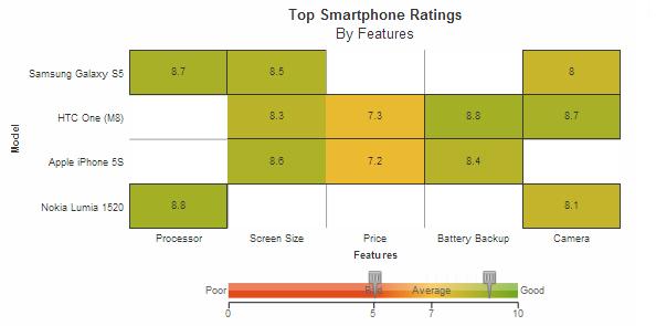
A heat map chart rendered with a gradient legend looks like this:
Given below is a brief description of the attributes used to configure a gradient legend:
| Attribute Name | Description |
|---|---|
gradient |
It is used to specify whether a gradient legend will be rendered for the chart. Setting this attribute to 1 will render the gradient legend, setting it to 0 (default) will render the icon legend. This attribute is used with the colorRange object. |
startLabel |
It is used to specify the label for the lower limit on the gradient legend, e.g. Poor. This attribute is used with the colorRange object. |
endLabel |
It is used to specify the label for the upper limit on the gradient legend, e.g. Good. This attribute is used with the colorRange object. |
color |
It is used to specify the hex code of the color that will be used to represent a color range in the gradient legend. This attribute is used with the colorRange object. |
The data structure needed to render a heat map chart with a gradient legend is given below:
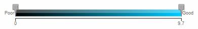
Configuring a Single-color Gradient Legend
The default gradient legend is rendered using several different colors. However, you can also render a gradient legend using shades of the same color.
A single-color gradient legend looks as shown in the image below:
The JSON data is shown below:
{
    "chart": {
        ...
    },
    ...
    "colorRange": {
        "gradient": "1",
        "mapByPercent": "0",
        "minValue": "0",
        "code": "#00ccff",
        "startLabel": "Poor",
        "endLabel": "Good"
    }
}
Interactivity using the Gradient Legend
Showing/Hiding Data Values
The gradient legend is interactive and allows filtering of cells within a specific range of values. To specify the range that should be shown on the chart, click and hold the cursor on any one or both of the scale pointers and drag them to set the required lower and upper limit.
For example, in a numeric range 0-10, you may want to show the numbers between 5 and 9. To do this, drag the lower limit pointer to 5 and the upper limit pointer to 9. T The chart will display only those data plots that lie in the range between 5 and 9. The rest of the numbers will hide.
A chart with data plots only in the range of 5 and 9 shown looks like this:
There! You have now seen how you can configure the various legend properties.