The select-scatter chart is a special type of chart that allows users to visually select a subset of data from the given data points. Essentially, it is an extension of the XY plot chart (scatter chart) with the added functionality of selecting any number of points on the chart and returning them back to the server, or JavaScript functions, for further processing.
This can be used for a variety of purposes, where you want your users to visually select data from the scatter chart.
In this section, you will be shown how you can create a select-scatter chart and use its interactivity feature.
As an example, we will plot a select-scatter chart to show the products sold and the price points earned, for televisions and cell phones at Harry’s SuperMart in one week.
The select-scatter chart thus created looks like this:
To select a set of points, you can drag and draw a rectangle over the chart. All the points within this rectangle are now selected points. Once the rectangle has been drawn, you can resize it to adjust more points. The resize handlers let you do so.
To select more scattered data points, you can add additional select rectangles on the chart. The process to add another select rectangle is the same, as shown in the image below. Click anywhere in the chart canvas and draw a rectangle.
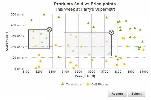
You can drag, resize, or delete any select rectangles individually. To delete any select rectangle, you can click the "X" "at the top right corner of the selection box and the rectangle will be gone.
In the above chart, drag the mouse pointer across the chart to select a subset of data points. Once the selection process is over, click the Submit button. This button sends the JSON/XML data as a form to the server-side script. In the above sample, the JSON data for the selected points - the price and quantity of each tv/cell phone unit - have been displayed in a table. Click the Restore button to bring back the chart to its original state.
The data structure needed to create the select-scatter chart is given below:
There! You have now seen how you can create and use the interactivity feature of select-scatter charts.