Loading
Introduction to Cylinder Gauge
The cylinder gauge is represented by a vertical cylinder, whose fill level is defined by the data value being plotted. It is used to report inventory levels, fuel levels, etc.
The cylinder gauge is a real-time chart, which can update its data after specified intervals, without requiring any page refreshes.
In this section, you will be introduced to:
A Simple Cylinder Gauge
A simple example of a cylinder gauge has been showcased below:
{
    "chart": {
        "theme": "fint",
        "caption": "Diesel Level in Generator",
        "subcaption": "Bakersfield Central",
        "lowerLimit": "0",
        "upperLimit": "120",
        "lowerLimitDisplay": "Empty",
        "upperLimitDisplay": "Full",
        "numberSuffix": " ltrs",
        "showValue": "0",
        "chartBottomMargin": "45"
    },
    "value": "110",
    "annotations": {
        "origw": "400",
        "origh": "190",
        "autoscale": "1",
        "groups": [
            {
                "id": "range",
                "items": [
                    {
                        "id": "rangeBg",
                        "type": "rectangle",
                        "x": "$canvasCenterX-45",
                        "y": "$chartEndY-30",
                        "tox": "$canvasCenterX +45",
                        "toy": "$chartEndY-75",
                        "fillcolor": "#6caa03"
                    },
                    {
                        "id": "rangeText",
                        "type": "Text",
                        "fontSize": "11",
                        "fillcolor": "#333333",
                        "text": "80 ltrs",
                        "x": "$chartCenterX-45",
                        "y": "$chartEndY-50"
                    }
                ]
            }
        ]
    }
}
<html>
<head>
<title>My first chart using FusionCharts Suite XT</title>
<script type="text/javascript" src="http://static.fusioncharts.com/code/latest/fusioncharts.js"></script>
<script type="text/javascript" src="http://static.fusioncharts.com/code/latest/themes/fusioncharts.theme.fint.js?cacheBust=56"></script>
<script type="text/javascript">
FusionCharts.ready(function(){
var fusioncharts = new FusionCharts({
type: 'cylinder',
dataFormat: 'json',
id: 'fuelMeter-1',
renderAt: 'chart-container',
width: '200',
height: '350',
dataSource: {
"chart": {
"theme": "fint",
"caption": "Diesel Level in Generator",
"subcaption": "Bakersfield Central",
"lowerLimit": "0",
"upperLimit": "120",
"lowerLimitDisplay": "Empty",
"upperLimitDisplay": "Full",
"numberSuffix": " ltrs",
"showValue": "1",
"chartBottomMargin": "45",
"showValue": "0"
},
"value": "110",
"annotations": {
"origw": "400",
"origh": "190",
"autoscale": "1",
"groups": [{
"id": "range",
"items": [{
"id": "rangeBg",
"type": "rectangle",
"x": "$canvasCenterX-45",
"y": "$chartEndY-30",
"tox": "$canvasCenterX +45",
"toy": "$chartEndY-75",
"fillcolor": "#6caa03"
}, {
"id": "rangeText",
"type": "Text",
"fontSize": "11",
"fillcolor": "#333333",
"text": "80 ltrs",
"x": "$chartCenterX-45",
"y": "$chartEndY-50"
}]
}]
}
},
"events": {
"rendered": function(evtObj, argObj) {
var fuelVolume = 110;
evtObj.sender.chartInterval = setInterval(function() {
(fuelVolume < 10) ? (fuelVolume = 80) : "";
var consVolume = fuelVolume - (Math.floor(Math.random() * 3));
evtObj.sender.feedData("&value=" + consVolume);
fuelVolume = consVolume;
}, 1000);
},
//Using real time update event to update the annotation
//showing available volume of Diesel
"realTimeUpdateComplete": function(evt, arg) {
var annotations = evt.sender.annotations,
dataVal = evt.sender.getData(),
colorVal = (dataVal >= 70) ? "#6caa03" : ((dataVal <= 35) ? "#e44b02" : "#f8bd1b");
//Updating value
annotations && annotations.update('rangeText', {
"text": dataVal + " ltrs"
});
//Changing background color as per value
annotations && annotations.update('rangeBg', {
"fillcolor": colorVal
});
},
"disposed": function(evt, arg) {
clearInterval(evt.sender.chartInterval);
}
}
}
);
fusioncharts.render();
});
</script>
</head>
<body>
<div id="chart-container">FusionCharts XT will load here!</div>
</body>
</html>The cylinder gauge shown here has been designed to monitor the diesel level in the generator at Bakersfield Central.
What makes a cylinder gauge different from other gauges is that this gauge can be rendered with only one fill color; it cannot be setup with color ranges.
Elements of the Gauge
A cylinder gauge chart consists of the following elements:
-
Cylinder fill
-
Tick marks
-
Chart value
-
Annotations
Here we’ll see each of them in detail. Let’s first have a look at a standard cylinder chart enlisting the various basic components:
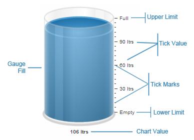
Cylinder Fill
The cylinder is the main component in a cylinder chart – the percentage of cylinder filled helps the end user to decipher the value being illustrated.
Tick Marks
Tick marks are the calibration marks on the vertical scale to the left/right of the cylinder to help interpret the reading. There are two types of tick marks which can be drawn on the chart:
-
Major Tick Marks – These are the bigger lines on the tick mark scale.
-
Minor Tick Marks – These are the smaller lines enclosed within the bigger lines.
Chart Value
The value display box helps you display the current value of the cylinder fill.
Annotations
Annotations are graphical elements that can be created and positioned anywhere on a chart or a gauge. These elements can be configured in a number of ways and allow you to customise your chart in imaginative and useful ways. Although annotations are non-chart elements, you have the option to render them on the chart to improve the visual representation of data.
With this, you have seen what is a cylinder gauge and the the basic components that make up a cylinder gauge.