Loading
Introduction to Box and Whisker Chart
A box and whisker chart is a statistical chart that is used to examine and summarize a range of data values.
In this section, you will be introduced to the:
Basics of a Box and Whisker Chart
A box and whisker chart shows a frequency distribution of the data that helps in interpreting the distribution of data. It draws a statistical conclusion for the given data using the five number summary principle. The box and whisker chart is very useful to observe the mean, median, upper and lower quartiles, deviations, etc. for a huge set of data. It is used mostly used in chemical industries and weapon industries.
Features of a Box and Whisker Chart
The distinct features of a box and whisker chart include:
-
It calculates the mean, median, upper and lower quartiles, and the minimum and maximum numbers for a given set of data
-
It calculates and displays the mean deviation, standard deviation, and the quartile deviation for a given set of data
-
It uses an interactive legend to distinguish between two data-sets by highlighting each data-set with different color strips
-
It connects the mean and deviations of multiple sets of data by drawing a line
-
It shows outliers - any value which is not residing within the set of values provided.
A simple box and whisker chart looks like this:
{
    "chart": {
        "caption": "Distribution of annual salaries",
        "subCaption": "By Gender",
        "xAxisName": "Pay Grades",
        "YAxisName": "Salaries (In USD)",
        "numberPrefix": "$",
        "paletteColors": "#0075c2,#1aaf5d,#f2c500,#f45b00",
        "bgColor": "#ffffff",
        "captionFontSize": "14",
        "subcaptionFontSize": "14",
        "subcaptionFontBold": "0",
        "showBorder": "0",
        "showCanvasBorder": "0",
        "showAlternateHGridColor": "0",
        "legendBorderAlpha": "0",
        "legendShadow": "0",
        "legendPosition": "right",
        "showValues": "0",
        "toolTipColor": "#ffffff",
        "toolTipBorderThickness": "0",
        "toolTipBgColor": "#000000",
        "toolTipBgAlpha": "80",
        "toolTipBorderRadius": "2",
        "toolTipPadding": "5"
    },
    "categories": [
        {
            "category": [
                {
                    "label": "Grade 1"
                },
                {
                    "label": "Grade 2"
                },
                {
                    "label": "Grade 3"
                }
            ]
        }
    ],
    "dataset": [
        {
            "seriesname": "Male",
            "lowerBoxColor": "#0075c2",
            "upperBoxColor": "#1aaf5d",
            "data": [
                {
                    "value": "2400,2000,2500,2800,3500,4000, 3700, 3750, 3880, 5000,5500,7500,8000,8200, 8400, 8500, 8550, 8800, 8700, 9000, 14000"
                },
                {
                    "value": "7500,9000,12000,13000,14000,16500,17000, 18000, 19000, 19500"
                },
                {
                    "value": "15000,19000,25000,32000,50000,65000"
                }
            ]
        },
        {
            "seriesname": "Female",
            "lowerBoxColor": "#f45b00",
            "upperBoxColor": "#f2c500",
            "data": [
                {
                    "value": "1900,2100,2300,2350,2400,2550,3000,3500,4000, 6000, 6500, 9000"
                },
                {
                    "value": "7000,8000,8300,8700,9500,11000,15000, 17000, 21000"
                },
                {
                    "value": "24000,32000,35000,37000,39000, 58000"
                }
            ]
        }
    ]
}
<html>
<head>
<title>My first chart using FusionCharts Suite XT</title>
<script type="text/javascript" src="http://static.fusioncharts.com/code/latest/fusioncharts.js"></script>
<script type="text/javascript" src="http://static.fusioncharts.com/code/latest/themes/fusioncharts.theme.fint.js?cacheBust=56"></script>
<script type="text/javascript">
FusionCharts.ready(function(){
var fusioncharts = new FusionCharts({
type: 'boxandwhisker2d',
renderAt: 'chart-container',
width: '500',
height: '350',
dataFormat: 'json',
dataSource: {
"chart": {
"caption": "Distribution of annual salaries",
"subCaption": "By Gender",
"xAxisName": "Pay Grades",
"YAxisName": "Salaries (In USD)",
"numberPrefix": "$",
"paletteColors": "#0075c2,#1aaf5d,#f2c500,#f45b00",
"bgColor": "#ffffff",
"captionFontSize": "14",
"subcaptionFontSize": "14",
"subcaptionFontBold": "0",
"showBorder": "0",
"showCanvasBorder": "0",
"showAlternateHGridColor": "0",
"legendBorderAlpha": "0",
"legendShadow": "0",
"legendPosition": "right",
"showValues": "0",
"toolTipColor": "#ffffff",
"toolTipBorderThickness": "0",
"toolTipBgColor": "#000000",
"toolTipBgAlpha": "80",
"toolTipBorderRadius": "2",
"toolTipPadding": "5"
},
"categories": [{
"category": [{
"label": "Grade 1"
}, {
"label": "Grade 2"
}, {
"label": "Grade 3"
}]
}],
"dataset": [{
"seriesname": "Male",
"lowerBoxColor": "#0075c2",
"upperBoxColor": "#1aaf5d",
"data": [{
"value": "2400,2000,2500,2800,3500,4000, 3700, 3750, 3880, 5000,5500,7500,8000,8200, 8400, 8500, 8550, 8800, 8700, 9000, 14000"
}, {
"value": "7500,9000,12000,13000,14000,16500,17000, 18000, 19000, 19500"
}, {
"value": "15000,19000,25000,32000,50000,65000"
}]
}, {
"seriesname": "Female",
"lowerBoxColor": "#f45b00",
"upperBoxColor": "#f2c500",
"data": [{
"value": "1900,2100,2300,2350,2400,2550,3000,3500,4000, 6000, 6500, 9000"
}, {
"value": "7000,8000,8300,8700,9500,11000,15000, 17000, 21000"
}, {
"value": "24000,32000,35000,37000,39000, 58000"
}]
}]
}
}
);
fusioncharts.render();
});
</script>
</head>
<body>
<div id="chart-container">FusionCharts XT will load here!</div>
</body>
</html>Five-number Summary Principle
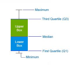
The ‘five-number summary’ principle is used to plot data on the box and whisker charts. This principle helps to provide a statistical summary for a given set of numbers. It gives information about the range (minimum and maximum numbers), the center (median), and the spread (upper and lower quartiles) for the set of values provided. A simple illustration of a box and whisker plot is given below:
There is another principle, named as the ‘Seven-number Summary’, which is not used in the current implementation.
On a box and whisker chart, three out of the five summary numbers are displayed by default (median, minimum number, and maximum number). You can also opt to display the other two summary numbers (upper and lower quartiles).
Apart from the five summary numbers the box and whisker chart allows you to display the following statistical figures on the chart:
To execute the five-number summary principle, we use the quartiles method. Using this method, a set of numbers is divided into four equal parts by three quartiles - Q1 (lower quartile), Q2 (median), and Q3 (upper quartile).
There are two other methods, Deciles and Percentiles, that are used to execute the five-number summary, which have not been used in this implementation.
We will now look at some of the formulae that are used to plot data on a box and whisker chart.
All the formulae are calculated after sorting the provided set of data in ascending order.
Mean
Mean is the usual average. The formula to calculate the mean is ΣXi /N, where N is the total number of elements in a set of data, X is the data points or values present in the set of data, and i is the position of the values.
Median (Q2)
To find the median, you will first need to arrange the given set of data in ascending order (from the smallest to the greatest number). The element that resides in the center-most position is said to be the median. This is easy to derive when the set of data contains odd number of elements. You can also use the formula (N+1)/2 to find the position, where N is the number of elements in the given set of data. But if the set of data consists of even number of elements, you get two middle positions. The average of the two numbers residing in the middle gives the median.
Lower Quartile (Q1)
The median divides the data into a lower half and an upper half. The lower quartile is the middle value of the lower half, i.e. the element between the minimum number and the median. The formula to find the position of the lower quartile when there are odd number of elements is (N+1)/4 and for even number of elements it is N/4.
Upper Quartile (Q3)
The upper quartile is the middle value that resides between the maximum number and the median. The formula to find the position of the upper quartile when there are odd number of elements is (3N+3)/4 and for even number of elements it is 3N/4.
Mean Deviation
Mean deviation is the average of the absolute differences between each individual value and the mean. It gives us an idea of how spread out the set of values is from the center. The formula to calculate the mean deviation is Σ|Xi - mean|/N, where N is the total number of elements in a set of data, X is the data points or values present in the set of data, and i is the position of the values in the set of data. For grouped data, the formula is Σf |Xi - mean|/N, where f is the frequency of occurrence.
The process to calculate mean deviation is given below:
-
Calculate the mean, i.e., the simple average of the given set of data
-
Subtract the mean from each number
-
Work out the mean (average) of those differences
Standard Deviation
Standard deviation is the measure of the dispersion of the values in a set of data from the mean. It gives an idea of how spread out the set of values is from the mean. The more spread apart the data, the higher is the deviation. The formula to calculate the standard deviation is √ (Σ(Xi - mean) ²/N), where N is the total number of elements in a set of data, X is the data points or values present in the set of data, and i is the position of the values in the set of data.
The process to calculate standard deviation is given below:
-
Calculate the mean, i.e., the simple average of the given set of data
-
Subtract the mean from each number and square the result
-
Work out the mean (average) of those squared differences
-
Take the square root of the whole result
Quartile Deviation
The distance between the upper quartile and the lower quartile is called the interquartile range. Quartile deviation is half the distance between the two quartiles, i.e. half the interquartile range. It is also called as the semi-interquartile range. The formula to calculate quartile deviation is (Q3-Q1)/2.