Loading
Configuring a Marimekko Chart
Marimekko charts are used for plotting the following three dimensions of marketing data for marketing analysis:
-
Total value of a market segment
-
Combined share of all competitors in a market segment
-
Individual share of competitors in a market segment
This section focuses on how you can customize the appearance of the Marimekko chart.
In this section, you will be shown how you can:
The section also talks about the interactive legend, introduced for the Marimekko chart in FusionCharts v3.11.0, works.
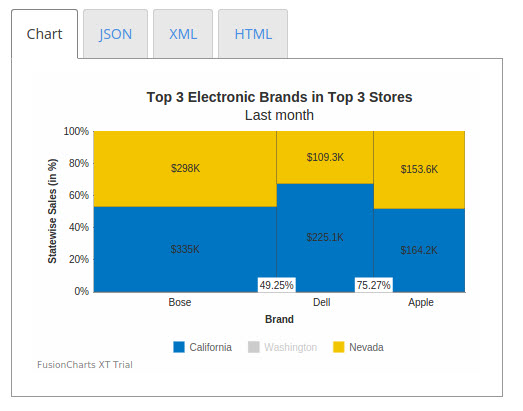
Displaying Actual Data Values Instead of Percentage Values
The stacked columns in a Marimekko chart can be rendered:
-
Using percentage values
-
Using actual data values
By default, a Marimekko chart is rendered with percentage values along the y-axis. A Marimekko chart rendered with actual values instead of percentage values looks like this:
{
    "chart": {
        "caption": "Top 3 Electronic Brands in Top 3 Stores",
        "subcaption": "Last month",
        "aligncaptiontocanvas": "0",
        "yaxisname": "Statewise Sales (in %)",
        "xaxisname": "Brand",
        "numberprefix": "$",
        "showPlotBorder": "1",
        "plotBorderThickness": "0.25",
        "showsum": "1",
        "usePercentDistribution": "0",
        "theme": "fint"
    },
    "categories": [
        {
            "category": [
                {
                    "label": "Bose"
                },
                {
                    "label": "Dell"
                },
                {
                    "label": "Apple"
                }
            ]
        }
    ],
    "dataset": [
        {
            "seriesname": "California",
            "data": [
                {
                    "value": "335000"
                },
                {
                    "value": "225100"
                },
                {
                    "value": "164200"
                }
            ]
        },
        {
            "seriesname": "Washington",
            "data": [
                {
                    "value": "215000"
                },
                {
                    "value": "198000"
                },
                {
                    "value": "120000"
                }
            ]
        },
        {
            "seriesname": "Nevada",
            "data": [
                {
                    "value": "298000"
                },
                {
                    "value": "109300"
                },
                {
                    "value": "153600"
                }
            ]
        }
    ]
}
<html>
<head>
<title>My first chart using FusionCharts Suite XT</title>
<script type="text/javascript" src="http://static.fusioncharts.com/code/latest/fusioncharts.js"></script>
<script type="text/javascript" src="http://static.fusioncharts.com/code/latest/themes/fusioncharts.theme.fint.js?cacheBust=56"></script>
<script type="text/javascript">
FusionCharts.ready(function(){
var fusioncharts = new FusionCharts({
type: 'marimekko',
renderAt: 'chart-container',
width: '450',
height: '300',
dataFormat: 'json',
dataSource: {
"chart": {
"caption": "Top 3 Electronic Brands in Top 3 Stores",
"subcaption": "Last month",
"aligncaptiontocanvas": "0",
"yaxisname": "Statewise Sales (in %)",
"xaxisname": "Brand",
"numberprefix": "$",
"showPlotBorder": "1",
"plotBorderThickness": "0.25",
"showsum": "1",
// No percentage distribution
"usePercentDistribution": "0",
//Theme
"theme": "fint"
},
"categories": [{
"category": [{
"label": "Bose"
}, {
"label": "Dell"
}, {
"label": "Apple"
}]
}],
"dataset": [{
"seriesname": "California",
"data": [{
"value": "335000"
}, {
"value": "225100"
}, {
"value": "164200"
}]
}, {
"seriesname": "Washington",
"data": [{
"value": "215000"
}, {
"value": "198000"
}, {
"value": "120000"
}]
}, {
"seriesname": "Nevada",
"data": [{
"value": "298000"
}, {
"value": "109300"
}, {
"value": "153600"
}]
}]
}
}
);
fusioncharts.render();
});
</script>
</head>
<body>
<div id="chart-container">FusionCharts XT will load here!</div>
</body>
</html>Given below is a brief description of the attribute used to display actual data values:
| Attribute | Description |
|---|---|
|
It is used to specify whether percentage distribution will be used on the y-axis to plot data. Setting this attribute to |
Hiding the Total Value of Market Segments
By default, the total value of a market segment for a competitor is rendered at the top of each column. Users can choose to hide this value. A Marimekko chart with the total value of market segments hidden looks like this:
{
    "chart": {
        "caption": "Top 3 Electronic Brands in Top 3 Stores",
        "subcaption": "Last month",
        "aligncaptiontocanvas": "0",
        "yaxisname": "Statewise Sales (in %)",
        "xaxisname": "Brand",
        "numberprefix": "$",
        "showPlotBorder": "1",
        "plotBorderThickness": "0.25",
        "showxaxispercentvalues": "1",
        "showSum": "0",
        "theme": "fint"
    },
    "categories": [
        {
            "category": [
                {
                    "label": "Bose"
                },
                {
                    "label": "Dell"
                },
                {
                    "label": "Apple"
                }
            ]
        }
    ],
    "dataset": [
        {
            "seriesname": "California",
            "data": [
                {
                    "value": "335000"
                },
                {
                    "value": "225100"
                },
                {
                    "value": "164200"
                }
            ]
        },
        {
            "seriesname": "Washington",
            "data": [
                {
                    "value": "215000"
                },
                {
                    "value": "198000"
                },
                {
                    "value": "120000"
                }
            ]
        },
        {
            "seriesname": "Nevada",
            "data": [
                {
                    "value": "298000"
                },
                {
                    "value": "109300"
                },
                {
                    "value": "153600"
                }
            ]
        }
    ]
}
<html>
<head>
<title>My first chart using FusionCharts Suite XT</title>
<script type="text/javascript" src="http://static.fusioncharts.com/code/latest/fusioncharts.js"></script>
<script type="text/javascript" src="http://static.fusioncharts.com/code/latest/themes/fusioncharts.theme.fint.js?cacheBust=56"></script>
<script type="text/javascript">
FusionCharts.ready(function(){
var fusioncharts = new FusionCharts({
type: 'marimekko',
renderAt: 'chart-container',
width: '450',
height: '300',
dataFormat: 'json',
dataSource: {
"chart": {
"caption": "Top 3 Electronic Brands in Top 3 Stores",
"subcaption": "Last month",
"aligncaptiontocanvas": "0",
"yaxisname": "Statewise Sales (in %)",
"xaxisname": "Brand",
"numberprefix": "$",
"showPlotBorder": "1",
"plotBorderThickness": "0.25",
"showxaxispercentvalues": "1",
//No Sum Value
"showSum": "0",
"theme": "fint"
},
"categories": [{
"category": [{
"label": "Bose"
}, {
"label": "Dell"
}, {
"label": "Apple"
}]
}],
"dataset": [{
"seriesname": "California",
"data": [{
"value": "335000"
}, {
"value": "225100"
}, {
"value": "164200"
}]
}, {
"seriesname": "Washington",
"data": [{
"value": "215000"
}, {
"value": "198000"
}, {
"value": "120000"
}]
}, {
"seriesname": "Nevada",
"data": [{
"value": "298000"
}, {
"value": "109300"
}, {
"value": "153600"
}]
}]
}
}
);
fusioncharts.render();
});
</script>
</head>
<body>
<div id="chart-container">FusionCharts XT will load here!</div>
</body>
</html>Given below is a brief description of the attribute used to hide the total value of market segments:
| Attribute | Description |
|---|---|
|
FusionCharts Suite XT allows you to show the sum of all data plots stacked above each other. The sum is shown above the stacked columns. This attribute is used to specify whether the sum of all stacked data plots will be shown. Setting this attribute to |
Hiding the Percentage Market Share Values
By default, labels are rendered between the columns of a Marimekko chart, along the x-axis, to show the percentage market value share of the competitors. These labels can be shown/hidden, depending on what the user requirement is.
A Marimekko chart with the percentage labels on the x-axis hidden looks like this:
{
    "chart": {
        "caption": "Top 3 Electronic Brands in Top 3 Stores",
        "subcaption": "Last month",
        "aligncaptiontocanvas": "0",
        "yaxisname": "Statewise Sales (in %)",
        "xaxisname": "Brand",
        "numberprefix": "$",
        "showPlotBorder": "1",
        "plotBorderThickness": "0.25",
        "showxaxispercentvalues": "0",
        "showsum": "1",
        "theme": "fint"
    },
    "categories": [
        {
            "category": [
                {
                    "label": "Bose",
                    "widthPercent": "45"
                },
                {
                    "label": "Dell",
                    "widthPercent": "30"
                },
                {
                    "label": "Apple",
                    "widthPercent": "25"
                }
            ]
        }
    ],
    "dataset": [
        {
            "seriesname": "California",
            "data": [
                {
                    "value": "335000"
                },
                {
                    "value": "225100"
                },
                {
                    "value": "164200"
                }
            ]
        },
        {
            "seriesname": "Washington",
            "data": [
                {
                    "value": "215000"
                },
                {
                    "value": "198000"
                },
                {
                    "value": "120000"
                }
            ]
        },
        {
            "seriesname": "Nevada",
            "data": [
                {
                    "value": "298000"
                },
                {
                    "value": "109300"
                },
                {
                    "value": "153600"
                }
            ]
        }
    ]
}
<html>
<head>
<title>My first chart using FusionCharts Suite XT</title>
<script type="text/javascript" src="http://static.fusioncharts.com/code/latest/fusioncharts.js"></script>
<script type="text/javascript" src="http://static.fusioncharts.com/code/latest/themes/fusioncharts.theme.fint.js?cacheBust=56"></script>
<script type="text/javascript">
FusionCharts.ready(function(){
var fusioncharts = new FusionCharts({
type: 'marimekko',
renderAt: 'chart-container',
width: '450',
height: '300',
dataFormat: 'json',
dataSource: {
"chart": {
"caption": "Top 3 Electronic Brands in Top 3 Stores",
"subcaption": "Last month",
"aligncaptiontocanvas": "0",
"yaxisname": "Statewise Sales (in %)",
"xaxisname": "Brand",
"numberprefix": "$",
"showPlotBorder": "1",
"plotBorderThickness": "0.25",
//Hide X-axis percent value
"showxaxispercentvalues": "0",
"showsum": "1",
"theme": "fint"
},
"categories": [{
"category": [{
"label": "Bose",
"widthPercent": "45"
}, {
"label": "Dell",
"widthPercent": "30"
}, {
"label": "Apple",
"widthPercent": "25"
}]
}],
"dataset": [{
"seriesname": "California",
"data": [{
"value": "335000"
}, {
"value": "225100"
}, {
"value": "164200"
}]
}, {
"seriesname": "Washington",
"data": [{
"value": "215000"
}, {
"value": "198000"
}, {
"value": "120000"
}]
}, {
"seriesname": "Nevada",
"data": [{
"value": "298000"
}, {
"value": "109300"
}, {
"value": "153600"
}]
}]
}
}
);
fusioncharts.render();
});
</script>
</head>
<body>
<div id="chart-container">FusionCharts XT will load here!</div>
</body>
</html>Given below is a brief description of the attribute used to hide the percentage labels:
| Attribute | Description |
|---|---|
|
It is used to specify whether percentage values will be shown along the x-axis. Setting this attribute to |
Legend Interactivity in the Marimekko Chart
The Marimekko chart includes support for an interactive legend starting FusionCharts Suite XT v3.11.0. The interactive legend implementation for the Marimekko chart not only lets you show/hide the data plots but also manages the space vacated when data plots are hidden. Consequently, the percentage labels are also updated to reflect the current state of the chart.
For example, in the Marimekko chart shown above, if you were to hide the data plots for Washington using the legend, the data plots for California and Nevada will be automatically arranged in the available space, as shown in the image below: