Drag Node Chart
This chart type belongs to PowerCharts XT.
The drag node chart is a specialized type of chart that shows each data set as a draggable node. Perfect for network diagrams, hierarchy structures, etc., this chart provides a highly intuitive interface for you to visually adjust related entities, link them, and even add new ones.
You can also take visual inputs from other users using this chart and then submit the final positions of the nodes to your scripts for further processing.
Features of a drag-node chart
Using a drag-node chart, you can:
Represent each data set on the chart as a draggable node of various shapes (circles, rectangles, or polygons) and sizes.
Include image and text together in nodes.
Set the chart in view or edit mode. In the view mode, you can just drag the nodes (unless the feature is explicitly disabled). In edit mode, you can:
add, edit, or delete nodes
add, edit, or delete connectors
add, edit, or delete text labels
Define links between any two nodes on the chart. Links can have arrows on both sides or either side. Each link has a label and a strength factor
Visually add nodes, connectors, and labels at runtime
Visually edit existing or newly created nodes and connectors at runtime
Filter the links dynamically at runtime to show only the n strongest links, using JavaScript.
Using JavaScript, Retrieve updated positions of nodes using JavaScript.
Send updated positions of nodes back to the server for processing.
A sample drag-node chart is given below:
{
    "chart": {
        "caption": "US Subway Map",
        "xaxisminvalue": "0",
        "xaxismaxvalue": "100",
        "yaxisminvalue": "0",
        "yaxismaxvalue": "100",
        "is3d": "0",
        "showformbtn": "1",
        "formaction": "resources/php/chart-guide-drag-node-chart-introduction-update.php",
        "formtarget": "_blank",
        "formmethod": "POST",
        "formbtntitle": "Save",
        "viewmode": "0",
        "showplotborder": "1",
        "plotborderthickness": "4",
        "theme": "fusion",
        "showcanvasborder": "1",
        "canvasborderalpha": "20",
        "animation": "0"
    },
    "dataset": [
        {
            "data": [
                {
                    "id": "01",
                    "label": "Santa Monica",
                    "color": "#ffffff",
                    "x": "16",
                    "y": "54",
                    "radius": "30",
                    "shape": "circle"
                },
                {
                    "id": "02",
                    "label": "Los Angeles",
                    "color": "#ffffff",
                    "x": "27",
                    "y": "54",
                    "radius": "30",
                    "shape": "circle"
                },
                {
                    "id": "03",
                    "label": "Ontario",
                    "color": "#ffffff",
                    "x": "48",
                    "y": "54",
                    "radius": "30",
                    "shape": "circle"
                },
                {
                    "id": "04",
                    "label": "Phoenix",
                    "color": "#ffffff",
                    "x": "85",
                    "y": "54",
                    "radius": "30",
                    "shape": "circle"
                },
                {
                    "id": "05",
                    "label": "Flagstaff",
                    "color": "#ffffff",
                    "x": "85",
                    "y": "80",
                    "radius": "30",
                    "shape": "circle"
                },
                {
                    "id": "06",
                    "label": "Barstow",
                    "color": "#ffffff",
                    "x": "62",
                    "y": "80",
                    "radius": "30",
                    "shape": "circle"
                },
                {
                    "id": "07",
                    "label": "San Diego",
                    "color": "#ffffff",
                    "x": "35",
                    "y": "30",
                    "radius": "30",
                    "shape": "circle"
                },
                {
                    "id": "08",
                    "label": "San Ysidro",
                    "color": "#ffffff",
                    "x": "40",
                    "y": "12",
                    "radius": "30",
                    "shape": "circle"
                },
                {
                    "id": "09",
                    "label": "Las Vegas",
                    "color": "#ffffff",
                    "x": "68",
                    "y": "93",
                    "radius": "30",
                    "shape": "circle"
                },
                {
                    "id": "10",
                    "label": "",
                    "color": "#ffffff",
                    "x": "12",
                    "y": "98",
                    "radius": "0",
                    "shape": "circle"
                },
                {
                    "id": "11",
                    "label": "",
                    "color": "#ffffff",
                    "x": "100",
                    "y": "80",
                    "radius": "0",
                    "shape": "circle"
                },
                {
                    "id": "12",
                    "label": "",
                    "color": "#ffffff",
                    "x": "99",
                    "y": "40",
                    "radius": "0",
                    "shape": "circle"
                },
                {
                    "id": "13",
                    "label": "Yuma",
                    "color": "#ffffff",
                    "x": "70",
                    "y": "30",
                    "radius": "30",
                    "shape": "circle"
                },
                {
                    "id": "14",
                    "label": "",
                    "color": "#ffffff",
                    "x": "100",
                    "y": "30",
                    "radius": "0",
                    "shape": "circle"
                }
            ]
        }
    ],
    "connectors": [
        {
            "color": "#ffffff",
            "stdthickness": "10",
            "connector": [
                {
                    "strength": "2",
                    "from": "01",
                    "to": "02",
                    "color": "#fec110",
                    "arrowatstart": "0",
                    "arrowatend": "0"
                },
                {
                    "strength": "2",
                    "from": "02",
                    "to": "03",
                    "color": "#fec110",
                    "arrowatstart": "0",
                    "arrowatend": "0"
                },
                {
                    "strength": "2",
                    "from": "03",
                    "to": "04",
                    "color": "#fec110",
                    "arrowatstart": "0",
                    "arrowatend": "0"
                },
                {
                    "strength": "2",
                    "from": "04",
                    "to": "12",
                    "color": "#fec110",
                    "arrowatstart": "0",
                    "arrowatend": "0"
                },
                {
                    "strength": "2",
                    "from": "04",
                    "to": "05",
                    "color": "#a6aaad",
                    "arrowatstart": "0",
                    "arrowatend": "0"
                },
                {
                    "strength": "2",
                    "from": "09",
                    "to": "06",
                    "color": "#0178bc",
                    "arrowatstart": "0",
                    "arrowatend": "0"
                },
                {
                    "strength": "2",
                    "from": "06",
                    "to": "03",
                    "color": "#0178bc",
                    "arrowatstart": "0",
                    "arrowatend": "0"
                },
                {
                    "strength": "2",
                    "from": "03",
                    "to": "07",
                    "color": "#0178bc",
                    "arrowatstart": "0",
                    "arrowatend": "0"
                },
                {
                    "strength": "2",
                    "from": "05",
                    "to": "06",
                    "color": "#f1277d",
                    "arrowatstart": "0",
                    "arrowatend": "0"
                },
                {
                    "strength": "2",
                    "from": "06",
                    "to": "11",
                    "color": "#f1277d",
                    "arrowatstart": "0",
                    "arrowatend": "0"
                },
                {
                    "strength": "2",
                    "from": "02",
                    "to": "07",
                    "color": "#c1c733",
                    "arrowatstart": "0",
                    "arrowatend": "0"
                },
                {
                    "strength": "2",
                    "from": "07",
                    "to": "08",
                    "color": "#c1c733",
                    "arrowatstart": "0",
                    "arrowatend": "0"
                },
                {
                    "strength": "2",
                    "from": "02",
                    "to": "10",
                    "color": "#c1c733",
                    "arrowatstart": "0",
                    "arrowatend": "0"
                },
                {
                    "strength": "2",
                    "from": "07",
                    "to": "13",
                    "color": "#6d6e70",
                    "arrowatstart": "0",
                    "arrowatend": "0"
                },
                {
                    "strength": "2",
                    "from": "13",
                    "to": "14",
                    "color": "#6d6e70",
                    "arrowatstart": "0",
                    "arrowatend": "0"
                }
            ]
        }
    ]
}<html>
<head>
<title>My first chart using FusionCharts Suite XT</title>
<script type="text/javascript" src="https://cdn.fusioncharts.com/fusioncharts/latest/fusioncharts.js"></script>
<script type="text/javascript" src="https://cdn.fusioncharts.com/fusioncharts/latest/themes/fusioncharts.theme.fusion.js"></script>
<script type="text/javascript">
FusionCharts.ready(function(){
var fusioncharts = new FusionCharts({
type: 'dragnode',
renderAt: 'chart-container',
width: '800',
height: '600',
dataFormat: 'json',
dataSource: {
"chart": {
"caption": "US Subway Map",
"xaxisminvalue": "0",
"xaxismaxvalue": "100",
"yaxisminvalue": "0",
"yaxismaxvalue": "100",
"is3d": "0",
"showformbtn": "1",
"formaction": "resources/php/chart-guide-drag-node-chart-introduction-update.php",
"formtarget": "_blank",
"formmethod": "POST",
"formbtntitle": "Save",
"viewmode": "0",
"showplotborder": "1",
"plotborderthickness": "4",
"theme": "fusion",
"showcanvasborder": "1",
"canvasborderalpha": "20",
"animation": "0"
},
"dataset": [{
"data": [{
"id": "01",
"label": "Santa Monica",
"color": "#ffffff",
"x": "16",
"y": "54",
"radius": "30",
"shape": "circle"
}, {
"id": "02",
"label": "Los Angeles",
"color": "#ffffff",
"x": "27",
"y": "54",
"radius": "30",
"shape": "circle"
}, {
"id": "03",
"label": "Ontario",
"color": "#ffffff",
"x": "48",
"y": "54",
"radius": "30",
"shape": "circle"
}, {
"id": "04",
"label": "Phoenix",
"color": "#ffffff",
"x": "85",
"y": "54",
"radius": "30",
"shape": "circle"
}, {
"id": "05",
"label": "Flagstaff",
"color": "#ffffff",
"x": "85",
"y": "80",
"radius": "30",
"shape": "circle"
}, {
"id": "06",
"label": "Barstow",
"color": "#ffffff",
"x": "62",
"y": "80",
"radius": "30",
"shape": "circle"
}, {
"id": "07",
"label": "San Diego",
"color": "#ffffff",
"x": "35",
"y": "30",
"radius": "30",
"shape": "circle"
}, {
"id": "08",
"label": "San Ysidro",
"color": "#ffffff",
"x": "40",
"y": "12",
"radius": "30",
"shape": "circle"
}, {
"id": "09",
"label": "Las Vegas",
"color": "#ffffff",
"x": "68",
"y": "93",
"radius": "30",
"shape": "circle"
}, {
"id": "10",
"label": "",
"color": "#ffffff",
"x": "12",
"y": "98",
"radius": "0",
"shape": "circle"
}, {
"id": "11",
"label": "",
"color": "#ffffff",
"x": "100",
"y": "80",
"radius": "0",
"shape": "circle"
}, {
"id": "12",
"label": "",
"color": "#ffffff",
"x": "99",
"y": "40",
"radius": "0",
"shape": "circle"
}, {
"id": "13",
"label": "Yuma",
"color": "#ffffff",
"x": "70",
"y": "30",
"radius": "30",
"shape": "circle"
}, {
"id": "14",
"label": "",
"color": "#ffffff",
"x": "100",
"y": "30",
"radius": "0",
"shape": "circle"
}]
}],
"connectors": [{
"color": "#ffffff",
"stdthickness": "10",
"connector": [{
"strength": "2",
"from": "01",
"to": "02",
"color": "#fec110",
"arrowatstart": "0",
"arrowatend": "0"
}, {
"strength": "2",
"from": "02",
"to": "03",
"color": "#fec110",
"arrowatstart": "0",
"arrowatend": "0"
}, {
"strength": "2",
"from": "03",
"to": "04",
"color": "#fec110",
"arrowatstart": "0",
"arrowatend": "0"
}, {
"strength": "2",
"from": "04",
"to": "12",
"color": "#fec110",
"arrowatstart": "0",
"arrowatend": "0"
}, {
"strength": "2",
"from": "04",
"to": "05",
"color": "#a6aaad",
"arrowatstart": "0",
"arrowatend": "0"
}, {
"strength": "2",
"from": "09",
"to": "06",
"color": "#0178bc",
"arrowatstart": "0",
"arrowatend": "0"
}, {
"strength": "2",
"from": "06",
"to": "03",
"color": "#0178bc",
"arrowatstart": "0",
"arrowatend": "0"
}, {
"strength": "2",
"from": "03",
"to": "07",
"color": "#0178bc",
"arrowatstart": "0",
"arrowatend": "0"
}, {
"strength": "2",
"from": "05",
"to": "06",
"color": "#f1277d",
"arrowatstart": "0",
"arrowatend": "0"
}, {
"strength": "2",
"from": "06",
"to": "11",
"color": "#f1277d",
"arrowatstart": "0",
"arrowatend": "0"
}, {
"strength": "2",
"from": "02",
"to": "07",
"color": "#c1c733",
"arrowatstart": "0",
"arrowatend": "0"
}, {
"strength": "2",
"from": "07",
"to": "08",
"color": "#c1c733",
"arrowatstart": "0",
"arrowatend": "0"
}, {
"strength": "2",
"from": "02",
"to": "10",
"color": "#c1c733",
"arrowatstart": "0",
"arrowatend": "0"
}, {
"strength": "2",
"from": "07",
"to": "13",
"color": "#6d6e70",
"arrowatstart": "0",
"arrowatend": "0"
}, {
"strength": "2",
"from": "13",
"to": "14",
"color": "#6d6e70",
"arrowatstart": "0",
"arrowatend": "0"
}]
}]
},
events: {
'beforeRender': function(event, args) {
// creating div for controllers
var controllers = document.createElement('div'),
chartRef = event.sender,
restoreBtn,
httpRequest,
//Function to restore data
restoreData = function() {
if (window.XMLHttpRequest) { // Mozilla, Safari, ...
httpRequest = new XMLHttpRequest();
} else if (window.ActiveXObject) { // IE 8 and older
httpRequest = new ActiveXObject("Microsoft.XMLHTTP");
}
httpRequest.onreadystatechange = function() {
if (httpRequest.readyState === 4) {
chartRef.setXMLUrl('https://static.fusioncharts.com/sample/dev2.0/chart-guide-drag-node-chart-introduction.xml');
alert("Data Restored");
} else if (httpRequest.readyState >= 400) {
alert("Data Restored Failed");
}
};
httpRequest.open('GET', 'https://static.fusioncharts.com/sample/dev2.0/chart-guide-drag-node-chart-introduction-restore.php', true);
httpRequest.send(null);
};
controllers.setAttribute('id', 'btnCont');
// Create Button inside div
controllers.innerHTML = '<input id="restoreXML" type="submit" name="Submit" value="Restore Original Data">';
args.container.parentNode.insertBefore(controllers, args.container.nextSibling);
// setting css styles for controllers div
controllers.style.cssText = "width: 800px; text-align:center;";
restoreBtn = document.getElementById('restoreXML');
//Set event listener for check boxes
restoreBtn.addEventListener && restoreBtn.addEventListener("click", restoreData);
},
"datasubmitted": function(e, a) {
alert("Successfully Saved");
}
}
}
);
fusioncharts.render();
});
</script>
</head>
<body>
<div id="chart-container">FusionCharts XT will load here!</div>
</body>
</html>Click here to edit the above chart.
Now, let's customize the appearance and properties of the chart.
Configure Drag-node Charts
Using FusionCharts Suite XT, you can configure the functional aspects of drag-node charts.
Enable/disable the dragging feature
Set the value of the allowDrag attribute to 1 to make a node draggable.
Refer to the code below:
{
    "chart": {
        "allowDrag": "1"
    }
}The chart will look as shown below:
Click here to edit the above chart.
Switch between modes
You can either render drag-node charts in the edit mode (in which you can add, edit, or delete nodes, connectors, and labels) or in the view mode (in which you can only view the chart). To enable view mode, set the value of the viewMode attribute to 1. If you set its value to 0 instead, then the chart will be rendered in edit mode but will have a Settings button at the bottom of it.
Refer to the code below:
{
    "chart": {
        "viewMode": "1"
    }
}The chart will look as shown below:
Click here to edit the above chart.
Add and edit nodes
Using FusionCharts Suite XT, you can customize a drag-node chart in runtime. You can add, edit, or delete nodes in a drag-node chart. To enable this feature, render the chart in edit mode.
The chart will look as shown below:
Click here to edit the above chart.
The above chart shows the US Subway Map and uses draggable nodes to mark locations on the map.
Add a node at runtime
Follow the steps given below to add a new node to the above subway map chart.
From the bottom-left corner of the chart, click the
 button. Note that a menu is rendered.
From the menu, select Add a node.

You will see a node properties dialog box, as shown in the image below:
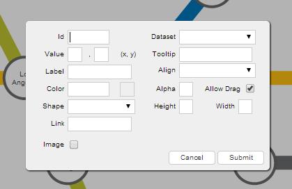
- In this dialog box, enter the node information, and finally click the Submit button.
Here's how to fill in the different fields in the dialog box:
Specify a unique identifier for the node in the Id field.
Specify the data set to which the node will belong, in the Dataset field. Note that the node inherits all visual properties you define for the data set.
Specify the label for the node in the Label field. The label will be displayed on the chart.
Specify the x- and y-coordinates for the node position in the Value field.
Specify tooltip text for the node in the Tooltip field.
Specify the hex code of the color to be applied to the node in the Color field.
Specify the transparency for the node between 0 (transparent) and 100 (opaque), in the Alpha field.
Specify the vertical alignment of the label with respect to the node as
top,middle, orbottom, in the Align field.Specify whether the node will be draggable, by leaving the Allow Drag checkbox in checked state.
Choose the shape of the node as
rectangle(default),circle, orpolygon, in the Shape dropdown menu.Specify the height of the shape in the Height field. Note that this field is visible only when you select the Rectangle option from the Shape dropdown menu.
Specify the width of the shape in the Width field. Note that this field is visible only when you select the Rectangle option from the Shape dropdown menu.
Specify the radius of the shape in the Radius field. Note that this field is visible only when you select Circle or Polygon from the Shape drop-down menu.
Specify the number of sides for the shape in the Sides field. Note that this field is visible only when you select Polygon from the Shape drop-down.
Specify the URL to which the chart will redirect you if you click on the node, in the Link field.
Specify whether an image will be rendered with the node in the Image field. If you select this checkbox several fields (URL, Width, Height, and Align) that allow you to enter image information will become visible.
Specify the link to which the chart will redirect you, if you click on the image in the URL field.
Specify the width of the image in the Width field.
Specify the height of the image in the Height field.
Specify the alignment of the image with respect to the node, as
top,middle, orbottom, in the Align field.
The dialog box will look like the one shown below:
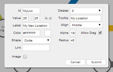
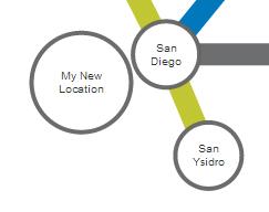
Now, when you click on the Submit button, the newly created node will look like the following:
Note: You can define nodes in the chart data using the
dataobject of thedatasetobject.
Customize chart by trapping raised event
When you create a new node, a JavaScript event, named nodeAdded, is raised. You can trap and use this event to customize the output, according to your requirements.
Refer to the code below:
chartInstance.addEventListener('nodeadded', function(e, a){
    //Your code here
});Edit a node at runtime
You can edit all of the properties of a node, except for the ID and the dataset to which it belongs. To edit a node:
Press and hold the left mouse button on that node. The node properties dialog box will be rendered with the
IdandDatasetfields disabled.In this dialog box, re-populate the fields you want to edit.
Click Submit.
The dialog box will look like as shown below:
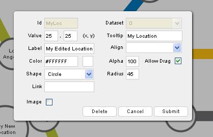
Now, when you click on the Submit button, the edited node will look like the following:
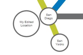
When you edit a node, a JavaScript event named nodeUpdated is raised. You can trap and use this event to customize the output according to your requirements.
The code snippet required to trap this event is given below:
chartInstance.addEventListener('nodeupdated', function(e, a){
    //Your code here
});Delete a node at runtime
To delete a node:
Press and hold the left mouse button on the node that you want to delete. The node properties dialog box will appear.
In the dialog box, click Delete button. The node will be deleted.
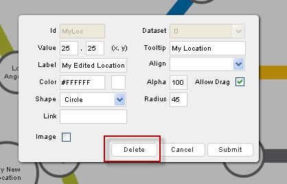
When you delete a node, a JavaScript event named nodeDeleted is raised. You can trap and use this event to customize the output according to your requirements.
The code snippet required to trap this event is given below:
chartInstance.addEventListener('nodedeleted', function(e, a){
    //Your code here
});Get the latest updated node positions using JavaScript or by submitting the updated positions to a server-side script.
Add and edit connectors
Using FusionCharts Suite XT, you can customize a drag-node chart in runtime. You can add, edit, or delete connectors in a drag-node chart. Set the chart to edit mode to use this feature (enable edit mode by setting "viewMode: 0" in the chart object).
A sample chart will look like the following:
Click here to edit the above chart.
The above chart shows the US Subway Map and uses drag-able nodes to mark locations on the map.
Add a connector at runtime
In the above chart, the "My Edited Location" node does not have any connectors connecting it to the other nodes on the chart. We will add a connector that will connect this node to the node representing Santa Monica.
To add a connector:
From the bottom-left corner of the chart, click the
 button. A menu will be rendered.
From the menu, select Add a Connector.

The connector properties dialog box, as seen in the image below, will appear:
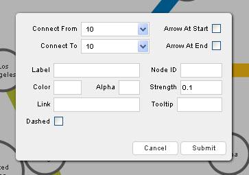
In this dialog box, enter the connector information.
Click Submit.
Here's how to fill in the different fields in the dialog box:
Specify the source node for the connector in the Connect From field.
Specify the destination node for the connector in the Connect To field.
Specify whether an arrow pointing towards the source node is to be rendered, using the Arrow At Start field.
Specify whether an arrow pointing towards the destination node is to be rendered, using the Arrow At End field.
Specify the label for the connector using the Label field. The label will be displayed on the chart.
Specify the unique ID of the node to be added using the Node ID field.
Specify the hex code of the color that will be used to render the connector, using the Color field.
Specify the transparency for the connector between
0(transparent) and100(opaque) in the Alpha field.Specify the strength of the connector between
0and2, using the Strength field. The value entered here is multiplied by the thickness specified for the connector (using thestdThicknessattribute).Specify the URL to which the chart will redirect you, if you click on the connector, using the Link field.
Specify the tool-tip text for the connector using the Tooltip field.
Specify whether the connector will be rendered as a dashed line, using the Dashed field.
Specify the gap between each dash, if the connector is rendered as a dashed line, using the Dash Gap field. Note that this field is visible only if you select the Dashed check box.
Specify the length of each dash, if the connector is rendered as a dashed line, using the Dash Length field. Note that this field is visible only if you select the Dashed check box.
The image below shows the fields of the dialog box populated for a new connector:
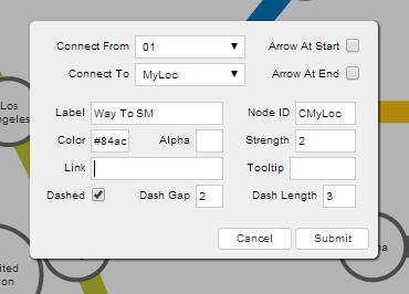
Now, when you click the Submit button, the new connector created will look like the following:
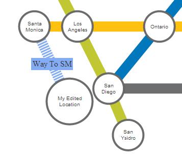
You can define connectors in chart data too. Each connector line is defined in the data of the chart as an object in the connectors array element.
When you create a new connector, a JavaScript event named connectorAdded is raised. You can trap and use this event to customize the output according to your requirements.
The code snippet required to trap this event is given below:
chartInstance.addEventListener('connectoradded', function(e, a) {
    //Your code here
});Edit a connector at runtime
You can edit all properties of a connector, except for the source and destination nodes.
To edit a connector:
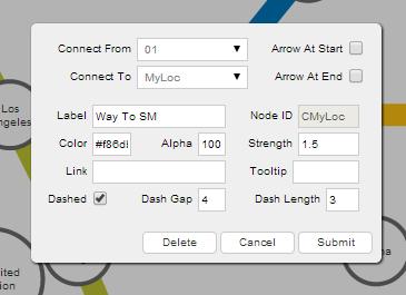
Press and hold the left mouse button on the connector to be edited. The connector properties dialog box will appear, with the Connect To and Connect From fields disabled.
In this dialog box, re-populate the fields you want to edit.
Click Submit.
The dialog box will look like the one shown below:
The edited connector will look like the following:
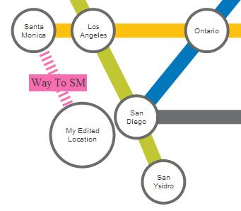
When you edit a connector, a JavaScript event named connectorUpdated is raised. You can trap and use this event to customize the output according to your requirements.
The code snippet required to trap this event is given below:
chartInstance.addEventListener('connectorupdated', function(e, a) {
    //Your code here
});Delete a Connector at runtime
To delete a connector:
Press and hold the left mouse button on the connector to delete. The connector properties dialog box appears.
From the dialog box, click Delete. The connector will be deleted.
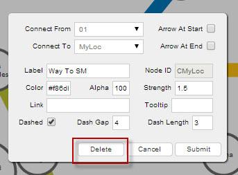
When you delete a connector, a JavaScript event named connectorDeleted is raised. You can trap and use this event to customize the output according to your requirements.
The code snippet required to trap this event is given below:
chartInstance.addEventListener('connectordeleted', function(e, a) {
    //Your code here
});You can get the latest updated node and connector positions using JavaScript or by submitting the updated positions to a server-side script.
Add and Delete Text Labels
FusionCharts Suite XT allows you to create individual floating text labels on the chart. This helps in defining a strict text content that can be shown and dragged anywhere on the chart. As of now, you can only add or delete a label, but you cannot edit a label.
To understand this, the sample chart that we will use looks like this:
Click here to edit the above chart.
The above chart shows the US Subway Map and uses draggable nodes to mark locations on the map.
Add a text label at runtime
To add a new text label:
From the bottom-left corner of the chart, click the
 button. A menu is rendered.
From the menu, select Add a Label. The label properties dialog box, as seen in the image below, will appear:
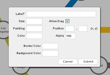
In the label properties dialog, enter the label information.
Click Submit.
Here's how to fill in the different fields in the dialog box:
Specify the text for the label in the Label field.
Specify the size of the label in the Size field.
Specify whether the label will be draggable, by selecting the Allow Drag checkbox.
Specify the space around the label in the Padding field.
Specify the x- and y-coordinates for the label position in the Position field.
Specify the hex code for the font color of the label text in the Color field.
Specify the label transparency between
0(transparent) and100(opaque) in the Alpha field.Specify the hex code for the label border color in the Border Color field.
Specify the hex code for the label background color in the Background Color field.
The dialog box will look like as shown below:
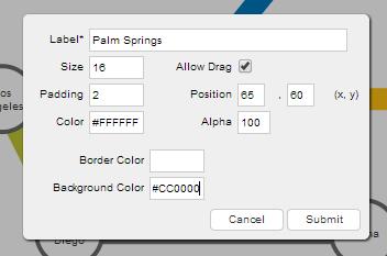
Now, when you click the Submit button, the new label created will look like the following:
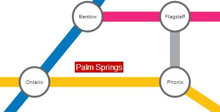
You can drag the label to any position on the chart.
You can define labels in chart data, through the object as the labels array element.
When you create a new label, a JavaScript event named labelAdded is raised. You can trap and use this event to customize the output according to your requirements.
The code snippet required to trap this event is given below:
chartInstance.addEventListener(labeladded, function(e, a) {
    //Your code here
});Delete a text label at runtime
To delete a text label:
- Press and hold the left mouse button on the label that you want to delete. A dialog box will appear and ask you to confirm the deletion.
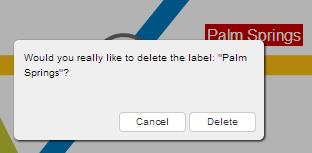
- In the dialog box, click the Delete button. The label will be deleted.
When you delete a label, a JavaScript event named labelDeleted is raised. You can trap and use this event to customize the output according to your requirements.
The code snippet required to trap this event is given below:
chartInstance.addEventListener('labeldeleted', function(e, a) {
    //Your code here
});You can get the latest updated node and connector positions using JavaScript or by submitting the updated positions to a server-side script.
Update Chart Data on Server
In the drag-node chart, you can update data in real-time and submit the modified data to your scripts for further processing.
There are two methods you can follow, to update chart data on the server:
Submit the updated data from the chart to your server-side script (as form elements) in XML format.
Submit the updated data as XML/array to client-side JavaScript functions. These functions can now handle the data in the way they want to.
In the following section, you will see how to update chart data using server-side scripts.
Set the Form
To enable data submission to server-side script, you need to make sure that the Submit button is not hidden on your form.
Use the following code snippet to show the Submit button:
{
    "chart": {
        "showFormBtn": "1"
    }
}This will add a submit button to your chart, as shown below:
Use the following attributes to show/hide and define the form properties for the Submit button:
Specify whether the Submit button will be rendered on the chart by setting the value of the
showFormBtnattribute to1. Note that if you use JavaScript methods to get data from the chart, you can hide this button.Specify the URL of the server-side script to which you want to submit the updated data, using the
formActionattribute. You can specify either the relative or the absolute path. You also need to use thestrXMLform variable on this page.Specify
GET, orPOSTas the method for submitting form data, using theformMethodattribute. If you submit the data in XML format, you should ideally use thePOSTmethod.Specify the target page where the response received after form data submission will be rendered, using the
formTargetattribute, which takes_blankor_selfas value.Specify the text label for the Submit button using the
formBtnTitleattribute.Specify the hex code of the color for the Submit button using the
btnTextColorattribute.Specify the width (in pixels) of the Submit button, using the
formBtnWidthattribute.Specify the hex code of the border color for the Submit button, using the
formBtnBorderColorattribute.Specify the hex code of the background color for the Submit button, using the
formBtnBngColorattribute.
You can see how the server-side PHP script is used to submit data, in the code snippet given below:
<?php
//File to write
$filename = 'xml/dragNodeData.xml';
//Requested data
$content = $_REQUEST['strXML'];
// Let's make sure the file exists and is writable first.
if (is_writable($filename)) {
    // In our example we're opening $filename in write mode.
    // The file pointer is at the bottom of the file hence
    // that's where $content will go when we fwrite() it.
    if (!$handle = fopen($filename, 'w')) {
        echo "Cannot open file ($filename)";
        exit;
    }
    // Write $content to our opened file.
    if (fwrite($handle, $content) === FALSE) {
        echo "Cannot write to file ($filename)";
        exit;
    }
    echo "Success, wrote ($content) to file ($filename)";
    //Close the file
    fclose($handle);
} else {
    echo "The file $filename is not writable";
}
?>Get data using JavaScript
In a drag-node chart, you can update data in real-time. To access the updated JSON data at the client-side using JavaScript, you can parse this data and update your data sources through AJAX, etc.
In this section, you will see how to read the updated data using JavaScript functions present on the same page. Once the chart is rendered, you can access the updated chart data as JSON, simply by calling the getJSONData() function on the chart. Use the following code snippet to do so:
//Get a reference to our chart
var ourChart = FusionCharts("NodeChart");

//Get the data from chart
var jsonRtn = ourChart.getJSONData();

//Show it to user in alert box.
alert(JSON.stringify(jsonRtn));The function getJSONData() returns the latest or changed data. You need to use this function to retrieve the original data from the chart, as well. Note that in order to get the original data from the chart, you need to pass
falseas a parameter to the function. For example,var jsonRtn = ourChart.getJSONData(false);
The chart will look as shown below:
Click here to edit the above chart.
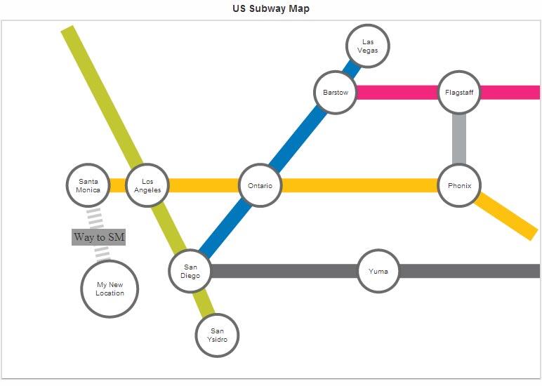
Now, make the following updates to this drag-node chart:
Add a node named My New Location, using the Add a Node menu item.
Add a connector named Way to SM, between "Santa Monica" and "My New Location", using the Add a Connector menu item.
The chart will look as shown in the image below:
Now if you want to get the current data using the code var jsonRtn = ourChart.getJSONData(); alert(JSON.stringify(jsonRtn));, the updated data will be shown in the chart. The modified part of the updated data is shown in the code snippet given below:
{
    "chart": {
            ...
    },
    "dataset": [{
        "data": [
            ...
            {
                "x": "20",
                "y": "25",
                "id": "myLoc",
                "datasetId": "0",
                "name": "My New Location",
                "tooltext": "My Location",
                "color": "#FFFFFF",
                "alpha": "100",
                "labelalign": "middle",
                "allowdrag": 1,
                "shape": "circle",
                "width": "",
                "height": "",
                "radius": "40",
                "numsides": "",
                "imagenode": 0,
                "imagewidth": "",
                "imageheight": "",
                "imagealign": "",
                "imageurl": "",
                "link": "http://www.fusioncharts.com"
            }
        ]
    }],
    "connectors": [{
        ...
        {
            ...
        },
        ...
        {
            "from": "myLoc",
            "to": "01",
            "id": "",
            "label": "Way to SM",
            "color": "#999999",
            "alpha": "50",
            "link": "",
            "tooltext": "",
            "strength": "2",
            "arrowatstart": "0",
            "arrowatend": "0",
            "dashed": "1",
            "dashlen": "4",
            "dashgap": "4"
        }
    ]},
    "labels": {
        "label": []
    }
}