Data Plot
Data plot refers to the columns of the column chart, lines in a line chart, pie/doughnut slices in a pie/doughnut chart. You can enhance the way your data plot looks using colors, gradients and hover effects.
Color individual data plots
You can specify a custom color for each data plot. Specify the hex code of the color using the color attribute within dataunder the chart object.
Refer to the code below:
{
    "chart": {
        ...
    },
    "data": [
        {
            "label": "Jan",
            "value": "420000"
        }, {
            "label": "Feb",
            "value": "810000"
        }, {
            "label": "Mar",
            "value": "720000"
        }, {
            "label": "Apr",
            "value": "550000"
        }, {
            "label": "May",
            "value": "910000",
            "color": "#9b59b6" //Custom Color
        }, {
            "label": "Jun",
            "value": "510000"
        }, {
            "label": "Jul",
            "value": "680000"
        }, {
            "label": "Aug",
            "value": "620000"
        }, {
            "label": "Sep",
            "value": "610000"
        }, {
            "label": "Oct",
            "value": "490000"
        }, {
            "label": "Nov",
            "value": "900000",
            "color": "#e44a00"  //Custom Color
        }, {
            "label": "Dec",
            "value": "730000"
        }
    ]
}The chart will look like as shown below:
Click here to edit the above chart.
Color different Data Plots
You can also specify a comma separated list of colors for use in different data series (or in case of single series charts, different data plots). The colors are selected from the list in a round-robin way for each data series.
Specify your custom palette for data plots by providing a list of hex colors using the paletteColors attribute. Refer to the code below:
{
    "chart":{
        "palettecolors":"5d62b5,29c3be,f2726f"
    }
}The chart will look like as shown below:
Click here to edit the above chart.
Add Gradient Effect to Data Plots
You can apply a global gradient color for an entire data plot. To do so follow the steps given below:
usePlotGradientColor- Set this attribute to1to turn use the gradient effect.plotGradientColor- Specify the hex code of the gradient color.
Refer to the code below:
{
    "chart": {
        "usePlotGradientColor": "1",
        "plotGradientColor":"#ffffff"
    }
} The chart will look like as shown below:
Click here to edit the above chart.
Customize Gradient Properties
Apart from a basic gradient effect, you can also customize the gradient angle and fill ratio for a data plot. To customize the gradient properties, the following attributes are used:
plotFillAngle- Set the fill angle for the gradient (for column, area and pie charts). Values can range from0-360.plotFillRatio- Specify the start and end of the gradient effect in a comma separated format. For example, a setting of "20, 40" would cause the gradient effect to start at 20% of width and end at 40% of the width. The color before gradient start would be set to the data plot color, and after the gradient end would get set to the gradient fill color.plotFillAlpha- Set the transparency of the gradient fill.
Refer to the code below:
{
    "chart": {
        "usePlotGradientColor": "1",
        "plotGradientColor": "#003366",
        "plotFillAngle": "0",
        "plotFillAlpha": "60",
        "plotFillRatio": "90,100"
    }
}The chart will look like as shown below:
Click here to edit the above chart.
Show/Hide Plot Border
Every data plot (column, area, or pie) has a border by default. Set the showPlotBorder to 0 to hide the plot border.
Refer to the code below:
{
    "chart": {
        "showPlotBorder": "0"
    }
}The chart will look like as shown below:
Click here to edit the above chart.
Dashed data Plot Border
You can set a dashed border for the data plot and can also customize dash-length and the gap between dashes. To do so, the following attributes are used:
plotBorderDashed- Set this to1to make the border dashed.plotBorderDashLen- Set the length of each dash in plot-border (in pixels).plotBorderDashGap- Set the gap between two consecutive dashes in plot border (in pixels).plotBorderThickness- Set the thickness of the plot border.plotBorderColor- Set the hex color code of the plot border.
Refer to the code below:
{
    "chart": {
        "showPlotBorder": "1",
        "plotBorderDashed": "1",
        "plotBorderDashLen": "4",
        "plotBorderDashGap": "4",
        "plotBorderThickness": "1",
        "plotBorderColor": "#000000"
    }
}The chart will look like as shown below:
Click here to edit the above chart.
The above attributes are used in the chart object which affects globally. You can also use dashed plot borders for specific data plots instead of the whole chart data plots. To do so, use the following attributes within data under the chart object:
dashed- Set this to1to make the border dashed.dashLen- Set the length of each dash in plot-border (in pixels).dashGap- Set the gap between two consecutive dashes in plot border (in pixels).
The settings of these attributes will override the settings of the attributes under the
chartobject.
Refer to the code below:
{
    "chart": {
        ...
    },
    "data": [{
        "label": "Q1",
        "value": "1950000",
        "Dashed": "1",
        "DashLen": "4",
        "DashGap": "4",
    }]
}The chart will look like as shown below:
Click here to edit the above chart.
Round Edges
You can configure data plots with rounded edges in 2D Column or Bar charts. Set the useRoundEdges attribute to 1.
Refer to the code below:
{
    "chart": {
        "useRoundEdges":"1"
    }
}The chart will look like as shown below:
Click here to edit the above chart.
Plot Hover Effects
You can display hover effects for data plots to add an interactive element to the charts. To apply the hover effects at the chart level, the following attributes are used:
plotHoverEffect- Set this attribute to1to enable hover effects for the data plots.plotFillHoverColor- Set the hover color for data plots in hex code format, e.g.#00ffaa.plotFillHoverAlpha- Set the transparency for hover color for data plots.plotBorderHoverColor- Set the hover border color in hex code format, e.g.#00ffaa.plotBorderHoverAlpha- Set the transparency of hover border for data plots.plotBorderHoverThickness- Set the hover border thickness (in pixels).plotBorderHoverDashed- Set this to1to make data plot borders appear dashed on hover.plotBorderHoverDashLen- Set the length of each dash for all data plots on hover(in pixels).plotBorderHoverDashGap- Set the gap between two consecutive dashes for all data plots on hover(in pixels).
Refer to the code below:
{
    "chart": {
        "plotHoverEffect":"1",
        "plotFillHoverColor":"#00ffaa",
        "plotBorderHoverThickness": "1",
        "plotBorderHoverDashed": "1",
        "plotBorderHoverDashLen": "6",
        "plotBorderHoverDashGap": "2"
    }
}Shown below is a chart with hover effects enabled:
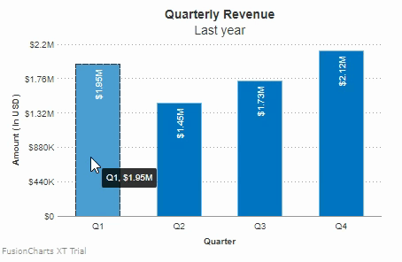
Click here to edit the above chart.
You can also apply hover effects for individual data plots instead of applying them for all the data plots. To do so, you have to set the attributes within data for individual values. The attributes are:
hoverColor- Set the hover color for data plots in hex code format, e.g.#00ffaa.hoverAlpha- Set the transparency for hover color for data plots.borderHoverColor- Set the hover border color in hex code format, e.g.#00ffaa.borderHoverAlpha- Set the transparency of hover border for data plots.borderHoverThickness- Set the hover border thickness (in pixels).borderHoverDashed- Set this to1to make data plot borders appear dashed on hover.borderHoverDashLen- Set the length of each dash for all data plots on hover (in pixels).borderHoverDashGap- Set the gap between two consecutive dashes for all data plots on hover(in pixels).
All the above attributes will work only if
plotHoverEffectis set to1under the chart object.
Refer to the code below:
{
    "chart": {
        "plotHoverEffect":"1"
    },
    "data": [{
        "label": "Q1",
        "value": "1950000",
        "HoverColor": "1",
        "HoverAlpha": "1"
    },
    {
        "label": "Q2",
        "value": "1450000"
    }]
}Shown below is a chart with hover effects enabled for an individual data plot:
Click here to edit the above chart.