Marimekko Chart
This chart type belongs to FusionCharts XT.
Marimekko charts are stacked column charts with columns of variable width. They are primarily used for marketing analysis.
The following three dimensions of marketing data can be represented using a Marimekko chart:
Total value of a market segment
Combined share of all competitors in a market segment
Individual share of competitors in a market segment
Create a Marimekko Chart
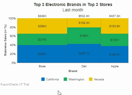
Let's create a simple Marimekko chart that shows the top 3 Electronic Brands (Bose, Dell, and Apple) in the top 3 revenue earning states (California, Washington, and Nevada).
The Marimekko chart shown below, when seen in the default mode, helps in instantly figure out the following:
The top three manufacturers within each state (Bose, Dell, and Apple) and the individual sales of each manufacturer within a state, indicated by the partitions in the stacked column.
The total sales by manufacturers across all three states for the given duration (a month, in this case), shown on top of the stacked column for each manufacturer. For example, the total sales for Bose, $848K, is shown above the first column.
The percentage market share for each manufacturer, shown as a percentage label between the stacked columns. For example, Bose has a total market share of approximately 46%, as shown by the label between the data plots for Bose and Dell.
To create a marimekko chart follow the steps given below:
In the JSON data, set the attributes and their corresponding values in
"<attributeName>": "<value>"format.Specify the chart type using the
typeattribute. To render a marimekko chart, setmarimekko.Set the container object using
renderAtattribute.Specify the dimension of the chart using
widthandheightattributes.Set the type of data (JSON/XML) you want to pass to the chart object using
dataFormatattribute.
For a detailed list of attributes, refer to the chart attributes page of marimekko chart.
The marimekko chart for the above code looks like :
{
    "chart": {
        "caption": "Top 3 Electronic Brands in Top 3 Stores",
        "subcaption": "Last month",
        "aligncaptiontocanvas": "0",
        "yaxisname": "Statewise Sales (in %)",
        "xaxisname": "Brand",
        "numberprefix": "$",
        "showPlotBorder": "1",
        "plotBorderThickness": "0.25",
        "theme": "fusion"
    },
    "categories": [
        {
            "category": [
                {
                    "label": "Bose"
                },
                {
                    "label": "Dell"
                },
                {
                    "label": "Apple"
                }
            ]
        }
    ],
    "dataset": [
        {
            "seriesname": "California",
            "data": [
                {
                    "value": "335000"
                },
                {
                    "value": "225100"
                },
                {
                    "value": "164200"
                }
            ]
        },
        {
            "seriesname": "Washington",
            "data": [
                {
                    "value": "215000"
                },
                {
                    "value": "198000"
                },
                {
                    "value": "120000"
                }
            ]
        },
        {
            "seriesname": "Nevada",
            "data": [
                {
                    "value": "298000"
                },
                {
                    "value": "109300"
                },
                {
                    "value": "153600"
                }
            ]
        }
    ]
}<html>
<head>
<title>My first chart using FusionCharts Suite XT</title>
<script type="text/javascript" src="https://cdn.fusioncharts.com/fusioncharts/latest/fusioncharts.js"></script>
<script type="text/javascript" src="https://cdn.fusioncharts.com/fusioncharts/latest/themes/fusioncharts.theme.fusion.js"></script>
<script type="text/javascript">
FusionCharts.ready(function(){
var fusioncharts = new FusionCharts({
type: 'marimekko',
renderAt: 'chart-container',
width: '700',
height: '400',
dataFormat: 'json',
dataSource: {
"chart": {
"caption": "Top 3 Electronic Brands in Top 3 Stores",
"subcaption": "Last month",
"aligncaptiontocanvas": "0",
"yaxisname": "Statewise Sales (in %)",
"xaxisname": "Brand",
"numberprefix": "$",
"showPlotBorder": "1",
"plotBorderThickness": "0.25",
"theme": "fusion"
},
"categories": [{
"category": [{
"label": "Bose"
}, {
"label": "Dell"
}, {
"label": "Apple"
}]
}],
"dataset": [{
"seriesname": "California",
"data": [{
"value": "335000"
}, {
"value": "225100"
}, {
"value": "164200"
}]
}, {
"seriesname": "Washington",
"data": [{
"value": "215000"
}, {
"value": "198000"
}, {
"value": "120000"
}]
}, {
"seriesname": "Nevada",
"data": [{
"value": "298000"
}, {
"value": "109300"
}, {
"value": "153600"
}]
}]
}
}
);
fusioncharts.render();
});
</script>
</head>
<body>
<div id="chart-container">FusionCharts XT will load here!</div>
</body>
</html>Click here to edit the marimekko chart.
As you can see in the chart data, the actual sales data has been provided. The Marimekko chart automatically converts these values into percentage values based on the size of a market segment and the percentage share held by competitors in each segment.
The percentage share of each manufacturer within a segment is shown in the tooltip text for that partition. For example, the percentage share for Bose in Washington is approximately 25%; it can be seen in the tooltip text shown when the mouse pointer hovers over the partition for Washington in the first column.
The height of columns can be used to compare the TAM (Total Available Market) per market segment.
Now, let's customize the appearance and properties of the marimekko chart. We'll also talk about the interactive legend, introduced for the marimekko chart in FusionCharts v3.11.0.
Display Actual Data Values
The stacked columns in a Marimekko chart can be rendered:
Using percentage values
Using actual data values
By default, a Marimekko chart is rendered with percentage values along the y-axis. To render the chart using actual data values, set the usePercentDistribution to 0. This attribute specifies whether percentage distribution will be used on the y-axis to plot the data. The default value of this attribute is 1.
Refer to the code given below:
{
    "chart": {
        "usePercentDistribution": "0"
    }
}A Marimekko chart rendered with actual values instead of percentage values looks like this:
Click here to edit the marimekko chart.
Hide the Total value of Market Segments
By default, the total value of a market segment for a competitor is rendered at the top of each column.
Set the showSum attribute to 0 to hide the sum of all data plots stacked above each other. The sum is shown above the stacked columns. The default value for this attribute is 1.
Refer to the code given below:
{
     "chart": {
        "showSum": "0"
     }
}A Marimekko chart with the total value of market segments hidden looks like this:
Click here to edit the marimekko chart.
Percentage Market Share Values
By default, labels are rendered between the columns of a Marimekko chart, along the x-axis, to show the percentage market value share of the competitors. These labels can be shown/hidden, depending on what the user requirement is. Set the showXAxisPercentValues attribute to 0 to hide the percent values along the x-axis. The default value of this attribute is 1.
Refer to the code given below:
{
  "chart": {
    "showXAxisPercentValues": "0"
  }
}A Marimekko chart with the percentage labels on the x-axis hidden looks like this:
Click here to edit the marimekko chart.
Legend Interactivity
The Marimekko chart includes support for an interactive legend starting FusionCharts Suite XT v3.11.0. The interactive legend implementation for the Marimekko chart not only lets you show/hide the data plots but also manages the space vacated when data plots are hidden. Consequently, the percentage labels are also updated to reflect the current state of the chart.
For example, in the Marimekko chart shown above, if you were to hide the data plots for Washington using the legend, the data plots for California and Nevada will be automatically arranged in the available space, as shown in the image below: