Pie and Doughnut Charts
These chart types belong to FusionCharts XT.
A pie chart is a circular chart divided into sectors where the arc length of each sector, its central angle, and its area is proportional to the quantity it represents. A doughnut chart is similar to a pie chart and facilities similar kind of data analysis. FusionCharts Suite XT includes the pie and doughnut charts to plot data that needs to be shown as a percent of the whole.
Pie 2D Chart
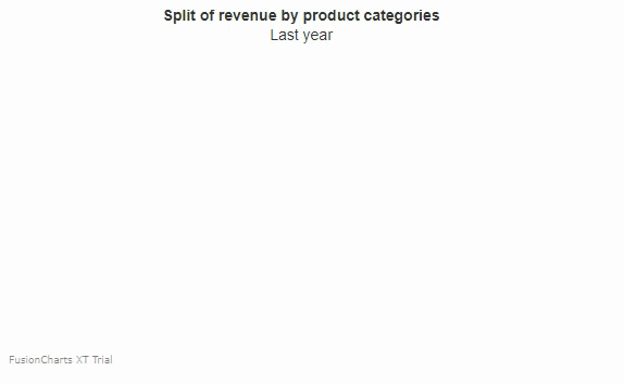
Let's create our first pie 2D chart which will showcase the split in revenue by product categories for one year.
To create a pie 2D chart follow the steps given below:
In the JSON data, set the attributes and their corresponding values in
"<attributeName>": "<value>"format.Specify the chart type using the
typeattribute. To render a pie 2D chart, setpie2d.Set the container object using
renderAtattribute.Specify the dimension of the chart using
widthandheightattributes.Set the type of data (JSON/XML) you want to pass to the chart object using
dataFormatattribute.
For a detailed list of attributes, refer to the chart attributes page of the pie 2D chart.
The pie 2D chart for the above code looks like:
{
    "chart": {
        "caption": "Split of revenue by product categories",
        "subCaption": "Last year",
        "numberPrefix": "$",
        "showPercentInTooltip": "0",
        "decimals": "1",
        "useDataPlotColorForLabels": "1",
        "theme": "fusion"
    },
    "data": [
        {
            "label": "Food",
            "value": "285040"
        },
        {
            "label": "Apparels",
            "value": "146330"
        },
        {
            "label": "Electronics",
            "value": "105070"
        },
        {
            "label": "Household",
            "value": "49100"
        }
    ]
}<html>
<head>
<title>My first chart using FusionCharts Suite XT</title>
<script type="text/javascript" src="https://cdn.fusioncharts.com/fusioncharts/latest/fusioncharts.js"></script>
<script type="text/javascript" src="https://cdn.fusioncharts.com/fusioncharts/latest/themes/fusioncharts.theme.fusion.js"></script>
<script type="text/javascript">
FusionCharts.ready(function(){
var fusioncharts = new FusionCharts({
type: 'pie2d',
renderAt: 'chart-container',
width: '450',
height: '300',
dataFormat: 'json',
dataSource: {
"chart": {
"caption": "Split of revenue by product categories",
"subCaption": "Last year",
"numberPrefix": "$",
"showPercentInTooltip": "0",
"decimals": "1",
"useDataPlotColorForLabels": "1",
//Theme
"theme": "fusion"
},
"data": [{
"label": "Food",
"value": "285040"
}, {
"label": "Apparels",
"value": "146330"
}, {
"label": "Electronics",
"value": "105070"
}, {
"label": "Household",
"value": "49100"
}]
}
}
);
fusioncharts.render();
});
</script>
</head>
<body>
<div id="chart-container">FusionCharts XT will load here!</div>
</body>
</html>Click here to edit the pie 2D chart.
Pie 3D Chart
To render a pie chart in 3D, change the value of the type attribute from pie2D to pie3D. The rest of the data structure remains the same.
For a detailed list of attributes, refer to the chart attributes page of the pie 3D chart.
A pie chart in 3D looks like :
{
    "chart": {
        "caption": "Split of revenue by product categories",
        "subCaption": "Last year",
        "numberPrefix": "$",
        "showPercentInTooltip": "0",
        "decimals": "1",
        "useDataPlotColorForLabels": "1",
        "theme": "fusion"
    },
    "data": [
        {
            "label": "Food",
            "value": "285040"
        },
        {
            "label": "Apparels",
            "value": "146330"
        },
        {
            "label": "Electronics",
            "value": "105070"
        },
        {
            "label": "Household",
            "value": "49100"
        }
    ]
}<html>
<head>
<title>My first chart using FusionCharts Suite XT</title>
<script type="text/javascript" src="https://cdn.fusioncharts.com/fusioncharts/latest/fusioncharts.js"></script>
<script type="text/javascript" src="https://cdn.fusioncharts.com/fusioncharts/latest/themes/fusioncharts.theme.fusion.js"></script>
<script type="text/javascript">
FusionCharts.ready(function(){
var fusioncharts = new FusionCharts({
type: 'pie3d',
renderAt: 'chart-container',
width: '450',
height: '300',
dataFormat: 'json',
dataSource: {
"chart": {
"caption": "Split of revenue by product categories",
"subCaption": "Last year",
"numberPrefix": "$",
"showPercentInTooltip": "0",
"decimals": "1",
"useDataPlotColorForLabels": "1",
//Theme
"theme": "fusion"
},
"data": [{
"label": "Food",
"value": "285040"
}, {
"label": "Apparels",
"value": "146330"
}, {
"label": "Electronics",
"value": "105070"
}, {
"label": "Household",
"value": "49100"
}]
}
}
);
fusioncharts.render();
});
</script>
</head>
<body>
<div id="chart-container">FusionCharts XT will load here!</div>
</body>
</html>Click here to edit the pie 3D chart.
Doughnut 2D Chart
As we know, a doughnut chart is similar to a pie chart. The only difference is that a doughnut chart has a blank center - as the name suggests, it looks like a doughnut.
Let's create our first doughnut 2D chart showcasing the same use case for the pie chart created above.
To create a doughnut 2D chart, set the type attribute to doughnut2d.
For a detailed list of attributes, refer to the chart attributes page of the doughnut 2D chart.
The doughnut 2D chart for the above code looks like:
{
    "chart": {
        "caption": "Split of Revenue by Product Categories",
        "subCaption": "Last year",
        "numberPrefix": "$",
        "showBorder": "0",
        "use3DLighting": "0",
        "enableSmartLabels": "0",
        "startingAngle": "310",
        "showLabels": "0",
        "showPercentValues": "1",
        "showLegend": "1",
        "defaultCenterLabel": "Total revenue: $64.08K",
        "centerLabel": "Revenue from $label: $value",
        "centerLabelBold": "1",
        "showTooltip": "0",
        "decimals": "0",
        "useDataPlotColorForLabels": "1",
        "theme": "fusion"
    },
    "data": [
        {
            "label": "Food",
            "value": "28504"
        },
        {
            "label": "Apparels",
            "value": "14633"
        },
        {
            "label": "Electronics",
            "value": "10507"
        },
        {
            "label": "Household",
            "value": "4910"
        }
    ]
}<html>
<head>
<title>My first chart using FusionCharts Suite XT</title>
<script type="text/javascript" src="https://cdn.fusioncharts.com/fusioncharts/latest/fusioncharts.js"></script>
<script type="text/javascript" src="https://cdn.fusioncharts.com/fusioncharts/latest/themes/fusioncharts.theme.fusion.js"></script>
<script type="text/javascript">
FusionCharts.ready(function(){
var fusioncharts = new FusionCharts({
type: 'doughnut2d',
renderAt: 'chart-container',
width: '450',
height: '450',
dataFormat: 'json',
dataSource: {
"chart": {
"caption": "Split of Revenue by Product Categories",
"subCaption": "Last year",
"numberPrefix": "$",
"showBorder": "0",
"use3DLighting": "0",
"enableSmartLabels": "0",
"startingAngle": "310",
"showLabels": "0",
"showPercentValues": "1",
"showLegend": "1",
"defaultCenterLabel": "Total revenue: $64.08K",
"centerLabel": "Revenue from $label: $value",
"centerLabelBold": "1",
"showTooltip": "0",
"decimals": "0",
"useDataPlotColorForLabels": "1",
"theme": "fusion"
},
"data": [{
"label": "Food",
"value": "28504"
}, {
"label": "Apparels",
"value": "14633"
}, {
"label": "Electronics",
"value": "10507"
}, {
"label": "Household",
"value": "4910"
}]
}
}
);
fusioncharts.render();
});
</script>
</head>
<body>
<div id="chart-container">FusionCharts XT will load here!</div>
</body>
</html>Click here to edit the doughnut 2D chart.
Doughnut 3D Chart
To render a doughnut chart in 3D, change the value of the type attribute from doughnut2D to doughnut3D. The rest of the data structure remains the same.
For a detailed list of attributes, refer to the chart attributes page of the doughnut 3D chart.
A doughnut chart in 3D looks like :
{
    "chart": {
        "caption": "Split of Revenue by Product Categories",
        "subCaption": "Last year",
        "numberPrefix": "$",
        "showBorder": "0",
        "use3DLighting": "0",
        "enableSmartLabels": "0",
        "startingAngle": "310",
        "showLabels": "0",
        "showPercentValues": "1",
        "showLegend": "1",
        "defaultCenterLabel": "Total revenue: $64.08K",
        "centerLabel": "Revenue from $label: $value",
        "centerLabelBold": "1",
        "showTooltip": "0",
        "decimals": "0",
        "useDataPlotColorForLabels": "1",
        "theme": "fusion"
    },
    "data": [
        {
            "label": "Food",
            "value": "28504"
        },
        {
            "label": "Apparels",
            "value": "14633"
        },
        {
            "label": "Electronics",
            "value": "10507"
        },
        {
            "label": "Household",
            "value": "4910"
        }
    ]
}<html>
<head>
<title>My first chart using FusionCharts Suite XT</title>
<script type="text/javascript" src="https://cdn.fusioncharts.com/fusioncharts/latest/fusioncharts.js"></script>
<script type="text/javascript" src="https://cdn.fusioncharts.com/fusioncharts/latest/themes/fusioncharts.theme.fusion.js"></script>
<script type="text/javascript">
FusionCharts.ready(function(){
var fusioncharts = new FusionCharts({
type: 'doughnut3d',
renderAt: 'chart-container',
width: '450',
height: '450',
dataFormat: 'json',
dataSource: {
"chart": {
"caption": "Split of Revenue by Product Categories",
"subCaption": "Last year",
"numberPrefix": "$",
"showBorder": "0",
"use3DLighting": "0",
"enableSmartLabels": "0",
"startingAngle": "310",
"showLabels": "0",
"showPercentValues": "1",
"showLegend": "1",
"defaultCenterLabel": "Total revenue: $64.08K",
"centerLabel": "Revenue from $label: $value",
"centerLabelBold": "1",
"showTooltip": "0",
"decimals": "0",
"useDataPlotColorForLabels": "1",
"theme": "fusion"
},
"data": [{
"label": "Food",
"value": "28504"
}, {
"label": "Apparels",
"value": "14633"
}, {
"label": "Electronics",
"value": "10507"
}, {
"label": "Household",
"value": "4910"
}]
}
}
);
fusioncharts.render();
});
</script>
</head>
<body>
<div id="chart-container">FusionCharts XT will load here!</div>
</body>
</html>Click here to edit the doughnut 3D chart.
Now, let's customize the appearance and properties of pie and doughnut charts.
Configure the Animation Direction
By default, when a pie/doughnut chart is loaded for the first time or refreshed, the rendering animation is in the anti-clockwise direction.
However, FusionCharts includes the animateClockwise attribute that lets you animate the chart in the clockwise direction. Set the animateClockwise attribute to 1 to animate the chart in the clockwise direction.
Refer to the code given below:
{
  "chart": {
      "animateClockwise": "1"
  }
}A pie chart configured to animate in the clockwise direction is shown below.
Click here to edit the above chart.
Show Percent Values and Actual Values
By default, for a pie chart, the actual data values are shown on the chart as well as in the tool-tips. However, you can choose to show percent values on the chart while retaining the actual values in tool-tips.
To show percent values and actual values in your chart, follow the steps given below:
Set the
showPercentValuesattribute to1to show percent values as data labels.Set the
showPercentInTooltipattribute to1to render the text of tooltip in percentage values.
The showPercentValues and the showPercentInTooltip attributes are applicable if you want to show percent values on the chart and actual values in tool-tips for a doughnut chart.
Refer to the code given below:
{
  "chart": {
    "showPercentValues": "1",
    "showPercentInTooltip": "0"
  },
}A pie2D chart configured to show percent values on the chart looks like this:
Click here to edit the pie 2D chart.
Customize the Center Label for a Doughnut Chart
For a doughnut chart, you can configure the default text that will be rendered on the center label. You can also configure the text that will be rendered on the center label when the mouse pointer is hovered over one of the doughnut slices.
To customize the center label of your chart, follow the steps given below:
Specify the text of the center label using the
defaultCenterLabelattribute.Specify the hover text of a doughnut slice using the
centerLabelattribute.
Refer to the code given below:
{
  "chart": {
    "defaultCenterLabel": "Total revenue: $60K",
    "centerLabel": "$value"
  },
}A doughnut chart with the center label customized looks like this:
Click here to edit the doughnut 2D chart.
Enable Single-Slice Slicing
By default, the pie and doughnut charts allow you to slice out multiple pie/doughnut slices at one time. You can, however, opt to enable slicing-out only one slice at a time.
By default, multiple slicing is enabled. To stop the multiple slicing set the enableMultiSlicing attribute to 0.
Refer to the code given below:
{
  "chart": {
    "enableMultiSlicing": "0"
  },
}A doughnut chart with single-slicing enabled looks like this:
Click here to edit the doughnut 2D chart.
Disable Smart Labels and Lines
By default, pie and doughnut charts are rendered with smart labels and lines - smart labels are data labels connected to their corresponding pie slices using line segments called smart lines. Smart labels manage overlapping of labels even when a large number of labels are placed in the close vicinity. You can, however, choose to disable these smart labels.
To disable the smart labels, set enableSmartLabels attribute to 0.
Refer to the code given below:
{
  "chart": {
    "enableSmartLabels": "0"
  },
}A pie chart with smart labels disabled looks like this:
Click here to edit the pie 2D chart.
If smart labels are disabled then, in case of a large number of labels, the labels might overlap each other.
Customize Smart Lines
Apart from enabling and disabling the smart lines, you can also set the cosmetic properties of smart lines. To customize the smart lines, follow the steps given below:
Specify the hex code for the smart line color using the
smartLineColorattribute.Set the thickness of the smart lines using the
smartLineThicknessattribute.Set the transparency of the smart lines using the
smartLineAlphaattribute. This attribute takes values between 0 (transparent) and 100 (opaque).Set the
isSmartLineSlantedattribute to0to render the smart lines as straight lines.
Refer to the code given below:
{
  "chart": {
    "smartLineColor": "#ff0000",
    "smartLineThickness": "2",
    "smartLineAlpha": "100",
    "isSmartLineSlanted": "0"
  },
}A pie chart with the cosmetic properties of smart lines customized looks like this:
Click here to edit the pie 2D chart.
Configuring the Label Distance and Clearance
Now, you already know how to customize the labels and the label lines in a chart. Here let's discuss how to configure the label distance and clearance of a chart.
To configure the label distance and clearance, follow the steps given below:
- Set the distance (in pixels) between the label/value from the pie/doughnut edge using the
labelDistanceattribute.
Note: This attribute is applicable only when smart labeling is disabled.
- Set the clearance distance (in pixels) of a label from adjacent sliced out pies using the
smartLabelClearanceattribute.
Refer to the code given below:
{
  "chart": {
    "enableSmartLabels": "0",
    "labelDistance": "5",
    "smartLabelClearance": "5"
  },
}Click here to edit the pie 2D chart.
Skip Overlap Labels
When there are too many labels in the pie/doughnut chart (which is difficult to adjust even if you are using smart labels), the labels may overlap. In this case, you have the option to skip the overlapping labels. The labels of the least significant pies will be removed. To skip the overlapping of labels set the skipOverlapLabels attribute to 1.
Refer to the code given below:
{
  "chart": {

    "skipOverlapLabels": "1"
  },
}Customize Pie Radius
By default, for pie/doughnut charts, the chart automatically calculates the best fit pie radius based on the data provided. However, you can choose to explicitly set the outer radius of the pie chart. Specify the outer radius of the pie/doughnut chart using pieRadius attribute.
Refer to the code given below:
{
  "chart": {

    "pieRadius": "50"
  },
}A pie chart with the outer radius customized looks like this:
Click here to edit the pie 2D chart.
Set the Starting Angle
By default, pie/doughnut charts start plotting from the 0° angle. The chart allows you to explicitly set the starting angle. Specify the startingAngle attribute set the starting angle for the pie/doughnut chart. The first pie slice will start plotting from the angle measure specified in this attribute.
Refer to the code given below:
{
  "chart": {
    "startingAngle": "45"
  },
}A pie chart with the starting angle set to 45° looks like this:
Click here to edit the pie 2D chart.
Slice a Pie/Doughnut
When a pie/doughnut chart first renders, by default, all slices are sliced-in. However, to highlight a slice, you may want to render it sliced-out when the chart first loads. isSliced attribute can be used to specify the pie chart will be rendered with one slice sliced-out. Set this attribute to 1 for a pie slice to render a slice sliced-out. This attribute belongs to the data object.
Refer to the code given below:
{
  "data": {
    "label": "Household",
    "value": "49100",
    "isSliced": "1"
  },
}A pie chart rendered with one slice sliced-out looks like this:
Click here to edit the pie 2D chart.
Configure the Slicing Distance
When a pie/doughnut slice is sliced-out, you can configure the distance between the center and the sliced-out slices. Set the distance (in pixels) between the center of the chart and the sliced out slices using slicingDistance attribute.
Refer to the code given below:
{
  "chart": {
    "slicingDistance": "10"
  },
}A chart with the slicing distance configured looks like this:
Click here to edit the pie 2D chart.
Configure the Bevel Effect
For pie/doughnut charts, you can configure the bevel effect to render the chart with 3D effects. Set the use3DLighting attribute to 1 to specify whether advanced gradients and shadow effects will be used to create better looking charts.
Set the 3D radius of the chart using radius3D attribute. Using this attribute the radius is set in percentage when the chart is rendered in the 3D lighting mode. It basically helps to set the bevel distance for the pie/doughnut.
Refer to the code given below:
{
  "chart": {
    "use3DLighting": "1",
  },
}A pie chart configured for the bevel effect looks like this:
Click here to edit the pie 2D chart.
For all the samples shown above, if you want to see how each attribute works for the doughnut chart, just change the value of the type attribute from pie2D/pie3D to doughnut2D/doughnut3D