Annotations
Annotations are user-defined objects or shapes drawn on a chart. You can use annotations to increase the visual appeal of your charts and make them more informative. Annotations help end users interpret charts better. You can create different shapes, images, and text annotations for use with your chart.
For a glimpse of how this feature works, look at the example shown below:
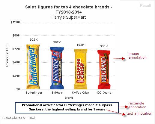
Assume that Harry wants to compare sales of the top four chocolate brands at his SuperMart.
A conventional column 2D chart used to show this data will look like the following:
Now, see how the same chart will look, when rendered using annotations:
Click here to edit the above chart.
Looks much better, doesn't it? The chocolate bars shown in this chart are image annotations.
Take a look at this video of a collaboration dashboard created to help a sales team unify their analysis and discussion. Notice the callouts shown above the columns for April and August. These callouts are shape annotations and the numbers shown next to the callouts are text annotations. Click these callouts and see how the annotations work!
In addition to creating annotations, you can:
Customize annotations for their functional properties as well as their look and feel
Position them on your chart or gauge using absolute or relative values
Create and control them dynamically
Customize the response to user actions using annotation events
Now that you have seen what annotations look like and how useful they can be in making your charts informative go ahead and see how you can create them.
How Annotations Work
Annotations are defined inside the annotations object. This object has an array of groups, and each group element has a unique id. The groups object contains an array of items, each of which contains information on one specific annotation in the chart.
Organising annotations in groups is useful when you manipulate multiple annotations at once through API calls. Refer to the code below to understand the structure of a simple annotations object.
{
    "chart": {
        ...
    },
    "data": [{
        ...
    }],
    "annotations": {
        "groups": [{
            "id": "custom-group-1",
            "items": [{
                // Item definition goes here
            },
            {
                // Item definition goes here
            }]
        },
        {
            "id": "custom-group-2",
            "items": [{
                // Item definition goes here
            },
            {
                // Item definition goes here
            }]
        }]
    }
}Use Objects to Create Annotations
Use the following objects to create annotations:
annotationsis an object that encompasses all the code for generating annotations.groupsis an object array that consolidates multiple annotations into one group. You can create multiple annotation groups for one chart. This is useful when you need to create a complex graphic using individual annotation items.itemsis an object array that defines individual annotation items contained in one annotation group.
Add Different types of Annotations
You can add the following types of annotations to your chart:
Text (custom notes, labels, or paragraphs of text)
Image (external images)
Shapes (rectangle, polygon, circle, arc, and line)
Path connectors (freeform arrows, connectors, callouts, and so on)
Refer to the basic JSON structure to create annotations, given below:
{
    "chart": {
        ...
    },
    "data": [{
        ...
    }],
    "annotations": {
        "groups": [{
            //Annotation group 1
            //Define a unique identification string for the group.
            "items": [
                //Define individual annotation items.
                {//Annotation Item 1},
                {//Annotation Item 2},
                ...
                {//Annotation Item n}
            ]
        }, {
            //Annotation group 2
            //Define a unique identification string for the group.
            "items": [
                //Define individual annotation items.
                {//Annotation Item 1},
                {//Annotation Item 2},
                ...
                {//Annotation Item n}
            ]
        }, {
            //Annotation group n
            //Define a unique identification string for the group.
            "items": [
                //Define individual annotation items.
                {//Annotation Item 1},
                {//Annotation Item 2},
                ...
                {//Annotation Item n}
            ]
        }]
    }
}The image of a chart rendered with different types of annotation items is shown below:
Create Text Annotations
Use the following attributes to text annotations, to add notes, labels, or any other contextual text information to charts.
Set a unique identification for the annotation using the
idattribute. You can then use it to identify and change other properties of the annotation.Set the type of annotation to be rendered using the
typeattribute. In this instance, set it totext.Set the x coordinate of the position of the text annotation for the leftmost position (taken as zero) of the chart using the
xattribute.Set the y coordinate of the position of the text annotation for the topmost position (taken as zero) of the chart using the
yattribute.Set the font family for the text annotation using the
fontattribute.Set the font size for the text annotation using the
fontSizeattribute.Set the horizontal alignment of the text annotation using the
alignattribute, which acceptsleft,center(default), orrightas value.Set the vertical alignment of the text annotation using the
vAlignattribute, which acceptstop,middle(default), orbottomas values.Set the value of
boldattribute to1, to render the annotation text in bold formatting.Set the value of
italicattribute to1, to render the annotation text in italic formatting.Set the color of the text annotation using the
colorattribute, which accepts hex codes of colors.Set the transparency of the annotation using the
alphaattribute, which accepts values between0(transparent) and100(opaque, default).Set the background color of the text annotation using the
bgColorattribute, which accepts hex codes of colors.Set a fixed margin in pixels, to the left of the text, using the
leftMarginattribute.Rotate the text annotation using the
rotateTextattribute, which accepts0(default),1,left, orrightas values.Set the value of the
wrapattribute to1, to enable text wrapping for the annotation.Set the width after which the text will be wrapped, using the
wrapWidthattribute. You can also set thetoXandtoYattributes if you provide the text wrapping dimensions in absolute pixels from the origin coordinates of the annotation group.Set the maximum height the text can occupy, using the
wrapHeightattribute. The chart will append ellipses to the end of the annotation whenever the text overflows beyond the vertical space that you allocate using thewrapHeightortoYattribute.
The text "Promotional activities for Butterfinger made it surpass Snickers, the highest selling brand for 3 years" is a text annotation.
Adding this text to the chart makes it self-descriptive and easy for a user to understand the chart. You can add multiple text annotations on a chart that can be notes, labels, or any text that adds more context to the chart.
The JSON structure for creating text annotations is given below:
{
    "chart": {
        ...
    },
    "data": [{
        ...
    }],
    "annotations": {
        "groups": [{
            "items": [{
                //Text annotation 1
                "type": "text",
                //Define the attributes needed to create a text annotation
                ...
            }, {
                //Text annotation n
                "type": "text",
                //Define the attributes needed to create a text annotation
                ...
            }]
        }]
    }
}The column 2D chart rendered using text annotations looks like as shown below:
Click here to edit the above chart.
Create Image Annotations
Use the following attributes to create image annotations:
Specify a unique identification string for each annotation item using the
idattribute.Specify the type of annotation using the
id.attribute. In this instance, set it toimage.Specify the location of the image file (JPEG, PNG, or GIF) that should be rendered on the chart using the
urlattribute. Note that chart rendering does not pause for images to load and asynchronously draws them as and when they are loaded. If you need to load them instantaneously, consider preloading the images.Set the x coordinate of the position of the image annotation for the leftmost position (taken as zero) of the chart using the
xattribute.Set the y coordinate of the position of the image annotation for the topmost position of the image annotation (taken as zero) of the chart using the
yattribute.Specify the resize value for the image width using the
xScaleattribute.Specify the resize value for the image height using the
yScaleattribute.Set the transparency of the annotation using the
alphaattribute, which accepts values between0(transparent) and100(opaque, default).
In this chart, images of brands are shown instead of the conventional 2D column data plots. Using these annotations makes the chart more intuitive while also increasing its visual appeal. Imagine how easy it becomes for your audience to read data in a chart like this, especially if the data is for a large number of brands.
The JSON structure for creating image annotations is given below:
{
    "chart": {
        ...
    },
    "data": [{
        ...
    }],
    "annotations": {
        "groups": [{
            "items": [{
                //Image 1
                "type": "image",
                //Define the attributes needed to create the image annotation
                ...
            }, {
                //Image 2
                "type": "image",
                //Define the attributes needed to create the image annotation
                ...
            }, {
                //Image n
                "type": "image",
                //Define the attributes needed to create the image annotation
                ...
            }]
        }]
    }
}The column 2D charts with image annotations looks like:
Click here to edit the above chart.
Create Shape Annotations
You can draw annotations in any of the following shapes using FusionCharts Suite XT:
- Rectangle
- Polygon
- Line
- Circle
- Arc
FusionCharts Suite XT includes several attributes to create and customize shape annotations. While many of these attributes are common to all shapes, some attributes work only for specific shapes.
As such, the attributes have been divided into two sections below - Common and Ad Hoc:
Common Attributes
Use the following attributes to create shape annotations:
Set a unique identification for the annotation using the
idattribute. You can then use it to identify and change other properties of the annotation.Set the type of annotation to be rendered using the
typeattribute. In this instance, set it to the type of shape (rectangle,polygon,line,circle, orarc) that you want to create.Set the color of the shape annotation using the
colorattribute, which accepts hex codes of colors.Set the transparency of the annotation using the
alphaattribute, which accepts values between0(transparent) and100(opaque, default).Specify whether a border will be shown around the annotation, by setting the
showBorderattribute to1.Specify the color for the annotation border using the
borderColorattribute, which accepts color hex codes as value. Note that this attribute doesn't apply to the line annotation.Set the transparency of the border using the
borderAlphaattribute, which accepts values between0(transparent) and100(opaque, default). Note that this attribute doesn't apply to the line annotation.Specify the thickness of the annotation border in pixels, using the
borderThicknessattribute. Note that this attribute doesn't apply to the line annotation.Specify whether a border will be drawn around the annotation, using dashed lines, by setting the
dashedattribute to1. Note that for the line annotation, this attribute will render the annotation itself as a dashed line.Specify the length of each dash, if a dashed border is drawn around the annotation, using the
dashLenattribute.Specify the gap between each dash, if a dashed border is drawn around the annotation, using the
dashGapattribute.
The JSON structure to create shape annotation is given below:
{
    "chart": {
        ...
    },
    "data": [{
        ...
    }],
    "annotations": {
        "groups": [{
            "items": [{
                //Shape 1
                "type": ""//appropriate value according to required shape type, discussed later in this article,
                ...
            }, {
                //Shape 2
                "type": ""//appropriate value according to required shape type, discussed later in this article,
                ...
            }, {
                //Shape *n*
                "type": ""//appropriate value according to required shape type, discussed later in this article,
                ...
            }]
        }]
    }
}The chart will look like as shown below:
Click here to edit the above chart.
The rectangle around the text is a shape annotation.
The complete data structure that shows how you use these attributes is given at the end of this article.
Adhoc Attributes
Rectangle
Use the following attributes to create rectangular annotations:
Set the type of annotation by setting the
typeattribute value torectangle.Set the x coordinate of the starting position of the rectangular annotation for the leftmost position (taken as zero) of the chart using the
xattribute.Set the y coordinate of the starting position of the rectangular annotation for the topmost position (taken as zero) of the chart using the
yattribute.Specify the x coordinate of the ending position of the rectangle for the leftmost position (taken as zero) of the chart using the
toXattribute.Specify the y coordinate of the ending position of the rectangle for the topmost position (taken as zero) of the chart using the
toYattribute.Specify the radius of the edges of the rectangle, in pixels, using the
radiusattribute. Use it when you want to render the annotation as a rounded rectangle.
A rectangle annotation will look as given below:

Polygon
Use the following attributes to create polygonal annotations:
Specify the type of annotation by setting the
typeattribute value topolygon.Set the number of sides of the polygon using the
sidesattribute. Note that its value must be greater than 2.Set the x coordinate of the center of the polygon for the leftmost position (taken as zero) of the chart using the
xattribute.Set the y coordinate of the center of the polygon for the topmost position (taken as zero) of the chart using the
yattribute.Specify the radius of the edges of the polygon, in pixels, using the
radiusattribute. Use it when you want to render the annotation as a rounded polygon.
A polygon annotation will look as given below:

Line
Use the following attributes to create linear annotations:
Specify the type of annotation by setting the
typeattribute value toline.Specify the x coordinate of the starting position of the line for the leftmost position (taken as zero) of the chart, using the
xattribute.Specify the y coordinate of the starting position of the line for the topmost position (taken as zero) of the chart, using the
yattribute.Specify the x coordinate of the ending position of the line for the leftmost position (taken as zero) of the chart, using the
toXattribute.Specify the y coordinate of the ending position of the line for the topmost position (taken as zero) of the chart, using the
toYattribute.Specify the thickness of the line (in pixels) using the
thicknessattribute.
A line annotation will look as given below:
Circle
Use the following attributes to create circular annotations:
Specify the type of annotation by setting the
typeattribute value tocircle.Set the x coordinate of the center of the circle for the leftmost position (taken as zero) of the chart using the
xattribute.Set the y coordinate of the center of the circle for the topmost position (taken as zero) of the chart using the
yattribute.Specify the radius of the edges of the circle, in pixels, using the
radiusattribute.Specify the height in pixels using the
yRadiusattribute, if you want to draw an oval annotation.
A circle annotation will look as given below:
Arc
An arc is suitable to draw doughnut like shapes or a slice of it. You can use it to highlight a slice of a pie chart, a doughnut chart, or an angular gauge. Use the following attributes to create arc annotations:
Specify the type of annotation by setting the
typeattribute value toarc.Set the x coordinate of the center of the arc for the leftmost position (taken as zero) of the chart using the
xattribute.Set the y coordinate of the center of the arc for the topmost position (taken as zero) of the chart using the
yattribute.Specify the outer radius of the arc in pixels using the
radiusattribute.Specify the inner radius of the arc in pixels using the
innerRadiusattribute.Specify the height in pixels using the
yRadiusattribute, if you want to draw an oval annotation.Specify the starting angle of the arc in degrees using the
startAngleattribute, which takes values between 0 (default) and 360.Specify the ending angle of the arc in degrees using the
endAngleattribute, which takes values between 0 (default) and 360.
An arc annotation will look as given below:
Create Path Annotations
You can draw free-form graphic elements on your charts using the path annotation. Use the following attributes to create path annotations:
Specify a unique identification string for the path annotation using the
idattribute.Specify the type of annotation by setting the
typeattribute value topath.Specify the path command and accepts standard SVG path format, using the
pathattribute.Set the x coordinate of the starting position of the path for the leftmost position (taken as zero) of the chart using the
xattribute.Set the y coordinate of the starting position of the path for the topmost position (taken as zero) of the chart using the
yattribute.Specify the hex color code for the annotation using the
colorattribute.Specify the transparency of the annotation using the
alphaattribute, which takes values between 0 (transparent) and 100 (opaque, default).
The rectangle drawn to highlight the lowest footfall is created using the path annotation.
The JSON structure for creating path annotations is given below:
{
    "chart": {
        ...
    },
    "data": [{
        ...
    }],
    "annotations": {
        "groups": [{
            "items": [{
                "type": "path",
                //Define the attributes needed to create the path annotation
                ...
            }]
        }]
    }
}The chart will look like as shown below:
Click here to edit the above chart.
Positioning Annotations
You can configure positions of annotations either during their creation or after rendering them on a chart/gauge. Position annotation items by setting the positioning attributes (x, y, toX, toY, radius, and so on) to the required coordinates.
You can position annotations using:
Absolute values
Macros - that take dynamic values relative to chart elements
Absolute Values
In this section, you will see how to position annotations using static values. The attributes used to position annotations are as follows:
Specify the unique identification string for the group using the
idattribute.Set the x coordinate of the starting position of the annotation for the leftmost position (taken as zero) of the chart using the
xattribute.Set the y coordinate of the starting position of the annotation for the topmost position (taken as zero) of the chart using the
yattribute.Specify the x coordinate of the ending position of the annotation for the leftmost position (taken as zero) of the chart, using the
toXattribute. Note that this attribute applies only to the rectangle and line annotations.Specify the y coordinate of the ending position of the annotation for the topmost position (taken as zero) of the chart, using the
toYattribute. Note that this attribute applies only to the rectangle and line annotations.Specify the original width of the chart, in which the annotation will render as intended, using the
origWattribute. It will be used as the reference width while automatically scaling annotations if a chart is resized.Specify the original height of the chart, in which the annotation will render as intended, using the
origHattribute. It will be used as the reference height while automatically scaling annotations if a chart is resized.Specify the x coordinate position value of the final annotation items using the
xShiftattribute. When applying scaling, the value of this attribute will be included within the scale factor.Specify the y coordinate position value of the final annotation items using the
yShiftattribute. When applying scaling, the value of this attribute will be included within the scale factor.
The code snippet to position the rectangle annotation is given below:
{
    "chart": {
        ...
    }
    "data": [{
        ...
    }],
    "annotations": {
            ...
        "groups": [{
            "items": [{
                "id": "dyn-labelBG",
                "type": "rectangle",
                "radius": "3",
                "x": "290",
                "y": "60",
                "tox": "390",
                "toy": "90",
                "color": "#0075c2",
                "alpha": "70",
                "origW": "400",
                "origH": "300"
            }]
        }]
    }
}A spline chart with a rectangle annotation and a text annotation positioned at the top-right corner of the canvas is shown below:
Click here to edit the above chart.
Use Macros
Annotation macros are predefined variables you can use to dynamically position individual annotation items. Since macros assume values at runtime, you can use them with all annotation positioning attributes. That way, you can position annotations relative to chart/gauge elements, such as caption, legend, etc. For example, for an annotation item, if you set "x": "$captionStartX", x will take the value of the starting x-coordinate of the chart caption.
You can use any number of macros as variables with the positioning attributes. Use the + or - operators to add or subtract the macro values from each other or from a fixed number. For example, for an annotation item, assume that you set "x": "$canvasStartX + $chartLeftMargin + 2". The starting x-coordinate of the item will now take a value that is the sum of the starting x-coordinate of the chart canvas, the chart's left margin, and a fixed length of two pixels added together.
You can use only the + or - operators to create a macro expression. There should be at least one macro name to create a macro expression. Common mathematical expressions like 30 + 10 - 5, which do not contain a macro, will not work.
When you resize a chart or a gauge, the values provided by macros are not scaled. Instead, they are replaced with the new values provided by the resized chart. However, the numeric values present in the macro expressions are scaled. For example, the value 10 in the expression $chartStartY + 10 is scaled when you dynamically resize the chart. To avoid this, prefix the number with the $ symbol. For example, the value 10 in the expression $chartStartY + $10 is NOT scaled when you dynamically resize the chart.
Dynamically Position Annotations using Macros
You can dynamically position annotations with respect to the chart itself, as well as the chart elements like the legend, caption, canvas, axes, and the datasets.
Position Annotations with respect to the Canvas
Use the macros $canvasStartX, $canvasStartY, $canvasEndX, $canvasEndY, $canvasWidth, and $canvasHeight to position annotations with respect to the chart canvas. Note that this only applies to charts that have canvas (primarily, cartesian charts).
Refer to the code below:
{
    "chart": {
        ...
    },
    "annotations": {
        ...
        "groups": [{
            "items": [{
                "id": "dyn-labelBG",
                "type": "rectangle",
                "radius": "3",
                "x": "$canvasEndX - 100",
                "y": "$canvasStartY",
                "tox": "$canvasEndX",
                "toy": "$canvasStartY + 30",
                "color": "#0075c2",
                "alpha": "70"
            }]
        }]
    },
    "data": [
        ...
    ]
}The chart will look as shown below:
Click here to edit the above chart.
In the chart above, the annotation items (a rectangle and a text label) showing the total footfall at Bakersfield Central are positioned at the top-right corner of the canvas. The values of the attributes
x,y,toX, andtoYare specified with respect to the canvas start and end position, using annotation macros.
Position annotations with respect to datasets
Use the $dataset macro to add the position information of the plots in a dataset to the annotation. You can apply the "dataset_index [separator] set [separator] set_index [separator] position_key" sub token to the macro.
Possible values you can assign to the position_key include X, Y, STARTX, STARTY, ENDX, ENDY, CENTERX, and CENTERY.
For example, you can use the following values to position a rectangle above the second column in a column chart:
x: $dataset.0.set.1.STARTX,
y:$dataset.0.set.1.STARTY,
tox: $dataset.0.set.1.STARTX+100,
toy:$dataset.0.set.1.STARTY-40
Refer to the code below::
{
    "chart": {
        "caption": "Number of visitors last week",
        "subCaption": "Bakersfield Central vs Los Angeles Topanga",
        "xAxisName": "Day",
        "yAxisName": "No. of Visitors",
        "theme": "fusion",
        "animation": "0",
        "showValues": "0",
        "showTooltip": "0"
    },
    "categories": [{
        "category": [{
            "label": "Mon"
        }, {
            "label": "Tue"
        }, {
            "label": "Wed"
        }, {
            "vline": "true",
            "lineposition": "0",
            "color": "#6267b7",
            "labelHAlign": "right",
            "labelPosition": "0",
            "label": "National holiday"
        }, {
            "label": "Thu"
        }, {
            "label": "Fri"
        }, {
            "label": "Sat"
        }, {
            "label": "Sun"
        }]
    }],
    "annotations": {
        "groups": [{
            "id": "ds1tips",
            "items": [{
                "id": "indicator-line",
                "type": "line",
                "dashed": "1"
            }, {
                "id": "tip1_1",
                "type": "rectangle",
                "visible": "0",
                "fillcolor": "#0075c2",
                "x": "$dataset.0.set.0.x + 5",
                "y": "$dataset.0.set.0.y - 30",
                "tox": "$dataset.0.set.0.x + 80",
                "toy": "$dataset.0.set.0.y - 10"
            }]
        }, {
            "id": "dyn-label-grp",
            "items": [{
                "id": "dyn-label-bg",
                "type": "rectangle",
                "radius": "3"
            }, {
                "id": "dyn-label",
                "type": "text",
                "fillcolor": "#ffffff",
                "fontsize": "11",
                "bold": "1"
            }, {
                "id": "dyn-detail-label",
                "type": "text",
                "align": "right",
                "x": "$canvasendx",
                "bgcolor": "#ffffff"
            }]
        }]
    },
    "dataset": [{
        "seriesname": "Bakersfield Central",
        "data": [{
            "value": "15123"
        }, {
            "value": "14233"
        }, {
            "value": "25507"
        }, {
            "value": "9110"
        }, {
            "value": "15529"
        }, {
            "value": "20803"
        }, {
            "value": "19202"
        }]
    }, {
        "seriesname": "Los Angeles Topanga",
        "data": [{
            "value": "13400"
        }, {
            "value": "12800"
        }, {
            "value": "22800"
        }, {
            "value": "12400"
        }, {
            "value": "15800"
        }, {
            "value": "19800"
        }, {
            "value": "21800"
        }]
    }]
}The chart will look as shown below:
Click here to edit the above chart.
In the chart above, the annotation items (the horizontal dashed line, a text label on a rectangle at extreme left of the dashed line, and the label with the store name and the total number of visitors on the extreme right side of the line) are dynamically positioned, so that they appear when you hover the mouse pointer over the corresponding anchor. You can use annotation macros to do this, simply by specifying values for the
x,y,toxandtoyattributes with respect to the dataset position.
Position annotations with respect to the axes
Use the following macros to position annotations with respect to the x and y axes:
$yaxis
Use the $yaxis macro to add the position information of the y-axis labels to the annotation. You can apply the "yaxis_index [separator] label [separator] label_index [separator] position_key" sub token to the macro.
Possible values you can assign to the position_key include X, Y, STARTX, STARTY, ENDX, ENDY, CENTERX, and CENTERY.
For example, you can position a text on the y axis, using the following values:
x: $yaxis.0.label.1.startx -12,
y: $yaxis.0.label.0.starty - 5
$xaxis
Use the $xaxis macro to add the position information of the x-axis labels to the annotation. You can apply the "xaxis_index [separator] label [separator] label_index [separator] position_key" sub token to the macro.
Possible values you can assign to the position_key are the same as the ones you can use with the $yaxis macro.
For example, you can position a text on the x axis, using the following values:
x: $xaxis.label.1.startx+2,
y: $xaxis.label.0.starty+3
Refer to the code below:
{
    "chart": {
        "caption": "Bakersfield Central - Total footfalls",
        "subCaption": "Last week",
        "xAxisName": "Day",
        "yAxisName": "No. of Visitors",
        "yAxisNamePadding": "20",
        "paletteColors": "#008ee4",
        "bgAlpha": "0",
        "borderAlpha": "20",
        "canvasBorderAlpha": "0",
        "plotBorderAlpha": "10",
        "captionpadding": "20",
        "axisLineAlpha": "25",
        "divLineAlpha": "10",
        "showValues": "0",
        "showAlternateHGridColor": "0"
    },
    "annotations": {
        "origw": "400",
        "origh": "300",
        "autoscale": "1",
        "groups": [{
            "items": [{
                "id": "high-labels-zone",
                "type": "rectangle",
                "x": "$yaxis.0.label.5.startx + 5",
                "y": "$yaxis.0.label.5.starty",
                "tox": "$yaxis.0.label.3.endx",
                "toy": "$yaxis.0.label.3.starty",
                "color": "#6baa01",
                "alpha": "20"
            }, {
                "id": "high-label",
                "type": "text",
                "text": "High",
                "x": "$yaxis.0.label.4.startx - 5",
                "y": "$yaxis.0.label.4.starty",
                "rotateText": "1",
                "color": "#6baa01"
            }, {
                "id": "moderate-labels-zone",
                "type": "rectangle",
                "x": "$yaxis.0.label.3.startx + 5",
                "y": "$yaxis.0.label.3.starty",
                "tox": "$yaxis.0.label.2.endx",
                "toy": "$yaxis.0.label.1.starty",
                "color": "#f8bd19",
                "alpha": "20"
            }, {
                "id": "moderate-label",
                "type": "text",
                "text": "Moderate",
                "x": "$yaxis.0.label.2.startx - 5",
                "y": "$yaxis.0.label.2.starty",
                "rotateText": "1",
                "color": "#f8bd19"
            }, {
                "id": "low-labels-zone",
                "type": "rectangle",
                "x": "$yaxis.0.label.1.startx - 3",
                "y": "$yaxis.0.label.1.starty",
                "tox": "$yaxis.0.label.0.endx",
                "toy": "$yaxis.0.label.0.endy",
                "color": "#e44a00",
                "alpha": "20"
            }, {
                "id": "low-label",
                "type": "text",
                "text": "Low",
                "x": "$yaxis.0.label.1.startx - 12",
                "y": "$yaxis.0.label.0.starty - 5",
                "rotateText": "1",
                "color": "#e44a00"
            }]
        }]
    },
    "data": [{
        "label": "Mon",
        "value": "15123"
    }, {
        "label": "Tue",
        "value": "14233"
    }, {
        "label": "Wed",
        "value": "25507"
    }, {
        "vline": "true",
        "lineposition": "0",
        "color": "#6baa01",
        "labelHAlign": "left",
        "label": "National holiday"
    }, {
        "label": "Thu",
        "value": "9110"
    }, {
        "label": "Fri",
        "value": "15529"
    }, {
        "label": "Sat",
        "value": "20803"
    }, {
        "label": "Sun",
        "value": "19202"
    }]
}The chart will look as shown below:
Click here to edit the above chart.
In the above chart, the annotation items, showing the low, moderate, and high footfall ranges, are dynamically positioned over the y-axis using annotation sub-token macros.
Position annotations with respect to other chart elements
Use the following macros to dynamically position annotations with respect to the chart and its other elements:
Define the annotation position attributes -
x,y,toX,toY, etc relative to the chart, using the macros$chartStartX,$chartStartY,$chartEndX,$chartEndY,$chartCenterX,$chartCenterY,$chartWidth, and$chartHeight.Position the annotations with respect to the chart margins, using the macros
$chartTopMargin,$chartBottomMargin,$chartLeftMargin, and$chartRightMargin.Position the annotation relative to the chart caption and subcaption, using the macros
$captionStartX,$captionStartY,$captionEndX,$captionEndY,$captionWidth,$captionHeight,$subCaptionStartX,$subCaptionStartY,$subCaptionEndX,$subCaptionEndY,$subCaptionWidth, and$subCaptionHeight.Position annotations around a legend, using the macros
$legendStartX,$legendStartY,$legendEndX,$legendEndY,$legendWidth, and$legendHeight. Note that these macros are only applicable to cartesian charts.Position annotations around gauges using the macros
$gaugeStartX,$gaugeStartY,$gaugeEndX,$gaugeEndY,$gaugeCenterX, and$gaugeCenterY.Position annotations with respect to the start angle and end angle of an angular gauge, using the macros
$gaugeStartAngleand$gaugeEndAngle.Position annotations with respect to the radius of a bulb gauge, using the macro
$gaugeRadius.Position annotations with respect to the width of the entire funnel or pyramid plot, using the macro
$plotWidth.Position annotations with respect to half-width of the entire funnel or pyramid plot, using the macro
$plotSemiWidth.
Group annotations
You can group a number of annotation items together as one item. This is useful when there are multiple annotations on a chart and you have to configure common properties for all of them.
Create annotation groups
To create an annotation group, all you have to do is create each annotation item as an object within the same groups → items object array. When you group multiple annotations together, you can easily manipulate common functional and cosmetic properties, as well as position them, using the following attributes:
Specify a unique identification string for the annotation group, using the
idattribute.Specify the x coordinate of the starting position of the group with respect to the leftmost position (taken as 0) of the chart, using the
xattribute. Note that if you also configure it individually for the annotation item(s) within the group, then the value of thexattribute for the item will be relative to the value of thexattribute for the group.Specify the y coordinate of the starting position of the group with respect to the topmost position (taken as 0) of the chart, using the
yattribute. Note that if you also configure it individually for the annotation item(s) within the group, then the value of theyattribute for the item will be relative to the value of theyattribute for the group.Set the value of the
autoScaleattribute to1, to automatically scale the annotation group, if you resize a chart.Set the value of the
scaleTextattribute to1, to automatically scale text annotations in the annotation group, if you resize a chart.Set the value of the
scaleImagesattribute to1, to automatically scale image annotations in the annotation group, if you resize a chart.Set the value of the
constrainedScaleattribute to1, to retain the aspect ratio (height:width) of annotations, even when they are scaled.Set the value of the
showBelowattribute to1, to prevent annotations in the group from overlapping the data plots. The annotations will then be shown below the data plots.Specify the original width of the chart (in which the annotation renders as intended), using the
origWattribute. Note that this value is used as the reference width while automatically scaling annotations, if you resize a chart.Specify the original height of the chart (in which the annotation renders as intended), using the
origHattribute. Note that this value is used as the reference width while automatically scaling annotations, if you resize a chart.Specify the value to be added to the x coordinate position value of the final annotation items on the x-axis, using the
xShiftattribute. Note that if you place an annotation at 100 pixels left and set the value ofxShiftto 50, then the effective value of the x coordinate for the annotation will add up to 150 pixels. Also, whenever you apply scaling, the value of this attribute is included within the scale factor.Specify the value to be added to the y coordinate position value of the final annotation items on the y-axis, using the
yShiftattribute. Note that if you place an annotation at 100 pixels from the top and set the value ofyShiftto 50, then the effective value of the y coordinate for the annotation will add up to 150 pixels. Also, whenever you apply scaling, the value of this attribute is included within the scale factor.Specify the value to be added to all annotation groups along the x coordinate, using the
grpXShiftattribute. The difference betweenxShiftand this attribute is that, during scaling,xShiftis included within the scale factor whereasgrpXShiftis excluded.Specify the value to be added to all annotation groups along the y coordinate, using the
grpYShiftattribute. The difference betweenyShiftand this attribute is that, during scaling,yShiftis included within the scale factor whereasgrpYShiftis excluded.Specify the transparency (between
0for transparent and100for opaque) for the group of annotations, using thealphaattribute.Set the value of the
visibleattribute of a group of annotations to0, to hide the group.Set the value of the
showShadowattribute to1, to show a shadow effect for the annotation group.Specify the hex color code for the annotation group, using the
colorattribute.Specify the font family for all the text annotation(s) in the annotation group, using the
fontattribute.Specify the font size for all the text annotation(s) in the annotation group, using the
fontSizeattribute.Specify the horizontal alignment for all text annotation(s), using the
textAlignattribute.Specify the vertical alignment for all text annotation(s), using the
textVAlignattribute.Specify whether text annotation(s) are to be rotated, using the
rotateTextattribute. Note that this attribute takes0(default),1,left, andright, as values.Set the value of the
wrapTextattribute to1, to automatically wrap words that are too long to fit in a line, to the next one.Specify the URL to which you will be redirected if you click the annotation group, using the
linkattribute.Specify the tooltip for the annotation group using the
toolTextattribute.Specify a list of hex color codes, if the group has to be rendered with a gradient effect, using the
fillColorattribute.Specify the fill color ratio for an annotation group, if the group has to be rendered with a gradient effect, using the
fillRatioattribute. Note that this attribute is useful only if you specify multiple colors using thefillColorattribute. It is a comma-separated list of numbers that lie between 0 and 100. The number of values you provide for this attribute should be the same as that for thefillColorattribute. In case the number of ratio values is less than the number of colors you provide, the last of the comma-separated values is repeated for the remaining colors. The summation of these values should not exceed 100.
These attributes belong to the annotations → groups object array.
Refer to the code below:
{
    "annotations": {
        "origw": "400",
        "origh": "300",
        "autoscale": "1",
        "groups": [{
            "items": [{
                "id": "dyn-labelBG",
                "type": "rectangle",
                "radius": "3",
                "x": "$canvasEndX - 100",
                "y": "$canvasStartY",
                "tox": "$canvasEndX",
                "toy": "$canvasStartY + 30",
                "color": "#0075c2",
                "alpha": "70"
            }, {
                "id": "dyn-label",
                "type": "text",
                "text": "Total: 119,507",
                "fillcolor": "#ffffff",
                "fontsize": "10",
                "x": "$canvasEndX - 50",
                "y": "$canvasStartY + 15"
            }]
        }]
    }
}The chart will look as follows:
Click here to edit the above chart.
In the spline chart given above, you can see the total number of footfalls for each week created as an annotation group. A rectangle and a text annotation are grouped together to show the total number of footfalls. Note that if you have to change the position of the text and rectangle annotation from the spline chart above, you would have to first reposition the rectangle annotation and then re-position the text annotation. Instead, if you manipulate them as a group, you only have to change the group's position.
When an annotation group is rendered on a chart, annotation items are layered in the order they are defined. In the above chart, you can position the text annotation above the rectangle annotation, by defining the rectangle annotation before the text annotation.
Manipulate Annotation Groups
In the example given below, you can see how manipulating annotations as a group is easier than manipulating them as individual items.
Refer to the code below:
{
    "chart": {
        "caption": "Bakersfield Central - Total footfalls",
        "subCaption": "Last week",
        "xAxisName": "Day",
        "yAxisName": "No. of Visitors",
        "showTooltip": "0",
        "formatNumberScale": "0",
        "theme": "fusion"
    },
    "annotations": {
        "origw": "400",
        "origh": "300",
        "autoscale": "1",
        "groups": [{
            "id": "total-footfall",
            "items": [{
                "id": "dyn-labelBG",
                "type": "rectangle",
                "radius": "3",
                "x": "$canvasEndX - 100",
                "y": "$canvasStartY",
                "tox": "$canvasEndX",
                "toy": "$canvasStartY + 30",
                "color": "#0075c2",
                "alpha": "70"
            }, {
                "id": "dyn-label",
                "type": "text",
                "text": "Total: 119,507",
                "fillcolor": "#ffffff",
                "fontsize": "10",
                "x": "$canvasEndX - 50",
                "y": "$canvasStartY + 15"
            }]
        }]
    },
    "data": [{
        "label": "Mon",
        "value": "15123"
    }, {
        "label": "Tue",
        "value": "14233"
    }, {
        "label": "Wed",
        "value": "25507"
    }, {
        "label": "Thu",
        "value": "9110"
    }, {
        "label": "Fri",
        "value": "15529"
    }, {
        "label": "Sat",
        "value": "20803"
    }, {
        "label": "Sun",
        "value": "19202"
    }]
}The chart will look as shown below:
Click here to edit the above chart.
In the above spline chart, you can control whether the total number of footfalls will be shown or hidden, by manipulating attributes as a group.
Dynamically control annotations
You can use methods available within FusionCharts Suite XT to create, update, set the visibility of, and delete annotation groups and items at runtime, with the FusionCharts API. This is especially helpful when you want to augment your charts with context sensitive information. For instance, you can show, hide, or update the color for an annotation group or item using the respective methods.
Use the following methods to dynamically create, manipulate, and delete annotations:
Add a group that can hold multiple annotation items within it, using the
addGroup(options)method. Use theoptionsparameter to define the characteristics of the group.Add an annotation item to a specified group, using the
addItem(groupId, options, drawImmediate)method.Use the
groupIdparameter to specify the id of the group, to which the annotation item will be added. If you leave this parameterunspecified, a new group will be created and the annotation item added to it.Use the
optionsparameter to define the characteristics of the annotation item to be added.Use the
drawImmediateparameter to specify whether the annotation item has to be drawn immediately, or not. This property is of the Boolean type and accepts either true or false as values.
Show a specific annotation group or item on the chart, using the
show(id)method. Use theidparameter to specify the identification string of the group or item to be shown.Hide a specific annotation group or item from the chart, using the hide(id) method. Use the
idparameter to specify the identification string of the group or item to be hidden.Update the properties of a specific annotation group, or an individual item in a specific group, using the
update(id,{key:value})method.Use the
idparameter to specify the identification string of the group or item to be updated.Use the
keyparameter to specify the property of the annotation group or item to be updated.Use the
valueparameter to specify the new value for the property of the annotation group or item to be updated.
Remove a specific group or an annotation item, using the
destroy(id)method. Use theidparameter to specify the identification string of the group or item to be removed.Removes all annotation groups and items within the groups, using the clear() method.
Refer to the code below:
{
    "chart": {
        "caption": "Total footfall in Bakersfield Central",
        "subCaption": "Last week",
        "xAxisName": "Day",
        "yAxisName": "No. of Visitors",
        "showValues": "1",
        "theme": "fusion"
    },
    "annotations": {
        "origw": "400",
        "origh": "300",
        "autoscale": "1"
    },
    "data": [{
        "label": "Mon",
        "value": "15123"
    }, {
        "label": "Tue",
        "value": "14233"
    }, {
        "label": "Wed",
        "value": "25507"
    }, {
        "label": "Thu",
        "value": "9110"
    }, {
        "label": "Fri",
        "value": "15529"
    }, {
        "label": "Sat",
        "value": "20803"
    }, {
        "label": "Sun",
        "value": "19202"
    }]
}The chart will look as shown below:
Click here to edit the above chart.
Real life use cases
In the examples given below, you can see how annotations can be used in different scenarios.
Add a data callout label
Refer to the code below:
{
    "chart": {
        "caption": "Comparison of Quarterly Revenue",
        "subCaption": "Last Year",
        "showBorder": "0",
        "xAxisName": "Quarter",
        "yAxisName": "Amount (In USD)",
        "numberPrefix": "$",
        "yAxisMaxValue": "50000",
        "showValues": "0",
        "showTooltip": "0",
        "animation": "0",
        "theme": "fusion"
    },
    "data": [{
        "label": "Q1",
        "value": "30400"
    }, {
        "label": "Q2",
        "value": "29800"
    }, {
        "label": "Q3",
        "value": "21800"
    }, {
        "label": "Q4",
        "value": "26800"
    }],
    "annotations": {
        "showbelow": "0",
        "groups": [{
            "id": "Callout",
            "items": [{
                "id": "CalloutBase",
                "type": "rectangle",
                "radius": "2",
                "alpha": "90",
                "fillColor": "#6baa01"
            }, {
                "id": "CalloutTriangle",
                "type": "polygon",
                "sides": "3",
                "startangle": "270",
                "alpha": "90",
                "fillColor": "#6baa01",
                "radius": "9"
            }, {
                "id": "CalloutLabel",
                "type": "Text",
                "fontSize": "12",
                "bold": "1",
                "fillcolor": "#ffffff"
            }]
        }]
    }
}The chart will look as shown below:
Click here to edit the above chart.
In the above chart, you can see how to use annotations to create a callout (using a rectangle, a polygon, and a text annotation, grouped together) above a column. The annotations are dynamically positioned using annotation macros. After the chart is rendered (when the
[renderComplete](/archive/3.13.1/api/fusioncharts/fusioncharts-events#rendercomplete-226)event is triggered), the quarter with the highest revenue is determined and the annotation group is positioned over the data plot representing that quarter.
Provide more information about data plots
Refer to the code below:
{
    "chart": {
        "caption": "Number of visitors last week",
        "subCaption": "Bakersfield Central vs Los Angeles Topanga",
        "xAxisName": "Day",
        "yAxisName": "No. of visitors",
        "yAxisNamePadding": "100",
        "showYAxisValues": "0",
        "theme": "fusion",
        "showValues": "0",
        "showTooltip": "0"
    },
    "categories": [{
        "category": [{
            "label": "Mon"
        }, {
            "label": "Tue"
        }, {
            "label": "Wed"
        }, {
            "vline": "true",
            "lineposition": "0",
            "color": "#6baa01",
            "labelHAlign": "right",
            "labelPosition": "0",
            "label": "National holiday"
        }, {
            "label": "Thu"
        }, {
            "label": "Fri"
        }, {
            "label": "Sat"
        }, {
            "label": "Sun"
        }]
    }],
    "annotations": {
        "origw": "600",
        "origh": "450",
        "autoscale": "1",
        "groups": [{
            "id": "ds1tips",
            "items": [{
                "id": "indicator-line",
                "type": "line",
                "dashed": "1"
            }, {
                "id": "tip1_1",
                "type": "rectangle",
                "fillcolor": "#6baa01",
                "x": "$dataset.0.set.0.x + 5",
                "y": "$dataset.0.set.0.y - 30",
                "tox": "$dataset.0.set.0.x + 80",
                "toy": "$dataset.0.set.0.y - 10",
                "visible": "0"
            }]
        }, {
            "id": "yaxisline",
            "items": [{
                "id": "line",
                "type": "line",
                "color": "#f8bd19",
                "x": "$canvasstartx - 5",
                "y": "$canvasstarty",
                "tox": "$canvasstartx - 5",
                "toy": "$canvasendy",
                "thickness": "3"
            }, {
                "id": "none-label-bg",
                "type": "rectangle",
                "fillcolor": "#f8bd19",
                "x": "$canvasstartx - 60",
                "tox": "$canvasstartx - 15",
                "y": "$canvasendy - 20",
                "toy": "$canvasendy",
                "radius": "3"
            }, {
                "id": "none-dot",
                "type": "circle",
                "radius": "5",
                "x": "$canvasstartx - 5",
                "y": "$canvasendy - 10",
                "color": "#f8bd19"
            }, {
                "id": "none-label",
                "type": "text",
                "fillcolor": "#ffffff",
                "text": "None",
                "x": "$canvasstartx - 37",
                "y": "$canvasendy - 12",
                "fontsize": "12",
                "bold": "1"
            }, {
                "id": "few-label-bg",
                "type": "rectangle",
                "fillcolor": "#f8bd19",
                "x": "$canvasstartx - 55",
                "tox": "$canvasstartx - 15",
                "y": "$canvasendy - 100",
                "toy": "$canvasendy - 80",
                "radius": "3"
            }, {
                "id": "few-dot",
                "type": "circle",
                "radius": "5",
                "x": "$canvasstartx - 5",
                "y": "$canvasendy - 90",
                "color": "#f8bd19"
            }, {
                "id": "few-label",
                "type": "text",
                "fillcolor": "#ffffff",
                "text": "Few",
                "x": "$canvasstartx - 35",
                "y": "$canvasendy - 92",
                "fontsize": "12",
                "bold": "1"
            }, {
                "id": "moderate-label-bg",
                "type": "rectangle",
                "fillcolor": "#f8bd19",
                "x": "$canvasstartx - 85",
                "tox": "$canvasstartx - 15",
                "y": "$canvasendy - 180",
                "toy": "$canvasendy - 160",
                "radius": "3"
            }, {
                "id": "moderate-dot",
                "type": "circle",
                "radius": "5",
                "x": "$canvasstartx - 5",
                "y": "$canvasendy - 170",
                "color": "#f8bd19"
            }, {
                "id": "moderate-label",
                "type": "text",
                "fillcolor": "#ffffff",
                "text": "Moderate",
                "x": "$canvasstartx - 50",
                "y": "$canvasendy - 172",
                "fontsize": "12",
                "bold": "1"
            }, {
                "id": "maximum-label-bg",
                "type": "rectangle",
                "fillcolor": "#f8bd19",
                "x": "$canvasstartx - 88",
                "tox": "$canvasstartx - 15",
                "y": "$canvasendy - 260",
                "toy": "$canvasendy - 240",
                "radius": "3"
            }, {
                "id": "maximum-dot",
                "type": "circle",
                "radius": "5",
                "x": "$canvasstartx - 5",
                "y": "$canvasendy - 252",
                "color": "#f8bd19"
            }, {
                "id": "maximum-label",
                "type": "text",
                "fillcolor": "#ffffff",
                "text": "High",
                "x": "$canvasstartx - 52",
                "y": "$canvasendy - 252",
                "fontsize": "12",
                "bold": "1"
            }]
        }, {
            "id": "dyn-label-grp",
            "items": [{
                "id": "dyn-label-bg",
                "type": "rectangle",
                "radius": "3"
            }, {
                "id": "dyn-label",
                "type": "text",
                "fillcolor": "#ffffff",
                "fontsize": "12",
                "bold": "1"
            }, {
                "id": "dyn-detail-label",
                "type": "text",
                "align": "right",
                "x": "$canvasendx",
                "bgcolor": "#ffffff"
            }]
        }]
    },
    "dataset": [{
        "seriesname": "Bakersfield Central",
        "data": [{
            "value": "15123"
        }, {
            "value": "14233"
        }, {
            "value": "25507"
        }, {
            "value": "9110"
        }, {
            "value": "15529"
        }, {
            "value": "20803"
        }, {
            "value": "19202"
        }]
    }, {
        "seriesname": "Los Angeles Topanga",
        "data": [{
            "value": "13400"
        }, {
            "value": "12800"
        }, {
            "value": "22800"
        }, {
            "value": "12400"
        }, {
            "value": "15800"
        }, {
            "value": "19800"
        }, {
            "value": "21800"
        }]
    }]
}The chart will look as shown below:
Click here to edit the above chart.
The above chart compares the footfall at two stores, Bakersfield Central and Los Angeles Topanga. When you hover the mouse pointer over a data plot, it triggers the
[dataplotRollover](/archive/3.13.1/api/fusioncharts/fusioncharts-events#dataplotrollover-247)event. Consequently, an annotation group (containing a line, a label, and text annotation) is shown, which displays additional information about the data plot. When you hover the mouse pointer out of the data plot, it triggers the[dataPlotRollOut](/archive/3.13.1/api/fusioncharts/fusioncharts-events#dataplotrollout-249)event and the annotation group is hidden.
Macro sub-tokens are used to position the annotation group with respect to the axes and datasets. The hide() method is used to hide the group.
Customize the Y-axis
Refer to the code below:
{
    "chart": {
        "caption": "Bakersfield Central - Total footfalls",
        "subCaption": "Last week",
        "xAxisName": "Day",
        "yAxisName": "No. of Visitors",
        "theme": "fusion"
    },
    "annotations": {
        "origw": "400",
        "origh": "300",
        "autoscale": "1",
        "groups": [{
            "items": [{
                "id": "high-labels-zone",
                "type": "rectangle",
                "x": "$yaxis.0.label.5.startx + 5",
                "y": "$yaxis.0.label.5.starty",
                "tox": "$yaxis.0.label.3.endx",
                "toy": "$yaxis.0.label.3.starty",
                "color": "#6baa01",
                "alpha": "20"
            }, {
                "id": "high-label",
                "type": "text",
                "text": "High",
                "x": "$yaxis.0.label.4.startx - 5",
                "y": "$yaxis.0.label.4.starty",
                "rotateText": "1",
                "color": "#6baa01"
            }, {
                "id": "moderate-labels-zone",
                "type": "rectangle",
                "x": "$yaxis.0.label.3.startx + 5",
                "y": "$yaxis.0.label.3.starty",
                "tox": "$yaxis.0.label.2.endx",
                "toy": "$yaxis.0.label.1.starty",
                "color": "#f8bd19",
                "alpha": "20"
            }, {
                "id": "moderate-label",
                "type": "text",
                "text": "Moderate",
                "x": "$yaxis.0.label.2.startx - 5",
                "y": "$yaxis.0.label.2.starty",
                "rotateText": "1",
                "color": "#f8bd19"
            }, {
                "id": "low-labels-zone",
                "type": "rectangle",
                "x": "$yaxis.0.label.1.startx - 3",
                "y": "$yaxis.0.label.1.starty",
                "tox": "$yaxis.0.label.0.endx",
                "toy": "$yaxis.0.label.0.endy",
                "color": "#e44a00",
                "alpha": "20"
            }, {
                "id": "low-label",
                "type": "text",
                "text": "Low",
                "x": "$yaxis.0.label.1.startx - 12",
                "y": "$yaxis.0.label.0.starty - 5",
                "rotateText": "1",
                "color": "#e44a00"
            }]
        }]
    },
    "data": [{
        "label": "Mon",
        "value": "15123"
    }, {
        "label": "Tue",
        "value": "14233"
    }, {
        "label": "Wed",
        "value": "25507"
    }, {
        "vline": "true",
        "lineposition": "0",
        "color": "#6baa01",
        "labelHAlign": "left",
        "label": "National holiday"
    }, {
        "label": "Thu",
        "value": "9110"
    }, {
        "label": "Fri",
        "value": "15529"
    }, {
        "label": "Sat",
        "value": "20803"
    }, {
        "label": "Sun",
        "value": "19202"
    }]
}The chart will look as shown below:
Click here to edit the above chart.
The above chart showcases annotations positioned dynamically, with respect to the y-axis, using macros. The annotations are used to mark three different ranges - low, moderate and high, with three different colors.
Add More Context to the Chart
Refer to the code below:
{
    "chart": {
        "caption": "Customer Satisfaction Score",
        "subcaption": "Los Angeles Topanga",
        "plotToolText": "Current Score: $value",
        "theme": "fusion",
        "chartBottomMargin": "50",
        "showValue": "1"
    },
    "colorRange": {
        "color": [{
            "minValue": "0",
            "maxValue": "4.5",
            "code": "#e44a00"
        }, {
            "minValue": "4.5",
            "maxValue": "7.5",
            "code": "#f8bd19"
        }, {
            "minValue": "7.5",
            "maxValue": "10",
            "code": "#6baa01"
        }]
    },
    "dials": {
        "dial": [{
            "value": "8.9"
        }]
    },
    "trendPoints": {
        "point": [{
            "startValue": "6.8",
            "color": "#0075c2",
            "dashed": "1"
        }, {
            "startValue": "9.5",
            "color": "#0075c2",
            "dashed": "1"
        }, {
            "startValue": "6.8",
            "endValue": "9.5",
            "color": "#0075c2",
            "radius": "185",
            "innerRadius": "80"
        }]
    },
    "annotations": {
        "origw": "450",
        "origh": "300",
        "autoscale": "1",
        "showBelow": "0",
        "groups": [{
            "id": "arcs",
            "items": [{
                "id": "national-cs-bg",
                "type": "rectangle",
                "x": "$chartCenterX+2",
                "y": "$chartEndY - 45",
                "tox": "$chartCenterX + 130",
                "toy": "$chartEndY - 25",
                "fillcolor": "#f8bd19"
            }, {
                "id": "national-cs-text",
                "type": "Text",
                "color": "#ffffff",
                "label": "National Average : 7.2",
                "fontSize": "12",
                "align": "left",
                "x": "$chartCenterX + 7",
                "y": "$chartEndY - 35"
            }, {
                "id": "state-cs-bg",
                "type": "rectangle",
                "x": "$chartCenterX-2",
                "y": "$chartEndY - 45",
                "tox": "$chartCenterX - 103",
                "toy": "$chartEndY - 25",
                "fillcolor": "#6baa01"
            }, {
                "id": "state-cs-text",
                "type": "Text",
                "color": "#ffffff",
                "label": "State Average : 8",
                "fontSize": "12",
                "align": "right",
                "x": "$chartCenterX - 7",
                "y": "$chartEndY - 35"
            }, {
                "id": "store-cs-bg",
                "type": "rectangle",
                "x": "$chartCenterX-130",
                "y": "$chartEndY - 22",
                "tox": "$chartCenterX + 150",
                "toy": "$chartEndY - 2",
                "fillcolor": "#0075c2"
            }, {
                "id": "state-cs-text",
                "type": "Text",
                "color": "#ffffff",
                "label": "Store's Customer Satisfaction Range: 6.8 to 9.5",
                "fontSize": "12",
                "align": "center",
                "x": "$chartCenterX + 10",
                "y": "$chartEndY - 12"
            }]
        }]
    }
}The chart will look as shown below:
Click here to edit the above chart.
The above gauge shows the customer satisfaction score with some significant data like, the state average and the national average, using annotation shapes and text elements.
Annotate images for better visualization
Refer to the code below:
{
    "chart": {
        "caption": "Sales figures for top 4 chocolate brands - FY2013-2014",
        "subCaption": "Harry's SuperMart",
        "xAxisName": "Brand",
        "yAxisName": "Amount (In USD)",
        "yAxisMaxValue": "120000",
        "numberPrefix": "$",
        "theme": "fusion",
        "PlotfillAlpha": "0",
        "placeValuesInside": "0",
        "rotateValues": "0",
        "valueFontColor": "#333333",
        "valuePadding": 10
    },
    "annotations": {
        "width": "500",
        "height": "300",
        "autoScale": "1",
        "groups": [{
            "id": "user-images",
            "xScale_": "20",
            "yScale_": "20",
            "items": [{
                "id": "butterFinger-icon",
                "type": "image",
                "url": "https://static.fusioncharts.com/sampledata/images/butterFinger.png",
                "x": "$xaxis.label.0.x - 30",
                "y": "$canvasEndY - 150",
                "xScale": "50",
                "yScale": "40"
            }, {
                "id": "tom-user-icon",
                "type": "image",
                "url": "https://static.fusioncharts.com/sampledata/images/snickrs.png",
                "x": "$xaxis.label.1.x - 26",
                "y": "$canvasEndY - 141",
                "xScale": "48",
                "yScale": "38"
            }, {
                "id": "Milton-user-icon",
                "type": "image",
                "url": "https://static.fusioncharts.com/sampledata/images/coffee_crisp.png",
                "x": "$xaxis.label.2.x - 22",
                "y": "$canvasEndY - 134",
                "xScale": "43",
                "yScale": "36"
            }, {
                "id": "Brian-user-icon",
                "type": "image",
                "url": "https://static.fusioncharts.com/sampledata/images/100grand.png",
                "x": "$xaxis.label.3.x - 22",
                "y": "$canvasEndY - 131",
                "xScale": "43",
                "yScale": "35"
            }]
        }]
    },
    "data": [{
        "label": "Butterfinger",
        "value": "92000"
    }, {
        "label": "Snickers",
        "value": "87000"
    }, {
        "label": "Coffee Crisp",
        "value": "83000"
    }, {
        "label": "100 Grand",
        "value": "80000"
    }]
}The chart will look as shown below:
Click here to edit the above chart.
In the above chart, images of brands are shown instead of the conventional 2D column data plots. Using these annotations makes the chart more intuitive while also increasing its visual appeal. Imagine how easy it becomes for your audience to read data in a chart like this, especially if the data is for a large number of brands.
Use Events to Trigger Display of Annotation Items
Refer to the code below:
{
    "chart": {
        "caption": "Total footfall in Bakersfield Central",
        "subCaption": "Last week",
        "xAxisName": "Day",
        "yAxisName": "No. of Visitors",
        "paletteColors": "#008ee4",
        "bgAlpha": "0",
        "borderAlpha": "20",
        "canvasBorderAlpha": "0",
        "plotBorderAlpha": "10",
        "captionpadding": "20",
        "showXAxisLines": "1",
        "axisLineAlpha": "25",
        "divLineAlpha": "10",
        "showValues": "0",
        "showAlternateHGridColor": "0"
    },
    "annotations": {
        "origw": "400",
        "origh": "300",
        "autoscale": "1",
        "groups": [{
            "items": [{
                "id": "zone",
                "type": "rectangle",
                "x": "$xaxis.label.6.x",
                "y": "$canvasEndY",
                "tox": "$xaxis.label.0.x",
                "toy": "$canvasStartY",
                "color": "#6baa01",
                "alpha": "20",
            }, {
                "id": "label",
                "type": "text",
                "text": "Weekend",
                "fillcolor": "#666666",
                "fontSize": "12",
                "bold": "1",
                "x": "$xaxis.label.7.x + 350",
                "y": "$canvasEndY - 20"
            }]
        }]
    },
    "data": [{
        "label": "Mon",
        "value": "15123"
    }, {
        "label": "Tue",
        "value": "14233"
    }, {
        "label": "Wed",
        "value": "25507"
    }, {
        "vline": "true",
        "lineposition": "0",
        "color": "#6baa01",
        "labelHAlign": "left",
        "label": "National holiday"
    }, {
        "label": "Thu",
        "value": "9110"
    }, {
        "label": "Fri",
        "value": "15529"
    }, {
        "label": "Sat",
        "value": "20803"
    }, {
        "label": "Sun",
        "value": "19202"
    }]
}The chart will look as shown below:
Click here to edit the above chart.
In the above chart, you can see how to use events on annotation items. If you hover the mouse pointer on the Weekend zone (represented by a green rectangle on the chart), it triggers the events annotationRollOver and annotationRollOut, which show the total footfall on Saturday and Sunday.
Create a Collaborative Dashboard
Click here to see a collaborative dashboard that is a complex and practical example of how to use annotations, to add more information to a chart.
Notice the callout that renders above the data plot for April. The callout is an annotation. When this callout is clicked, annotationClick event is triggered. This navigates the user to a view that shows the monthly sales analysis for April in the left pane and user comments on this analysis in the right pane. Every time a comment is added, the text annotation (showing the number of comments) alongside the callout is updated.
Annotations, thus, let you add more information to your charts, creatively.
Annotation references
In the following sections, you can see an exhaustive set of attributes and macros supported by annotations in FusionCharts Suite XT.
General configuration attributes
You can use the following attributes with the root annotations object, to globally configure generic aspects of annotations:
Set the value of the
autoScaleattribute to1, to automatically scale a group of annotations, if chart dimensions change.Set the value of the
constrainedScaleattribute to1, to retain the aspect ratio (height:width) of annotations when scaling.Set the value of the
scaleTextattribute to1, to automatically scale text annotations in a group of annotations, if chart dimensions change.Set the value of the
scaleImagesattribute to1, to automatically scale image annotations in a group of annotations, if chart dimensions change.Specify a value to be added to the x coordinate position value of the final annotation items on the x-axis, using the
xShiftattribute. While applying scaling, the value of this attribute is included within the scale factor.Specify a value to be added to the y coordinate position value of the final annotation items on the y-axis, using the
yShiftattribute. While applying scaling, the value of this attribute is included within the scale factor.Shift all annotation groups along the x coordinate by a fixed distance, using the
grpXShiftattribute. Note that unlikexShift, the value ofgrpXShiftis not included in the scale factor when applying scaling.Shift all annotation groups along the y coordinate by a fixed distance, using the
grpyShiftattribute. Note that unlikeyShift, the value ofgrpyShiftis not included in the scale factor when applying scaling.Specify the original width of the chart, in which the annotations render as intended, using the
origWattribute. Note that this value is used as the reference width while automatically scaling annotations, when a chart is resized.Specify the original height of the chart, in which the annotations render as intended, using the
origHattribute. Note that this value is used as the reference height while automatically scaling annotations, when a chart is resized.
Refer to the code below:
{
    "annotations": {
        // Define the general configuration attributes here.
    }
}Configure attributes for annotation groups
You can uniformly configure all annotation items contained within an annotation group, by using a number of attributes, as detailed in the list below. Group attributes inherit default values from the ones defined as root-level annotation attributes.
Specify a unique identification string for the annotation group using the
idattribute.Specify the x coordinate of the starting position of a group of annotations with respect to the leftmost position (taken as 0) of the chart, using the
xattribute. If you also configure it individually for the annotation item(s) within the group. Then the value of thexattribute for the item is set relative to the value of thexattribute for the group.Specify the y coordinate of the starting position of a group of annotations with respect to the topmost position (taken as 0) of the chart, using the
yattribute. If you also configure it individually for the annotation item(s) within the group. Then the value of theyattribute for the item is set relative to the value of theyattribute for the group.Set the value of the
autoScaleattribute to1, to automatically scale a group of annotations, if chart dimensions change.Set the value of the
constrainedScaleattribute to1, to retain the aspect ratio (height:width) of annotations when scaling.Set the value of the
scaleTextattribute to1, to automatically scale text annotations in a group of annotations, if chart dimensions change.Set the value of the
scaleImagesattribute to1, to automatically scale image annotations in a group of annotations, if chart dimensions change.Set the value of the
showBelowattribute to1, to prevent the annotation group from overlapping the data plots.Specify the original width of the chart, in which the annotations render as intended, using the
origWattribute. Note that this value is used as the reference width while automatically scaling annotations, when a chart is resized.Specify the original height of the chart, in which the annotations render as intended, using the
origHattribute. Note that this value is used as the reference height while automatically scaling annotations, when a chart is resized.Specify a value to be added to the x coordinate position value of the final annotation items on the x-axis, using the
xShiftattribute. While applying scaling, the value of this attribute is included within the scale factor.Specify a value to be added to the y coordinate position value of the final annotation items on the y-axis, using the
yShiftattribute. While applying scaling, the value of this attribute is included within the scale factor.Shift all annotation groups along the x coordinate by a fixed distance, using the
grpXShiftattribute. Note that unlikexShift, the value ofgrpXShiftis not included in the scale factor when applying scaling.Shift all annotation groups along the y coordinate by a fixed distance, using the
grpyShiftattribute. Note that unlikeyShift, the value ofgrpyShiftis not included in the scale factor when applying scaling.Specify the transparency (between
0for transparent and100for opaque) for a group of annotations, using thealphaattribute.Set the value of the
visibleattribute of a group of annotations to0, to hide the group.Set the value of the
showShadowattribute to1, to show a shadow effect for the annotation group.Specify the hex color code for the annotation group, using the
colorattribute.Specify the font family for all the text annotation(s) in the annotation group, using the
fontattribute.Specify the font size for all the text annotation(s) in the annotation group, using the
fontSizeattribute.Specify the horizontal alignment for all text annotation(s), using the
textAlignattribute.Specify the vertical alignment for all text annotation(s), using the
textVAlignattribute.Specify whether text annotation(s) are to be rotated, using the
rotateTextattribute. Note that this attribute takes0(default),1,left, andright, as values.Set the value of the
wrapTextattribute to1, to automatically wrap words that are too long to fit in a line, to the next one.Specify the URL to which you will be redirected if you click the annotation group, using the
linkattribute.Specify the tooltip for the annotation group using the
toolTextattribute.
Refer to the code below:
{
    "annotations": {
        "groups": [{
            //Define the group configuration attributes here.
        }]
    }
}Configure attributes for annotation items
You can segregate attributes for annotation items into two types, common (which work for all annotation types) and ad-hoc (which only work for certain annotation types).
Common Attributes
Specify a unique identification for the annotation using the
idattribute. You can then use it to identify and change other properties of the annotation.Specify the type of annotation to be drawn, using the
typeattribute.Specify the hex color code for the annotation, using the
colorattribute.Specify the transparency (between
0for transparent and100for opaque) of the annotation, using thealphaattribute.Specify a list of hex color codes, if the group has to be rendered with a gradient effect, using the
fillColorattribute. Note that this attribute is not applicable to the line, text, and image annotations.Specify the transparency (between
0for transparent and100for opaque) of the colors (specified using thefillColorattribute) using thefillAlphaattribute. Note that the number of values you provide for this attribute should be the same as those for thefillColorattribute. In case the number of values is less than the number of colors you provide, the last of the comma-separated values is repeated for the remaining colors.Specify the ratio (between
0and100) for distribution for all colors specified as a comma-separated list to thefillColorattribute, using thefillRatioattribute. The number of values you provide for this attribute should be the same as that for thefillColorattribute. In case the number of ratio values is less than the number of colors you provide, the last of the comma-separated values is repeated for the remaining colors. The summation of these values should not exceed 100.Specify the angle (between
0degree and360degrees) in which the gradient is to be drawn for a gradientfillColor, using thefillAngleattribute.Specify whether the gradient fill is to be linear or radial (default for circle and arc annotations), using the
fillPatternattribute.Show a border around the annotation by setting the value of the
showBorderattribute to1.Specify the hex color code for the annotation border, using the
borderColorattribute. Note that this attribute is not applicable to the line annotation.Specify the transparency (between
0for transparent and100for opaque) of the annotation border, using theborderAlphaattribute. Note that this attribute is not applicable to the line annotation.Specify the thickness (in pixels) of the annotation border, using the
borderThicknessattribute. Note that this attribute is not applicable to the line annotation.Specify whether the annotation border is to be drawn using dashed lines, by setting the value of the
dashedattribute to1. Note that for the line annotation, this attribute renders the annotation itself as a dashed line.Specify the length of each dash, if a dashed border is drawn for the annotation, using the
dashLenattribute.Specify the gap between each dash, if a dashed border is drawn for the annotation, using the
dashGapattribute.Specify the tooltip for annotation items that is shown when you hover the mouse pointer over it, using the
toolTextattribute.Specify the URL to which you will be redirected, if you click the annotation item, using the
linkattribute.Specify whether a shadow effect is to be shown for the annotation group, by setting the value of the
showShadowattribute to1.
Refer to the code below:
{
    "annotations": {
        "groups": [{
            "items": [{
                //Define the annotation items configuration attributes here.
            }]
        }]
    }
}Use macros to position annotations
Use the following macros to position annotations within charts and gauges:
Define the annotation position attributes (x, y, toX, toY, etc.) relative to the chart using the
$chartStartX,$chartStartY,$chartEndX,$chartEndY,$chartCenterX,$chartCenterY,$chartWidth, and$chartHeightmacros.Position annotations with respect to the chart margins using the
$chartTopMargin,$chartBottomMargin,$chartLeftMargin, and$chartRightMarginmacros.Position annotations relative to the chart caption and subcaption, using the
$captionStartX,$captionStartY,$captionEndX,$captionEndY,$captionWidth,$captionHeight,$subCaptionStartX,$subCaptionStartY,$subCaptionEndX,$subCaptionEndY,$subCaptionWidth, and$subCaptionHeightmacros.Position annotations with respect to the canvas, using the
$canvasStartX,$canvasStartY,$canvasEndX,$canvasEndY,$canvasWidth, and$canvasHeightmacros. Note that these macros are only applicable to Cartesian charts.Position annotations around a legend using the
$legendStartX,$legendStartY,$legendEndX,$legendEndY,$legendWidth, and$legendHeightmacros. Note that these macros are only applicable to Cartesian charts.Position annotations around gauges using the
$gaugeStartX,$gaugeStartY,$gaugeEndX,$gaugeEndY,$gaugeCenterX, and$gaugeCenterYmacros.Position annotations with respect to the start angle and end angle of an angular gauge, using the
$gaugeStartAngleand$gaugeEndAnglemacros respectively.Position annotations with respect to the radius of a bulb gauge using the
$gaugeRadiusmacro.Position annotations with respect to the width of the entire funnel or pyramid plot using the
$plotWidthmacro.Position annotations with respect to half-width of the entire funnel or pyramid plot, using the
$plotSemiWidthmacro.
Use sub-token macros to position annotations
Use the following sub-token macros to position annotations with respect to datasets and axes:
$dataset
Use the $dataset macro to add the position information of the plots in a dataset to the annotation. You can apply the "dataset_index [separator] set [separator] set_index [separator] position_key" sub token to the macro.
Possible values you can assign to the position_key include X, Y, STARTX, STARTY, ENDX, ENDY, CENTERX, and CENTERY.
For example, you can use the following values to position a rectangle above the second column in a column chart:
x: $dataset.0.set.1.STARTX,
y:$dataset.0.set.1.STARTY,
tox: $dataset.0.set.1.STARTX+100,
toy:$dataset.0.set.1.STARTY-40
$yaxis
Use the $yaxis macro to add the position information of the y-axis labels to the annotation. You can apply the "yaxis_index [separator] label [separator] label_index [separator] position_key" sub token to the macro.
Possible values you can assign to the position_key include X, Y, STARTX, STARTY, ENDX, ENDY, CENTERX, and CENTERY.
For example, you can position a text on the y axis, using the following values:
x: $yaxis.0.label.1.startx -12,
y: $yaxis.0.label.0.starty - 5
$xaxis
Use the $xaxis macro to add the position information of the x-axis labels to the annotation. You can apply the "xaxis_index [separator] label [separator] label_index [separator] position_key" sub token to the macro.
Possible values you can assign to the position_key are the same as the ones you can use with the $yaxis macro.
For example, you can position a text on the x axis, using the following values:
x: $xaxis.label.1.startx+2,
y: $xaxis.label.0.starty+3