Rendering Different Charts
In the Getting Started section, we discussed building a single series chart using FusionCharts Suite XT. In this section, you can see how to create different charts and maps using FusionCharts and Flutter.
Note that some of the chart types and the maps use data structures that are different from the ones you use in a single-series chart. Those are highlighted in the sections below:
Multi-series Charts
A Multi-series chart plots data for more than one series of data values. It is used to analyze and compare data points grouped in sub-categories. For example, you can plot the revenue collected each month for the last two years using a multi-series chart. Multi-series charts also plot the highs and lows of multiple datasets to compare them easily.
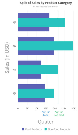
In a multi-series chart, we have two or more datasets plotted against the same X-axis (or Y-axis) value. Below is an example of a Multi-series Overlapped Bar 2D Chart.

As you can see, a Multi-series Overlapped Bar 2D Chart has horizontally aligned rectangular bars on one axis with discrete values shown on the other. The bar’s length is proportionate to the value it represents.
The following table shows the data used to build the chart shown above.
| Quarter | Food Products | Non-Food Products |
|---|---|---|
| Q1 | 12000 | 24400 |
| Q2 | 10500 | 29800 |
| Q3 | 23500 | 20800 |
| Q4 | 16000 | 26000 |
In the example chart, we have plotted quarters with data values for the Food Products and the Non-Food Products along the Y-axis. To convert this to a data format that FusionCharts can use, you need the following two properties:
categoriesdataset
As shown above, the chart compares the quarterly sales split by product category of a company for over two years. The data in the JSON format for the above chart looks as follows:
// Define the categories representing the labels on the Y-axis
const categories = [
{
"category": [
{ "label": "Q1" },
{ "label": "Q2" },
{ "label": "Q3" },
{ "label": "Q4" }
]
}
]
// Construct the dataset comprising multiple series
const dataset = [
{
"seriesname": "Food Products",
"data": [
{ "value": "12000" },
{ "value": "10500" },
{ "value": "23500" },
{ "value": "16000" }
]
},
{
"seriesname": "Non-Food Products",
"data": [
{ "value": "24400" },
{ "value": "29800" },
{ "value": "20800" },
{ "value": "26800" }
]
}
]The number of objects passed in the series should be the same as the number of labels.
Now that the data is ready let us dive in directly to render the chart. The consolidated code is given below:
import 'package:flutter/foundation.dart';
import 'package:flutter/material.dart';
import 'package:flutter_fusioncharts/flutter_fusioncharts.dart';
import '../../constants.dart';
class OverlappedBar2D extends StatefulWidget {
const OverlappedBar2D({super.key});
@override
State<OverlappedBar2D> createState() => _OverlappedBar2DState();
}
class _OverlappedBar2DState extends State<OverlappedBar2D> {
late FusionCharts _fusionChart2D;
FusionChartsController fusionChartsController = FusionChartsController();
@override
void initState() {
super.initState();
// STEP 2- Define the categories representing the labels on the Y-axis
const categories = [
{
"category": [
{ "label": "Q1" },
{ "label": "Q2" },
{ "label": "Q3" },
{ "label": "Q4" }
]
}
]
//Construct the dataset comprising multiple series
const dataset = [
{
"seriesname": "Food Products",
"data": [
{ "value": "12000" },
{ "value": "10500" },
{ "value": "23500" },
{ "value": "16000" }
]
},
{
"seriesname": "Non-Food Products",
"data": [
{ "value": "24400" },
{ "value": "29800" },
{ "value": "20800" },
{ "value": "26800" }
]
}
]
//STEP 3 - Chart Configurations
const chartConfig = {
type: "overlappedbar2d",
width: "100%",
height: "400",
dataFormat: "json",
dataSource: {
"chart": {
"theme": "fusion",
"caption": "Split of Sales by Product Category",
"xAxisname": "Sales (In USD)",
"yAxisName": "Quarter",
"numberPrefix": "$",
"plotFillAlpha": "80",
"divLineIsDashed": "1",
"divLineDashLen": "1",
"divLineGapLen": "1"
},
"categories": categories,
"dataset": dataset,
}
};
this.state = chartConfig;
this.libraryPath = Platform.select({
// Specify fusioncharts.html file location
android: {
uri: "file:///android_asset/fusioncharts.html"
},
ios: require("./assets/fusioncharts.html")
});
}
render() {
return (
<View style={styles.container}>
<Text style={styles.header}>A Multi-Series Column 2D Chart</Text>
<View style={styles.chartContainer}>
<FusionCharts
type={this.state.type}
width={this.state.width}
height={this.state.height}
dataFormat={this.state.dataFormat}
dataSource={this.state.dataSource}
libraryPath={this.libraryPath} // set the libraryPath property
/>
</View>
</View>
);
}
}
const styles = StyleSheet.create({
container: {
flex: 1,
padding: 10
},
header: {
fontWeight: "bold",
fontSize: 20,
textAlign: "center",
paddingBottom: 10
},
chartContainer: {
height: 400,
borderColor: "#000",
borderWidth: 1
}
});You can also create various charts belonging to the multi-series family in a similar way. We have over 15+ multi-series charts. You can find more about their types, components, configurations, etc. here.
Combination Charts
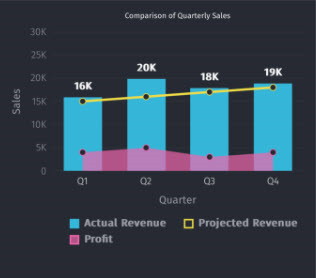
Combination charts also allow you to plot multiple datasets on the same chart. However, while in multi-series charts you need to use the same plot type for all datasets, in a combination chart you can use a different plot type for each dataset. For instance, you can show a column, a line, and an area plot on the same chart canvas.

As you can see in the 2D Single Y-axis combination chart above, a line, a column, and an area type plot share the same set of X and Y-axis. The line plot displays the projected monthly revenue of Harry’s SuperMart, while the column plot displays the actual revenue earned, and the area plot shows the monthly profit. To build the chart, we will use the data provided in the following table:
| Quarter | Actual Revenue | Projected Revenue | Profit |
|---|---|---|---|
| Q1 | 16000 | 15000 | 4000 |
| Q2 | 20000 | 16000 | 5000 |
| Q3 | 18000 | 17000 | 3000 |
| Q4 | 19000 | 18000 | 4000 |
In the above chart, we have plotted quarterly values for projected revenue, actual revenue, and profits made by Harry’s Supermart with monthly data values along the X-axis. To convert the data provided in the above table to a data format that FusionCharts can use, you need the following two properties:
categoriesdataset
As shown in the sample above, the chart compares the quarterly sales and profits of the Supermart. The data in the JSON format for the above chart looks as follows:
// Define the categories representing the labels on the X-axis
const categories = [
{
"category": [
{"label": "Q1"},
{"label": "Q2"},
{"label": "Q3"},
{"label": "Q4"}
]
}
]
// Construct the dataset comprising multiple series
const dataset = [
{
"seriesname": "Actual Revenue",
"renderAs": "column",
"data": [
{"value": "16000"},
{"value": "20000"},
{"value": "18000"},
{"value": "19000"}
]
},
{
"seriesname": "Projected Revenue",
"renderAs": "line",
"data": [
{"value": "15000"},
{"value": "16000"},
{"value": "17000"},
{"value": "18000"}
]
},
{
"seriesName": "Profit",
"renderAs": "area",
"data": [
{"value": "4000"},
{"value": "5000"},
{"value": "3000"},
{"value": "4000"}
]
}
]The number of objects passed in the series should be the same as the number of labels.
Now that the data is ready, let us dive in directly to render the chart. The consolidated code is given below:
import Flutter, { Component } from "flutter";
import { Platform, StyleSheet, Text, View } from "flutter";
import FusionCharts from "react-native-fusioncharts";
export default class Combination2D extends Component {
constructor(props) {
super(props);
// STEP 2- Define the categories representing the labels on the X-axis
const categories = [{
"category": [{
"label": "Q1"
},
{
"label": "Q2"
},
{
"label": "Q3"
},
{
"label": "Q4"
}
]
}
]
// STEP 3- Construct the dataset comprising combination series
const dataset = [{
"seriesName": "Actual Revenue",
"showValues": "1",
"data": [{
"value": "16000"
},
{
"value": "20000"
},
{
"value": "18000"
},
{
"value": "19000"
}
]
},
{
"seriesName": "Projected Revenue",
"renderAs": "line",
"data": [{
"value": "15000"
},
{
"value": "16000"
},
{
"value": "17000"
},
{
"value": "18000"
}
]
},
{
"seriesName": "Profit",
"renderAs": "area",
"data": [{
"value": "4000"
},
{
"value": "5000"
},
{
"value": "3000"
},
{
"value": "4000"
}
]
}
]
//STEP 3 - Chart Configurations
const chartConfig = {
type: "mscombi2d",
width: "100%",
height: "400",
dataFormat: "json",
dataSource: {
"chart": {
"caption": "Harry's SuperMart",
"subCaption": "Sales analysis of last year",
"xAxisname": "Quarter",
"yAxisName": "Amount (In USD)",
"numberPrefix": "$",
"divlineColor": "#999999",
"divLineIsDashed": "1",
"divLineDashLen": "1",
"divLineGapLen": "1",
"toolTipColor": "#ffffff",
"toolTipBorderThickness": "0",
"toolTipBgColor": "#000000",
"toolTipBgAlpha": "80",
"toolTipBorderRadius": "2",
"toolTipPadding": "5",
"theme": "fusion"
},
"categories": categories,
"dataset": dataset
}
};
this.state = chartConfig;
this.libraryPath = Platform.select({
// Specify fusioncharts.html file location
android: {
uri: "file:///android_asset/fusioncharts.html"
},
ios: require("./assets/fusioncharts.html")
});
}
render() {
return (
<View style={styles.container}>
<Text style={styles.header}>A Combination Chart</Text>
<View style={styles.chartContainer}>
<FusionCharts
type={this.state.type}
width={this.state.width}
height={this.state.height}
dataFormat={this.state.dataFormat}
dataSource={this.state.dataSource}
libraryPath={this.libraryPath} // set the libraryPath property
/>
</View>
</View>
);
}
}
const styles = StyleSheet.create({
container: {
flex: 1,
padding: 10
},
header: {
fontWeight: "bold",
fontSize: 20,
textAlign: "center",
paddingBottom: 10
},
chartContainer: {
height: 400,
borderColor: "#000",
borderWidth: 1
}
});You can also create various charts with various combinations in a similar way. We have over 10+ combination charts. You can find more about their types, components, configurations etc. from here.
Real Time Charts
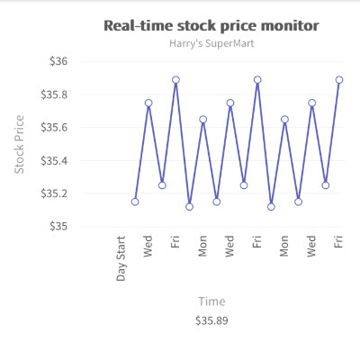
Real-time charts are also referred to as data streaming charts, because they can automatically update themselves at regular intervals, by fetching new data from the server and discarding the previous values. You do not need to keep refreshing the page to see the updated versions of these charts.
FusionCharts XT supports various types of Real-time charts - Line, Area, Column, Stacked Area, Stacked Column, and Line (Dual Y axis). In the section below, we will see how to build a real-time area 2D chart.
Create a StreamController and pass the reference of the StreamController to the FusionChart widget. Subsequently you can emit data which is consumed by the FusionChart. As and when the data is received over the stream, the FusionChart will get updated accordingly.

As you can see in the real-time 2D line chart above, the data plot is presenting the values present at a given instance. As soon as new values are available in the source data, the chart will update itself with the fresh values, gradually discarding the data plots displayed above.
final streamController = StreamController<String>();
_fusionChart2D = FusionCharts(
...
...
streamController: streamController,
);
/// Subsequently anywhere in your code you can push the new data as so
streamController.add(nextData);You can also create various types of real-time charts in a similar way. We have 6 charts for which you can inject the data in real-time. You can find more about their types, configurations here.