Loading
Introducing the Zoom Scatter Chart
The FusionCharts Suite XT zoom-scatter chart is a special type of chart that extends the capabilities of the scatter chart to include the zooming and panning features. It can be seen as an extension of the scatter chart with the ability of displaying millions of data points because of the zoom and pan feature.
The zoom-scatter chart is mainly used to find correlations between datasets. Correlations in the chart can be determined by the visual patterns in the data. Higher the number of data points, higher are the chances of more accurate correlations. The zoom-scatter chart is capable of handling more than a million data points in modern canvas supported browsers (including IE9+).
Take a look at the sample zoom-scatter chart shown below:
The chart compares the admission rate (in percent) with the average annual return on degree (in percent) for five majors and over a period of 20 years.
Drag the mouse-pointer over the chart to select and zoom into a subset of data points.
At the time of rendering, the zoom-scatter chart is displayed with a macroscopic view of data. To select a subset of data points and zoom into them, drag the mouse pointer over the data points. A rectangle is drawn to highlight the selected data points and all points within this rectangle are zoomed.
When a subset of data plots is selected and zoomed into, the selected portion expands to occupy the entire width and height of the chart. Data is neatly compressed, so that all of it fits into the height and width of the chart. To analyze the data in greater detail, the select and zoom process can be repeated several times over, until the last level of granularity. The chart can be restored to its original macroscopic display mode by clicking the  button on the toolbar.
The Zoom-scatter Chart Toolbar
The zoom-scatter chart toolbar is an important interaction mode for the users of this chart. The toolbar, shown in the image below, is located in the top-right corner of the chart.
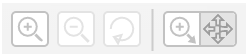
The table below briefly describes the buttons on the toolbar of a zoom-scatter chart.
| Button Icon | Button Name | Function |
|---|---|---|
|
Zoom-in |
Click to zoom-in to the chart/selected subset of data by a predefined amount, based on the center pivot point of the chart/dataset. |
|
Zoom-out |
Click to zoom-out of the chart/selected subset of data by a predefined amount, similar to the zoom-in functionality. |
|
Reset |
Click to zoom-out to the original macroscopic view of data. |
|
Select-zoom/Pan switch button |
Click to switch between the modes of interaction. The zoom-scatter chart supports two modes of interaction—the zoom mode and the pan mode. The zoom mode lets you select a subset of data to get a zoomed view of that data. The pan mode lets you pan through the data in the current chart view. By default, the zoom mode is enabled. After every zoom, the pan mode is activated. |


For a large amount of data rendered within limited chart space, this chart helps you identify the correlation between data as well as analyze it further by zooming and panning into the data.