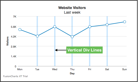
Vertical Div Lines
Introduction
Vertical divisional (or div) lines are a key feature in charts. They provide vertical markers that help to visually separate data points along the x-axis. These lines run vertically across the chart canvas, enhancing readability and making it easier to interpret the data.
Understanding how to render and customize lineas vertical dividers can significantly improve the clarity and aesthetic of your charts. In this blog, we will explore how to show vertical divisional lines, customize their appearance, use dashed lines, and display vertical grid bands for enhanced visualization.
Vertical div lines are applicable only for the line, area, spline, splineArea, and XY type charts.
The image below shows vertical div lines rendered in a line chart:

Show Vertical Divisional Lines
By default, vertical divisional lines are not rendered in a chart. To render vertical divisional lines, specify the number of divisional lines you want to display using the numVDivLines attribute.
Refer to the code below:
{
"chart": {
"numVDivLines": "5"
}
}The chart will look like as shown below:
Click here to edit the above chart.
Customize the Visuals of Vertical Divisional Lines
To customize the visuals of the divisional lines use the following attributes:
Specify the hex code of for the divisional line color using the
vDivLineColorattribute.Set the thickness (in pixels) using the
vDivLineThicknessattribute.Set the transparency of the using the
vDivLineAlphaattribute.
Refer to the code below:
{
"chart": {
"numVDivLines": "5",
"vDivLineColor": "#99ccff",
"vDivLineThickness": "1",
"vDivLineAlpha": "50"
}
}The chart will look like as shown below:
Click here to edit the above chart.
Dashed Divisional Lines
You can also render div lines as dashed lines instead of the default continuous lines. To do so, use the following attributes:
Set the
vDivLineDashedattribute to1to view the divisional lines as dashed.Set the length of each dashed line using the
vDivLineDashLenattribute.Set the gap between each dash using the
vDivLineDashGapattribute.
Refer to the code below:
{
"chart": {
"numVDivLines": "5",
"vDivLineColor": "#99ccff",
"vDivLineThickness": "1",
"vDivLineAlpha": "70",
"vDivLineDashed": "1",
"vDivLineDashLen": "5",
"vDivLineDashGap": "3"
}
}The chart will look like as shown below:
Click here to edit the above chart.
Show Vertical Grid Bands
Vertical grid bands, by default, do not appear between the vertical divisional lines.
To show the vertical grid bands, set the showAlternateVGridColor attribute to 1.
Refer to the code below:
{
"chart": {
"showAlternateVGridColor": "1"
}
}A line chart with alternate vertical grid bands enabled is shown below:
Click here to edit the above chart.
Customize the Visuals Vertical Grid Bands
To customize the visual properties of the vertical grid bands use the following attributes:
Specify the hex code for the color of the grid bands using the
alternateVGridColorattribute.Set the transparency of the grid band using the
alternateVGridAlphaattribute.
Refer to the code below:
{
"chart": {
"alternateVGridColor": "#bee6ff",
"alternateVGridAlpha": "30"
}
} The chart will look like as shown below:
Click here to edit the above chart.
Conclusion
Vertical divisional lines, or div lines, are a powerful tool for improving the clarity and visual appeal of your charts. They provide visual separators between data points on the x-axis, making it easier for viewers to interpret trends and compare values. This blog has equipped you with the knowledge to:
- Enable and customize the appearance of vertical divisional lines.
- Create dashed lines for a more distinct separation.
- Implement vertical grid bands for additional visual emphasis.
By incorporating these techniques, you can create charts that are not only informative but also aesthetically pleasing, promoting a better understanding of your data.
Level Up Your Visualizations with FusionCharts
Start creating charts that are both beautiful and insightful. Explore our comprehensive documentation to master all the customization options. Enhance your data storytelling today!
FAQs
How to draw a vertical line in div?
When you need to draw a vertical line in a div, CSS comes to the rescue. By setting the border-left or border-right property, you can achieve this. For example, use border-left: 1px solid black to create a thin vertical line on the left side of the div. This practical method allows you to create a vertical line graph effect within your webpage, a valuable skill in your web development toolkit.
How do I vertically divide a div?
To vertically divide a div, you can use the CSS border property or create multiple divs inside a parent div with specified widths and borders. This technique is useful for displaying a vertical line graph within a container. Here's an example:
.divider {
border-left: 1px solid black;
height: 100%;
}What is the tag for the vertical line?
There isn't a specific HTML tag exclusively for vertical lines. However, you can create a vertical line using a styled div or the hr tag with CSS transformations. This approach allows you to create vertical grid lines or markers in your designs.
<hr style="width: 1px; height: 200px; transform: rotate(90deg);">