Pyramid Chart
These chart types belong to FusionWidgets XT.
Use Pyramid charts to compare data, such as the sales data of a product for a year. A pyramid chart consists of various segments, each representing a data point. The height of the pyramid segment, with respect to the entire pyramid, represents the value of a specific data point.
As you know, each segment in a pyramid chart represents a dataset with the height of the segment representing the value for that dataset. To distinguish segments from one another, you can configure them individually for their background, border, etc. Adjacent to the pyramid segments, the label and value of that pyramid can be displayed.
Salient features
Click on Interactive pyramid slices to separate them from the main pyramid.
Right click on the chart and select View 2D to seamlessly convert 3D pyramid to 2D pyramid.
Render the pyramid in 2D mode with more control over border and fill properties.
Show values as actual values or in percentage.
Use smart labels to avoid overlapping of pyramid labels.
Place labels on the side or in the center of the chart.
Use custom tool text for each pyramid slice.
Link each pyramid slice to a valid target, such as a web page, a Javascript function, or even a drill down chart, if you wish.
Create a simple pyramid chart
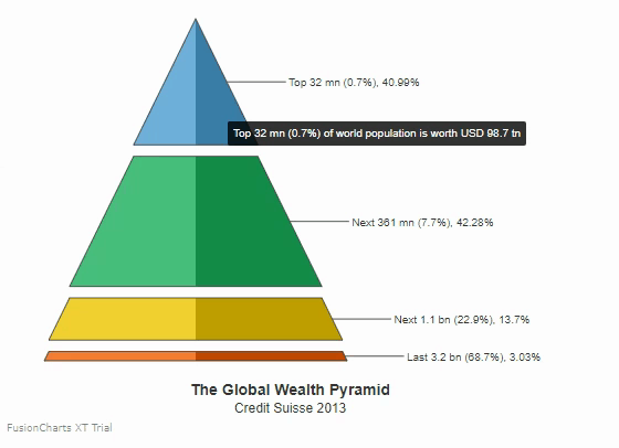
Build the Global Wealth Pyramid (Credit Suisse 2013) chart using the data given below, to see how the world's wealth was distributed during that year:
| Number of People | Wealth owned (In trillion USD) | |
|---|---|---|
| Top 32 mn (0.7%) | 98.7 | |
| Next 361 mn (7.7%) | 101.8 | |
| Next 1.1 bn (22.9%) | 33.0 | |
| Last 3.2 bn (68.7%) | 7.3 |
To create a pyramid chart follow the steps given below:
In the JSON data, set the attributes and their corresponding values in
"<attributeName>": "<value>"format.Specify the chart type using the
typeattribute. To render a pyramid chart, setpyramid.Set the container object using
renderAtattribute.Specify the dimension of the chart using
widthandheightattributes.Set the type of data (JSON/XML) you want to pass to the chart object using
dataFormatattribute.Set the
valueattribute within thedataobject to show the numerical value of the data.Set the
labelattribute to specify the label of a pyramid segment.
The Global Wealth Pyramid chart you get by using the above code will look like the following:
{
    "chart": {
        "theme": "fusion",
        "caption": "The Global Wealth Pyramid",
        "captionOnTop": "0",
        "captionPadding": "25",
        "alignCaptionWithCanvas": "1",
        "subcaption": "Credit Suisse 2013",
        "subCaptionFontSize": "12",
        "borderAlpha": "20",
        "is2D": "1",
        "bgColor": "#ffffff",
        "showValues": "1",
        "numberPrefix": "$",
        "numberSuffix": "M",
        "plotTooltext": "$label of world population is worth USD $value tn ",
        "showPercentValues": "1",
        "chartLeftMargin": "40"
    },
    "data": [
        {
            "label": "Top 32 mn (0.7%)",
            "value": "98.7"
        },
        {
            "label": "Next 361 mn (7.7%)",
            "value": "101.8"
        },
        {
            "label": "Next 1.1 bn (22.9%)",
            "value": "33"
        },
        {
            "label": "Last 3.2 bn (68.7%)",
            "value": "7.3"
        }
    ]
}<html>
<head>
<title>My first chart using FusionCharts Suite XT</title>
<script type="text/javascript" src="https://cdn.fusioncharts.com/fusioncharts/latest/fusioncharts.js"></script>
<script type="text/javascript" src="https://cdn.fusioncharts.com/fusioncharts/latest/themes/fusioncharts.theme.fusion.js"></script>
<script type="text/javascript">
FusionCharts.ready(function(){
var fusioncharts = new FusionCharts({
type: 'pyramid',
renderAt: 'chart-container',
id: 'wealth-pyramid-chart',
width: '500',
height: '400',
dataFormat: 'json',
dataSource: {
"chart": {
"theme": "fusion",
"caption": "The Global Wealth Pyramid",
"captionOnTop": "0",
"captionPadding": "25",
"alignCaptionWithCanvas": "1",
"subcaption": "Credit Suisse 2013",
"subCaptionFontSize": "12",
"borderAlpha": "20",
"is2D": "1",
"bgColor": "#ffffff",
"showValues": "1",
"numberPrefix": "$",
"numberSuffix": "M",
"plotTooltext": "$label of world population is worth USD $value tn ",
"showPercentValues": "1",
"chartLeftMargin": "40"
},
"data": [{
"label": "Top 32 mn (0.7%)",
"value": "98.7"
}, {
"label": "Next 361 mn (7.7%)",
"value": "101.8"
}, {
"label": "Next 1.1 bn (22.9%)",
"value": "33"
}, {
"label": "Last 3.2 bn (68.7%)",
"value": "7.3"
}]
}
}
);
fusioncharts.render();
});
</script>
</head>
<body>
<div id="chart-container">FusionCharts XT will load here!</div>
</body>
</html>Click here to edit the above chart.
You can configure several functional and cosmetic properties for pyramid charts.
Draw a 2D pyramid and customize border properties
By default, a pyramid chart renders as a 3D chart with a context menu, which you can use to switch between 2D and 3D display modes. However, you can configure a pyramid chart to render in the 2D mode when it first loads, without using the context menu. You can also customize the border properties of a pyramid chart for better visual representation.
Use the following attributes to render a 2D pyramid chart with customized border properties:
Set the
is2Dattribute to1to render the chart in 2D.Set the
showPlotBorderattribute to1, to show the plot border.Set the value of the
plotBorderColorattribute to the hex code of the color of the plot border.Set the value of the
plotBorderThicknessattribute to specify the thickness of the plot border in pixels.Set the value of the
plotBorderAlphaattribute between0(transparent) and100(opaque) to specify the degree of transparency of the plot border.
Refer to the code given below:
{
    "chart": {
        "is2D": "1",
        "showPlotBorder": "1",
        "plotBorderThickness": "1",
        "plotBorderAlpha": "100",
        "plotBorderColor": "#333333"
    },
}The chart will look like the following:
Click here to edit the above chart.
Show labels at the center of the chart
Set the value of the showLabelsAtCenter attribute to '1', to show the labels at the center of the chart.
Refer to the code given below:
{
    "chart": {
        "showLabelsAtCenter": "1"
    },
}The chart will look like the following:
Click here to edit the above chart.
Show labels in the legend of the chart
You can show the labels in the legend box, instead of showing them with the data plots. To do this, show the legend box and hide the labels for the data plots. The following attributes are used:
Set the value of
showLegendattribute to1, to specify whether the legend box is shown for the chart.Set the value of
showLabelsattribute to1, to specify whether the labels are shown.
Refer to the code given below:
{
    "chart": {
        "showlegend": "1",
        "showlabels": "0"
    },
}The chart will look like the following:
Click here to edit the above chart.
Configure the position of the legend box
By default, the legend box is placed at the bottom of the pyramid chart. You can, however, shift its position to the right. To do that, set the value of the legendPosition attribute to RIGHT.
Refer to the code given below:
{
    "chart": {
        "legendPosition": "RIGHT",
    },
}The chart will look like the following:
Click here to edit the above chart.
Show data values as percentage
You can configure a pyramid chart to show percent values instead of numerical values. To do so, set the value of the showPercentValues attribute to 1.
Refer to the code given below:
{
    "chart": {
        "showPercentValues": "1"
    },
}The chart will look like the following:
Click here to edit the above chart.
Slice Out Individual Pyramid Slices
You can make either all slices, or individual slice(s) of the pyramid chart, appear sliced out. To do so, set the value of the isSliced attribute to 1. Use it as part of the chart object to make the entire chart appear sliced out, or use it as part of the data object, to make one or more segments appear sliced out.
Refer to the code given below:
{
    "chart": {
        "isSliced": "1"
    },
}The chart will look like the following:
Click here to edit the above chart.
Configure Hover Effects
Use the attributes given below, to configure the hover effects in a chart:
Set the value of the
showhovereffectattribute to1, to enable the hover effect.Set the value of the
hoverColorattribute to the hex code of the color that will be used to fill a slice when you hover the mouse pointer over it.Set the value of the
hoverAlphaattribute between0(transparent) and100(opaque) to specify the transparency of the slice when you hover the mouse pointer over it.Set the value of the
borderHoverColorattribute to the hex code of the color that will be used when you hover the mouse pointer over it.Set the value of the
borderHoverAlphaattribute between0(transparent) and100(opaque) to specify the transparency of the border when you hover the mouse pointer over it.Set the value of the
borderHoverThicknessattribute to specify the thickness, in pixels, of the slice border when you hover the mouse pointer over it.
Refer to the code given below:
{
    "chart": {
        "showHoverEffect": "1",
        "hoverColor": "#cccccc",
        "hoverAlpha": "75",
        "borderHoverColor": "#aa0000",
        "borderHoverAlpha": "100",
        "borderHoverThickness": "3"
    },
}The chart will look like the following:
Click here to edit the above chart.