Anchors and Lines
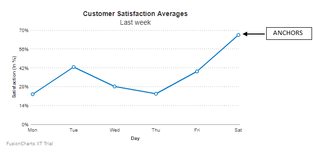
Each data point in a line/spline/area chart is represented by an anchor. Anchors help to identify the data point in the chart easily. Anchors show a tooltip showing the data plot details when the mouse is hovered over them and can be linked to other pages as well. In this article, we will discuss different configurations of the anchors.

Hide Anchors
By default, the anchors and their corresponding tooltips are displayed. To hide the anchors set the drawAnchors attribute to 0 as shown in the code below:
{
    "chart": {
        "drawAnchors": "0"
    }
}A line chart with anchors hidden looks like as shown below:
Click here to edit the above chart.
Customize Anchor Properties
To customize the properties of the anchors, the following attributes are used:
Specify the number of sides using the
anchorSidesattribute to define the shape of the anchor. Set the value to3to draw the anchor shaped like a triangle.Set the radius (in pixels) of the anchor using the
anchorRadiusattribute.Set the hex code for anchor border color using the
anchorBorderColorattribute.Set the thickness (in pixels) of the anchor border using the
anchorBorderThicknessattribute.Set the hex code for anchor background color using the
anchorBgColorattribute.Set the transparency of the anchor background using the
anchorBgAlphaattribute.
Refer to the code below:
{
    "chart": {
        "anchorRadius": "6",
        "anchorBorderThickness": "2",
        "anchorBorderColor": "#127fcb",
        "anchorSides": "3",
        "anchorBgColor": "#d3f7ff"
    }
}A line chart with customized anchors looks like as shown below:
Click here to edit the above chart.
Customize Anchors for specific Data Points
To highlight a specific anchor, customize the cosmetics for only that particular anchor.
To customize the anchor of a specific data point use the same attributes as mentioned above . In this scenario, instead of using the attributes within the chart object use them within the data object.
Refer to the code below:
{
    "chart": {
        "anchorRadius": "6",
        "anchorBorderThickness": "2"
    },
    "data": [
        {
            "label": "Mon",
            "value": "22.5",
            "anchorBorderColor": "#cc3333",
            "anchorBgColor": "#ff9900"
        },
        {
            "label": "Tue",
            "value": "42.4"
        }
        ....
    ]
}
A line chart with anchors of specific data points customized looks as below:
Click here to edit the above chart.
Add External Images
You can add external images in place of anchors for line and area charts. This allows you to use different images for each anchor and lets you highlight special values. To do so, you have to set the attributes in individual data object. The attributes used are:
Specify the URL of the image using the
anchorImageUrlattribute.Set the transparency of the image using the
anchorImageAlphaattribute.Set the scale of the image using the
anchorImageScaleattribute.
Refer to the code below:
{
    "chart": {
        ...
        "anchorAlpha": "100",
        "anchorImageAlpha": "100",
        "anchorImageScale": "90"
    },
    "data": [
        {
            "label": "July",
            "value": "7.8",
            "displayValue": "John, 7.8",
            "tooltext": "July : John, 7.8",
            "anchorImageUrl": "https://static.fusioncharts.com/sampledata/userimages/1.png"
        },
        {
            "label": "August",
            "value": "6.9",
            "displayValue": "Mac, 6.9",
            "tooltext": "August : Mac, 6.9",
            "anchorImageUrl": "https://static.fusioncharts.com/sampledata/userimages/2.png"
        },
        {
            "label": "September",
            "value": "8",
            "displayValue": "Phillips, 8",
            "tooltext": "September : Phillips, 8",
            "anchorImageUrl": "https://static.fusioncharts.com/sampledata/userimages/3.png"
        },
        {
            "label": "October",
            "value": "7.5",
            "displayValue": "Terrin, 7.5",
            "tooltext": "October : Terrin, 7.5",
            "anchorImageUrl": "https://static.fusioncharts.com/sampledata/userimages/4.png"
        },
        {
            "label": "November",
            "value": "7.7",
            "displayValue": "Tom, 7.7",
            "tooltext": "November : Tom, 7.7",
            "anchorImageUrl": "https://static.fusioncharts.com/sampledata/userimages/5.png"
        },
        {
            "label": "December",
            "value": "6.7",
            "displayValue": "Martha, 6.7",
            "tooltext": "December : Martha, 6.7",
            "anchorImageUrl": "https://static.fusioncharts.com/sampledata/userimages/6.png"
        }
    ]
}A line chart with external images in the anchors looks as below:
Click here to edit the above chart.