Changed Behavior
This section is for users who are using previous version of FusionCharts in their application. Here we'll talk about the change in behavior of the charts after v3.15.2.
Setting yAxisValueDecimals when setAdaptiveYMin is enabled.
yAxisValueDecimal now displays the right number of decimal places when setAdaptiveYMin and forceYAxisValueDecimals are enabled. Previously, yAxisValueDecimal failed to work properly with values lower than 3 when setAdaptiveYMin was enabled.
Before the fix yAxisValueDecimals is set to 2 and setAdaptiveYMin to 1 (enabled) the chart shows values with 3 decimal places.

After the fix yAxisValueDecimals is set to 2 and setAdaptiveYMin to 1 (enabled) the chart shows values with 2 decimal places.

Crossline tooltips position
zoomline and zoomlineDY charts now show tooltips values sorted in decreasing order. Previously, tooltip values were displayed in the same order they had on the category object. For further information refer to Displaying Values in Tooltips
Returning property names using getJSONData() and getChartData()
With the introduction of the isRaw property getJSONData() and getChartData() now return property names without changing the casing used in the dataSource. Previously, getJSONData() and getChartData() returned all property names as lowercase regardless of the casing used on the dataSource.
getJSONData() and getChartData() can now return all property names as defined on the data source. Here is an example
let jsonData = topStores.getJSONData({ isRaw:1 });
let chartData = topStores.getJSONData({ format:'json', isRaw:1 });For more information refer to getChartData and getJSONData.
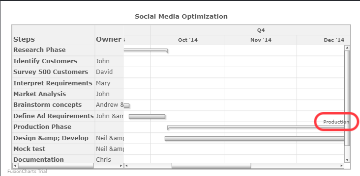
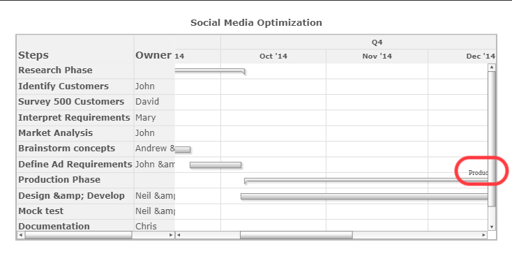
Task labels in Gantt Charts
In Gantt charts, the task labels are now displayed properly. Previously, when scrolling horizontally the task labels overlapped with the vertical scroll bar.
Before the fix
After the fix
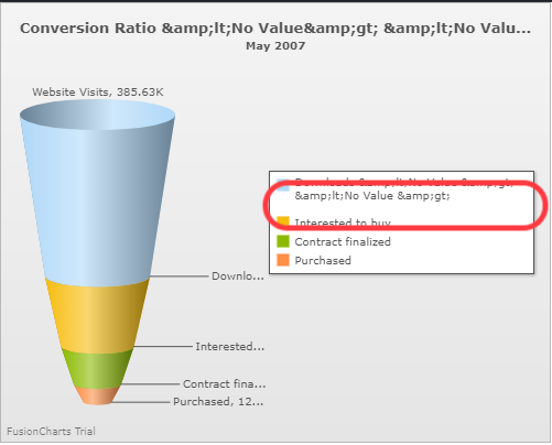
Legend spacing in all Charts
For an optimal data visualization, the space between legend items has been decreased in order to improve the visual space of the data plot.
For more information see legend.
Before the fix
After the fix
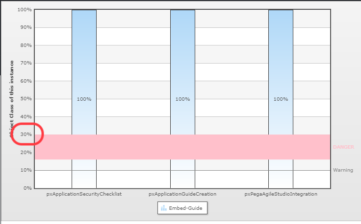
The "%" symbol displays correctly in all Stacked Charts
In Stacked bar charts the percentage "%" symbol now displays properly on the numeric axis. Previously, when the stack100Percent attribute was set to 1, the "%" symbol did not get applied on the numeric axis
Before the fix
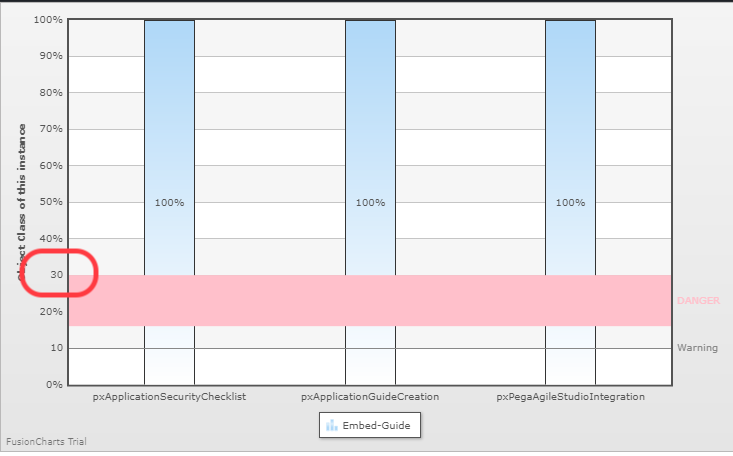
After the fix
