Cross Line
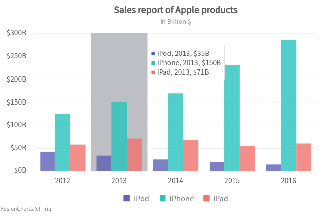
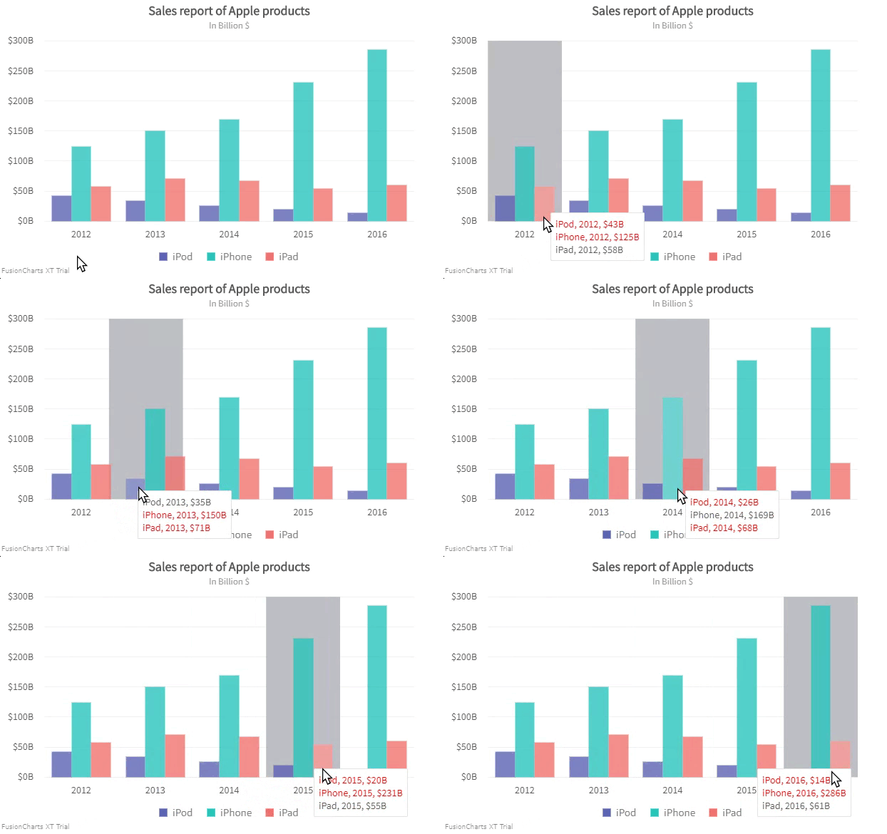
Cross line is a vertical line/area used as a quick reference for data plots. When you hover over the canvas, a line/area appears highlighting the data plots along with the information in a tooltip. The tooltip that appears has all the information required, for example, data values, labels of each data plot and also the color of the data plots. A cross line appears as shown in the image below:
Show/Hide the Cross Line
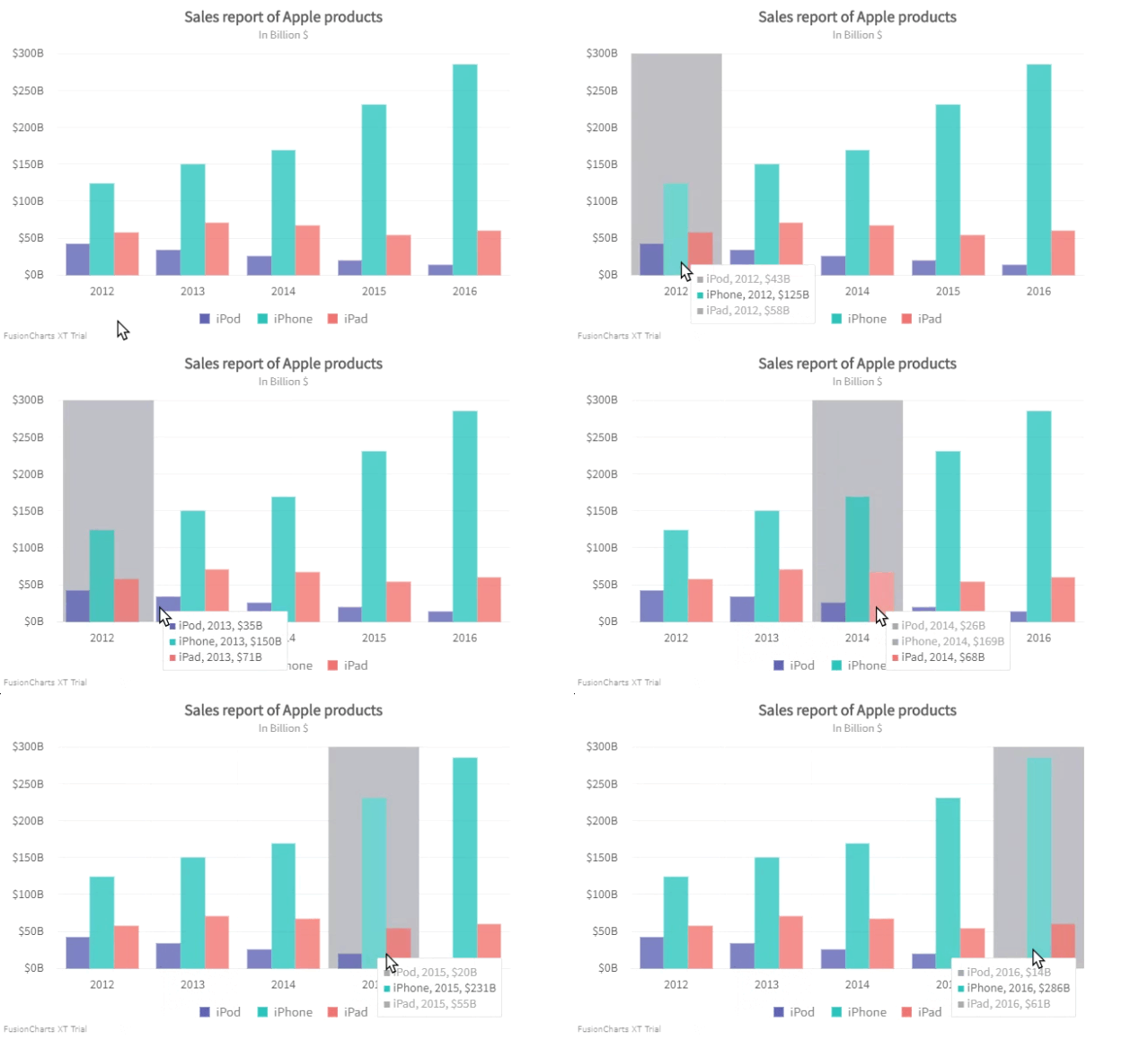
By default, the cross line is turned off. To show the crossline set the drawCrossLine attribute to 1. Refer to the code below:
{
"chart": {
"drawCrossLine": "1"
}
}A chart with crossline will look like as shown below:
Click here to edit the above chart.
Customize Cross Line Color
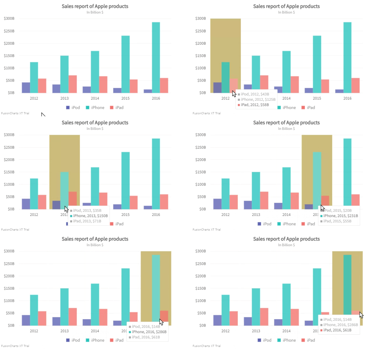
Specify the hex code of the cross line color using the crossLineColor attribute. Refer to the code below:
{
"chart": {
"crosslinecolor": "#ccbb7a"
}
}A multi-series column chart with a customized cross line looks like as shown below:
Click here to edit the above chart.
Customize Opacity
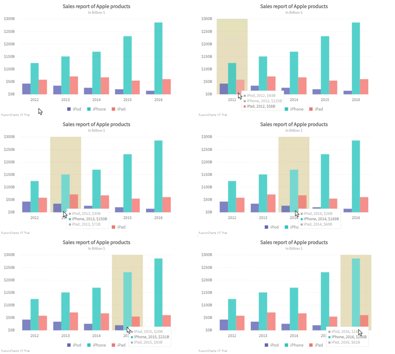
Set the opacity of the crossline using the crossLineAlpha attribute. Refer to the code below:
{
"chart": {
"crossLineAlpha": "50"
}
}A multi-series column chart with a customized transparency (set to 20) of the cross line looks like as shown below:
Click here to edit the above chart.
Enable/Disable Animation
By default, the cross line animation is disabled. Set the crossLineAnimation attribute to1 to enable the animation. Refer to the code below:
{
"chart": {
"crossLineAnimation": "1"
}
}If you have enabled animation, set the animation duration for the cross line of your chart using the crossLineAnimationDuration attribute. Refer to the code below:
{
"chart": {
"crossLineAnimationDuration": "0.7"
}
}A multi-series area chart with animation enabled looks as below:
Click here to edit the above chart.
Set Tooltip Background Color
A tooltip is a common element, used to display information whenever you hover over a particular data point. A consolidated tooltip has been introduced with the cross line which can be used to get the detailed information of the hovered plots in a multi-series chart.
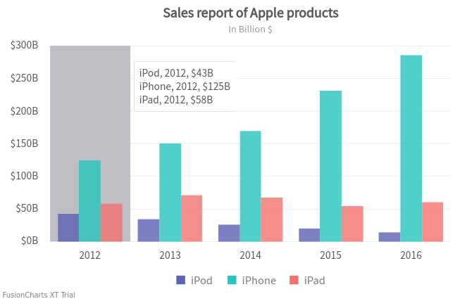
By default, the tooltip takes the color of the dataplot. Set the plotColorInTooltip attribute to 0 to turn off the color of the plot in the tooltip.
Refer to the code below:
{
"chart": {
"plotColorinTooltip": "0"
}
}The chart will look like as shown in the image below:
Click here to edit the above chart.
Set tooltipGrayOutColor attribute to specify the color of the unfocused plot in the tooltip. Refer to the code below:
{
"chart": {
"tooltipGrayOutColor": "#ff0000"
}
}The chart will look like as shown below:
Click here to edit the above chart.
Specify the hex code of the tooltip background color using the toolTipBgColor attribute. Refer to the code below:
{
"chart": {
"toolTipBgColor": "#ffffff"
}
}The chart will look like as shown below:

Click here to edit the above chart.
Customize Tooltip Border
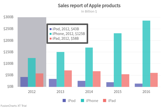
To customize the tooltip border, the following attributes are used:
Specify the hex code of the tooltip border color using the
toolTipBorderColorattribute.Set the thickness of the border using the
toolTipBorderThicknessattribute.
Refer to the code below:
{
"chart": {
"toolTipBorderColor": "#545454",
"toolTipBorderThickness": "5"
}
}The chart will look like as shown below:
Click here to edit the above chart.
Set Separator Character for Tooltip
Specify the character to separate the name and the value displayed in the tooltip using the toolTipSepChar attribute. Refer to the code below:
{
"chart": {
"toolTipSepChar": ","
}
}The chart will look like as shown below:

Click here to edit the above chart.
Show/Hide Tooltip Shadow
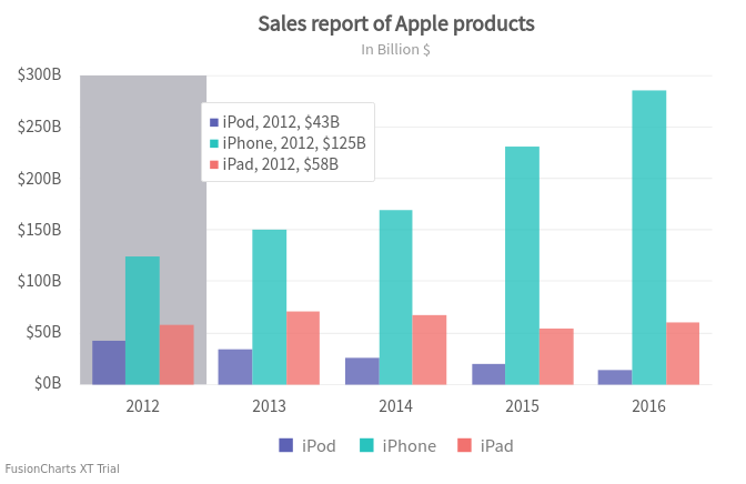
By default, the tooltip shadow is visible. To hide the tooltip shadow set the showTooltipShadow attribute to 0. Refer to the code below:
{
"chart": {
"showTooltipShadow": "0"
}
}The chart will look like as shown below:
Click here to edit the above chart.