What's New
This section is for users who are using previous version of FusionCharts in their application. Here we'll talk about the new features introduced in v3.14.0.
Top plot border of an area chart
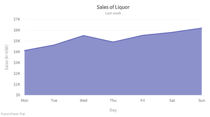
In area charts, you can now draw the borders of the data plots only at the top of an area plot.
The image below shows the border only at the top of an area plot.

To know more click here.
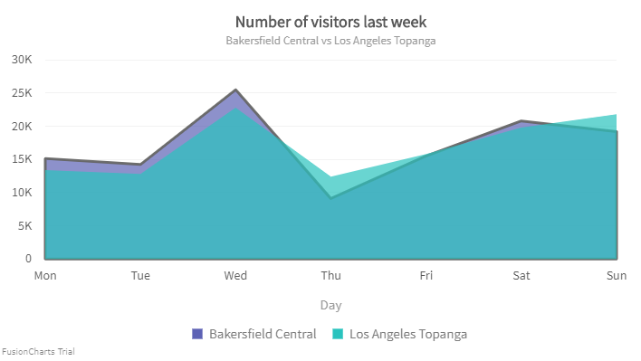
You can also configure the top border of a particular data plot in an area chart with multiple data plots.
Take a look at the image given below:

To know more click here.
Inherit plot border color of an area chart
FusionCharts Suite now allows you to set the border color of the area chart by inheriting the plot color.
The chart looks like as shown in the image below:
Click here to know more.
Control the visibility of data values
Starting v3.14.0, FusionCharts allows you to control the visibility of data values of the plots by specifying the minimum height of the columns. Data plots less than the minimum height specified will not show the data value text. This will help reduce clutter and improve the readability of the chart.
The chart will look like as shown below:
Click here to know more.
In the above chart, we can see that the data values of the data plots with height less than 20 pixels have been disabled.
Bubble chart
A similar scenario can occur for a Bubble chart as well. We cannot calculate the height of a bubble chart so a new attribute minRadiusForValue has been introduced where u can specify the minimum radius of the bubble to display the data values of the plots.
A bubble chart looks like as shown below:
Click here to know more.
Pie/Doughnut chart
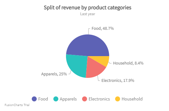
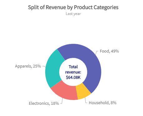
Starting v3.14.0, FusionCharts Suite XT allows you to place the values inside the pie/doughnut slices of a pie and doughnut chart respectively. This helps to improve the overall look as it saves the canvas area outside the chart.
The chart will look liks as shown below:
Click here to know more.
In pie/doughnut chart, changing the position of the value can sometimes overlap each other due to the unavailability of space. For this scenario, a new attribute minAngleForValue has been introduced which sets the minimum angle of the pie below which the values will not be visible.
The chart will look like as shown below:
Click here to know more.
Set the radius as a percent value
You can now set the radius of the pie chart in percent by setting the value of pieRadius attribute. When you set the value of pieRadius in percent, the radius of the pie is calculated with respect to the chart canvas space.
Refer to the image shown below:

Click here to know more.
In the doughnut chart, you can apply the pieRadius attribute to set the radius of the upper threshold of the doughnut chart.
Refer to the image below:

Click here to know more.
X-axis position
With 3.14.0, the position of this axis will be configurable - TOP/BOTTOM for vertical charts, LEFT/RIGHT for horizontal charts.
The chart looks like as shown below:
Click here to know more.
Y-axis position
Starting 3.14.0, you can customize the position of the Y-axis by setting the value of yAxisPosition attribute to right. This will render a chart with y-axis on right.
The chart looks like as shown below:
Click here to know more.
Configure background properties for y-axis values
You can now configure the background properties of the y-axis values.
The chart will look like as shown below:
Click here to know more.
Configure border properties for y-axis values
You can now configure the border properties of the y-axis values.
The chart will look like as shown below:
Click here to know more.
Configure font properties for y-axis values
You can now configure the font properties of the y-axis values.
The chart will look like as shown below:
Click here to know more.
Improve the readability of data values
Often when data values are placed inside the data plot, the data values are not properly visible. Based on the plot color and the text color of the data values it is sometimes difficult to read them. You can now add outline borders to the data value text for better readability.
The chart will look like as shown below:
Click here to edit the chart.