Chart Components (Anatomy)
To know how FusionCharts works, it is important to understand the various components and concepts of a chart
Below you can find different sections with interactive annotated images describing various components and concepts of charts
Chart with Single Series
Click on the bubbles below to know more about different chart components.
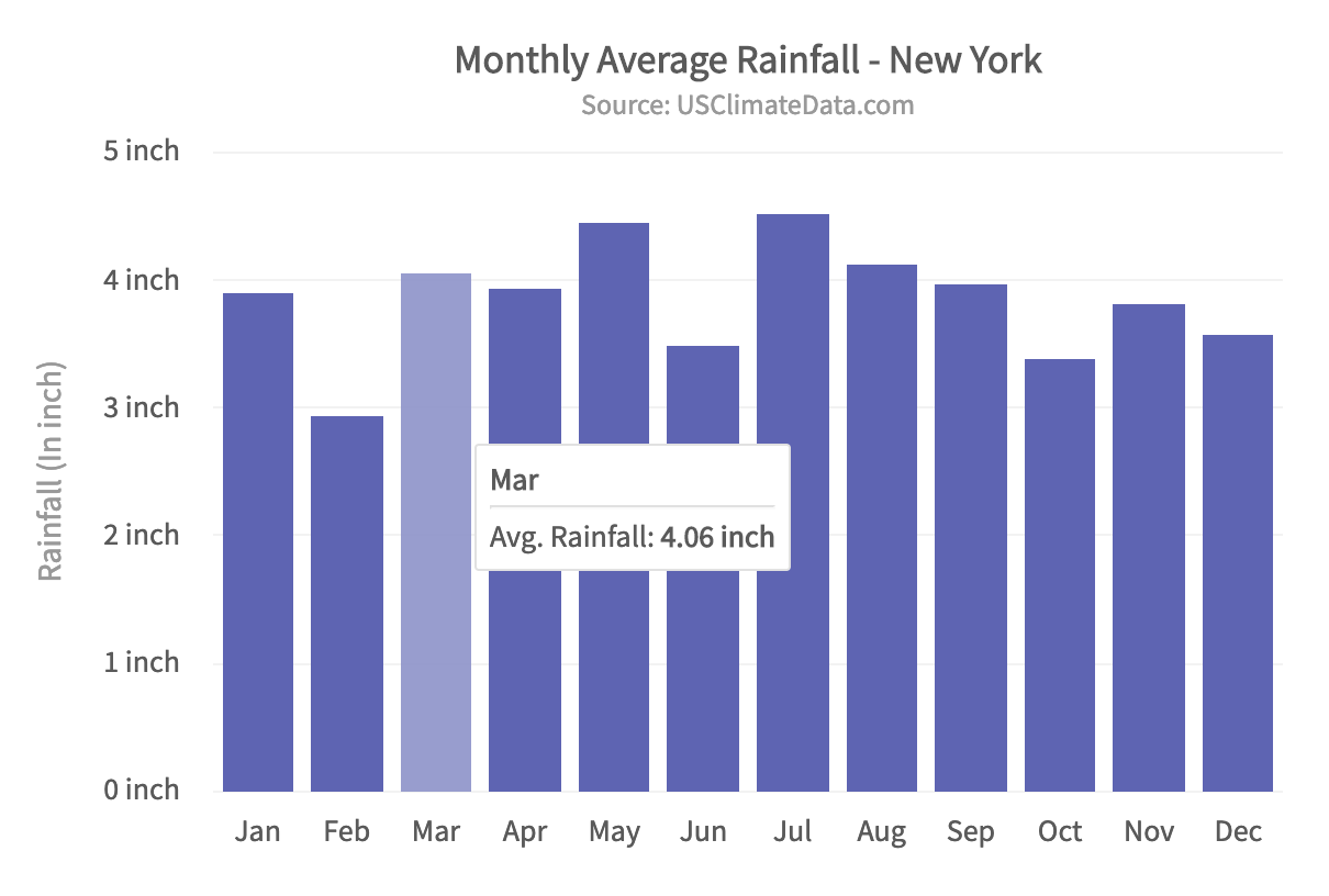
Caption
The caption (also called the chart title) is the heading of your chart. You can add custom text for the caption. You can also configure its font properties and cosmetics.
Sub-caption
The sub-caption (also called the chart subtitle) is the sub-heading of your chart. You can add custom text for the sub-caption. You can also configure its font properties.
Canvas Area
Canvas area refers to the area in which the chart data is plotted, excluding the area where titles, legends, and axis names are rendered.
X-Axis
X-Axis refers to a line on a chart that runs horizontally (left-right). Learn more about it here.
Y-Axis
Y-Axis refers to a line on a chart that runs vertically (up-down) through zero. Learn more about it here.
Tooltip
A tooltip is displayed when the mouse cursor hovers over a particular data point. It provides context-sensitive information about the data point. here.
- 1 Caption
- 2 Sub-caption
- 3 Canvas Area
- 4 X-Axis
- 5 Y-Axis
- 6 Tooltip
Chart with Multiple Series
Click on the bubbles below to know more about different chart components.
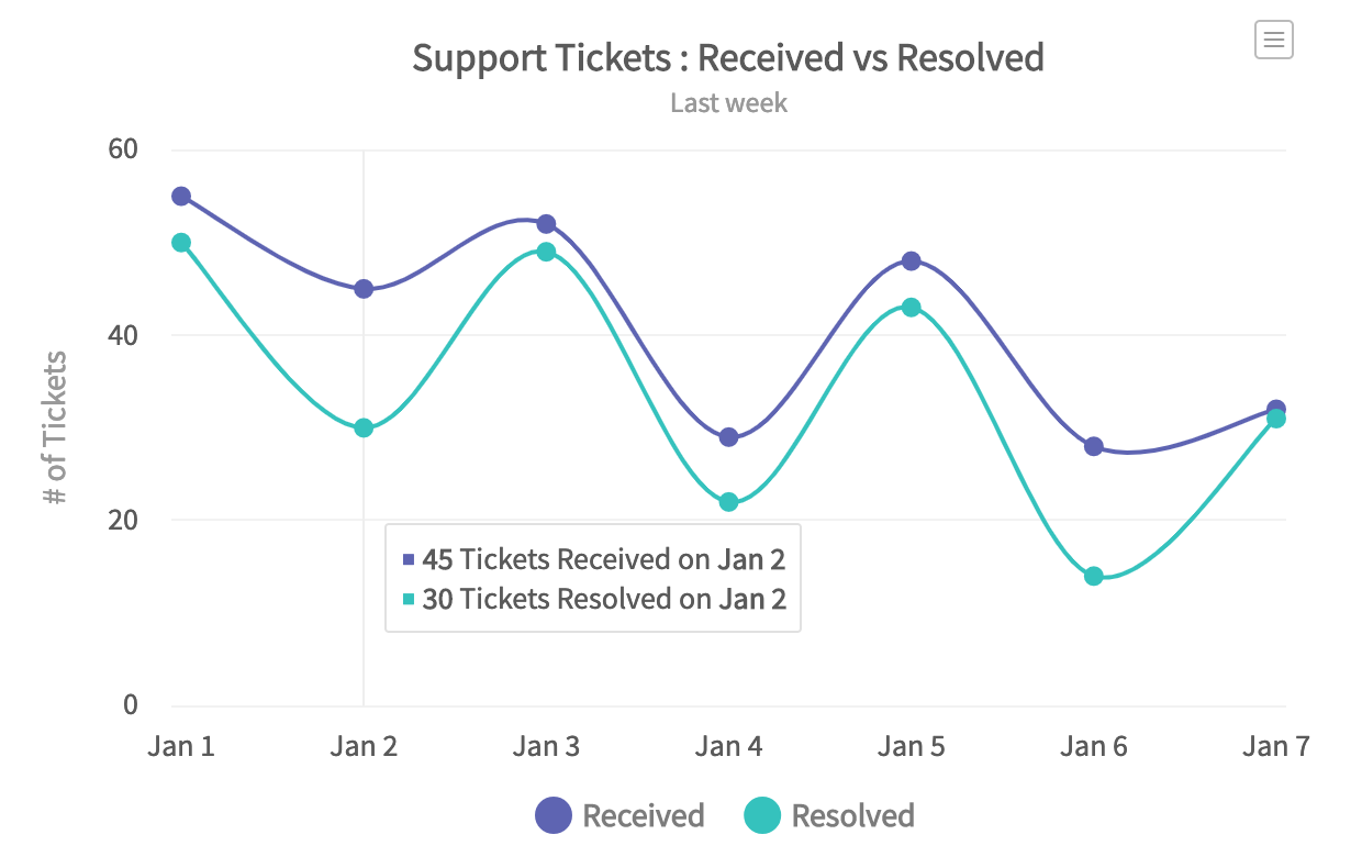
Legend
A legend is a chart element used to display the series name for each dataset, in case of multi-series or combination charts. Legends are used to correlate a data plot to its series name using its color.
- You can customize look and feel of the legend, such as increase/decrease legend icon size, define custom legend icons, enable legend scroll, etc. Learn more about it here.
- You can customize legend position on the chart either to the right or the bottom of the chart. Learn more about it here.
- You can highlight data plots by hovering over corresponding legend item using plot highlight effect feature. Learn more about it here.
Cross line
Cross line is a vertical line/area used as a quick reference for data plots. When you hover over the canvas, a line/area appears highlighting the data plots along with the information in a tooltip.
Data Plot
Data plot refers to the columns of the column chart, lines in a line chart, pie/doughnut slices in a pie/doughnut chart, and so on.
- You can customize the way your data plot looks by modifying colors, gradients and hover effects using attributes. Learn more about their usage here.
Export Menu
Export Menu is hamburger menu that appears on top-right of the chart. You can hover the mouse pointer over it to export the chart using available options.
- You can enable or disable chart export using attribute exportEnabled. Learn more about its usage here.
- You can define export modes like SERVER, CLIENT, or AUTO for chart export. Learn more about them here.
- You can customize the look and feel of the export menu using attributes. Learn more about them here.
- 1 Legend
- 2 Cross line
- 3 Data Plot
- 4 Export Menu