Reference Line
A Reference Line is essentially an arbitrary fixed line (mapped to the Y-axis), which indicates a specific value. It can help you quickly compare any data value against a fixed value represented by a line. For multivariate charts, each chart canvas can have it's own reference line.
The salient features of the reference line:
A label which is by default displayed on the right side of the refernce the line, when you hover on the knob.
A value which is by default displayed on the left side (y-axis) whenyou hover on the reference line.
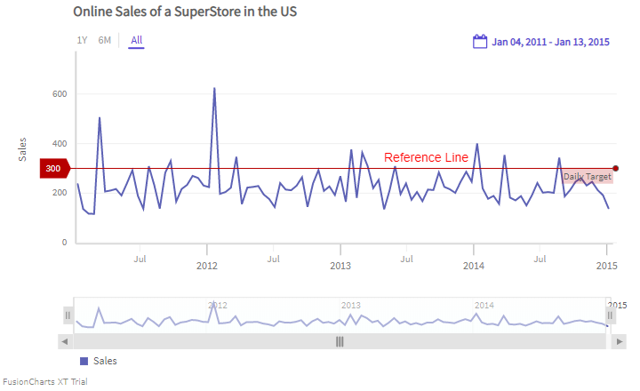
A chart with a reference line is shown below:
In the example given above, a reference line appears, parallel to the time axis. Hover on the knob of the reference line to see the label and the value.
Configure the Reference Line
You can configure the reference line using the following attributes of the referenceLine object:
Use the
labelattribute to set the text of the label.Use the
valueattribute to set the value at which the reference line should appear.
Refer to the code given below:
{
type: 'timeseries',
...
dataSource: {
data: dataStore,
...
// Reference Line
"referenceLine": [{
"label": "Daily Target",
"value": 300
}],
}
}
}Style Definition
You can add CSS styling to set the cosmetic properties for reference line. To set the styling, instead of creating a separate CSS file, you can define the styling using StyleDefinition object.
Now, let's define the styleDefinition object and set the font color in an object. The code is given below:
styleDefinition: {
"colorstyle": {
"fill": "#ff0000"
}
}Once the StyleDefinition is defined, you can refer it for the various components using colorstyle attribute.
The syntax to set the StyleDefintion to the label of the reference line is given below:
"referenceLine": [{
"label": "Daily Target",
"value": 300,
style: {
text: "colorstyle",
marker: "colorstyle"
}
}],In the above code, colorStyle object is called to set the color of the caption.
The chart after applying the above attributes will look like as shown below:
In the above sample, font color of the y-axis label has been changed.