The heat map chart is a specialized chart which uses colors to represent data values in a table. Heat map charts are mostly used to plot large and complex data like employee attendance of a company, a periodic table, tracking investments in the stock market, comparing the performance of different companies and many more. You can set different colors for different levels of data. For example, in a chart measuring the level of weekly attendance of a company you can define colors red, yellow, blue and green to determine bad, average, good and excellent percentage of employee attendance respectively. When the chart is rendered the four levels can be easily distinguished by their respective colors.
Key features of this chart are:
- Data is arranged in a tabular format containing finite number of rows and columns
- Both numeric and non-numeric data can be provided to plot data
- A solid color or a gradient color can be set to display a range of values
- Interactive legend is used to show or hide dataplots
- Any data which is not mapped by the defined color range remains hidden
- There are two types of legends : icon legend and gradient legend
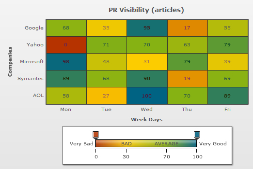
A very basic Heat map chart looks as under:
And the XML for same can be listed as under:
<chart Caption='PR Visibility (articles)' xAxisName='Week Days' yAxisName='Companies' >

	<rows>
		<row id='Yahoo'/>
		<row id='Google'/>
		<row id='Microsoft'/>
		<row id='Symantec'/>
		<row id='AOL'/>

	</rows>

	<columns>

		<column id='MON'/>
		<column id='TUE'/>
		<column id='WED'/>
		<column id='THU'/>
		<column id='FRI'/>

	</columns>

    <dataset>

     <set rowId='Google' columnId='Mon' value='68'/>
     <set rowId='Google' columnId='Tue' value='35'/>
     <set rowId='Google' columnId='Wed' value='95'/>
     <set rowId='Google' columnId='Thu' value='17'/>
     <set rowId='Google' columnId='Fri' value='55'/>

     <set rowId='Yahoo' columnId='Mon' value='0'/>
     <set rowId='Yahoo' columnId='Tue' value='71'/>
     <set rowId='Yahoo' columnId='Wed' value='70'/>
     <set rowId='Yahoo' columnId='Thu' value='63'/>
     <set rowId='Yahoo' columnId='Fri' value='79'/>

     <set rowId='Microsoft' columnId='Mon' value='98'/>
     <set rowId='Microsoft' columnId='Tue' value='48'/>
     <set rowId='Microsoft' columnId='Wed' value='31'/>
     <set rowId='Microsoft' columnId='Thu' value='79'/>
     <set rowId='Microsoft' columnId='Fri' value='39'/>

     <set rowId='Symantec' columnId='Mon' value='89'/>
     <set rowId='Symantec' columnId='Tue' value='68'/>
     <set rowId='Symantec' columnId='Wed' value='90'/>
     <set rowId='Symantec' columnId='Thu' value='19'/>
     <set rowId='Symantec' columnId='Fri' value='69'/>

     <set rowId='AOL' columnId='Mon' value='58'/>
     <set rowId='AOL' columnId='Tue' value='27'/>
     <set rowId='AOL' columnId='Wed' value='100'/>
     <set rowId='AOL' columnId='Thu' value='70'/>
     <set rowId='AOL' columnId='Fri' value='89'/>

   </dataset>

   <colorRange gradient='1' minValue='0' code='B63300' startlabel='Very Bad' endLabel="Very Good">

        <color code ='FFCC00' maxValue='30' label='BAD'/>
        <color code ='87B213' maxValue='70' label='AVERAGE'/>
        <color code ='006384'  maxValue='100' />

   </colorRange>
</chart>
{
 "chart":{
    "caption":"Weekly Performance",
    "subcaption":"In percentage",
    "xaxisname":"Week Days",
    "yaxisname":"Companies"
  },
  "rows":{
    "row":[{
        "id":"Yahoo"
      },
      {
        "id":"Google"
      },
      {
        "id":"Microsoft"
      },
      {
        "id":"Symantec"
      },
      {
        "id":"AOL"
      }
    ]
  },
  "columns":{
    "column":[{
        "id":"MON"
      },
      {
        "id":"TUE"
      },
      {
        "id":"WED"
      },
      {
        "id":"THU"
      },
      {
        "id":"FRI"
      }
    ]
  },
  "dataset":[{
      "data":[{
          "rowid":"Google",
          "columnid":"Mon",
          "value":"68"
        },
        {
          "rowid":"Google",
          "columnid":"Tue",
          "value":"35"
        },
        {
          "rowid":"Google",
          "columnid":"Wed",
          "value":"95"
        },
        {
          "rowid":"Google",
          "columnid":"Thu",
          "value":"17"
        },
        {
          "rowid":"Google",
          "columnid":"Fri",
          "value":"55.98"
        },
        {
          "rowid":"Yahoo",
          "columnid":"Mon",
          "value":"0"
        },
        {
          "rowid":"Yahoo",
          "columnid":"Tue",
          "value":"71"
        },
        {
          "rowid":"Yahoo",
          "columnid":"Wed",
          "value":"70"
        },
        {
          "rowid":"Yahoo",
          "columnid":"Thu",
          "value":"63"
        },
        {
          "rowid":"Yahoo",
          "columnid":"Fri",
          "value":"79"
        },
        {
          "rowid":"Microsoft",
          "columnid":"Mon",
          "value":"98"
        },
        {
          "rowid":"Microsoft",
          "columnid":"Tue",
          "value":"48"
        },
        {
          "rowid":"Microsoft",
          "columnid":"Wed",
          "value":"31"
        },
        {
          "rowid":"Microsoft",
          "columnid":"Thu",
          "value":"79"
        },
        {
          "rowid":"Microsoft",
          "columnid":"Fri",
          "value":"39"
        },
        {
          "rowid":"Symantec",
          "columnid":"Mon",
          "value":"89"
        },
        {
          "rowid":"Symantec",
          "columnid":"Tue",
          "value":"68"
        },
        {
          "rowid":"Symantec",
          "columnid":"Wed",
          "value":"90"
        },
        {
          "rowid":"Symantec",
          "columnid":"Thu",
          "value":"19"
        },
        {
          "rowid":"Symantec",
          "columnid":"Fri",
          "value":"69"
        },
        {
          "rowid":"AOL",
          "columnid":"Mon",
          "value":"58"
        },
        {
          "rowid":"AOL",
          "columnid":"Tue",
          "value":"27"
        },
        {
          "rowid":"AOL",
          "columnid":"Wed",
          "value":"100"
        },
        {
          "rowid":"AOL",
          "columnid":"Thu",
          "value":"70"
        },
        {
          "rowid":"AOL",
          "columnid":"Fri",
          "value":"89"
        }
      ]
    }
  ],
  "colorrange":{
    "gradient":"1",
    "minvalue":"0",
    "code":"AA7F55",
    "startlabel":"Very Bad",
    "endlabel":"Very Good",
    "color":[{
        "code":"FFDFAA",
        "maxvalue":"30",
        "label":"BAD"
      },
      {
        "code":"C0DCC0",
        "maxvalue":"70",
        "label":"AVERAGE"
      },
      {
        "code":"007FAA",
        "maxvalue":"100"
      }
    ]
  }
}
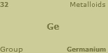
The above displayed heat map chart is derived using numeric based mapping. You can also render a heat map chart with non-numeric data.This type of a heat map chart is known as a "Category based heat map chart". A sample chart is shown below:
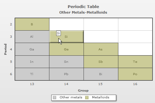
The data for the above chart is given below:
<chart caption='Periodic Table' subCaption='Other Metals-Metalloids' xAxisName='Group' yAxisName='Period' canvasBgColor='FFFFFF' mapByCategory='1' >

<colorRange>

<color code ='CCCCCC' label='Other metals'/>
<color code ='CCCC99' label='Metalloids'/>

</colorRange>

<dataset>

  <set columnId='13' rowId='2' colorRangeLabel='Metalloids' displayValue='B' color='7F7F00'/>
  <set columnId='13' rowId='3' colorRangeLabel='Other metals' displayValue='Al' color='7FBFAA'/>
  <set columnId='14' rowId='3' colorRangeLabel='Metalloids' displayValue='Si'/>
  <set columnId='13' rowId='4' colorRangeLabel='Other metals' displayValue='Ga'/>
  <set columnId='14' rowId='4' colorRangeLabel='Metalloids' displayValue='Ge'/>
  <set columnId='15' rowId='4' colorRangeLabel='Metalloids' displayValue='As'/>
  <set columnId='13' rowId='5' colorRangeLabel='Other metals' displayValue='In'/>
  <set columnId='14' rowId='5' colorRangeLabel='Other metals' displayValue='Sn'/>
  <set columnId='15' rowId='5' colorRangeLabel='Metalloids' displayValue='Sb'/>
  <set columnId='16' rowId='5' colorRangeLabel='Metalloids' displayValue='Te'/>
  <set columnId='13' rowId='6' colorRangeLabel='Other metals' displayValue='Tl'/>
  <set columnId='14' rowId='6' colorRangeLabel='Other metals' displayValue='Pb'/>
  <set columnId='15' rowId='6' colorRangeLabel='Other metals' displayValue='Bi'/>
  <set columnId='16' rowId='6' colorRangeLabel='Metalloids' displayValue='Po'/>

</dataset>

</chart>
{
  "chart":{
    "caption":"Periodic Table",
    "subcaption":"Other Metals-Metalloids",
    "xaxisname":"Group",
    "yaxisname":"Period",
    "canvasbgcolor":"FFFFFF",
    "mapbycategory":"1",
    "showcolumnidintooltext":"1",
    "showrowidintooltext":"1"
  },
  "colorrange":{
    "color":[{
        "code":"CCCCCC",
        "label":"Other metals"
      },
      {
        "code":"CCCC99",
        "label":"Metalloids"
      }
    ]
  },
  "dataset":[{
      "data":[{
          "columnid":"13",
          "rowid":"2",
          "colorRangeLabel":"Metalloids",
          "displayvalue":"B",
          "color":"7F7F00"
        },
        {
          "columnid":"13",
          "rowid":"3",
          "colorRangeLabel":"Other metals",
          "displayvalue":"Al",
          "color":"7FBFAA"
        },
        {
          "columnid":"14",
          "rowid":"3",
          "colorRangeLabel":"Metalloids",
          "displayvalue":"Si"
        },
        {
          "columnid":"13",
          "rowid":"4",
          "colorRangeLabel":"Other metals",
          "displayvalue":"Ga"
        },
        {
          "columnid":"14",
          "rowid":"4",
          "colorRangeLabel":"Metalloids",
          "displayvalue":"Ge"
        },
        {
          "columnid":"15",
          "rowid":"4",
          "colorRangeLabel":"Metalloids",
          "displayvalue":"As"
        },
        {
          "columnid":"13",
          "rowid":"5",
          "colorRangeLabel":"Other metals",
          "displayvalue":"In"
        },
        {
          "columnid":"14",
          "rowid":"5",
          "colorRangeLabel":"Other metals",
          "displayvalue":"Sn"
        },
        {
          "columnid":"15",
          "rowid":"5",
          "colorRangeLabel":"Metalloids",
          "displayvalue":"Sb"
        },
        {
          "columnid":"16",
          "rowid":"5",
          "colorRangeLabel":"Metalloids",
          "displayvalue":"Te"
        },
        {
          "columnid":"13",
          "rowid":"6",
          "colorRangeLabel":"Other metals",
          "displayvalue":"Tl"
        },
        {
          "columnid":"14",
          "rowid":"6",
          "colorRangeLabel":"Other metals",
          "displayvalue":"Pb"
        },
        {
          "columnid":"15",
          "rowid":"6",
          "colorRangeLabel":"Other metals",
          "displayvalue":"Bi"
        },
        {
          "columnid":"16",
          "rowid":"6",
          "colorRangeLabel":"Metalloids",
          "displayvalue":"Po"
        }
      ]
    }
  ]
}
For more details refer to the Category based mapping page.
In a heat map chart you can display two types of legends:
Gradient legend
For more details refer to the Gradient legend page.
Icon legend
For more details refer to the Icon legends page.
Heat map chart also allows to display the data values in percentage. A chart with percentage values will look as under:
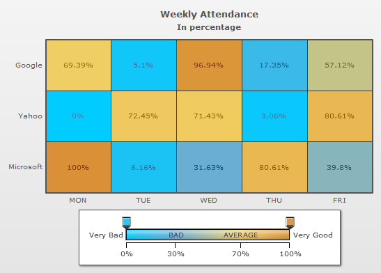
For more details refer to the Gradient legend page.
Each cell in a heat map chart allows you to render 5 labels within itself. You can configure each cell of a heat map chart to show labels in 5 locations of the cell - center, top-left, top-right, bottom-left and bottom-right as shown in the chart below:
For more details refer to the Labels page.
In the following pages we will discuss how to create a simple heat map chart and proceed with detailed discussion of all the features stated above.