In a Heat map chart a dataplot can show multiple labels in different positions. For example, you can display labels at the center and the four corners of a dataplot. The attributes that help in achieving this, are discussed below:
| Attribute Name | Type | Description | Screenshot |
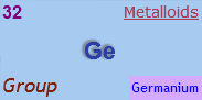
| Value | Numeric | Displays any numeric value at the center of the dataplot. All number formatting features will be applicable if this attribute is used. The example screenshot shows the value 32. |  |
| displayValue | Numeric/String | Displays any numeric or string value at the center of the dataplot. This attribute overwrites the data of the value attribute when both are present. Number formatting features are not applicable on the value of this attribute. It is set to 'Ge' as displayed in the image beside. |  |
| tlLabel | Numeric/String | Displays a label on the top left corner of a dataplot. It is set with the value '32' as displayed in the image beside. | 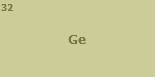 |
| trLabel | Numeric/String | Displays a label on the top right corner of a dataplot. It is set to 'Metalloids' as displayed in the image beside. | 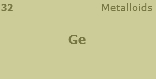 |
| blLabel | Numeric/String | Displays a label on the bottom left corner of the dataplot. It is set to 'Group' as displayed in the image beside. | 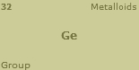 |
| brLabel | Numeric/String | Displays the label on the bottom right corner of the dataplot. It is set to 'Germanium' as displayed in the image beside. | 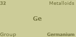 |
If you do not want all the text on your chart to have similar font properties, you can use Styles to define individual font properties for different text on the chart including all the labels. Using Styles, you can specify a different font name, size, color, background color and border color and also make the text bold or italicized.
Shown below are changes made in the basic font properties of all the data labels and a shadow effect added using Styles.
The data for the above Style changes is given below:
<chart caption='Periodic Table' subCaption='Other Metals-Metalloids' xAxisName='Group' yAxisName='Period' canvasBgColor='FFFFFF' mapByCategory='1'>
...
<styles>
  <definition>
    <style name='tlLabelFont' type='font' font='Arial' size='16' color='800080' bold='1'/>
    <style name='trLabelFont' type='font' font='verdana' size='14' color='AA3F55' underline='1'/>
    <style name='blLabelFont' type='font' font='trebuchet MS' size='18' color='7F1F00' italic='1'/>
    <style name='brLabelFont' type='font' font='trebuchet MS' size='12' color='0000FF' bgcolor='D4ABFF'/>
    <style name='datavaluesFont' type='font' font='Arial' size='22' color='2A3FAA' bold='1'/>
    <style name='datavaluesShadow' type='shadow' strength='2' quality='1'/>
  </definition>
  <application>
    <apply toObject='tldatavalues' styles='tlLabelFont'/>
    <apply toObject='trdatavalues' styles='trLabelFont'/>
    <apply toObject='bldatavalues' styles='blLabelFont'/>
    <apply toObject='brdatavalues' styles='brLabelFont'/>
    <apply toObject='datavalues' styles='datavaluesFont'/>
    <apply toObject='datavalues' styles='datavaluesShadow'/>
  </application>
</styles>

</chart>
{
  "chart":{
    "caption":"Periodic Table",
    "subcaption":"Other Metals-Metalloids",
    "xaxisname":"Group",
    "yaxisname":"Period",
    "canvasbgcolor":"FFFFFF",
    "mapbycategory":"1"
  },
...
 "styles":{
    "definition":[{
        "name":"tlLabelFont",
        "type":"font",
        "font":"Arial",
        "size":"16",
        "color":"800080",
        "bold":"1"
      },
      {
        "name":"trLabelFont",
        "type":"font",
        "font":"verdana",
        "size":"14",
        "color":"AA3F55",
        "underline":"1"
      },
      {
        "name":"blLabelFont",
        "type":"font",
        "font":"trebuchet MS",
        "size":"18",
        "color":"7F1F00",
        "italic":"1"
      },
      {
        "name":"brLabelFont",
        "type":"font",
        "font":"trebuchet MS",
        "size":"12",
        "color":"0000FF",
        "bgcolor":"D4ABFF"
      },
      {
        "name":"datavaluesFont",
        "type":"font",
        "font":"Arial",
        "size":"22",
        "color":"2A3FAA",
        "bold":"1"
      },
      {
        "name":"datavaluesShadow",
        "type":"shadow",
        "strength":"2",
        "quality":"1"
      }
    ],
    "application":[{
        "toobject":"tldatavalues",
        "styles":"tlLabelFont"
      },
      {
        "toobject":"trdatavalues",
        "styles":"trLabelFont"
      },
      {
        "toobject":"bldatavalues",
        "styles":"blLabelFont"
      },
      {
        "toobject":"brdatavalues",
        "styles":"brLabelFont"
      },
      {
        "toobject":"datavalues",
        "styles":"datavaluesFont"
      },
      {
        "toobject":"datavalues",
        "styles":"datavaluesShadow"
      }
    ]
  }
}By default, Heat map chart shows the value or display value as tool tip for that data item. It also includes all the values provided through trLabel, tlLabel, brlabel and bllabel attributes along with the values of trType, tlType, brType and blType attributes. A screenshot displaying the tool tip with all the mentioned values is given below:
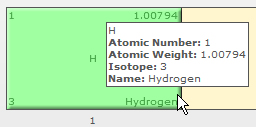
The data for the above screenshot is given below:
<chart
tlType='Atomic Number' brType='Name' blType='Isotope' trType='Atomic Weight' mapByCategory='1'
caption='Periodic Table' subCaption='Other Metals-Metalloids' canvasBgColor='FFF5CE'
xAxisName='Group' yAxisName='Period' canvasBgColor='FFFFFF'
canvasBorderThickness='1'>
...
  <dataset>

    <set columnId='1' rowId='1'  colorRangeLabel='Other nonmetals' tlLabel='1' brLabel='Hydrogen' trLabel='1.00794' blLabel='3' displayValue='H' />
...

  </dataset>

</chart>
{
  "chart":{
    "tltype":"Atomic Number",
    "brtype":"Name",
    "bltype":"Isotope",
    "trtype":"Atomic Weight",
    "caption":"Periodic Table",
    "mapbycategory":"1",
    "subcaption":"Other Metals-Metalloids",
    "canvasbgcolor":"FFF5CE",
    "xaxisname":"Group",
    "yaxisname":"Period",
    "canvasborderthickness":"1"
  },
  ...
   "dataset":[{
      "data":[{
          "columnid":"1",
          "rowid":"1",
          "colorrangelabel":"Other nonmetals",
          "tllabel":"1",
          "brlabel":"Hydrogen",
          "trlabel":"1.00794",
          "bllabel":"3",
          "displayvalue":"H"
        },
...
]
    }
  ]
}
You can also customize the information displayed in the tooltip. To do this, you need to use the attribute tooltext through the <set> element. The value of the attribute should be the information that you want to provide. A screenshot displaying customized tool tip is shown below:
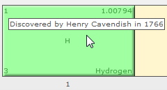
The data for the above screenshot is given below:
<chart caption='Periodic Table' subCaption='Other Metals-Metalloids' canvasBgColor='FFF5CE'  xAxisName='Group' yAxisName='Period' canvasBgColor='FFFFFF' mapByCategory='1'
tlType='Atomic Number' brType='Name' blType='Isotope' trType='Atomic Weight'
canvasBorderThickness='1'>
...
  <dataset>

    <set tooltext='Discovered by Henry Cavendish in 1766' columnId='1' rowId='1'  colorRangeLabel='Other nonmetals' tlLabel='1' brLabel='Hydrogen' trLabel='1.00794' blLabel='3' displayValue='H'/>
...

  </dataset>

</chart>
{
  "chart":{
    "caption":"Periodic Table",
    "subcaption":"Other Metals-Metalloids",
    "canvasbgcolor":"FFF5CE",
    "xaxisname":"Group",
    "yaxisname":"Period",
    "mapbycategory":"1",
    "tltype":"Atomic Number",
    "brtype":"Name",
    "bltype":"Isotope",
    "trtype":"Atomic Weight",
    "canvasborderthickness":"1"
  },
  ...
   "dataset":[{
      "data":[{
          "columnid":"1",
          "rowid":"1",
          "colorrangelabel":"Other nonmetals",
          "tllabel":"1",
          "brlabel":"Hydrogen",
          "trlabel":"1.00794",
          "bllabel":"3",
          "displayvalue":"H",
          "tooltext":"Discovered by Henry Cavendish in 1766"
        },
...
  ]
    }
  ]
}