
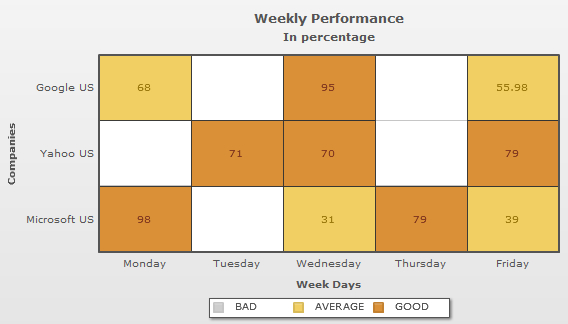
Icon legend allows you to display single color icons for the numeric ranges. If the gradient attribute is not present or is set to '0' in the <colorRange> element, the chart will display the icon legend. Icon legend consists of legend items each of which has a rectangular icon reflecting a single color and a label that gives a name to the legend item. In the above image we see 3 items, like, BAD, AVERAGE and GOOD.
The data for the above displayed icon legend is discussed below:
<chart Caption='Weekly Attendance' subCaption='In percentage' xAxisLabel='Week Days' yAxisLabel='Companies' >
...
<colorRange>
	<color code ='66ADD9' minValue='0' maxValue='30' label='BAD'/>
	<color code ='F2CF63' minValue='30' maxValue='70' label='AVERAGE'/>
	<color code ='D99036' minValue='70' maxValue='100' label='GOOD'/>
</colorRange>
</chart>
{
  "chart":{
    "caption":"Weekly Attendance",
    "subcaption":"In percentage",
    "xaxislabel":"Week Days",
    "yaxislabel":"Companies"
  },
  ...
  "colorrange":{
    "color":[{
        "code":"66ADD9",
        "minvalue":"0",
        "maxvalue":"30",
        "label":"BAD"
      },
      {
        "code":"F2CF63",
        "minvalue":"30",
        "maxvalue":"70",
        "label":"AVERAGE"
      },
      {
        "code":"D99036",
        "minvalue":"70",
        "maxvalue":"100",
        "label":"GOOD"
      }
    ]
  }
}
In the above data, the lower limit (minValue) and the upper limit (maxValue) for the numeric ranges are defined in each of the <color> elements. The colors for each numeric ranges is also specified in the <color> elements by the code attribute. The labels for the numeric ranges are mentioned by the label attribute through the <color> elements. If the labels for the numeric ranges are not specified, the chart will display the range in place of the labels. For example, 0-30, 30-70 and 70-100.
Icon legend is also interactive. You can click on a legend item to hide or show all the cells mapped with the color range represented by the legend item. For example, you may want to hide the numeric range 0-30. Click on the icon labeled as "bad". The chart will show blank dataplots for the numbers residing in that range. Any data value not present in that range will be visible. A sample chart is shown below:
In icon legend you can use the mapbyPercent attribute of the <colorRange> element and display the data values in percentage. In percentage mapping you need to create color ranges that make a complete range from 0 to 100. This ensures all data values to be shown.
A sample chart with percent values is displayed below:
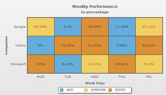
The data for the above given chart is shown below:
<chart Caption='Weekly Attendance' subCaption='In percentage' xAxisLabel='Week Days' yAxisLabel='Companies' >
<rows>
   <row id='Google'/>
   <row id='Yahoo'/>
   <row id='Microsoft'/>
</rows>

<columns>
   <column id='MON'/>
   <column id='TUE'/>
   <column id='WED'/>
   <column id='THU'/>
   <column id='FRI'/>
</columns>

<dataset>

   <set rowId='Yahoo' columnId='Mon' value='0'/>
   <set rowId='Yahoo' columnId='Tue' value='71'/>
   <set rowId='Yahoo' columnId='Wed' value='70'/>
   <set rowId='Yahoo' columnId='Thu' value='3'/>
   <set rowId='Yahoo' columnId='Fri' value='79'/>

   <set rowId='Google' columnId='Mon' value='68'/>
   <set rowId='Google' columnId='Tue' value='5'/>
   <set rowId='Microsoft' columnId='Wed' value='31'/>
   <set rowId='Microsoft' columnId='Thu' value='79'/>
   <set rowId='Google' columnId='Fri' value='55.98'/>

   <set rowId='Microsoft' columnId='Mon' value='98'/>
   <set rowId='Microsoft' columnId='Tue' value='8'/>
   <set rowId='Google' columnId='Wed' value='95'/>
   <set rowId='Google' columnId='Thu' value='17'/>
   <set rowId='Microsoft' columnId='Fri' value='39'/>
</dataset>
 <colorRange mapbyPercent='1'>

    <color code ='66ADD9' minValue='0' maxValue='30' label='BAD'/>
    <color code ='F2CF63' minValue='30' maxValue='70' label='AVERAGE'/>
    <color code ='D99036' minValue='70' maxValue='100' label='GOOD'/>

   </colorRange>
</chart>
{
  "chart":{
    "caption":"Weekly Attendance",
    "subcaption":"In percentage",
    "xaxislabel":"Week Days",
    "yaxislabel":"Companies"
  },
  "rows":{
    "row":[{
        "id":"Google"
      },
      {
        "id":"Yahoo"
      },
      {
        "id":"Microsoft"
      }
    ]
  },
  "columns":{
    "column":[{
        "id":"MON"
      },
      {
        "id":"TUE"
      },
      {
        "id":"WED"
      },
      {
        "id":"THU"
      },
      {
        "id":"FRI"
      }
    ]
  },
  "dataset":[{
      "data":[{
          "rowid":"Yahoo",
          "columnid":"Mon",
          "value":"0"
        },
        {
          "rowid":"Yahoo",
          "columnid":"Tue",
          "value":"71"
        },
        {
          "rowid":"Yahoo",
          "columnid":"Wed",
          "value":"70"
        },
        {
          "rowid":"Yahoo",
          "columnid":"Thu",
          "value":"3"
        },
        {
          "rowid":"Yahoo",
          "columnid":"Fri",
          "value":"79"
        },
        {
          "rowid":"Google",
          "columnid":"Mon",
          "value":"68"
        },
        {
          "rowid":"Google",
          "columnid":"Tue",
          "value":"5"
        },
        {
          "rowid":"Microsoft",
          "columnid":"Wed",
          "value":"31"
        },
        {
          "rowid":"Microsoft",
          "columnid":"Thu",
          "value":"79"
        },
        {
          "rowid":"Google",
          "columnid":"Fri",
          "value":"55.98"
        },
        {
          "rowid":"Microsoft",
          "columnid":"Mon",
          "value":"98"
        },
        {
          "rowid":"Microsoft",
          "columnid":"Tue",
          "value":"8"
        },
        {
          "rowid":"Google",
          "columnid":"Wed",
          "value":"95"
        },
        {
          "rowid":"Google",
          "columnid":"Thu",
          "value":"17"
        },
        {
          "rowid":"Microsoft",
          "columnid":"Fri",
          "value":"39"
        }
      ]
    }
  ],
  "colorrange":{
    "mapbypercent":"1",
    "color":[{
        "code":"66ADD9",
        "minvalue":"0",
        "maxvalue":"30",
        "label":"BAD"
      },
      {
        "code":"F2CF63",
        "minvalue":"30",
        "maxvalue":"70",
        "label":"AVERAGE"
      },
      {
        "code":"D99036",
        "minvalue":"70",
        "maxvalue":"100",
        "label":"GOOD"
      }
    ]
  }
}