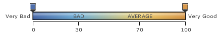
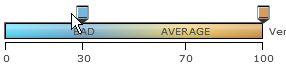
Gradient legend is a pane of blended colors derived from the <colorRange> definitions. A linear scale is drawn with two drag-able pointers. Each color defined for a numeric range blends with the next color, thus forming a gradient strip.
Each point on the gradient scale represents a unique color and value. So, all different values in the chart will appear in unique colors as per the position on the gradient scale. The data for the above displayed gradient legend is given below:
<chart Caption='Weekly Attendance' subCaption='In percentage' xAxisLabel='Week Days' yAxisLabel='Companies' >
...
<colorRange mapBypercent='0' gradient='1' minValue='0' code='385DA6' startlabel='Very Bad' endLabel='Very Good'>
		<color code ='66ADD9'  maxValue='30' label='bad'/>
		<color code ='F2CF63'  maxValue='70' label='average'/>
		<color code ='D99036'  maxValue='100'/>
</colorRange>
</chart>
{
  "chart":{
    "caption":"Weekly Attendance",
    "subcaption":"In percentage",
    "xaxislabel":"Week Days",
    "yaxislabel":"Companies"
  },
  ...
  "colorrange":{
    "mapbypercent":"0",
    "gradient":"1",
    "minvalue":"0",
    "code":"385DA6",
    "startlabel":"Very Bad",
    "endlabel":"Very Good",
    "color":[{
        "code":"66ADD9",
        "maxvalue":"30",
        "label":"bad"
      },
      {
        "code":"F2CF63",
        "maxvalue":"70",
        "label":"average"
      },
      {
        "code":"D99036",
        "maxvalue":"100"
      }
    ]
  }
}
In the above data, the attributes used to define the numeric range and to set the colors are:
- gradient attribute in the <colorRange> element is set to '1' to show gradient legend
- minValue and maxValue attribute in the <colorRange> element attribute is used to set the upper limits and the intervals in the gradient scale of each numeric range through the <color> elements
- code attribute in the <colorRange> element is used to specify the color at the beginning of the gradient scale. The same attribute is used to set the colors for each numeric range through the <color> elements
In the <colorRange> element we are defining the start value of the numeric range or the gradient scale as '0'. The starting color for the gradient scale is set as 385DA6 (deep blue).
In the first <color> element, the code attribute is used to define the second color in the gradient scale which blends with the first and the third color. The color applied is 66ADD9 (light blue). The maxValue attribute is used to set the upper limit of the first numeric range. So, any number greater than or equals to 0 and less than 30 will appear in the colors having a blend of deep blue and light blue. The blending will depend on the numeric value and its position on the gradient scale.
In the second <color> element, the upper limit is set to '70' and '30' becomes the lower limit for the second numeric range. The color defined for the range is F2CF63 (yellow).
In the last <color> element, the upper limit of the gradient scale and the last numeric range is set to '100' and '70' becomes the lower limit. The color set for the range is D99036 (orange).
The table below shows the equation of the above explanation:
| Numeric Range | Label | Color Hex code |
| 0 <= value < 30 | Bad | 66ADD9 (Light Blue) |
| 30 <= value < 70 | Average | F2CF63 (Yellow) |
| 70 <= value <= 100 | Good | D99036 (Orange) |
The gradient scale shows a tick mark with labels for each upper and lower limit. The labels for the upper and lower limit of the gradient scale are set using the startLabel and endLabel attributes in the <colorRange> element. The labels for the numeric ranges are set using the label attribute through the <color> elements. The label for the last numeric range is taken from the endLabel attribute.
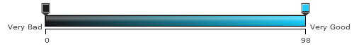
You can also customize the gradient legend as per your requirement. For example, a single color gradient legend can also be used. The XML data is shown below:
<chart Caption='Weekly Attendance' subCaption='In percentage' xAxisLabel='Week Days' yAxisLabel='Companies' >
...
  <colorRange mapBypercent='0' gradient='1' code='00CCFF' startlabel='Very Bad' endLabel='Very Good'/>

</chart>
{
  "chart":{
    "caption":"Weekly Attendance",
    "subcaption":"In percentage",
    "xaxislabel":"Week Days",
    "yaxislabel":"Companies"
  },
...
  "colorrange":{
    "mapbypercent":"0",
    "gradient":"1",
    "code":"00CCFF",
    "startlabel":"Very Bad",
    "endlabel":"Very Good"
  }
}
In this instance, only one color is used to draw the gradient scale. So, the scale will appear in the darkest shade of the color (lower limit) to the brightest shade of the color (upper limit). In this example, the chart will automatically decide the numeric range taking the lowest data value present in the <set> elements as the lower limit and the highest data value as the upper limit. There is no scope of setting the upper limit using the maxValue attribute but you can use the minValue attribute in the <colorRange> element to set the lower limit of the numeric range. The legend will look like as under:
Hide or Show data values
Gradient legend is highly interactive and allows you to show a certain range of numbers and hide rest of the data plots or cell. Click and hold the cursor on any of the scale pointers and drag it to a particular point on the scale to set the numeric range that is to be shown. For example, in a numeric range 0-100, you may want to show the numbers between 30 and 70. To do this, click on the lower limit pointer and drag it to 30 and release. Then, click on the upper limit pointer and drag it to 70 and release. The chart will only display the dataplots residing in the range between 30 and 70. The rest of the numbers will hide. A chart with hidden dataplots using the interactive legend is shown below:
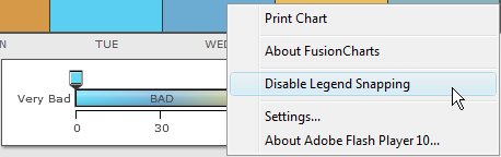
Snap to tick
All the lower and upper limits in the gradient scale are marked with ticks. Sometime, it gets very difficult to place the pointers exactly on the ticks. The chart allows you to "Snap to tick" for gradient legend to ease the process. "Snap to tick" allows the pointer to get placed automatically on the tick if it is released on a position close to the tick. For example, a pointer will automatically get placed on the tick mark of the position 30 if it is released on 30.42 or 29.78. To turn this feature off, you can set the snapLegendPointers attribute to '0' or right click on the chart and click on "Disable legend snapping". You can also set the snapping range of the pointers by using the legendSnapRange attribute. The value of this attribute is calculated in percentage with respect to the total numeric range. The maximum value that can be used for the attribute is 5.
Let us see an example of how to set the snapping range of the legend pointers. The data is show below:
<chart Caption='Weekly Attendance' subCaption='In percentage' xAxisLabel='Week Days' yAxisLabel='Companies' legendSnapRange='5' >
...
<colorRange mapBypercent='0' gradient='1' minValue='0' code='385DA6' startlabel='Very Bad' endLabel='Very Good'>
		<color code ='66ADD9'  maxValue='30' label='bad'/>
		<color code ='F2CF63'  maxValue='70' label='average'/>
		<color code ='D99036'  maxValue='100'/>
</colorRange>
</chart>
{
"chart":{
"caption":"Weekly Attendance",
"subcaption":"In percentage",
"xaxislabel":"Week Days",
"yaxislabel":"Companies",
"legendSnapRange":"5"
},
...
"colorrange":{
"mapbypercent":"0",
"gradient":"1",
"minvalue":"0",
"code":"385DA6",
"startlabel":"Very Bad",
"endlabel":"Very Good",
"color":[{
"code":"66ADD9",
"maxvalue":"30",
"label":"bad"
},
{
"code":"F2CF63",
"maxvalue":"70",
"label":"average"
},
{
"code":"D99036",
"maxvalue":"100"
}
]
}
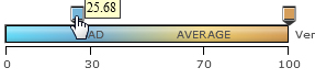
}In the above data, the attribute legendSnapRange is set to '5'. The numeric range defined in the <colorRange> element is 0-100. Hence, the snapping range of the gradient pointers is 5. In the images below we are snapping the lower limit pointer on the tick mark of 30. The first image shows that the pointer is released on 25.68. The second image shows that the pointer is snapped on the tick mark of 30.
 |
 |
To disable this feature right click on the chart and select "Disable Legend Snapping".
You can also disable this feature from the XML/JSON data by using the snapLegendPointers attribute. The data is shown below:
<chart Caption='Weekly Attendance' subCaption='In percentage' xAxisLabel='Week Days' yAxisLabel='Companies' snapLegendPointers='0' >
...
</chart>
{
  "chart":{
    "caption":"Weekly Attendance",
    "subcaption":"In percentage",
    "xaxislabel":"Week Days",
    "yaxislabel":"Companies",
    "snapLegendPointers":"0"
  },
}
Percentage mapping is a feature that allows the chart to display the data values in percentage. To display the data values in percentage mapbyPercent attribute needs to be set to '1' in the <colorRange> element. In percentage mapping, the lowest data value from the <set> elements is considered to be the lower limit and will be displayed as 0% and the highest data value is considered as the upper limit displayed as 100%. In percent mapping, you need to create color ranges with 0 as the lower limit and 100 as the upper limit.
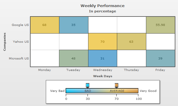
A sample chart with percentage mapping is shown below:
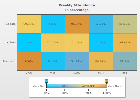
The data for the above chart is given below:
<chart Caption='Weekly Attendance' subCaption='In percentage' xAxisLabel='Week Days' yAxisLabel='Companies' >
<rows>
   <row id='Google'/>
   <row id='Yahoo'/>
   <row id='Microsoft'/>
</rows>

<columns>
   <column id='MON'/>
   <column id='TUE'/>
   <column id='WED'/>
   <column id='THU'/>
   <column id='FRI'/>
</columns>

<dataset>

   <set rowId='Yahoo' columnId='Mon' value='0'/>
   <set rowId='Yahoo' columnId='Tue' value='71'/>
   <set rowId='Yahoo' columnId='Wed' value='70'/>
   <set rowId='Yahoo' columnId='Thu' value='3'/>
   <set rowId='Yahoo' columnId='Fri' value='79'/>

   <set rowId='Google' columnId='Mon' value='68'/>
   <set rowId='Google' columnId='Tue' value='5'/>
   <set rowId='Microsoft' columnId='Wed' value='31'/>
   <set rowId='Microsoft' columnId='Thu' value='79'/>
   <set rowId='Google' columnId='Fri' value='55.98'/>

   <set rowId='Microsoft' columnId='Mon' value='98'/>
   <set rowId='Microsoft' columnId='Tue' value='8'/>
   <set rowId='Google' columnId='Wed' value='95'/>
   <set rowId='Google' columnId='Thu' value='17'/>
   <set rowId='Microsoft' columnId='Fri' value='39'/>
</dataset>
 <colorRange mapbyPercent='1' gradient='1' minValue='0' code='00CCFF' startlabel='Very Bad' endLabel="Very Good">

    <color code ='66ADD9'  maxValue='30' label='BAD'/>
    <color code ='F2CF63'  maxValue='70' label='AVERAGE'/>
    <color code ='D99036'  maxValue='100' />

   </colorRange>
</chart>
{
  "chart":{
    "caption":"Weekly Attendance",
    "subcaption":"In percentage",
    "xaxislabel":"Week Days",
    "yaxislabel":"Companies"
  },
  "rows":{
    "row":[{
        "id":"Google"
      },
      {
        "id":"Yahoo"
      },
      {
        "id":"Microsoft"
      }
    ]
  },
  "columns":{
    "column":[{
        "id":"MON"
      },
      {
        "id":"TUE"
      },
      {
        "id":"WED"
      },
      {
        "id":"THU"
      },
      {
        "id":"FRI"
      }
    ]
  },
  "dataset":[{
      "data":[{
          "rowid":"Yahoo",
          "columnid":"Mon",
          "value":"0"
        },
        {
          "rowid":"Yahoo",
          "columnid":"Tue",
          "value":"71"
        },
        {
          "rowid":"Yahoo",
          "columnid":"Wed",
          "value":"70"
        },
        {
          "rowid":"Yahoo",
          "columnid":"Thu",
          "value":"3"
        },
        {
          "rowid":"Yahoo",
          "columnid":"Fri",
          "value":"79"
        },
        {
          "rowid":"Google",
          "columnid":"Mon",
          "value":"68"
        },
        {
          "rowid":"Google",
          "columnid":"Tue",
          "value":"5"
        },
        {
          "rowid":"Microsoft",
          "columnid":"Wed",
          "value":"31"
        },
        {
          "rowid":"Microsoft",
          "columnid":"Thu",
          "value":"79"
        },
        {
          "rowid":"Google",
          "columnid":"Fri",
          "value":"55.98"
        },
        {
          "rowid":"Microsoft",
          "columnid":"Mon",
          "value":"98"
        },
        {
          "rowid":"Microsoft",
          "columnid":"Tue",
          "value":"8"
        },
        {
          "rowid":"Google",
          "columnid":"Wed",
          "value":"95"
        },
        {
          "rowid":"Google",
          "columnid":"Thu",
          "value":"17"
        },
        {
          "rowid":"Microsoft",
          "columnid":"Fri",
          "value":"39"
        }
      ]
    }
  ],
  "colorrange":{
    "mapbypercent":"1",
    "gradient":"1",
    "minvalue":"0",
    "code":"00CCFF",
    "startlabel":"Very Bad",
    "endlabel":"Very Good",
    "color":[{
        "code":"66ADD9",
        "maxvalue":"30",
        "label":"BAD"
      },
      {
        "code":"F2CF63",
        "maxvalue":"70",
        "label":"AVERAGE"
      },
      {
        "code":"D99036",
        "maxvalue":"100"
      }
    ]
  }
}