Category based mapping is done by defining several color categories or ranges and setting a specific color category to a cell. You do not need to have numeric values to map to value ranges. Instead, a color-range label is used to map a cell with a color category. A color category is defined using the label attribute in the <color> element. This label is mapped in the <set> element using colorRangeLabel attribute. Like this you can assign color to the cells. You can always set a numeric or non-numeric values of each cell to display information.
To show a simple example let us create a part of the periodic table showing only the Metalloids and Other Metals. The chart will look as under:
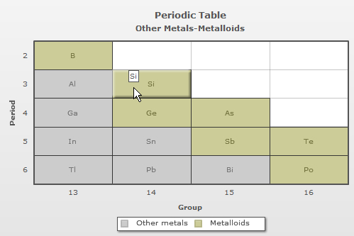
The data for the chart would be:
<chart caption='Periodic Table' subCaption='Other Metals-Metalloids' xAxisName='Group' yAxisName='Period' canvasBgColor='FFFFFF' mapByCategory='1'>

<colorRange>

  <color code ='CCCCCC' label='Other metals'/>
  <color code ='CCCC99' label='Metalloids'/>

</colorRange>

<dataset>

  <set columnId='13' rowId='2' colorRangeLabel='Metalloids' displayValue='B'/>
  <set columnId='13' rowId='3' colorRangeLabel='Other metals' displayValue='Al'/>
  <set columnId='14' rowId='3' colorRangeLabel='Metalloids' displayValue='Si'/>
  <set columnId='13' rowId='4' colorRangeLabel='Other metals' displayValue='Ga'/>
  <set columnId='14' rowId='4' colorRangeLabel='Metalloids' displayValue='Ge'/>
  <set columnId='15' rowId='4' colorRangeLabel='Metalloids' displayValue='As'/>
  <set columnId='13' rowId='5' colorRangeLabel='Other metals' displayValue='In'/>
  <set columnId='14' rowId='5' colorRangeLabel='Other metals' displayValue='Sn'/>
  <set columnId='15' rowId='5' colorRangeLabel='Metalloids' displayValue='Sb'/>
  <set columnId='16' rowId='5' colorRangeLabel='Metalloids' displayValue='Te'/>
  <set columnId='13' rowId='6' colorRangeLabel='Other metals' displayValue='Tl'/>
  <set columnId='14' rowId='6' colorRangeLabel='Other metals' displayValue='Pb'/>
  <set columnId='15' rowId='6' colorRangeLabel='Other metals' displayValue='Bi'/>
  <set columnId='16' rowId='6' colorRangeLabel='Metalloids' displayValue='Po'/>

</dataset>

</chart>
{
  "chart":{
    "caption":"Periodic Table",
    "subcaption":"Other Metals-Metalloids",
    "xaxisname":"Group",
    "yaxisname":"Period",
    "canvasbgcolor":"FFFFFF",
    "mapbycategory":"1"
  },
  "colorrange":{
    "color":[{
        "code":"CCCCCC",
        "label":"Other metals"
      },
      {
        "code":"CCCC99",
        "label":"Metalloids"
      }
    ]
  },
  "dataset":[{
      "data":[{
          "columnid":"13",
          "rowid":"2",
          "colorRangeLabel":"Metalloids",
          "displayvalue":"B"
        },
        {
          "columnid":"13",
          "rowid":"3",
          "colorRangeLabel":"Other metals",
          "displayvalue":"Al"
        },
        {
          "columnid":"14",
          "rowid":"3",
          "colorRangeLabel":"Metalloids",
          "displayvalue":"Si"
        },
        {
          "columnid":"13",
          "rowid":"4",
          "colorRangeLabel":"Other metals",
          "displayvalue":"Ga"
        },
        {
          "columnid":"14",
          "rowid":"4",
          "colorRangeLabel":"Metalloids",
          "displayvalue":"Ge"
        },
        {
          "columnid":"15",
          "rowid":"4",
          "colorRangeLabel":"Metalloids",
          "displayvalue":"As"
        },
        {
          "columnid":"13",
          "rowid":"5",
          "colorRangeLabel":"Other metals",
          "displayvalue":"In"
        },
        {
          "columnid":"14",
          "rowid":"5",
          "colorRangeLabel":"Other metals",
          "displayvalue":"Sn"
        },
        {
          "columnid":"15",
          "rowid":"5",
          "colorRangeLabel":"Metalloids",
          "displayvalue":"Sb"
        },
        {
          "columnid":"16",
          "rowid":"5",
          "colorRangeLabel":"Metalloids",
          "displayvalue":"Te"
        },
        {
          "columnid":"13",
          "rowid":"6",
          "colorRangeLabel":"Other metals",
          "displayvalue":"Tl"
        },
        {
          "columnid":"14",
          "rowid":"6",
          "colorRangeLabel":"Other metals",
          "displayvalue":"Pb"
        },
        {
          "columnid":"15",
          "rowid":"6",
          "colorRangeLabel":"Other metals",
          "displayvalue":"Bi"
        },
        {
          "columnid":"16",
          "rowid":"6",
          "colorRangeLabel":"Metalloids",
          "displayvalue":"Po"
        }
      ]
    }
  ]
}
Note: The <colorRange> element is used at the beginning of the data for better understanding. You can also use it after the <dataset> element.
In the above data:
- A new attribute mapByCategory has been added in <chart>. For category based mapping it is mandatory to set this attribute to '1'
- The <colorRange> element is used to define different categories through the <color> elements
- The label attribute defines a category and the code attribute is used to set the color in which the category will be displayed
- Then, through the <set> elements the same color-range labels are specified through colorRangeLabel attribute to map with the color-range
- The rowId attribute is used to specify the position of rows where the dataplots are placed
- The columnId attribute is used to specify the position of columns where the dataplots are to be placed
- To display a value or text in the dataplot the displayValue attribute is used. You can also use the following attributes:
- value : Displays numeric values which can be formatted using Number formatting settings
- tlLabel : Displays as text at the top left corner of the cell
- trLabel : Displays as text at the top right corner of the cell
- blLabel : Displays as text at the bottom left corner of the cell
- brLabel : Displays as text at the bottom right corner of the cell
For more details view the Labels page.
In category based heat map charts you can only define a single color for a particular category. Any data set to that category will appear in the color specified for that particular group. It is not possible to use gradient colors in a category based heat map chart.
You can also set individual color for a particular cell apart from the colors defined in the <colorRange> element. To do this, you need to use the color attribute within the <set> element. To show this, let us use the same chart and change the color of the first two cells. The chart will look like as under:
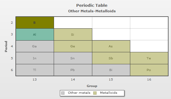
In the above data, the color attribute is used in two <set> elements to define different colors for these cells. These two colors are different from the colors defined in the <colorRange> element. The transparency of the colors can also be controlled by using the alpha attribute through the <set> elements.