<chart caption='Business Results 2005 v 2006' xAxisName='Month' yAxisName='Revenue' showValues='0' numberPrefix='$'
 chartOrder='line,area,column' >

   <categories>
      <category label='Jan' />
      <category label='Feb' />
      <category label='Mar' />
      <category label='Apr' />
      <category label='May' />
      <category label='Jun' />
      <category label='Jul' />
      <category label='Aug' />
      <category label='Sep' />
      <category label='Oct' />
      <category label='Nov' />
      <category label='Dec' />
   </categories>

   <dataset seriesName='2006'>
      <set value='27400' />
      <set value='29800'/>
      <set value='25800' />
      <set value='26800' />
      <set value='29600' />
      <set value='32600' />
      <set value='31800' />
      <set value='36700' />
      <set value='29700' />
      <set value='31900' />
      <set value='34800' />
      <set value='24800' />
   </dataset>

   <dataset seriesName='2005' renderAs='Area'>
      <set value='10000'/>
      <set value='11500'/>
      <set value='12500'/>
      <set value='15000'/>
      <set value='11000' />
      <set value='9800' />
      <set value='11800' />
      <set value='19700' />
      <set value='21700' />
      <set value='21900' />
      <set value='22900' />
      <set value='20800' />
   </dataset>

   <dataset seriesName='2004' renderAs='Line'>
      <set value='7000'/>
      <set value='10500'/>
      <set value='9500'/>
      <set value='10000'/>
      <set value='9000' />
      <set value='8800' />
      <set value='9800' />
      <set value='15700' />
      <set value='16700' />
      <set value='14900' />
      <set value='12900' />
      <set value='8800' />
   </dataset>

   <trendlines>
      <line startValue='22000' color='91C728' displayValue='Target' valueOnRight='1'/>
   </trendlines>

</chart>
{
  "chart": {
    "caption": "Business Results 2005 v 2006",
    "xaxisname": "Month",
    "yaxisname": "Revenue",
    "showvalues": "0",
    "numberprefix": "$",
    "chartorder": "line,area,column"
  },
  "categories": [
    {
      "category": [
        {
          "label": "Jan"
        },
        {
          "label": "Feb"
        },
        {
          "label": "Mar"
        },
        {
          "label": "Apr"
        },
        {
          "label": "May"
        },
        {
          "label": "Jun"
        },
        {
          "label": "Jul"
        },
        {
          "label": "Aug"
        },
        {
          "label": "Sep"
        },
        {
          "label": "Oct"
        },
        {
          "label": "Nov"
        },
        {
          "label": "Dec"
        }
      ]
    }
  ],
  "dataset": [
    {
      "seriesname": "2006",
      "data": [
        {
          "value": "27400"
        },
        {
          "value": "29800"
        },
        {
          "value": "25800"
        },
        {
          "value": "26800"
        },
        {
          "value": "29600"
        },
        {
          "value": "32600"
        },
        {
          "value": "31800"
        },
        {
          "value": "36700"
        },
        {
          "value": "29700"
        },
        {
          "value": "31900"
        },
        {
          "value": "34800"
        },
        {
          "value": "24800"
        }
      ]
    },
    {
      "seriesname": "2005",
      "renderas": "Area",
      "data": [
        {
          "value": "10000"
        },
        {
          "value": "11500"
        },
        {
          "value": "12500"
        },
        {
          "value": "15000"
        },
        {
          "value": "11000"
        },
        {
          "value": "9800"
        },
        {
          "value": "11800"
        },
        {
          "value": "19700"
        },
        {
          "value": "21700"
        },
        {
          "value": "21900"
        },
        {
          "value": "22900"
        },
        {
          "value": "20800"
        }
      ]
    },
    {
      "seriesname": "2004",
      "renderas": "Line",
      "data": [
        {
          "value": "7000"
        },
        {
          "value": "10500"
        },
        {
          "value": "9500"
        },
        {
          "value": "10000"
        },
        {
          "value": "9000"
        },
        {
          "value": "8800"
        },
        {
          "value": "9800"
        },
        {
          "value": "15700"
        },
        {
          "value": "16700"
        },
        {
          "value": "14900"
        },
        {
          "value": "12900"
        },
        {
          "value": "8800"
        }
      ]
    }
  ],
  "trendlines": [
    {
      "line": [
        {
          "startvalue": "22000",
          "color": "91C728",
          "displayvalue": "Target",
          "valueonright": "1"
        }
      ]
    }
  ]
}
 Chart Image
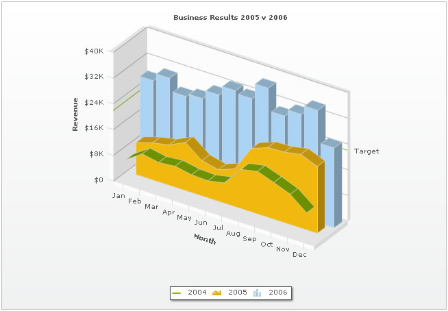