Loading
Vertical Div Lines
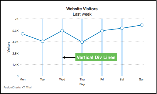
Vertical divisional (or div) lines are vertical lines running through the canvas in a chart. They help in relating the data to its respective label, when there is large amount of data.
Vertical div lines are applicable only to line, area, spline, splineArea, and XY type charts.
The image below shows vertical div lines rendered in a line chart:
This section talks about:
-
Rendering vertical divisional lines
-
Customizing display of vertical divisional lines
-
Customizing vertical grid bands
Rendering vertical divisional lines
By default, vertical divisional lines are not rendered in a chart. A line chart with vertical div lines explicitly rendered is shown below:
Given below is the attribute used to render vertical div lines in a chart:
| Attribute | Description |
|---|---|
|
It specifies the number of vertical divisional lines to be rendered in the chart. |
The data structure used, in the chart above, to render vertical div lines is given below:
{
    "chart": {
        "caption": "Website Visitors",
        "subCaption": "Last week",
        "xAxisName": "Day",
        "yAxisName": "Visitors",
        "anchorRadius": "5",
        "showValues": "0",
        "numVDivLines": "5",
        "vDivLineColor": "#99ccff",
        "vDivLineThickness": "1",
        "vDivLineAlpha": "50",
        "vDivLineDashed": "0",
        "theme": "fint"
    },
    "data": [
        {
            "label": "Mon",
            "value": "5123"
        },
        {
            "label": "Tue",
            "value": "4233"
        },
        {
            "label": "Wed",
            "value": "5507"
        },
        {
            "label": "Thu",
            "value": "4110"
        },
        {
            "label": "Fri",
            "value": "5529"
        },
        {
            "label": "Sat",
            "value": "5803"
        },
        {
            "label": "Sun",
            "value": "6202"
        }
    ]
}
Customizing display of vertical divisional lines
A line chart with customized vertical div lines is as shown below:
Given below are the attributes used to customize the appearance of vertical div lines:
| Attribute | Description |
|---|---|
|
If specifies the hex code for the color that will be used to render the vertical divisional lines. e.g. |
|
Sets the thickness of the vertical axis division lines(in pixels). |
|
Sets the transparency of vertical divisional lines. Can take values from |
The data structure used, in the chart above, to customize vertical div lines is given below:
{
    "chart": {
        "caption": "Website Visitors",
        "subCaption": "Last week",
        "xAxisName": "Day",
        "yAxisName": "Visitors",
        "anchorRadius": "5",
        "showValues": "0",
        "numVDivLines": "5",
        "vDivLineColor": "#99ccff",
        "vDivLineThickness": "1",
        "vDivLineAlpha": "50",
        "vDivLineDashed": "0",
        "theme": "fint"
    },
    "data": [
        {
            "label": "Mon",
            "value": "5123"
        },
        {
            "label": "Tue",
            "value": "4233"
        },
        {
            "label": "Wed",
            "value": "5507"
        },
        {
            "label": "Thu",
            "value": "4110"
        },
        {
            "label": "Fri",
            "value": "5529"
        },
        {
            "label": "Sat",
            "value": "5803"
        },
        {
            "label": "Sun",
            "value": "6202"
        }
    ]
}
Using dashed divisional lines
You can render vertical divisional lines as dashed lines, instead of the default continuous lines. A line chart with dashed lines as vertical div lines is shown below:
Given below are the attributes used to render dashed vertical div lines:
| Attribute | Description |
|---|---|
|
Set this to |
|
Sets the length of each dash of vertical div line(in pixels). |
|
Sets the gap between two consecutive dashes in vertical div lines (in pixels). |
The data structure used, in the chart above, to render dashed vertical div lines is given below:
{
    "chart": {
        "caption": "Website Visitors",
        "subCaption": "Last week",
        "xAxisName": "Day",
        "yAxisName": "Visitors",
        "anchorRadius": "5",
        "showValues": "0",
        "numVDivLines": "5",
        "vDivLineColor": "#99ccff",
        "vDivLineThickness": "1",
        "vDivLineAlpha": "70",
        "vDivLineDashed": "1",
        "vDivLineDashLen": "5",
        "vDivLineDashGap": "3",
        "theme": "fint"
    },
    "data": [
        {
            "label": "Mon",
            "value": "5123"
        },
        {
            "label": "Tue",
            "value": "4233"
        },
        {
            "label": "Wed",
            "value": "5507"
        },
        {
            "label": "Thu",
            "value": "4110"
        },
        {
            "label": "Fri",
            "value": "5529"
        },
        {
            "label": "Sat",
            "value": "5803"
        },
        {
            "label": "Sun",
            "value": "6202"
        }
    ]
}
Customizing vertical grid bands
Showing/hiding vertical grid bands
Vertical grid bands, by default, do not appear between the vertical divisional lines. A line chart with alternate vertical grid bands enabled is shown below:
Given below is the attribute used to render the alternate grid bands:
| Attribute | Description |
|---|---|
|
Set this to |
The data structure used, in the chart above, to render alternate grid bands is given below:
{
    "chart": {
        "caption": "Website Visitors",
        "subCaption": "Last week",
        "xAxisName": "Day",
        "yAxisName": "Visitors",
        "anchorRadius": "5",
        "showValues": "0",
        "numVDivLines": "5",
        "showAlternateVGridColor": "1",
        "theme": "fint"
    },
    "data": [
        {
            "label": "Mon",
            "value": "5123"
        },
        {
            "label": "Tue",
            "value": "4233"
        },
        {
            "label": "Wed",
            "value": "5507"
        },
        {
            "label": "Thu",
            "value": "4110"
        },
        {
            "label": "Fri",
            "value": "5529"
        },
        {
            "label": "Sat",
            "value": "5803"
        },
        {
            "label": "Sun",
            "value": "6202"
        }
    ]
}
Customizing display of vertical grid bands
A line chart with customized vertical grid bands looks as below:
Given below are the attributes used to customize the vertical grid bands:
| Attribute | Description |
|---|---|
|
It specifies the hex code for the color that will be used to render the vertical grid bands. e.g. |
|
It specifies the transparency of the vertical grid bands. Can take values from |
The data structure used, in the chart above, to customize vertical grid bands is given below:
{
    "chart": {
        "caption": "Website Visitors",
        "subCaption": "Last week",
        "xAxisName": "Day",
        "yAxisName": "Visitors",
        "anchorRadius": "5",
        "showValues": "0",
        "numVDivLines": "5",
        "showAlternateHGridColor": "1",
        "showAlternateVGridColor": "1",
        "alternateVGridColor": "#bee6ff",
        "alternateHGridColor": "#f4fbff",
        "alternateVGridAlpha": "30",
        "theme": "fint"
    },
    "data": [
        {
            "label": "Mon",
            "value": "5123"
        },
        {
            "label": "Tue",
            "value": "4233"
        },
        {
            "label": "Wed",
            "value": "5507"
        },
        {
            "label": "Thu",
            "value": "4110"
        },
        {
            "label": "Fri",
            "value": "5529"
        },
        {
            "label": "Sat",
            "value": "5803"
        },
        {
            "label": "Sun",
            "value": "6202"
        }
    ]
}