In this section, we'll see a few of the basic configuration properties exposed by the chart.
Please note that the chart actually offers a lot more properties than what's discussed here - you can find a list of all of them in the XML Sheet.
We'll study the following properties here (click on each one of them to directly scroll to the respective section):
- Customizing color palettes
- Customizing font properties for categories, process names etc.
- Defining task labels and showing/hiding them
- Showing/hiding task start and end dates
- Adding process header and customizing its cosmetics
- Adding more columns to data table
- Customizing hover effect
Let's see each of them in detail.
FusionWidgets XT Gantt chart offers 5 pre-defined color palettes for you to choose from. Each of these palettes is accessible by the numbers 1-5 respectively. To choose a palette, all you need to do is set:
Shown below are a few examples of palettes applied on our previous chart:
 |
 |
<chart palette='2'...> |
<chart palette='3'...> |
 |
 |
<chart palette='4'...> |
<chart palette='5'...> |
Additionally, you can also define an entire new palette by setting a single theme color using:
This will create a new palette derived from this color and then color the chart as under:

The Gantt chart offers you multiple ways to customize font properties for various objects, like:
- For the caption, sub-caption and legend, you can use the Styles feature to individually customize their font properties. Please see the Using Styles section.
- For categories and category labels, you've individual attributes to specify their font properties.
- For process names also, you can specify the font properties using individual attributes.
You can specify font properties for all processes on the chart as a whole by setting:
<processes font='Arial' fontColor='0372AB' fontSize='13' isBold='1' isItalic='1' isUnderLine='1' bgColor='FFFFFF' align='center' vAlign='middle' ...>
"processes":{ "font":"Arial", "fontcolor":"0372AB", fontsize":"13", "isbold":"1", "isitalic":"1", "isunderline":"1", "bgcolor":"FFFFFF", "align":"center", "valign":"middle" ... } }
There are a lot more possible attributes which have been discussed in the XML Sheet for Gantt chart.
Additionally, you can also over-ride the collective font settings for all processes by specifying the font property of each process individually as under:
Similar to processes, you can specify the collective font properties of all sub-categories within a <categories> element by specifying:
<categories font='Arial' fontColor='0372AB' fontSize='13' isBold='1' isItalic='1' isUnderLine='1' bgColor='FFFFFF' align='center' vAlign='middle' ...>
"categories":[{ "font":"Arial", "fontcolor":"0372AB", "fontsize":"13", "isbold":"1", "isitalic":"1", "isunderline":"1", "bgcolor":"FFFFFF", "align":"center", "valign":"middle" } ]
Or, you can specify the font property for each category individually using:
Apart from the process labels, you can also define task labels for each task and then show/hide them on the chart. To define a task label, you set:
Here, we've defined the task label for a single task. By default, the task label is not visible on the chart. To make the task label visible on the chart, you need to set:
or
If you want to show/hide a particular task label, you need to set:
Basically, the above attribute lets you control whether to show labels or not - collectively for all tasks or individually for a single task.
When you now view the chart, the task bar will show up with the label. Also, the label of task will appear in the tool text of the task bar:
Apart from showing the task labels, you can also show the task start and end dates by setting:
<chart showTaskStartDate='1' showTaskEndDate='1' > to show start and end dates for all tasks as shown under:
Or, you can opt to show the start and end date for individual task by setting:
This will result in:

The format in which the dates are displayed on the chart is customizable. Please see the section "Configuring date formats" on how to do the same.
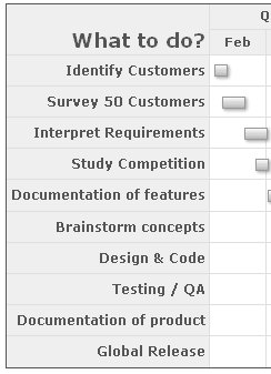
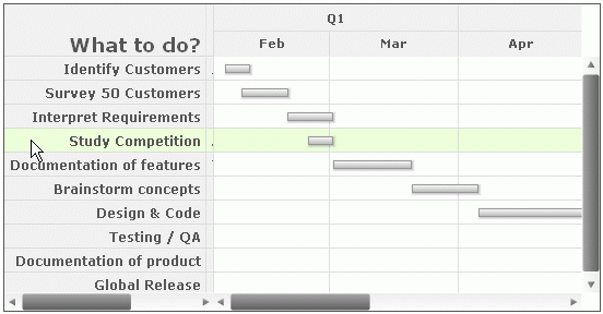
You can add header (title) for the processes column in data table and customize its cosmetics by setting:
<processes fontSize='12' isBold='1' align='right' headerText='What to do?' headerFontSize='18' headerVAlign='bottom' headerAlign='right'>
"processes":{ "fontsize":"12", "isbold":"1", "align":"right", "headertext":"What to do?", "headerfontsize":"18", "headervalign":"bottom", "headeralign":"right" }
This will result in:
<chart>
 ...
  <datatable headerVAlign="bottom">
    <datacolumn headerText="Who does?" headerFontSize="18" headerVAlign="bottom" headerAlign="right" align="left" fontSize="12">
      <text label="John"/>
      <text label="David"/>
      <text label="Mary"/>
      <text label="Andrew"/>
      <text label="Tiger"/>
      <text label="Sharon"/>
      <text label="Neil"/>
      <text label="Harry"/>
      <text label="Chris"/>
      <text label="Richard"/>
    </datacolumn>
  </datatable>
   ...
</chart>
{
  "chart": {},
  ...
  "datatable": {
    "headervalign": "bottom",
    "datacolumn": [
      {
        "headertext": "Who does?",
        "headerfontsize": "18",
        "headervalign": "bottom",
        "headeralign": "right",
        "align": "left",
        "fontsize": "12",
        "text": [
          {
            "label": "John"
          },
          {
            "label": "David"
          },
          {
            "label": "Mary"
          },
          {
            "label": "Andrew"
          },
          {
            "label": "Tiger"
          },
          {
            "label": "Sharon"
          },
          {
            "label": "Neil"
          },
          {
            "label": "Harry"
          },
          {
            "label": "Chris"
          },
          {
            "label": "Richard"
          }
        ]
      }
    ]
    ...
  }
}
With this, you'll get the following result:
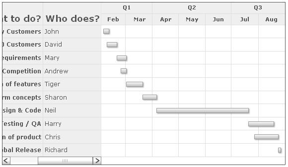
You can add any number of columns to this grid.
Since our chart width is relatively small here, a scroll bar comes up and allows the users to scroll through the data table. You can increase the width of data table by:
- Either increasing chart width.
- Or, by setting <chart ganttWidthPercent='0-100' > to a lower value. This attribute indicates the percent space (width) the Gantt pane takes.
The data grid on the left is both scrollable and resizable i.e., the users can click on the drag handlers (vertical line separating two data columns) and drag them to resize the data column. Additionally, if you wish, you can also explicitly set the width of each data column using:
<datacolumn width='200' ..> - Sets data column width as 200 pixels
or
<datacolumn width='40%' ..> - Sets data column width as 40% of the entire data grid width
If you wish to hide the scroll bar of the data column, you can set:
This will wrap & truncate the data labels and try to squeeze them in the required space (only if possible).
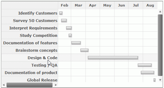
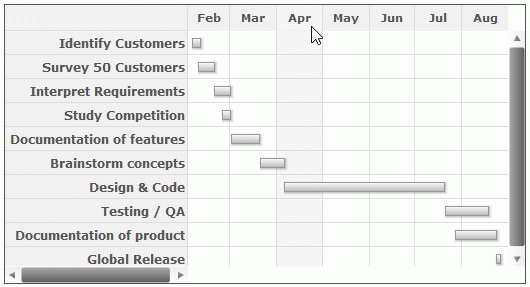
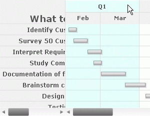
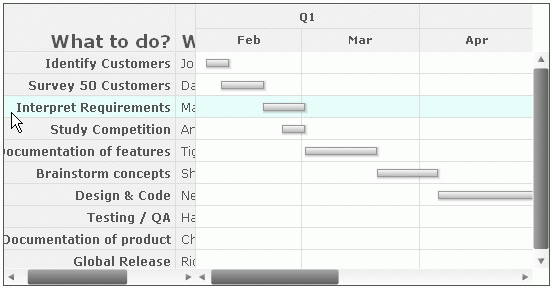
Starting FusionWidgets XT (v3.3.1) you'll see a veritcal or horizontal colored band when you hover the mouse over or touch any category or process respectively. Additionally, hover effect is also added for tasks and connectors.
In this section, we will discuss about the hover effects of categories and processes.
This is available for JavaScript Gantt chart only.
 |
 |
Hover on Process |
Hover on Category |
The JavaScript Gantt chart offers you multiple ways to customize the hovering effect, like:
You can specify the collective hovering properties from the entire <chart> element. This customizes the hover effect of <processes>, <process>, <categories> and <category> elements. You need to specify the following:
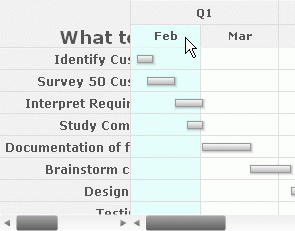
The charts below depicts the customization of the hovering effect from the entire <chart> element.
 |
 |
 |
| Categories | Individual category | Processes |
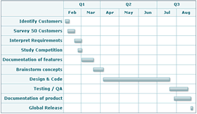
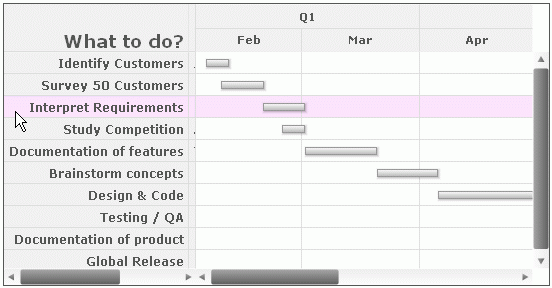
You can specify the collective hovering properties for all processes globally within <chart> element using:
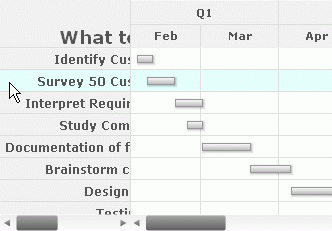
The chart below shows the hovering effect for processes.
You can customize the hovering properties for all the processes within the <processes> element (horizontal color band) on the chart by setting:
<chart ...>
<processes hoverBandcolor="AFFAEC" hoverBandAlpha="30" ... >
<process label="Identify Customers"/>
<process label="Survey 50 Customers"/>
<process label="Interpret Requirements"/>
<process label="Study Competition"/>
<process label="Documentation of features"/>
<process label="Brainstorm concepts"/>
<process label="Design & Code"/>
<process label="Testing / QA"/>
<process label="Documentation of product"/>
<process label="Global Release"/>
</processes>
...
</chart>
{
  "chart": {
  ...
  "processes":{
    "hoverBandcolor": "AFFAEC",
    "hoverBandAlpha": "30",
    ...
    "process": [
      {
        "label": "Identify Customers"
      },
      {
        "label": "Survey 50 Customers"
      },
      {
        "label": "Interpret Requirements"
      },
      {
        "label": "Study Competition"
      },
      {
        "label": "Documentation of features"
      },
      {
        "label": "Brainstorm concepts"
      },
      {
        "label": "Design & Code"
      },
      {
        "label": "Testing / QA"
      },
      {
        "label": "Documentation of product"
      },
      {
        "label": "Global Release"
      }
    ]
	 }
	 ...
 }
}
The chart below shows the hovering effect for all processes.
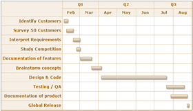
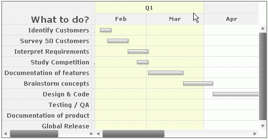
Additionally, you can also over-ride the collective hover settings for all processes by specifying the hovering properties of each process individually. This is shown in the code below:
<chart ...>
<processes hoverColor="AFFAEC" hoverAlpha="30" ... >
<process label="Identify Customers"/>
<process label="Survey 50 Customers"/>
<process label="Interpret Requirements" hoverBandcolor="F0A4FF" hoverBandAlpha="30"/>
<process label="Study Competition"/>
<process label="Documentation of features"/>
<process label="Brainstorm concepts"/>
<process label="Design & Code"/>
<process label="Testing / QA"/>
<process label="Documentation of product"/>
<process label="Global Release"/>
</processes>
...
</chart>
{
  "chart": {},
  ...
  "processes":{
    "hoverColor": "AFFAEC",
    "hoverAlpha": "30",
    ...
    "process": [
      {
        "label": "Identify Customers"
      },
      {
        "label": "Survey 50 Customers"
      },
      {
        "label": "Interpret Requirements"
        "hoverBandcolor": "F0A4FF",
        "hoverBandAlpha": "30"
      },
      {
        "label": "Study Competition"
      },
      {
        "label": "Documentation of features"
      },
      {
        "label": "Brainstorm concepts"
      },
      {
        "label": "Design & Code"
      },
      {
        "label": "Testing / QA"
      },
      {
        "label": "Documentation of product"
      },
      {
        "label": "Global Release"
      }
	]
    }
...
}
The chart below shows the hovering effect for individual process.
There are a lot more possible attributes which have been discussed in the XML Sheet for Gantt chart.
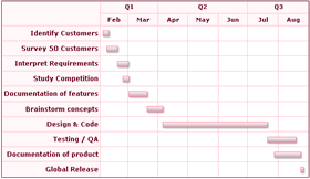
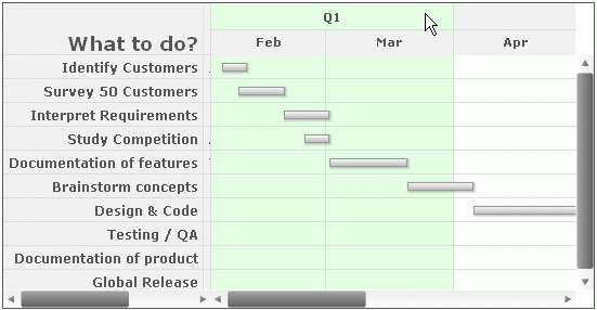
If you have multiple categories you can specify the collective hovering properties globally within the <chart> element using:
The chart below shows the hovering effect for all categories including individual category.
Similar to processes, you can specify the collective hovering properties of all sub-categories within a <categories> element by specifying:
<chart...>
...
<categories hoverBandcolor="A6FFA4" hoverBandAlpha="30" ... >
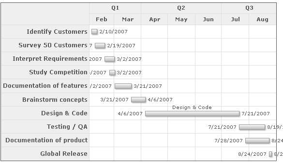
<category start="02/01/2007" end="04/01/2007" label="Q1"/>
<category start="04/01/2007" end="07/01/2007" label="Q2"/>
<category start="07/01/2007" end="09/01/2007" label="Q3"/>
</categories>
<categories>
<category start="02/01/2007" end="03/01/2007" label="Feb"/>
<category start="03/01/2007" end="04/01/2007" label="Mar"/>
<category start="04/01/2007" end="05/01/2007" label="Apr"/>
<category start="05/01/2007" end="06/01/2007" label="May"/>
<category start="06/01/2007" end="07/01/2007" label="Jun"/>
<category start="07/01/2007" end="08/01/2007" label="Jul"/>
<category start="08/01/2007" end="09/01/2007" label="Aug"/>
</categories>
...
</chart>
{
  "chart": {},
  ...
  "categories":{
    "hoverBandcolor": "A6FFA4",
    "hoverBandAlpha": "30",
    ...
      "category": [
        {
          "start": "02/01/2007",
          "end": "04/01/2007",
          "label": "Q1"
        },
        {
          "start": "04/01/2007",
          "end": "07/01/2007",
          "label": "Q2"
        },
        {
          "start": "07/01/2007",
          "end": "09/01/2007",
          "label": "Q3"
        }
      ]
    },
    {
      "category": [
        {
          "start": "02/01/2007",
          "end": "03/01/2007",
          "label": "Feb"
        },
        {
          "start": "03/01/2007",
          "end": "04/01/2007",
          "label": "Mar"
        },
        {
          "start": "04/01/2007",
          "end": "05/01/2007",
          "label": "Apr"
        },
        {
          "start": "05/01/2007",
          "end": "06/01/2007",
          "label": "May"
        },
        {
          "start": "06/01/2007",
          "end": "07/01/2007",
          "label": "Jun"
        },
        {
          "start": "07/01/2007",
          "end": "08/01/2007",
          "label": "Jul"
        },
        {
          "start": "08/01/2007",
          "end": "09/01/2007",
          "label": "Aug"
        }
      ]
      ...
    }
  ]
}
The chart below shows the hovering effect of all sub-categories within a <categories> element.
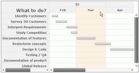
Or, you can specify the hovering property for each category individually using:
<chart...>
...
  <categories hoverColor="A6FFA4" hoverAlpha="30" ... >
    <category start="02/01/2007" end="04/01/2007" label="Q1"/>
    <category start="04/01/2007" end="07/01/2007" label="Q2"/>
    <category start="07/01/2007" end="09/01/2007" label="Q3"/>
  </categories>
  <categories>
    <category start="02/01/2007" end="03/01/2007" label="Feb"/>
    <category start="03/01/2007" end="04/01/2007" label="Mar" hoverBandcolor="FFD3A4" hoverBandAlpha="30"/>
    <category start="04/01/2007" end="05/01/2007" label="Apr"/>
    <category start="05/01/2007" end="06/01/2007" label="May"/>
    <category start="06/01/2007" end="07/01/2007" label="Jun"/>
    <category start="07/01/2007" end="08/01/2007" label="Jul"/>
    <category start="08/01/2007" end="09/01/2007" label="Aug"/>
  </categories>
  ...
</chart>
{
  "chart": {},
  ...
  "categories":{
    "hoverColor": "A6FFA4",
    "hoverAlpha": "30",
    ...
      "category": [
        {
          "start": "02/01/2007",
          "end": "04/01/2007",
          "label": "Q1"
        },
        {
          "start": "04/01/2007",
          "end": "07/01/2007",
          "label": "Q2",
          "hoverBandcolor": "FFD3A4",
          "hoverBandAlpha": "30"
        },
        {
          "start": "07/01/2007",
          "end": "09/01/2007",
          "label": "Q3"
        }
      ]
    },
    {
      "category": [
        {
          "start": "02/01/2007",
          "end": "03/01/2007",
          "label": "Feb"
        },
        {
          "start": "03/01/2007",
          "end": "04/01/2007",
          "label": "Mar"
        },
        {
          "start": "04/01/2007",
          "end": "05/01/2007",
          "label": "Apr"
        },
        {
          "start": "05/01/2007",
          "end": "06/01/2007",
          "label": "May"
        },
        {
          "start": "06/01/2007",
          "end": "07/01/2007",
          "label": "Jun"
        },
        {
          "start": "07/01/2007",
          "end": "08/01/2007",
          "label": "Jul"
        },
        {
          "start": "08/01/2007",
          "end": "09/01/2007",
          "label": "Aug"
        }
      ]
      ...
    }
  ]
}
The chart below shows the hovering effect for each individual category.
There are a lot more possible attributes which have been discussed in the XML Sheet for Gantt chart.
By default, the hovering effects remains enabled for the tasks, connectors, categories and processes. You may opt to disable the hover effects. To do so you need to set the following:
In the above data, we have set showHoverEffect as 0. This will ensure that all the hover effects including tasks, connectors, categories and processes are disabled. Yo may opt to enable the hover effects of the categories and processes only and keep the hover effects of tasks and connectors disabled. To do so, you need to set the following:
In the above data, we have set showHoverBand to '1'. This will ensure that, only the hover effect of categories and processes are enabled.
You can also opt to disable hover effects for processes, categories, tasks, and connectors. To know more about the attributes please go through the XML Sheet for Gantt chart.