In this section, we'll see the various possible configurations we can have for the task bar. Specifically, we'll be looking at the following:
- How to create task bars that indicate what percent of task is complete
- How to customize hovering effects of task bars
- How to create task bars that look like task group
- Drawing task bar with rounded corners
- Customizing the tool text for each task and removing dates from the same
Let's see them one by one.
FusionWidgets XT Gantt chart allows you to create task bars that can show percentage complete figures. For example, if you've a task which is only 50% complete, you can easily show the same on the chart by setting:
Here, percentComplete attribute takes a value between 0-100, which represents what percent of the task is complete. When you view this chart, you'll get the following result:
As you can see above, the part that is not complete has been filled by a shade of red. This color can be customized by setting:
Here, we've changed the slack fill color to a shade of blue, as shown under:
Or, you can opt to show the slack without a fill by setting:
This will result in:
Starting FusionWidgets XT (v3.3.1), Gantt chart offers hovering effects when you move the mouse over any task bar. Hovering the mouse cursor over a task allows better visualization by highlighting it.
Note: This feature is available for JavaScript Gantt chart only.
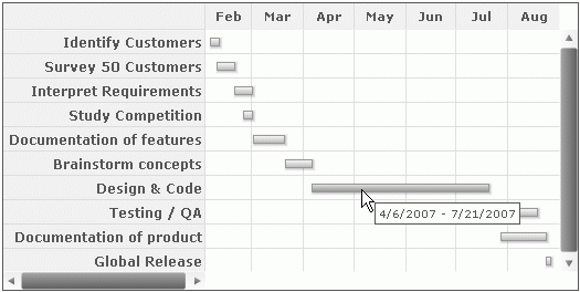
Hovering effect of the task bars in JavaScript Gantt chart appears by default as shown in the image below:
JavaScript Gantt chart allows you to customize the hovering effect by configuring properties like color and transparency. To customize the hovering properties for all the tasks globally within <chart> element, you need to set:
You can also specify the customizable properties within <tasks> element as shown in the code below:
<chart ... >
 ...
<tasks ... hoverFillColor="F4BEFF" hoverFillAlpha="80">
    <task start="02/04/2007" end="04/06/2007"/>
    <task start="02/04/2007" end="02/10/2007"/>
    <task start="02/08/2007" end="02/19/2007"/>
    <task start="02/19/2007" end="03/02/2007"/>
    <task start="02/24/2007" end="03/02/2007"/>
    <task start="03/02/2007" end="08/27/2007"/>
    <task start="03/02/2007" end="03/21/2007"/>
    <task start="03/21/2007" end="04/06/2007"/>
    <task start="04/06/2007" end="07/21/2007"/>
    <task start="07/21/2007" end="08/19/2007"/>
    <task start="07/28/2007" end="08/24/2007"/>
    <task start="08/24/2007" end="08/27/2007"/>
  </tasks>
 ...
</chart>
{
  "chart": {},
  ...
  "tasks":{
    "hoverFillColor": "F4BEFF",
    "hoverFillAlpha": "80",
    ...
    "task": [
      {
        "start": "02/04/2007",
        "end": "04/06/2007",

      },
      {
        "start": "02/04/2007",
        "end": "02/10/2007",
      },
      {
        "start": "02/08/2007",
        "end": "02/19/2007"
      },
      {
        "start": "02/19/2007",
        "end": "03/02/2007"
      },
      {
        "start": "02/24/2007",
        "end": "03/02/2007"
      },
      {
        "start": "03/02/2007",
        "end": "08/27/2007",
      },
      {
        "start": "03/02/2007",
        "end": "03/21/2007"
      },
      {
        "start": "03/21/2007",
        "end": "04/06/2007"
      },
      {
        "start": "04/06/2007",
        "end": "07/21/2007"
      },
      {
        "start": "07/21/2007",
        "end": "08/19/2007"
      },
      {
        "start": "07/28/2007",
        "end": "08/24/2007"
      },
      {
        "start": "08/24/2007",
        "end": "08/27/2007"
      }
    ]
    }
...
}
The chart below shows the hovering effect on one of the tasks.
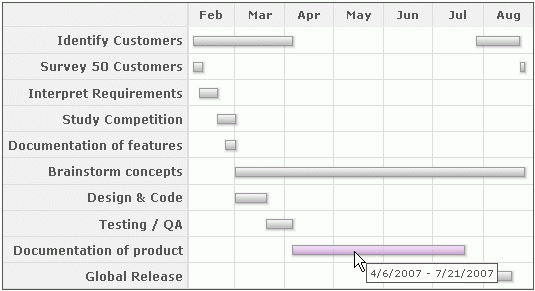
Additionally, you can also over-ride the collective hover settings for all tasks by specifying the hovering properties of each task individually. This is shown in the code below:
<chart ...>
<tasks ... hoverFillColor="F4BEFF" hoverFillAlpha="30">
    <task start="02/04/2007" end="04/06/2007"/>
    <task start="02/04/2007" end="02/10/2007"/>
    <task start="02/08/2007" end="02/19/2007"/>
    <task start="02/19/2007" end="03/02/2007"/>
    <task start="02/24/2007" end="03/02/2007"/>
    <task start="03/02/2007" end="08/27/2007"/>
    <task start="03/02/2007" end="03/21/2007"/>
    <task start="03/21/2007" end="04/06/2007"/>
    <task start="04/06/2007" end="07/21/2007" hoverFillColor="1FC0FF" hoverFillAlpha="80"/>
    <task start="07/21/2007" end="08/19/2007"/>
    <task start="07/28/2007" end="08/24/2007"/>
    <task start="08/24/2007" end="08/27/2007"/>
  </tasks>
...
</chart>
{
  "chart": {},
  ...
  "tasks":{
    "hoverFillColor": "F4BEFF",
    "hoverFillAlpha": "30",
    ...
    "task": [
      {
        "start": "02/04/2007",
        "end": "04/06/2007",
      },
      {
        "start": "02/04/2007",
        "end": "02/10/2007"
	  },
      {
        "start": "02/08/2007",
        "end": "02/19/2007"
      },
      {
        "start": "02/19/2007",
        "end": "03/02/2007"
      },
      {
        "start": "02/24/2007",
        "end": "03/02/2007"
      },
      {
        "start": "03/02/2007",
        "end": "08/27/2007",
      },
      {
        "start": "03/02/2007",
        "end": "03/21/2007"
      },
      {
        "start": "03/21/2007",
        "end": "04/06/2007"
      },
      {
        "start": "04/06/2007",
        "end": "07/21/2007"
        "hoverFillColor": "1FC0FF",
        "hoverFillAlpha": "80",
	  },
      {
        "start": "07/21/2007",
        "end": "08/19/2007"
      },
      {
        "start": "07/28/2007",
        "end": "08/24/2007"
      },
      {
        "start": "08/24/2007",
        "end": "08/27/2007"
      }
    ]
    }
...
}
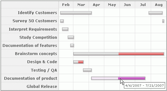
In the code above, we've specified hovering properties for an individual <task> element. In the image below, note that the color of the task corresponding to Design & Code has changed.
By default, the hovering effect remains enabled. You may opt to disable the hover effects. To do so you need to set the following:
In the above data, we have set showHoverEffect as 0. This will ensure that all the hover effects including connectors, categories and processes are disabled. You may opt to enable the hover effects of the task bars only and keep the hover effects of categories, processes and connectors disabled. To do so, you need to set the following:
In the above data, we have set showTaskHoverEffect to '1'. This will ensure that, only the hover effect of task bars are enabled.
You can also opt to disable hover effects for individual tasks. To know more about the attributes please go through the XML Sheet for Gantt chart.
JavaScript Gantt chart also allows you to customize the hovering properties of all the slacks collectively for all the tasks. This is shown in the code below:
<chart ... >
 ...
<tasks ... hoverFillColor="F4BEFF" hoverFillAlpha="30" slackHoverFillColor='CEFF1F' slackHoverFillAlpha='80'>
    <task start="02/04/2007" end="04/06/2007"/>
    <task start="02/04/2007" end="02/10/2007"/>
    <task start="02/08/2007" end="02/19/2007"/>
    <task start="02/19/2007" end="03/02/2007"/>
    <task start="02/24/2007" end="03/02/2007"/>
    <task start="03/02/2007" end="08/27/2007" percentComplete="50"/>
    <task start="03/02/2007" end="03/21/2007" percentComplete="50"/>
    <task start="03/21/2007" end="04/06/2007"/>
    <task start="04/06/2007" end="07/21/2007" percentComplete="50"/>
    <task start="07/21/2007" end="08/19/2007"/>
    <task start="07/28/2007" end="08/24/2007"/>
    <task start="08/24/2007" end="08/27/2007"/>
  </tasks>
 ...
</chart>
{
  "chart": {},
  ...
  "tasks":{
    "hoverFillColor": "F4BEFF",
    "hoverFillAlpha": "30",
    "slackHoverFillColor": "CEFF1F",
    "slackHoverFillAlpha": "80",
    ...
    "task": [
      {
        "start": "02/04/2007",
        "end": "04/06/2007",

      },
      {
        "start": "02/04/2007",
        "end": "02/10/2007",
      },
      {
        "start": "02/08/2007",
        "end": "02/19/2007"
      },
      {
        "start": "02/19/2007",
        "end": "03/02/2007"
      },
      {
        "start": "02/24/2007",
        "end": "03/02/2007"
      },
      {
        "start": "03/02/2007",
        "end": "08/27/2007",
        "percentComplete": "50"
      },
      {
        "start": "03/02/2007",
        "end": "03/21/2007",
        "percentComplete": "50"
      },
      {
        "start": "03/21/2007",
        "end": "04/06/2007"
      },
      {
        "start": "04/06/2007",
        "end": "07/21/2007",
        "percentComplete": "50"
      },
      {
        "start": "07/21/2007",
        "end": "08/19/2007"
      },
      {
        "start": "07/28/2007",
        "end": "08/24/2007"
      },
      {
        "start": "08/24/2007",
        "end": "08/27/2007"
      }
    ]
    }
...
}
This results in:
Additionally, you can also over-ride the collective hover settings for all the slacks by specifying the hovering properties of each slack individually in <task> element. You need to set the following:
<chart ... >
 ...
<tasks ... hoverFillColor="F4BEFF" hoverFillAlpha="30" slackHoverFillColor='CEFF1F' slackHoverFillAlpha='80'>
    <task start="02/04/2007" end="04/06/2007"/>
    <task start="02/04/2007" end="02/10/2007"/>
    <task start="02/08/2007" end="02/19/2007"/>
    <task start="02/19/2007" end="03/02/2007"/>
    <task start="02/24/2007" end="03/02/2007"/>
    <task start="03/02/2007" end="08/27/2007" percentComplete="50"/>
    <task start="03/02/2007" end="03/21/2007" percentComplete="50"/>
    <task start="03/21/2007" end="04/06/2007"/>
    <task start="04/06/2007" end="07/21/2007" percentComplete="50" slackHoverFillColor='F50EF1' slackHoverFillAlpha='80'/>
    <task start="07/21/2007" end="08/19/2007"/>
    <task start="07/28/2007" end="08/24/2007"/>
    <task start="08/24/2007" end="08/27/2007"/>
  </tasks>
 ...
</chart>
{
  "chart": {},
  ...
  "tasks":{
    "hoverFillColor": "F4BEFF",
    "hoverFillAlpha": "30",
    "slackHoverFillColor": "CEFF1F",
    "slackHoverFillAlpha": "80",
    ...
    "task": [
      {
        "start": "02/04/2007",
        "end": "04/06/2007",

      },
      {
        "start": "02/04/2007",
        "end": "02/10/2007",
      },
      {
        "start": "02/08/2007",
        "end": "02/19/2007"
      },
      {
        "start": "02/19/2007",
        "end": "03/02/2007"
      },
      {
        "start": "02/24/2007",
        "end": "03/02/2007"
      },
      {
        "start": "03/02/2007",
        "end": "08/27/2007",
        "percentComplete": "50"
      },
      {
        "start": "03/02/2007",
        "end": "03/21/2007",
        "percentComplete": "50"
      },
      {
        "start": "03/21/2007",
        "end": "04/06/2007"
      },
      {
        "start": "04/06/2007",
        "end": "07/21/2007",
        "percentComplete": "50"
        "slackHoverFillColor": "F50EF1",
        "slackHoverFillAlpha": "80",
      },
      {
        "start": "07/21/2007",
        "end": "08/19/2007"
      },
      {
        "start": "07/28/2007",
        "end": "08/24/2007"
      },
      {
        "start": "08/24/2007",
        "end": "08/27/2007"
      }
    ]
    }
...
}
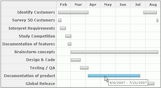
In the code above, we've specified hovering properties of the slack bar in an individual <task> element. Note, that the color of the slack has changed in the image shown below:
You can also specify the collective hovering properties for all the slacks globally within <chart> element using:
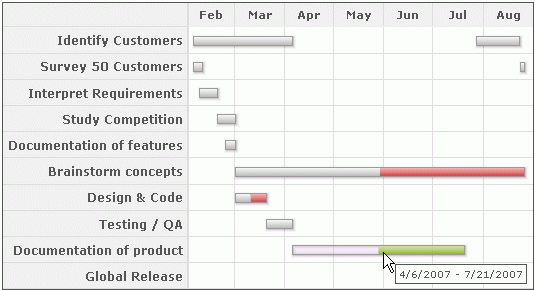
If you want to show the percent complete figures as part of each task bar, you can set:
This will result in:
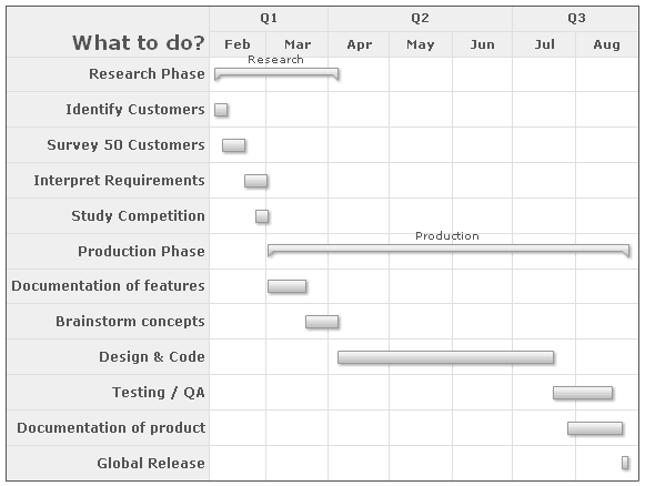
If you want to represent a task as a parent group visually, you can set the showAsGroup attribute of <task> element to 1.
Consider the following XML:
<chart dateFormat="mm/dd/yyyy" caption="Project Gantt" subCaption="From 1st Feb 2007 - 31st Aug 2007" showSlackAsFill="0" showPercentLabel="1">
  <categories>
    <category start="02/01/2007" end="04/01/2007" label="Q1"/>
    <category start="04/01/2007" end="07/01/2007" label="Q2"/>
    <category start="07/01/2007" end="09/01/2007" label="Q3"/>
  </categories>
  <categories>
    <category start="02/01/2007" end="03/01/2007" label="Feb"/>
    <category start="03/01/2007" end="04/01/2007" label="Mar"/>
    <category start="04/01/2007" end="05/01/2007" label="Apr"/>
    <category start="05/01/2007" end="06/01/2007" label="May"/>
    <category start="06/01/2007" end="07/01/2007" label="Jun"/>
    <category start="07/01/2007" end="08/01/2007" label="Jul"/>
    <category start="08/01/2007" end="09/01/2007" label="Aug"/>
  </categories>
  <processes fontSize="12" isBold="1" align="right" headerText="What to do?" headerFontSize="18" headerVAlign="bottom" headerAlign="right">
    <process label="Research Phase"/>
    <process label="Identify Customers"/>
    <process label="Survey 50 Customers"/>
    <process label="Interpret Requirements"/>
    <process label="Study Competition"/>
    <process label="Production Phase"/>
    <process label="Documentation of features"/>
    <process label="Brainstorm concepts"/>
    <process label="Design & Code"/>
    <process label="Testing / QA"/>
    <process label="Documentation of product"/>
    <process label="Global Release"/>
  </processes>
  <tasks>
    <task start="02/04/2007" end="04/06/2007" showAsGroup="1" label="Research" showLabel="1"/>
    <task start="02/04/2007" end="02/10/2007"/>
    <task start="02/08/2007" end="02/19/2007"/>
    <task start="02/19/2007" end="03/02/2007"/>
    <task start="02/24/2007" end="03/02/2007"/>
    <task start="03/02/2007" end="08/27/2007" showAsGroup="1" label="Production" showLabel="1"/>
    <task start="03/02/2007" end="03/21/2007"/>
    <task start="03/21/2007" end="04/06/2007"/>
    <task start="04/06/2007" end="07/21/2007"/>
    <task start="07/21/2007" end="08/19/2007"/>
    <task start="07/28/2007" end="08/24/2007"/>
    <task start="08/24/2007" end="08/27/2007"/>
  </tasks>
</chart>
{
  "chart": {
    "dateformat": "mm/dd/yyyy",
    "caption": "Project Gantt",
    "subcaption": "From 1st Feb 2007 - 31st Aug 2007",
    "showslackasfill": "0",
    "showpercentlabel": "1"
  },
  "categories": [
    {
      "category": [
        {
          "start": "02/01/2007",
          "end": "04/01/2007",
          "label": "Q1"
        },
        {
          "start": "04/01/2007",
          "end": "07/01/2007",
          "label": "Q2"
        },
        {
          "start": "07/01/2007",
          "end": "09/01/2007",
          "label": "Q3"
        }
      ]
    },
    {
      "category": [
        {
          "start": "02/01/2007",
          "end": "03/01/2007",
          "label": "Feb"
        },
        {
          "start": "03/01/2007",
          "end": "04/01/2007",
          "label": "Mar"
        },
        {
          "start": "04/01/2007",
          "end": "05/01/2007",
          "label": "Apr"
        },
        {
          "start": "05/01/2007",
          "end": "06/01/2007",
          "label": "May"
        },
        {
          "start": "06/01/2007",
          "end": "07/01/2007",
          "label": "Jun"
        },
        {
          "start": "07/01/2007",
          "end": "08/01/2007",
          "label": "Jul"
        },
        {
          "start": "08/01/2007",
          "end": "09/01/2007",
          "label": "Aug"
        }
      ]
    }
  ],
  "processes": {
    "fontsize": "12",
    "isbold": "1",
    "align": "right",
    "headertext": "What to do?",
    "headerfontsize": "18",
    "headervalign": "bottom",
    "headeralign": "right",
    "process": [
      {
        "label": "Research Phase"
      },
      {
        "label": "Identify Customers"
      },
      {
        "label": "Survey 50 Customers"
      },
      {
        "label": "Interpret Requirements"
      },
      {
        "label": "Study Competition"
      },
      {
        "label": "Production Phase"
      },
      {
        "label": "Documentation of features"
      },
      {
        "label": "Brainstorm concepts"
      },
      {
        "label": "Design & Code"
      },
      {
        "label": "Testing / QA"
      },
      {
        "label": "Documentation of product"
      },
      {
        "label": "Global Release"
      }
    ]
  },
  "tasks": {
    "task": [
      {
        "start": "02/04/2007",
        "end": "04/06/2007",
        "showasgroup": "1",
        "label": "Research",
        "showlabel": "1"
      },
      {
        "start": "02/04/2007",
        "end": "02/10/2007"
      },
      {
        "start": "02/08/2007",
        "end": "02/19/2007"
      },
      {
        "start": "02/19/2007",
        "end": "03/02/2007"
      },
      {
        "start": "02/24/2007",
        "end": "03/02/2007"
      },
      {
        "start": "03/02/2007",
        "end": "08/27/2007",
        "showasgroup": "1",
        "label": "Production",
        "showlabel": "1"
      },
      {
        "start": "03/02/2007",
        "end": "03/21/2007"
      },
      {
        "start": "03/21/2007",
        "end": "04/06/2007"
      },
      {
        "start": "04/06/2007",
        "end": "07/21/2007"
      },
      {
        "start": "07/21/2007",
        "end": "08/19/2007"
      },
      {
        "start": "07/28/2007",
        "end": "08/24/2007"
      },
      {
        "start": "08/24/2007",
        "end": "08/27/2007"
      }
    ]
  }
}
FusionWidgets XT allows you to use round corners for the task bars in Gantt chart, if you're NOT using the percentComplete feature.
To use round radius, you need to set:
You'll get the output as under:
If you've a label defined for the task, you can additionally see the labels as part of tooltip, as shown under:
If you want to show just the label and not dates in tooltip, you can set:
It will result in:
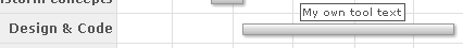
You can also set custom tool text for each task using:
This will result in: