<chart lowerLimit="0" upperLimit="100" lowerLimitDisplay="Bad" upperLimitDisplay="Good" gaugeStartAngle="180" gaugeEndAngle="0" palette="1" numberSuffix="%" tickValueDistance="20" showValue="1">
  <colorRange>
    <color minValue="0" maxValue="75" code="FF654F"/>
    <color minValue="75" maxValue="90" code="F6BD0F"/>
    <color minValue="90" maxValue="100" code="8BBA00"/>
  </colorRange>
  <dials>
    <dial value="92" rearExtension="10"/>
  </dials>
</chart>
{
  "chart": {
    "lowerlimit": "0",
    "upperlimit": "100",
    "lowerlimitdisplay": "Bad",
    "upperlimitdisplay": "Good",
    "gaugestartangle": "180",
    "gaugeendangle": "0",
    "palette": "1",
    "numbersuffix": "%",
    "tickvaluedistance": "20",
    "showvalue": "1"
  },
  "colorrange": {
    "color": [
      {
        "minvalue": "0",
        "maxvalue": "75",
        "code": "FF654F"
      },
      {
        "minvalue": "75",
        "maxvalue": "90",
        "code": "F6BD0F"
      },
      {
        "minvalue": "90",
        "maxvalue": "100",
        "code": "8BBA00"
      }
    ]
  },
  "dials": {
    "dial": [
      {
        "value": "92",
        "rearextension": "10"
      }
    ]
  }
}  Chart Image
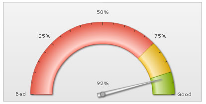