FusionCharts for Flex > Introduction > What's new in v1.3 ?
This section is meant for users who have implemented v1.2 or earlier version of FusionCharts for Flex in their applications and are now upgrading to FusionCharts for Flex v1.3.
Here, we will discuss how to make use of the features in FusionCharts for Flex v1.3
- Creating dynamically resizable gauges and charts
- Creating dynamically resizable annotations
- Using macros in annotations
- Showing legend in Funnel and Pyramid charts
- Adding Legend to Pie and Doughnut charts
- Increasing size of Legend icons
- Setting display modes of background image
- Alignment of background image
- Adding quadrants and labels to Bubble and Scatter charts
- Advanced configuration of x-axis in Scatter and Bubble charts
- Regression lines in Scatter and Bubble charts
- Controlling maximum area allotted for x-axis labels on Bar charts
- Using the default font size of the caption and sub caption
- Controlling alignment of caption and sub-caption
- Specifying y-axis minimum value (lower limit) for Stacked charts
- Plotting columns on right axis of chart in 3D combination charts
- Manually controlling position of data values in line charts
- Hide zero plane value
Creating dynamically resizable charts
Starting FusionCharts for Flex v1.3, all charts and gauges (widgets) can resize automatically as per the changed size of the container element. The charts and gauges can accept width and height in percentage (%) and scale in percentage with respect to the containers' size. Whenever a container's size changes, the chart or gauge automatically resizes itself with respect to the new size of the container element. To achieve this, all you need to do is:
- Set percentage values as the chart's width and height
<components:FusionCharts width="100%" height="100%" FCChartType="Column3D" FCDataURL="Data.xml" x="0" y="0" />
or
<components:FusionWidgets width="100%" height="100%" FCChartType="AngularGauge" FCDataURL="Data.xml" x="0" y="0" />
- For gauges set manageResize="1" in <chart> element
<chart manageResize='1' ...>
All charts and gauges in FusionCharts for Flex v1.3 can now resize automatically as per the changed size of the container element.
For more details on dynamic-resizing, please see the Using Dynamic Resizing page
Note: The dynamic resizing feature in guges does not work if autoScale attribute is set to 0.
Go to top
Creating dynamically resizable annotations
Starting FusionCharts for Flex v1.3, Annotations present in FusionWidgets can also resize dynamically along with the dynamically resizable charts/gauge. For this, you need to make the chart/gauge dynamically resizable by:
- Setting percentage dimensions to the chart/gauge
- Making the container of the chart/gauge capable of resizing (due to user interaction or using code)
- Setting manageResize="1" in the <chart> element
By default, when a chart is rendered initially (before resizing), it draws the annotations based on the coordinates and size provided in the XML. It does not scale the annotations.
On further resizing (dynamically), the annotation groups and the annotation elements are scaled in the following way:
- The x and y positions of the annotation groups are first re-calculated and scaled.
- Scaling of the x and y positions of the annotation groups is done without maintaining proportions.
- Scaling is not applied on the values passed through the xShift and yShift attributes.
- Scaling is also not applied on the values provided by annotation macros. However, the numeric values (if not prefixed by a $) present in the macro expressions are scaled.
- Scaling is further applied on the position (x, y, toX and toY) and size (radius etc.) of the annotation elements.
- All the annotation elements (rectangle, line, arc, circle, and polygon) are scaled proportionally, i.e., preserving the proportions of the shapes to avoid distortion. To maintain proportion, the annotations scale based on the least change between the height and the width.
- You can scale the line and rectangle annotations without maintaining proportions by setting constrainedScale='0'.
- To allow scaling of text and image annotations, you need to set scaleText='1' and scaleImages='1' respectively, in the <annotationGroup> element.
Note: The dynamic resizing feature does not work if autoScale attribute is set to 0. This attribute can be set in the <chart> or <annotations> element.
- Position the annotation groups (using x, y, xShift and yShift attributes) with respect to the other elements of the gauge. For example, align the annotation groups' origins with center of an angular gauge.
- Position an annotation element relative to the position of its annotation group.
- Make proper use of the newly introduced macros for annotations to set dynamic positions to the annotation groups and individual annotation elements.
Note for users of FusionCharts for Flex v1.2 or earlier:If you are already using the Auto Scale feature of FusionCharts for Flex v1.2 (setting autoScale='1' in the <chart>, <annotations> or <annotationGroup> element) to auto-scale annotations, you can continue to use it in FusionCharts for Flex v1.3 without facing any problem.
However, if you want to use the dynamic resizing feature and macros introduced in FusionCharts for Flex v1.3, you can set manageResize='1'. Also, please note that you may require to tweak your existing annotations to make them work (without getting distorted) in dynamically resizable charts. While tweaking, please remember the following:
- Position the annotation groups (using x, y, xShift and yShift attributes) with respect to the other elements of the gauge. For example, align the annotation groups' origins with center of an angular gauge.
- Position an annotation element relative to the position of its annotation group.
- Make proper use of the newly introduced macros for annotations to set dynamic positions to the annotation groups and individual annotation elements.
- Unconstrained scaling on circle, arc and polygons will not be applied while using the dynamic resizing feature.
Go to top
Using macros in annotations
FusionCharts for Flex v1.3 introduces macros for annotations - pre-defined variables which assume values at run-time. These values are generated dynamically based on various configurations of a chart or gauge. The macros can be set as the value for the x and y positions of an annotation or annotation group. For example, the macro $chartCenterX always provides the horizontal-center position of a chart or gauge. If you want to place a circle annotation at the center of a chart or gauge, set x="$chartCenterX" and y="$chartCenterY" while defining the circle annotation. The circle will be placed at the center of the chart or gauge.
Again, the values provided by the macros change dynamically when a chart or gauge resizes. Thus, irrespective of the size of a chart or gauge, the circle is always placed at the center of the chart or gauge.
Additionally, using macro expressions, you can add numeric (integer) values to the macros or subtract numeric (integer) values from macros. For example, if you want to create a line 10 pixel from the top of the chart you can set y="$ChartStartY+10" while defining the line annotation. Again, if you want a line to be 10 pixel inside the right margin of the chart, you can set x="$ChartEndX-10".
Important Note: While using the dynamic resizing feature, the values provided by macros are not scaled. Rather, these values are re-set with the new values provided by the resized chart. However, the numeric values present in the macro expressions are scaled. For example, the value 10 in the expression $chartStartY+10 is scaled while using dynamic resizing. If do not want this numeric part to be scaled while using the dynamic resizing feature, you need to prefix the number with $. For example, the value 10 in the expression $chartStartY+$10 is NOT scaled while using dynamic resizing.
Go to top
Showing legend in Funnel and Pyramid charts
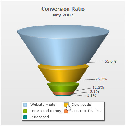
Starting FusionCharts for Flex v1.3, you can choose to place the labels in separate legend box for Funnel and Pyramid charts. You can click on the legend items to slice in and slice-out the respective funnel/pyramid item as shown below:
 |
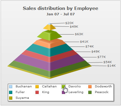 |
To show the legend (and hide the labels beside the pyramid) set:
<chart .. showLegend='1' showLabels='0'...>
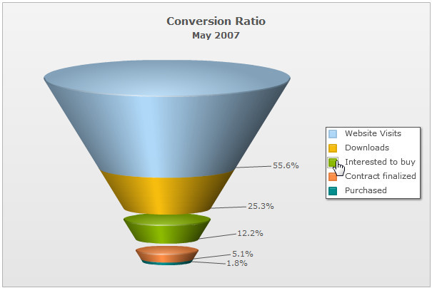
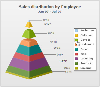
You can also place the legend at the right by setting the value of the legendPosition attribute to RIGHT:
<chart .. showLegend='1' legendPosition='RIGHT' showLabels='0'...>
The legend will be placed on the right as shown below:
 |
 |
Go to top
Adding Legend to Pie and Doughnut charts
FusionCharts for Flex 1.3 introduces interactive legends for all Pie and Doughnut charts. Each slice's label is shown as legend text along with the legend icon. When you click the legend icon, the relevant Pie or Doughnut slice slides out from the chart. Re-clicking the icon causes the slice to slide in.
Legend is not active by default in Pie and Doughnut charts. You can enable legend adding showLegend = "1" in <chart> element of XML. The legend can be placed either at the bottom or right side of the chart.
Go to top
Increasing size of Legend icons
FusionCharts for Flex v1.3 introduces interactive legend which most of the charts support. The interactive legend allows end users to click the legend icon to show or hide the particular data series.
Legends appear in all multi-series charts, stacked charts, combination, scroll charts, and in single series Pie and Doughnut charts. Interactive legend is not supported in Marimekko chart. Apart from being interactive, legend now provides visual icons pertinent to the data series, that is, column icon for a column data series. Generally, these icons are drawn at a size that appears best on the chart.
You can configure size of these icons using legendIconScale attribute of the <chart> element.
<chart legendIconScale='1.75' ...>
The scale value ranges from 0-5 where the default scale value is 1. Anything less than 1 reduces the size of the legend-icons on the chart. Any value bigger than 1 increase the size of the icons. Hence, .5 means half the size where as 2 means twice the size of the default icon size.
Note that the legendMarkerCircle attribute has been dropped in all the charts. This attribute used to set circular legend shapes. Due to the introduction of legend icons, which offer advanced visualization and interactive features, this feature has been deprecated.
Go to top
Setting display modes of background image
It is now possible to display the chart's background images using stretch, tile, center, etc. display modes. To apply a display mode to the background image, you need to use the bgImageDisplayMode attribute in the <chart> element. For example:
<chart bgImageDisplayMode='Stretch' ...>
There are six different modes. Sample charts showcasing each mode along with the name and a brief definition are given below:
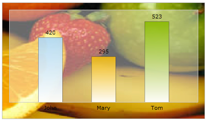
Stretch - Expands the image to fit the entire chart area, without maintaining original image constraints
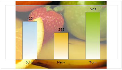
Fit - Fits the image proportionately on the chart area
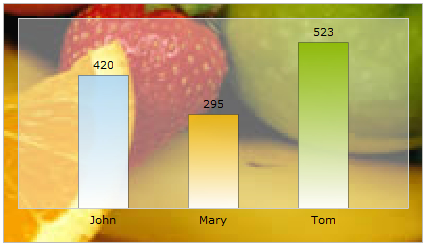
Fill -Proportionately fills the entire chart area with the image
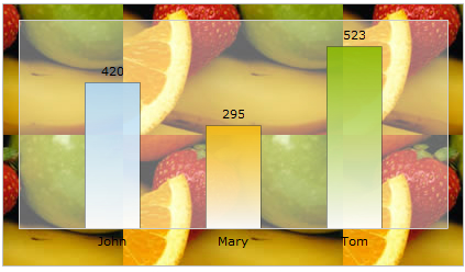
Tile - The image is repeated as a pattern on the entire chart area
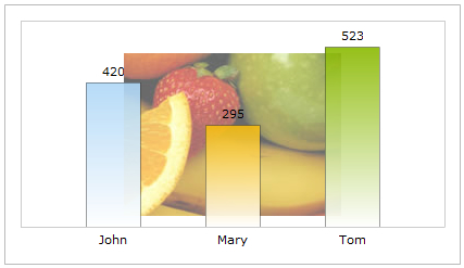
Center - The image is positioned at the center of the chart area
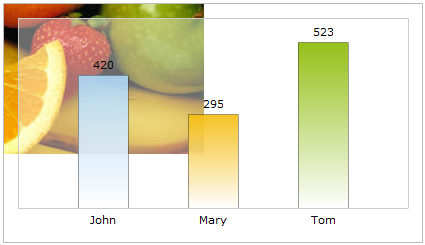
none - the original image is placed at the top left corner of the chart background (default)
Go to top
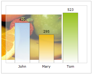
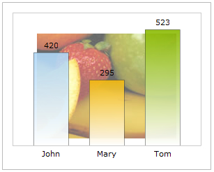
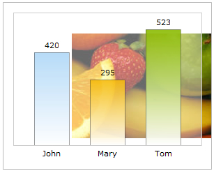
Alignment of background image
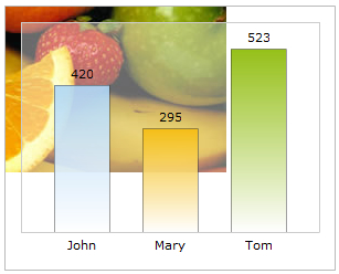
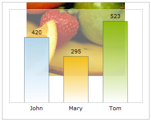
It is now possible to configure the vertical and horizontal alignment of chart's background image. The attributes used to apply the alignments are bgImageVAlign (possible values are - top, middle and bottom) and bgImageHALign (possible values are left, middle and right) in the <chart> element.
<chart bgImageHAlign='top' bgImageVAlign='middle' ...>
The charts below show how the combination of alignments works in a chart:
 |
 |
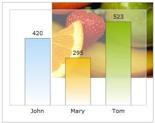 |
| bgImageVAlign='top' bgImageHAlign='left' |
bgImageVAlign='top' bgImageHAlign='middle' |
bgImageVAlign='top' bgImageHAlign='right' |
 |
 |
 |
| bgImageVAlign='middle' bgImageHAlign='left' |
bgImageVAlign='middle' bgImageHAlign='middle' |
bgImageVAlign='middle' bgImageHAlign='right' |
 |
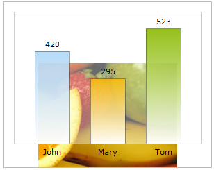 |
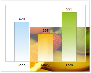 |
| bgImageVAlign='bottom'
bgImageHAlign='left' |
bgImageVAlign='bottom' bgImageHAlign='middle' |
bgImageVAlign='bottom' bgImageHAlign='right' |
Go to top
Adding quadrants and labels to Bubble and Scatter charts
It is now possible to add quadrants and their labels to Scatter and Bubble charts. To add quadrants, you need to use drawQuadrant='1' in the <chart> element of XML data. This makes the quadrant lines intercept exactly at the middle of the chart.
<chart drawQuadrant='1' ...>
Apart from setting the quadrant on, you can also set the interception position of the horizontal and vertical lines using two attributes - quadrantXVal and quadrantYVal. These two attributes accept values relative to x-axis and y-axis and act as the X and Y interception point.
<chart quadrantXVal='40' quadrantYVal='55' ...>
There are six attributes that configure the quadrant lines. These are quadrantLineColor, quadrantLineThickness, quadrantLineAlpha, quadrantLineIsDashed, quadrantLineDashLen, and quadrantLineDashGap.
Each quadrant can be set with a text label. We name each quadrant as 'top-left', 'top-right', 'bottom-left' and 'bottom-right'. To set label to each of these quadrants you need to set label values in these attributes - quadrantLabelTL, quadrantLabelTR, quadrantLabelBL, and quadrantLabelBR .
To add some padding space between quadrant labels and chart canvas borders, use the quadrantLabelPadding attribute.
Go to top
Advanced configuration of x-axis in Scatter and Bubble charts
It is now possible to apply advanced configuration to the x-axis labels of scatter and bubble charts. To configure the x-axis labels for scatter and bubble chart, you need to use the xAxisLabelMode attribute. The three configurable options of this attribute are:
- auto: This setting makes the chart automatically calculate a scale for x-axis and shows x-axis labels accordingly.
- categories: This setting shows explicitly defined x -axis labels
- mixed: This is a mixture of the two modes stated above. It shows both automatically defined and explicitly defined x-axis labels
The examples shown below discuss each mode in details:
Auto mode: x-axis labels are generated automatically. You do not need to explicitly define the <categories>...<category> elements in the data. The x-axis labels are based on x-axis values which in turn are generated using the x values of the chart data.An example data is given below:
<chart xAxisLabelMode='auto' caption='Income Expenditure Analysis'
  subcaption='(sample survey done among buyers of LCD TV)' xAxisName='Salary' yAxisName='Amount spent on LCD TV' >

  <dataset color='000000'>
    <set x='9200' y='1600' />
    <set x='9900' y='1800' />
    <set x='9500' y='1510' />
    <set x='9700' y='1400' />
    <set x='8100' y='1500' />
    <set x='8600' y='1300' />
    <set x='8300' y='1220' />
    <set x='7800' y='1300' />
    <set x='7800' y='1220' />
    <set x='7000' y='1210' />
    <set x='6000' y='1140' />
    <set x='6000' y='1000' />
    <set x='6200' y='950' />
    <set x='5300' y='940' />
    <set x='4700' y='1000' />
    <set x='4800' y='947' />
    <set x='4500' y='850' />
    <set x='4000' y='870' />
    <set x='3700' y='800' />
    <set x='3100' y='800' />
    <set x='4500' y='600' />
    <set x='3600' y='500' />
    <set x='3400' y='450' />
    <set x='3100' y='650' />
    <set x='3100' y='600' />
    <set x='3100' y='540' />
    <set x='2800' y='460' />
    <set x='2400' y='650' />
    <set x='2300' y='540' />
    <set x='3000' y='340' />
    <set x='2000' y='280' />
    <set x='2200' y='340' />
    <set x='2000' y='180' />
  </dataset>
</chart>
The chart for the above data will look as under:

Here, you do not need to specify the <categories>...<category> elements to generate the x-axis labels. Using the Auto mode, as shown in the above chart, the x-axis labels are automatically calculated and displayed.
Categories mode: x-axis labels or categories need to be defined explicitly using <categories>...<category> elements. An example data is shown below:
<chart xAxisLabelMode='categories' caption='Income Expenditure Analysis'
	  subcaption='(sample survey done among buyers of LCD TV)' xAxisName='Salary' yAxisName='Amount spent on LCD TV'>

  <categories>
    <category label='Low' x='1200' showVerticalLine='1' lineDashed='1'/>
    <category label='Avg' x='6000' showVerticalLine='1' lineDashed='1'/>
    <category label='High' x='9000' showVerticalLine='1' lineDashed='1'/>
  </categories>

  <dataset color='000000'>
	<set x='9200' y='1600' />
    <set x='9900' y='1800' />
    <set x='9500' y='1510' />
    <set x='9700' y='1400' />
    <set x='8100' y='1500' />
    <set x='8600' y='1300' />
    <set x='8300' y='1220' />
    <set x='7800' y='1300' />
    <set x='7800' y='1220' />
    <set x='7000' y='1210' />
    <set x='6000' y='1140' />
    <set x='6000' y='1000' />
    <set x='6200' y='950' />
    <set x='5300' y='940' />
    <set x='4700' y='1000' />
    <set x='4800' y='947' />
    <set x='4500' y='850' />
    <set x='4000' y='870' />
    <set x='3700' y='800' />
    <set x='3100' y='800' />
    <set x='4500' y='600' />
    <set x='4000' y='660' />
    <set x='3600' y='500' />
    <set x='3400' y='450' />
    <set x='3100' y='650' />
    <set x='3100' y='600' />
    <set x='3100' y='540' />
    <set x='2800' y='460' />
    <set x='2400' y='650' />
    <set x='2300' y='540' />
    <set x='3000' y='340' />
    <set x='2000' y='280' />
    <set x='2200' y='340' />
    <set x='2000' y='180' />
  </dataset>
</chart>
The chart for the above data will look as under:
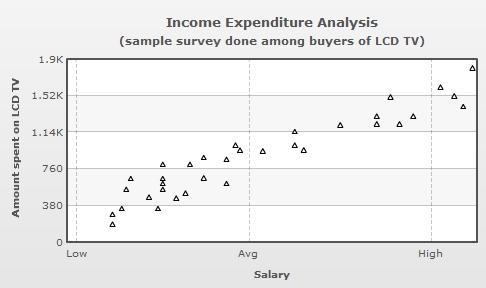
In the above chart, the labels displayed on the x-axis are derived from label attributes from the <category> elements of the <categories> element. The positions of the labels on the x-axis are defined by the x attribute of the <category> elements.
Mixed mode: A combination of Auto and Categories modes. To display the mixed mode, we have set xAxisLabelMode='mixed' in the above data.
<chart caption='Portfolio of Investments in Equities' xAxisLabelMode='mixed'... >
The chart with the same data which we passed using the Categories mode is shown below with the Mixed mode:
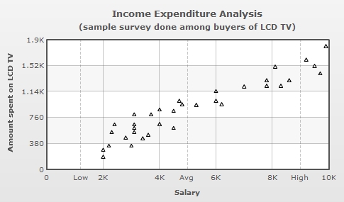
In the above chart, with Mixed mode, the x-axis displays both the explicitly defined labels and the automatically calculated labels through the <category> elements.
Go to top
Regression lines in Scatter and Bubble charts
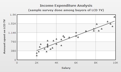
In Scatter and Bubble charts, you can now show regression lines to calculate and draw the average trend lines for all the data points. To display the regression line for all the data-points of a dataset, you need to declare the attribute showRegressionLine='1' in that <dataset> element. In case you wish to show all regression lines for all the datasets, you can declare showRegressionLine='1'in the <chart> element. An example is shown below:
<chart showRegressionLine="1" . . . >
The following scatter chart draws a regression line:
Go to top
Controlling maximum area allotted for x-axis labels on Bar charts
All Bar charts now provide a better management of long x-axis labels. Now, you can control the maximum width that the labels should take. You need to use a new attribute - maxLabelWidthPercent which limits the maximum width of x-axis labels.
<chart maxLabelWidthPercent='40' ...>
The attribute takes value in percent with respect to the whole chart. This prevents the longer labels from taking more space than the chart canvas, which otherwise might have allowed very little space for the chart to render.
In case the text of a label is still bigger than the allotted width, the label gets truncated with an ellipse (...) added as suffix. However, when hovered over the label, a tool tip appears, showing the full label in it. Wrapping of labels is also done, depending on how much height is available per label.
The default value of maxLabelWidthPercent is 65. In case all labels are smaller than the calculated width, as per this attribute, this value does not get applied and the chart calculates the best value.
Go to top
Using the default font size of the caption and sub caption
Starting FusionCharts for Flex v1.3, the default font size for caption and sub caption has been increased. Hence, you are no more required to apply font Styles to increase the size of the caption or sub caption of a chart. The default font size for caption is 13 pixels and the default font size for the sub caption is 11 pixels.
Go to top
Controlling alignment of caption and sub-caption
It is now possible to set alignment of chart caption and sub caption with respect to the chart canvas. You can achieve this using align attribute in Font style definition. This attribute is only applicable for CAPTION and SUBCAPTION objects of the chart. Let us see an example which set left alignment to the caption and right alignment to the sub caption.
<styles>
  <definition>
    <style name='LeftAlignCaption' type='font' align='left'/>
    <style name='RightAlignSubCaption' type='font' align='right'/>
  </definition>
  <application>
    <apply toObject='CAPTION' styles='LeftAlignCaption' />
    <apply toObject='SUBCAPTION' styles='RightAlignSubCaption' />
  </application>
</styles>
Go to top
Specifying y-axis minimum value (lower limit) for Stacked charts
Now it is possible to set a minimum value of the y-axis of all the stacked charts. For all single y-axis charts, the yAxisMinValue attribute is used to set this. In Dual Y Axis charts pYAxisMinValue can be set for all charts aligned to Primary y-axis.
<chart yAxisMinValue='-100' ...>
or
<chart pYAxisMinValue='-100' ...>
Go to top
Plotting columns on right axis of chart in 3D combination charts
Normally, the column data series in 3D charts with dual y-axis are plotted on the primary axis. The primary axis appears at the left side of the canvas. Now, you can swap the primary axis to the right by setting primaryAxisOnLeft attribute of <chart> element to 0. The example below shows how you can set the primary axis to right side of the chart.
<chart primaryAxisOnLeft='0' ...>
Go to top
Manually controlling position of data values in line charts
In order to stop clutter and overlapping of anchor-values of a line chart, FusionCharts for Flex v1.3 introduces a new attribute - valuePosition. If you have opted to show data values on the chart, this attribute lets you adjust the vertical alignment of data values with respect to dataplots. By default, this attribute is set to AUTO mode in which the alignment of each data value is determined automatically based on the position of each plot point. When the mode is set to 'ABOVE', data values are displayed above the plot points unless a plot point is too close to the upper edge of the canvas. In the BELOW mode, data values are displayed below the plot points unless a plot point is too close to the lower edge of the canvas. The attribute can be set in the <chart> element or <set> element of the chart XML. If the attribute is given in the <set> element, it overrides the global attribute value set in the <chart> element. The sample data below shows how you can use this attribute:
<chart showValues='1' valuePosition='auto' rotateValues='1'
    caption='Monthly Revenue' subcaption='Month' yAxisName='Revenue' numberPrefix='$' >
  <set label='Jan' value='420000' />
  <set label='Feb' value='910000' />
  <set label='Mar' value='720000' valuePosition='bottom' />
  <set label='Apr' value='550000' valuePosition='bottom' />
  <set label='May' value='810000' valuePosition='above' />
  <set label='Jun' value='510000' valuePosition='auto' />
</chart>
Please note the use of valuePosition in chart global settings as well as valuePosition in each dataplot. The settings provided in dataplot overrides the settings provided on the chart global settings.
Go to top
Show or hide zero plane value
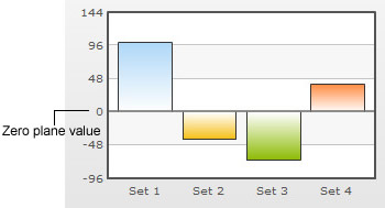
You can also opt to show or hide the value on which the zero plane exists on the y-axis. To do so, you need to set the attribute showZeroPlaneValue='0' in the <chart> element. A chart with and without zero plane value is displayed below:
 |
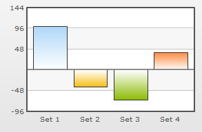 |
Chart displaying zero plane value |
Chart not displaying zero plane value |
Note: In Dual Y-Axis charts showPZeroPlaneValue='0' hides the zero plane value for the Primary Y-Axis and showSZeroPlaneValue='0' hides the zero plane value for the Secondary Y-Axis.