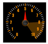
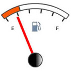
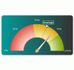
Angular gauges are essentially like the speedometer or fuel gauge of your car. They use a radial scale to display your data range and a dial is used to indicate the data value.
An angular/meter/dial gauge chart is used to display a specific dataset utilizing an indicator that moves within a circular range to indicate whether the monitored data is within defined limits. Colors can be selected for the data range to suit the application such as green for satisfactory, yellow for caution and red for alarm.
A few outputs of FusionWidgets XT Angular Gauge chart can be reproduced as under:
 |
 |
 |
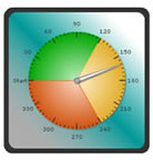 |
As you can see in all the charts, the chart is defined by minimum and maximum values (referred to as lower limit and upper limit). Within that scale, you can create various qualitative ranges (color range) to classify your data. Its purpose is to classify that value as belonging to a predetermined range. For example, you might define a range called “Best” that consists of values between 60 and 100. Or you might create a range called “Weak” that consists of values between 30 and 60. For each range, you define a color, which helps to visually distinguish the ranges from each other.
To create a FusionWidgets XT Angular Gauge chart, you need to:
- Decide the lower and upper limit of the chart
- Decide the cosmetic and functional properties of the chart
- Decide the color range for the chart. That is, suppose you are plotting a chart to show the production output of a factory, the color range could be:
0-100 pieces/hr – Under Average – Red
100-200 pieces/hr – Average Production - Yellow
200-300 pieces/hr – Very good - Green - Decide trend points if any – for example, if you like to mark an average at say 175 - say “Last week’s average production”, you can use trend points to do the same.
- Decide the chart value(s). FusionWidgets XT allows you to indicate multiple values on the angular gauge chart. All you have to do is decide the value each spindle/dial will indicate and the width and color of each one of them.
Let’s study the anatomy of an angular gauge chart before we move to the XML/JSON structure of the chart.