The angular gauge allows you to add the following trend elements on the gauge:
Here we'll see how to add these and configure the same.
Here, we've first added the <trendpoints> element, which can contain any number of trend-points for the chart. Now, for each trend point, you need to add a <point> element with startValue/endValue as the value and other cosmetic properties defined.
The above trend point will show up on the chart as under:
You can have the following properties for <point> element:
| Attribute Name | Type / Range | Description |
| startValue | Number | The starting value for the trend-point. Say, if you want to plot a trend arc from value 102 to 109, the startValue will be 102. |
| endValue | Number | The ending value for the trend-point. Say, if you want to plot a trend-arc from value 102 to 109, the endValue will be 109. |
| displayValue | String | Display label for the trend-point/trend-arc. If you do not specify a value, the chart displays the numeric value. |
| valueInside | Boolean (0/1) | Whether to display the trend-point value inside the gauge? |
| color | Color Code | Color of the trend point and its associated text. |
| thickness | Number (Pixels) | If you've opted to show the trend as a point, this attribute lets you define the thickness of trend line. |
| showBorder | Boolean (0/1) | If you're drawing a trend-arc, you can set its border on using this attribute. |
| borderColor | Color Code | Lets you define the border color for trend-arc. |
| radius | Number (Pixels) | Radius for trend point/outer side of trend arc. |
| innerRadius | Number (Pixels) | In case of trend-arc, radius for inner side of arc. |
| dashed | Boolean (0/1) | If you're showing the trend point as line, this attribute lets you control whether the line will be plotted as dashed? |
| dashLen | Number (pixels) | Length of each dash, if trend-point is plotted as dashed line. |
| dashGap | Number (pixels) | Length of each dash gap, if trend-point is plotted as dashed line. |
| useMarker | Boolean (0/1) | You can opt to show a triangular marker for each trend-point by setting this attribute to 1. |
| markerColor | Color Code | Fill color of marker. |
| markerBorderColor | Color Code | Border color of marker. |
| markerRadius | Number (pixels) | Radius of the marker. |
| markerTooltext | String | You can define tooltip for marker using this marker. |
If we wanted to customize the radius for this trend point, we can write:
Here we're using our own pixel based outer and inner radius for the trend point. This will result in:

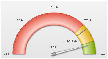
You can also place the value inside by setting:
This will result in:
The line can also be drawn as dashed one by setting:
This will result in:

If you wish to increase the space between trend line and its value, you can set it in:
<chart ... trendValueDistance='25' ..> (or a value in pixels)
This might often be necessary when you've long trend labels.
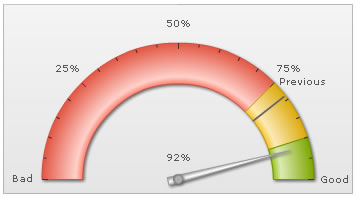
For each trend point, you can also show a triangular marker using:
<point startValue='79' displayValue='Previous' color='666666' useMarker='1' markerColor='F1f1f1' markerBorderColor='666666' markerRadius='7'/>
"point": [
      {
        "startvalue": "79",
        "displayvalue": "Previous",
        "color": "666666"
        "usemarker": "1",
        "markercolor": "F1F1F1",
        "markerbordercolor": "666666",
        "markerradius": "7"
      }
    ]
This will result in:

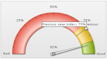
You can also add a tooltip to this marker using:
This will result in:
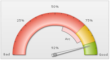
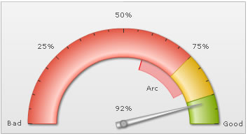
You can also create trend-arcs to represent a range of values, instead of a single value. Shown below is a simple XML:
Here, we've added both startValue and endValue to create a trend arc. Also, we've specified the cosmetics. This will result in:
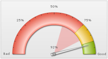
You can customize its radius as under:
This will result in:
You can opt to show border for the arc using:
This will result in: