An angular gauge chart consists of the following elements:
- Color Range (Radial scale)
- Dials (Data Value Indicators)
- Tick Marks & Values
- tooltip
- Trend points, trend arcs & trend markers
- Annotations
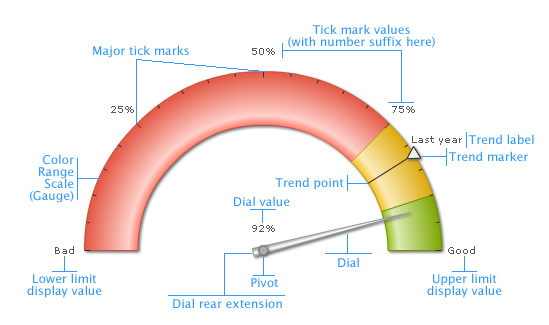
Here we’ll see each of them in detail. Let’s first have a look at a standard angular gauge chart enlisting the various basic components:
Note: Each color range should have its own unique range value. That is say, if a range is defined as 0-50, the next range should have the minimum value as 50 necessarily. It cannot have anything other than this. Similarly, if the upper limit of the chart is 100, the last range should have max value as 100.
In an angular gauge, dials are used to point to the desired value. You can point to more than one value using multiple dials. Each dial can have its individual properties like color (border and background), width (both base and top), radius and value of the dial. Tick marks are the calibration marks on the radial scale to help interpret the reading. There are two types of tick marks which can be drawn on the chart:- Major Tick Marks – These are the bigger lines around the radial scale.
- Minor Tick Marks – These are the smaller lines enclosed within the bigger lines.
For all the tick marks, you can specify the color, height and thickness. You can also specify the number of tick marks that you want to have on the chart. You have the option to show/hide the tick mark values as well.
For each dial on the chart, FusionWidgets XT allows you to set a tooltip to display the value indicated by that particular dial. You can customize the tooltip background color and border color. You can also opt to show/hide it.Trend Points / Trend arcs / Trend markers
The angular gauge chart allows you to define trend points on the chart. For example, if you wish to highlight a certain value (say like last year’s average), you could use the trend point feature to do so. Annotations allow you to draw your own custom shapes, text, or load images on the chart.Now that you know the potential of the angular chart, let's go ahead and build a sample angular gauge.