Y-Axis
In FusionTime, the yAxis object can be specified within the dataSource object of the FusionCharts constructor.
Refer to the image below:
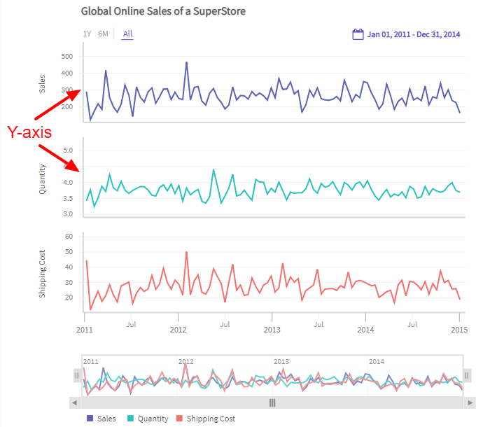
The yaxis object accepts input in two forms of an array.
- Array of objects
- Array of strings
An example of an array of objects is shown in the code below:
"yAxis": [{
"plot": {
"value": "Sales",
},
}, {
"plot": {
"value": "Quantity",
},
}, {
"plot": {
"value": "Shipping Cost",
},
}],In the above code an array has been created with two objects specifying Y-axes of canvases in a chart.
An example of an array of strings is shown in the code below:
"yAxis": [{
"plot": ["Sales", "Quantity", "Shipping Cost"]
}]In the above code an array has been created with two strings specifying y-axis of canvases in a chart.
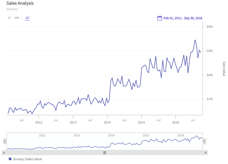
Refer to the chart below:
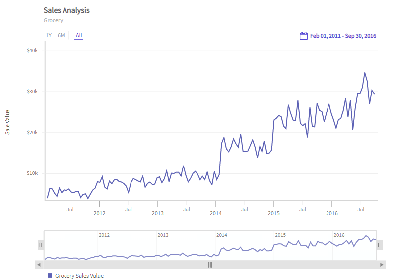
Y-axis on Right
By default, the position of the Y-axis is set to left. You can customize the position of the Y-axis by setting the value of orientation attribute to right. This will render a chart with Y-axis on right.
The code is given below:
"yAxis": [{
"plot": {
"value": "Sales",
},
"title": "Sales Value",
"orientation": "right",
}],In the above code, the value of orientation attribute has been set to right under yaxis object.
By applying the above attribute, the chart looks like as shown in the image below:
Dual Y-axis
In some scenarios, you might have data with two measures of different units. For example - temperature in degree Celsius and energy in kilowatt. This is where a dual Y-Axis comes handy. You can opt to show both the measures on two different Y-Axis in the same canvas. A chart with dual Y-Axis is shown below:
The chart above shows a dual y-axis chart created to compare energy consumed with the temperature for the year 2018.
To render a chart with dual y-axis refer to the code below:
{
data: dataStore,
chart: {
multiCanvas: false
},
caption: {
text: 'Energy & Temperature Measurements'
},
yAxis: [{
plot: [{
value: 'Energy',
connectNullData: true,
type: 'line'
}],
format: {
suffix: ' kWh'
}
}, {
plot: [{
value: 'Temperature',
connectNullData: true,
type: 'line'
}],
format: {
suffix: ' °C'
}
}],
}In the above code:
- Set the
multiCanvasattribute tofalse, which renders the chart with dual y-axis. - Set the column name using the
valueattribute under theplotobject to specify the column which is mapped to the y-axis. - Set the y-axis title for both the y-axis using the
titleattribute under theyAxisobject.
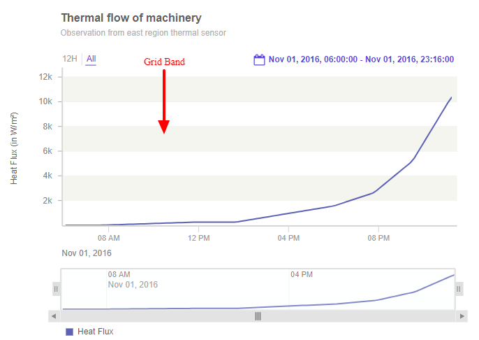
Log Y-Axis
In some scenarios, you might also have data for which instead of a usual linear axis you want a logarithmic axis. Logarithmic y-axis means log scale of any base greater than 1. The default base is 10. You can also opt to change the base if required. The charts with logarithmic y-axis are perfect for plotting data that comprises of both small and large values. You can use this to plot data like sales comparison, election results, population growth, etc. A chart with logarithmic y-Axis is shown below:
The chart is a logarithmic y-axis chart created to showcase the Thermal flow of machinery observed from the east region thermal sensor.
To render a chart with logarithmic y-axis refer to the code below:
{
caption: {
text: 'Thermal flow of machinery'
},
subcaption: {
text: 'Observation from east region thermal sensor'
},
yAxis: [{
plot: {
value: 'Heat Flux'
},
title: 'Heat Flux (in W/m²)',
type: 'log'
}],
}In the above code, the value of the type attribute of yAxis object has been set to log which renders a chart with the logarithmic y-axis.
Change Log Base
By default, the base of a chart with logarithmic y-axis is set to 10. You can, however, set the base to any value of your requirement. Just ensure that the base value is any natural number. Set the base attribute to specify the base value for the logarithmic chart.
A chart with logarithmic y-axis with base set to 50 is shown below:
The code to set the base of the logarithmic y-axis is shown below:
{
caption: {
text: 'Thermal flow of machinery'
},
subcaption: {
text: 'Observation from east region thermal sensor'
},
yAxis: [{
plot: {
value: 'Heat Flux'
},
title: 'Heat Flux (in W/m²)',
type: 'log',
base: '50'
}],
}Grid bands
Grid bands are horizontal bands running along with the canvas. They enable easier visual reference while panning the chart. FusionTime gives you support for alternate grid bands on the y-axis.
Grid bands are not applicable for log type of y-axis.
Refer to the image below:
To create grid bands, follow the steps given below:
Within the
yAxisobject, set the value ofshowGridbandattribute to1.Add style to the grid band using
grid-bandobject in thestyleobject underyAxisobject.
The only styling which can be added to the grid band is its fill color.
Refer to the code given below:
"dataSource": {
yAxis: [{
plot: {
value: 'Heat Flux'
},
title: 'Heat Flux (in W/m²)',
"showGridband": "1",
"style": {
"grid-band": {
"fill": "#f5f5ef"
}
}
// type: 'log'
}]
}In the above chart, fill color of the grid band is set to #D8D8D8.
A time-series chart rendered using y-axis grid bands is shown below:
Set Y-Axis Limits
You can set the custom y-axis limits as per your requirement. To do so, apply the following attributes under the yAxis object.
- Set the lower limit of the y-axis using the
minattribute. - Set the upper limit of the y-axis using the
maxattribute.
The code is given below:
"yAxis": [{
"plot": {
"value": "Sales",
},
"title": "Total Sales",
"min": "0",
"max": "40000"
"format": {
"prefix": "$",
}
}],The chart with custom y-axis limits looks as shown in the image below:
Add Prefix & Suffix
To specify the prefix and suffix of the y-axis values, set the suffix and prefix of the y-axis values using the suffix and prefix attributes under the format object within the yAxis object.
The code is given below:
"yAxis": [{
plot: {
"value": "Sales",
},
"title": "Total Sales",
}, {
format: {
"prefix": "$",
}
}],In the above code, prefix has been set as $.
Automatic Number Formatting
By default, FusionTime formats the y-axis values displayed on the charts using a predefined default format. You can disable the default formatting of the y-axis values to display the raw data in the chart. To disable the default formatting of the y-axis values, set the value of defaultFormat attribute to 0 under format object.
The sample formatting applied to the data values visible in the reflect tags, in the tooltip of both data plot and crossline.
Refer to the code below:
dataSource: {
yAxis: [{
format: {
defaultFormat: 0
}
}],
}In the above code, the value of defaultFormat attribute has been set to 0.
When the
defaultFormatattribute is set tofalse, all the numbers of a numeric value is shown up to 12 significant digits.
The chart rendered with the unformatted data value looks like shown below:
Round off the Numeric Values
It is an experimental feature.
To round off the y-axis values in a time series chart, give the rounding off value to the round attribute.
Refer to the code below:
dataSource: {
yAxis: [{
format: {
round: "1"
}
}],
}In the above code, the value of the round attribute is set to 1, i.e., the time series chart will be displayed with the y-axis values rounded off till one decimal places.
The chart rendered with the round attribute set to 1 looks like shown below:
The rounding off the y-axis values of a time series charts works in two ways:
When the value of
roundattribute is set as positive, it controls the number of decimal characters after the decimal point.Whereas, when set to negative, it controls the rounding of the values to the nearest 10s, 100s, 1000s, etc.
Refer to the table below:
| Value | Round | Rounded value |
|---|---|---|
| 3.14159 | 3 | 3.142 |
| 3.14159 | 2 | 3.14 |
| 3.14159 | 1 | 3.1 |
| 3.14159 | 0 | 3 |
| 9746.25 | -1 | 9750 |
| 9746.25 | -2 | 9700 |
| 9746.25 | -3 | 10000 |
Configure Null Values
FusionTime allows you to connect the data plots even if you have not specified any value for that particular date or dates. Previously by default, the connecting lines were getting rendered with the same style as of the data plots (only applicable for line and area charts). Starting v1.2.0, FusionTime has configured the default connecting lines to dashed lines. So, now if you have a null data in your time-series chart, by default the connecting line is rendered as dashed lines.
The dashed connecting line helps in interpolating the line/area segment differently and enables you to establish the clarity between the recorded data values and the interpolated values.
The default connecting line looks like as shown in the image below:
Add Styles to Connecting Line
FusionTime allows you to style the connector for the line or area data plot. You can configure the:
Line thickness,
Color, and
type of the connecting line.
Refer to the code given below:
The code given below can be used you want to configure the connecting line of a particular data plot. The detailed code to configure all the data plots of the chart is given later in the page.
{
"yAxis": [{
"plot": [{
"type": "line",
"connectNullData": "true"
"style": {
"plot.null": Style Object,
"line.null": Style Object,
"area.null": Style Object
}
}]
}]
}
In the above code:
connectNulldataattribute has been set to true underyAxisobject.A
styleobject has been created underyAxisobject to style the connecting line for null values.plot.nullobject is created to configure the connecting line of the plots in the canvas.line.nullobject is created to configure the connecting line of the line chart.area.nullobject is created to configure the connecting area of the area chart.
A sample code to style the null data of a simple time-series chart is given below:
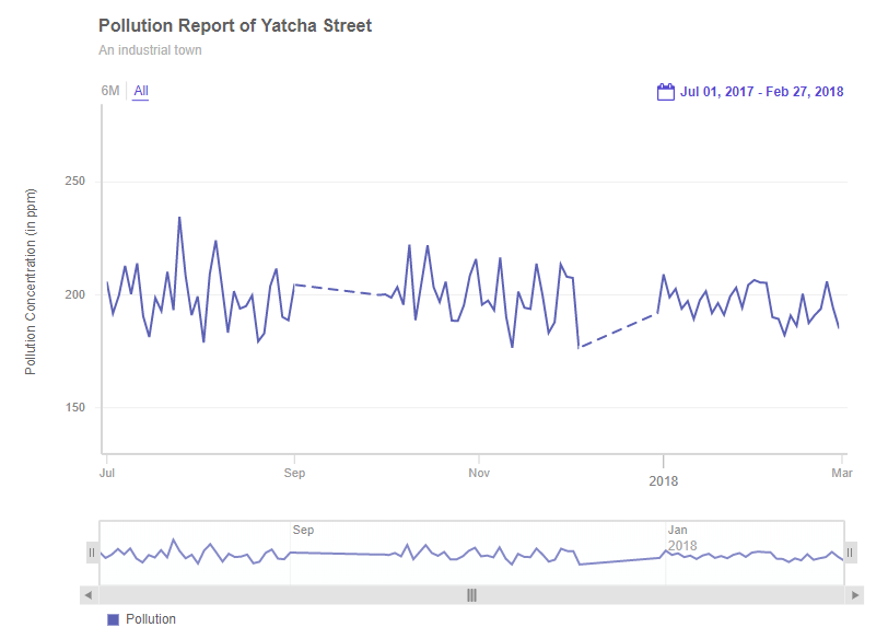
{
"type": "timeseries",
"renderAt": "container",
"width": 800,
"height": 600,
"dataSource": {
"data": dataStore,
"caption": {
"text": "Pollution Report of Yatcha Street"
},
"subcaption": {
"text": "An industrial town"
},
"yAxis": [
{
"plot": [
{
"value": "Pollution",
"connectNullData": true,
"style": {
"plot.null": {
"stroke-dasharray": "-1",
"stroke": "#FF0000"
}
}
}
],
"title": "Pollution Concentration (in ppm)",
"min": "130"
}
]
}
}The chart looks like as shown below:
Style Definition
You can add CSS styling to set the cosmetic properties of y-axis. To set the styling, instead of creating a separate CSS file, you can define the styling using StyleDefinition object.
Now, let's define the styleDefinition object and set the font color in an object. The code is given below:
styleDefinition: {
"colorstyle": {
"fill": "#ff0000"
}
}Once the StyleDefinition is defined, you can refer it for the various components using colorstyle attribute.
In order to understand better, we have named the object as
colorstyle. You can name the object as per your choice.
The syntax to set the StyleDefintion to the y-axis label is given below:
{
"yAxis": [
{
"plot": "Sales",
"title": "Sales",
"style": {
"title": "colorstyle"
}
}
]
}In the above code, colorStyle object is called to set the color of the caption.
The chart after applying the above attributes will look like as shown below:
In the above sample, font color of the y-axis label has been changed.