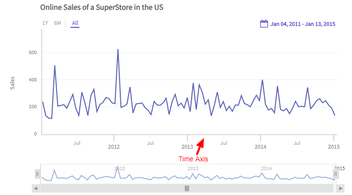
Time Axis
The X-axis of a chart in FusionTime represents the date column from the data table and is known as the Time Axis. Based on the atomicity of the data and the active window (of the time navigator) the time axis intelligently creates a timescale to display the chart data. Refer to the image below:
The salient features of the time axis are:
Intelligently creates a timescale to represent the chart data.
Uses major ticks, minor ticks and the contextual labels to help understand the timescale.
Each tick is associated with a label. The label is center aligned with the tick and appears right below it.
The visibility of each label is smartly controlled to reduce clutter and provide better clarity of the timescale.
The Time Axis supports almost all types of time-related units, from milliseconds (smallest) to years (largest).
The Time Axis automatically updates itself whenever there is a change in the time period from any of the components like standard range selector, custom range selector, and time navigator, or interactions such as zoom/pan from the chart canvas.
A sample chart is shown below:
In the above chart, try and change the time period and see how the time axis adjusts automatically to respond to the change occured. For example - try and zoom into the data from the chart canvas.
Multiple time columns in data
Let's suppose that you have a tabular data which has multiple date/time columns. For example - Order Date and Shipping Date. The time axis of FusionTime can only represent one date/time column on the timescale. In such a scenario, specify which date/time column you want the time axis to represent. To do so, refer to the code below:
new FusionCharts({
type: 'timeseries',
dataSource: {
xAxis {
"plot": "Order Date"
}
},
});In th above code:
- Create the
xAxisobject. - Set the column name which you want to represent on the time axis as the value of the
plotproperty. In this case,Order Dateis the column name.
If the tabular data has only one date type column, then FT automatically represents it in the
xAxis.
If multiple data type columns are available in the tabular data and we do not specify the data type column in
xAxis, then FT will assign the first date type column in the tabular data to thexAxis.
Data binning
Binning stages can be defined for the following time units:
- Year
- Month
- Day
- Hour
- Minute
- Second
- Millisecond
Default binning happens for each time unit, and if you want to modify it, you can specify the valid multipliers for each time unit.
Valid multipliers for each time unit are:
| Time Units | Valid Multipliers |
|---|---|
Year |
1, 2, 3, 5, 10 |
Month |
1, 2, 3, 4, 6 |
Day |
1, 2, 3, 5, 6, 10, 15 |
Hour |
1, 2, 3, 4, 6, 8, 12 |
Minute |
1, 2, 3, 4, 5, 6, 10, 12, 15, 20, 30 |
Second |
1, 2, 3, 4, 5, 6, 10, 12, 15, 20, 30 |
Millisecond |
10, 20, 50, 100, 200, 250, 500 |
The structure to apply the above multipliers is shown below:
new FusionCharts({
type: 'timeseries',
dataSource: {
xAxis: {
binning: {
"year": [Array of multipliers] // Ex - [1,2,3,5,10]
"month": [Array of multipliers] // Ex - [1,2,3,4,6]
"day": [Array of multipliers] // Ex - [1,2,3,5,6,10,15]
"hour": [Array of multipliers] // Ex - [1,2,3,4,6,8,12]
"minute": [Array of multipliers] // Ex - [1,2,3,4,5,6,10,12,15,20,30]
"second": [Array of multipliers] // Ex - [1,2,3,4,5,6,10,12,15,20,30]
"millisecond": [Array of multipliers] // Ex - [10,20,50,100,200,250,500]
}
},
}
});Refer the example below where we have just modified the binning stages for month, day & hour time unit.
In this case, default binning for other time units will apply.
If you do not want a particular time unit to be available in a data binned stage, you can specify an empty array against that time unit. Ex:
year=[].
Max bin
To specify the max bin for each chart, you need to provide empty arrays to all the time units which are below your interested time unit (by a natural hierarchy of time).
Refer the code below:
new FusionCharts({
type: "timeseries",
dataSource: {
xAxis: {
binning: {
year: [1],
month: [],
day: [],
hour: [],
minute: [],
second: [],
millisecond: []
}
}
}
});The live chart looks like as shown below:
Min bin
To specify the min bin for each chart, you need to provide empty arrays to all the time units which are above your interested time unit (by a natural hierarchy of time).
Refer the code below:
new FusionCharts({
type: "timeseries",
dataSource: {
xAxis: {
binning: {
year: [],
month: [1],
day: [],
hour: [],
minute: [],
second: [],
millisecond: []
}
}
}
});The live chart looks like ash shown below:
Clip time axis
The time axis offers a clipping feature, which you can use to remove the time periods you do not want to display on your time axis. The unclipped time sections of the time axis show all the other plots as a continuous stream of data.
Consider the following scenarios:
You only wish to display data for the business hours of an organization (say, 10 am to 7 pm) and clip sections of the time axis that indicate the time period from 7 pm to 10 am of the next business day.
You wish to remove the section for the holiday season in an organization, i.e., you want to clip sections of the time axis from the second week of December to the first week of January.
You only want to display data for weekdays and clip sections for Saturdays and Sundays from the time axis.
Use the clip object (under xAxis) to remove time duration which you do not need on the time axis. You can set the value of clip using from, to, and repeat parameters inside the clip object. The last two values are optional, but clipping will not work if you omit the from value.
When you want to clip a particular interval of time, set the values of from and to to the first and the last date of the time interval. The time axis will then clip the time interval indicated by the dates and display the other dates in the dataset.
The visual cue of a broken axis on xAxis shows the removal of a complete bin at the particular zoom level.
The visual cue of the dotted/dashed line on x-axis shows some time removal from that particular bin.
If you want to clip dates at equal intervals, use the unit and multiplier attributes with repeat object of clip object. For instance, if you want to clip out every Saturday and Sunday, set the date of the first Saturday to from, and the first Sunday to to. Now set the value of unit to day and the value of multiplier to 7.
Refer to the code given below:
new FusionCharts({
type: "timeseries",
dataSource: {
caption: {
text: "Temperature variations - New York 2019"
},
subcaption: {
text:
"Daily average temperature of New York City - missing data on Feb 5th"
},
yaxis: [
{
columnname: "Daily Visitors",
plottype: "column",
title: "Daily Visitors"
}
],
xaxis: {
initialinterval: {
from: "1/1/2019",
to: "30/6/2019"
},
showclippingcue: "1",
clip: [
{
from: "2019 Feb 05",
to: "2019 Feb 05",
format: "%Y %b %d"
}
]
}
}
});The live chart will look as shown below:
Output time format
FusionTime supports the following time units:
- Year
- Month
- Day
- Hour
- Minute
- Second
- Millisecond
You can customize the output time format for each time unit by specifying date-time tokens for respective time format.
Refer to the example given below:
In the above example, we have tried to specify the output time format on the time axis. Refer to the code below:
"xAxis": {
outputTimeFormat: {
//year: "",
month: "%b'%y (%q)",
day: "%d/%m (%a)",
//hour: "",
//minute: "",
//second: "",
//millisecond: ""
}
}In the above code:
- Define the
xAxisobject. - Create the
outputTimeFormatobject. - Set the custom output time format for month and day as
%b'%y (%q)and%d/%m (%a)respectively.
If yo do not set the data-time tokens for any time unit, the default formatting for the particular time unit will apply.
The date-time tokens for respective time formats is given below:
| Time Unit | Tokens | Example |
|---|---|---|
| Year | %Y |
2018 |
| Month | %b |
Jan |
| Day | %d |
04 |
| Hour | %-I %p |
11 PM |
| Minute | %-M m |
26 m |
| Second | %-S s |
30 s |
| Millisecond | %-L ms |
75 ms |
Style Definition
Styling can be applied to three elements of the X-axis:
- Labels
- Title
- Tick marks
FusionTime allows to the style the major and minor ticks individually. The values of the style properties for major and minor tick marks and their labels are derived from the provided style.
The syntax to customize the ticks and labels of the time axis is given below:
"DataScource": {
"xAxis": {
"style": {
"tick-mark": { },
"tick-mark-major": { },
"tick-mark-minor": { },
"label": { },
"label-major": { },
"label-minor": { },
"label-context": { }
}
}
}In the above code:
xAxisis the object to customize the elements of the x-axis.styleis the object to apply to style the x-axis.tick-markis used to apply to style to both major and minor ticks.tick-mark-majoris used to apply to the major ticks of the time axis.tick-mark-minoris used to apply to style to the minor ticks of the time axis.labelis used to set the labels of the ticks.label-majoris used to set the contextual labels of the major ticks.label-minoris used to set the contextual labels of the minor tickslabel-contextis used to set the contextual labels to help understand the timescale.