Custom Range Selector
A custom range selector is an extension which allows you to set the from and to date/time. It is useful when you already know the exact start and end date/time for which you want to see the data. The custom range selector appears on the top-right corner of the chart canvas.
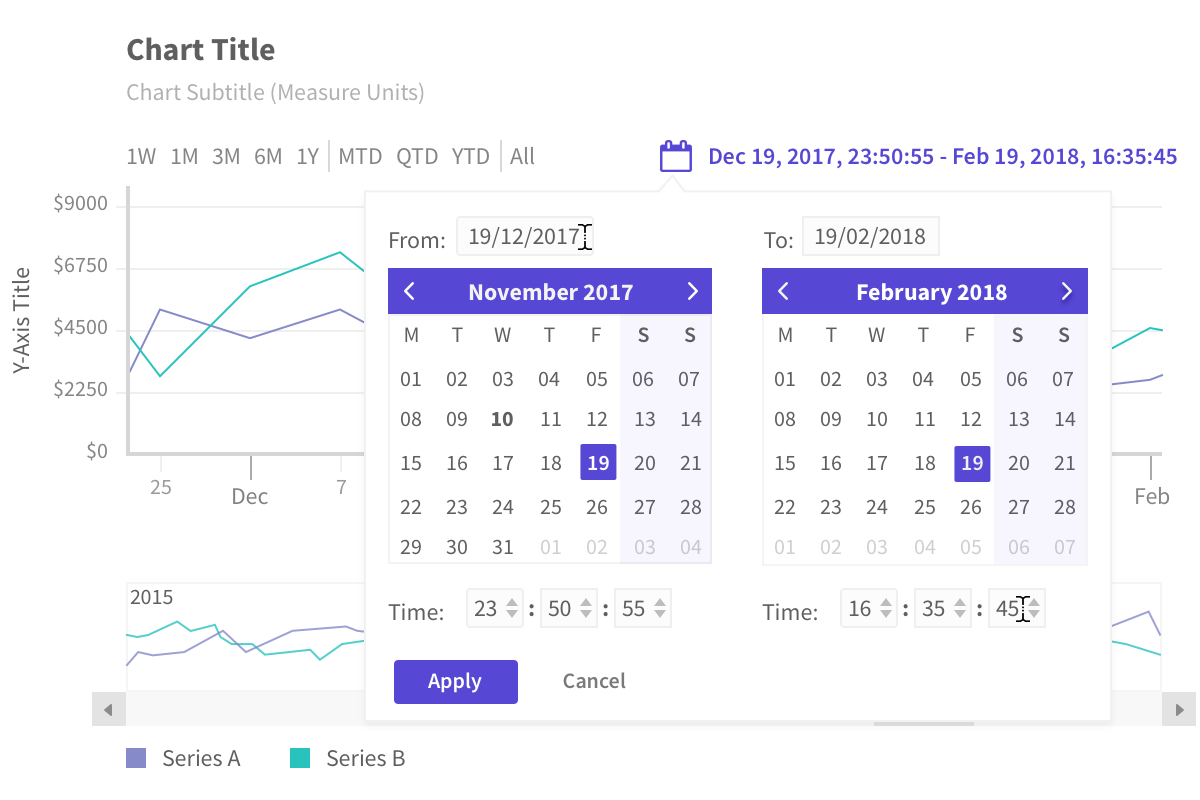
A custom range selector appears as shown in the image below:
Set custom date and time
To set the custom date and time follow the steps below:
Click on the custom range selector.
A calendar widget appears, select the date from the widget, or type in the input box.
After setting the date, set the time from the drop-down boxes. This option appears only if the atomicity of data is at time level.
Click
Applyto view the changes.
A chart with custom range selector is shown below:
Show/Hide Custom Range Selector
By default, the Custom Range Selector is visible in every chart. However, you can turn it off if you want, by setting the value of the enabled attribute within the customRangeSelector of the extensions object to 0.
Refer to the code below:
{
type: 'timeseries',
dataSource: {
data: fusionTable,
// Show/Hide Custom Range Selector
"extensions": {
"customRangeSelector": {
"enabled": "0"
}
}
}
}Behavior with data binning
The Custom Range Selector displays a complete time spread when binning is defined in time units, this provides users with a better understanding and details at first glance.

Zoom or pan the following example and notice binning values appearing in the custom range selector:
Add styling
Styling can be applied to following elements of the Custom Range Selector:
- Title
- Container
- Label
- Button
You can add style to the Custom Range Selector using style object under customRangeSelector object.
The
customRangeSelectorobject should be created underextensionsobject.
Syntax:
new FusionCharts({
type: "timeseries",
dataSource: {
"extensions": {
"customRangeSelector": {
"style": {
"title-text": {}, //Object | String
"title-icon": {}, //Object | String
"title-text:hover": {}, //Object | String
"title-icon:hover": {}, //Object | String
"title-text:active": {}, //Object | String
"title-icon:active": {}, //Object | String
"container": {}, //Object | String
"label": {}, //Object | String
"button-apply": {}, //Object | String
"button-cancel": {}, //Object | String
"button-apply:hover": {}, //Object | String
"button-cancel:hover": {}, //Object | String
"select": {}, //Object | String
"input": {} //Object | String
}
}
}
}
})
You can also add a different style to the calendar of the Custom Range Selector by adding following style attributes under style object of customRangeSelector object.
new FusionCharts({
type: "timeseries",
dataSource: {
"extensions": {
"customRangeSelector": {
"style": {
"cal-month": {}, //Object | String
"cal-month:hover": {}, //Object | String
"cal-header": {}, //Object | String
"cal-header:hover": {}, //Object | String
"cal-subheader": {}, //Object | String
"cal-subheader:hover": {}, //Object | String
"cal-body": {}, //Object | String
"cal-body:hover": {}, //Object | String
"cal-monthname": {}, //Object | String
"cal-monthname:hover": {}, //Object | String
"cal-navprev": {}, //Object | String
"cal-navprev:hover": {}, //Object | String
"cal-navnext": {}, //Object | String
"cal-navnext:hover": {}, //Object | String
"cal-weekend": {}, //Object | String
"cal-weekend:hover": {}, //Object | String
"cal-days": {}, //Object | String
"cal-days:hover": {}, //Object | String
"cal-date": {}, //Object | String
"cal-date:hover": {}, //Object | String
"cal-activedate": {}, //Object | String
"cal-activedate:hover": {}, //Object | String
"cal-selecteddate": {}, //Object | String
"cal-selecteddate:hover": {}, //Object | String
"cal-disableddate": {}, //Object | String
"cal-disableddate:hover": {}, //Object | String
}
}
}
}
})