Axes
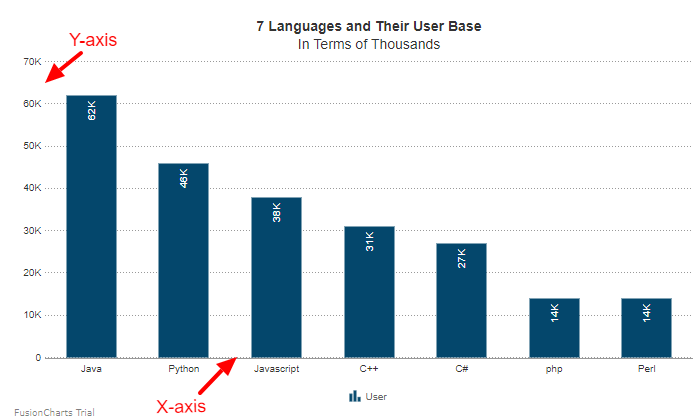
The axes of a chart are the intersecting lines that act as boundaries of the chart canvas and help you estimate the value of a data plot at a glance. Apart from setting the values for the axes, you can also customize the appearance of the axes, as well as that of the values displayed on them.
Refer to the image below:

X-Axis
In FusionCharts.NET Visualization, the x-axis is the horizontal axis of the chart. You can customize the title of the x-axis in the following ways, using the XAxis object under the object.
Set X-Axis Title
Set the title of the x-axis as string to the Text properties. Refer to the code given below:
visualizationObj.XAxis.Text = "chart x axis";Customize Font Properties
Customize the font properties of the x-axis title using the following:
- Set the font size as an integer using the
FontSizeproperties. - Set the font type as string using the
FontNameproperties. - Set the font color as hex code using the
FontColorproperties. - Display the title as bold by setting the
Boldproperties totrue. - Display the title as italic by setting the
Italicproperties totrue.
Refer to the code below:
visualizationObj.XAxis.FontSize = 18;
visualizationObj.XAxis.Fontname = "Arial";
visualizationObj.XAxis.FontColor = "#5d62b5";
isualizationObj.XAxis.Bold = true;
visualizationObj.XAxis.Italic = true;The chart will look as shown below:
Customize Border Color
Set the border color of the title as hex code using the BorderColor properties. Refer to the code given below:
visualizationObj.XAxis.BorderColor = "#737373";Customize Background Color
Set the background color of the title as hex code using the BGColor properties. Refer to the code given below:
visualizationObj.XAxis.BGColor = "#bfbfbf";Customize Border Thickness
Set the border thickness of the title as hex code using the BorderThickness properties. Refer to the code given below:
visualizationObj.XAxis.BorderThickness = 3;The chart after applying the above attributes will look as shown below:
Y-Axis
In FusionCharts .NET Visualization, the y-axis is the vertical axis of the chart. You can customize the caption of the y-axis using the YAxis object under the visualizationObj object.
Set Y-Axis Title
Set the title of the y-axis as string using the Text properties. Refer to the code given below:
visualizationObj.YAxis.Text = "chart y axis";Customize Font Properties
Customize the font properties of the x-axis title using the following:
- Set the font size as an integer using the
FontSizeproperties. - Set the font type as the string using the
FontNameproperties. - Set the font color as hex code using the
FontColorproperties. - Display the title as bold by setting the
Boldproperties totrue. - Display the title as bold by setting the
Italicproperties totrue.
Refer to the code below:
visualizationObj.YAxis.FontSize = 18;
visualizationObj.YAxis.Fontname = "Arial";
visualizationObj.YAxis.FontColor = "#5d62b5";
visualizationObj.YAxis.Bold = true;
visualizationObj.YAxis.Italic = true;The chart will look like as shown below:
Customize Border Color
Set the border color of the title as hex code using the BorderColor properties. Refer to the code given below:
visualizationObj.YAxis.BorderColor = "#737373";Customize Background Color
Set the background color as hex code using the BGColor properties. Refer to the code given below:
visualizationObj.YAxis.BGColor = "#bfbfbf";Customize Border Thickness
Set the border thickness of the title as hex code using the BorderThickness properties. Refer to the code given below:
visualizationObj.YAxis.BorderThickness = 3;The chart after applying the above attributes will look as shown below: