Plot Types
Plot refers to a line in a line chart, a column in a column chart, area in an area chart, etc.
FusionTime supports the following plot types:
- Line
- Column
- Stacked Column
- Grouped Column
- Area
- Stacked Area
- Smooth Area
- Spline
- Step Line
- Candlestick
- OHLC
By default, the chart renders with a line plot. However, you can specify the plot type in a chart, using the plotType property inside the yAxis object. Refer to the code below:
yAxis: {
"plot": {
"value": "Sales",
"type": "column"
}
}In this article, we'll see different types of data plots to render a chart.
Line
Let’s create a time series chart using line as a data plot showcasing online sales of SuperStore in United States of America.
The time series chart is shown below:
To check out the detailed step to render the above chart, click here.
Column
To render a time series chart with column as data plot, set the value of type attribute to column.
The above time series chart, rendered with column plot is shown below:
Stacked Column
To render a time series chart with the stacked column as data plot, set the value of type attribute to column and the value of the series to the y-axis value.
Let’s create a chart showcasing Unemployment rate in San Jose & SJ Metro Area.
Grouped Column
To render a time series chart with the grouped column, set the value of plottype attribute to column and the value of the plot attribute in the series name.
Let’s create a chart showcasing Sales Analysis of Grocery and Footwear Store.
Area
To render a time series chart with area as data plot, set the value of type attribute to area.
A time series chart, rendered with area plot is shown below:
Stacked Area
To render a time series chart with the stacked area as data plot, set the value of type attribute to area and the value of the series to the y-axis value.
Let’s create a chart showcasing total rainfall of Assam and Tripura. The time series chart looks like:
Smooth Area
To render a time series chart with the smooth area as data plot, set the value of type attribute to smooth-area.
Let’s create a chart showcasing daily visitors count of a website. The time series chart looks like:
Spline
To render a time series chart with spline as data plot, set the value of type attribute to smooth-line.
Let's create a chart showcasing weather report. The time series chart looks like:
Step-line
To render a time series chart with step-line as data plot, set the value of type attribute to step-line.
Let's create a chart showcasing weather report. The time series chart looks like:
Candlestick
To render a time series chart with candlestick as data plot, set the value of type attribute to candlestick.
Let's create a chart showing Apple Inc. Stock Price. The time series chart looks like:
OHLC
To render a time series chart with ohlc as data plot, set the value of type attribute to ohlc.
Let's create a chart showing NASDAQ Composite Index. The time series chart looks like:
Style Definition
You can add CSS styling to set the cosmetic properties of the data plots. To set the styling, instead of creating a separate CSS file, you can define the styling using StyleDefinition object or setting the style object in a particular object of the component.
Applying CSS styling to the data plots of the chart is a bit different from the other components. Although the style object supports any of the SVG attributes, the color of the data plots cannot be changed from their style sections. The color can be customized using the paletteColors attribute within the chart object.
Data plots can either be styled:
using plot configuration
or by y-axis configuration
Plot Configuration
Style defined using plotConfig object are scoped to the entire chart, i.e., if you define a line plot and set the value of stroke-width to 4, all the line plots in the chart will have stroke width set to 4 pixels.
Syntax:
{
"plotConfig": {...}
}You can also apply style across all the chart types using generic object within the plotConfig object. It applies the style to any chart type even in multiple canvases.
Syntax:
{
"plotConfig": {
"style": {
"generic": {...}
}
}
}All the supported chart types of time-series chart can be customized using the plotConfig object. In FusionTime, some of the data plots have been build using several elements, for example, an area plot is built using a line at the top and the filled space is the area of the plot. Each element of the data plot can be styled individually.
Example:
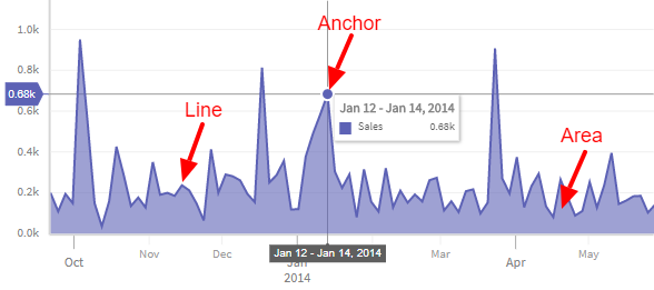
In the above image, as you can see an area chart with three elements, a line, an area, and an anchor. You can either style them individually or style them all together.
Let's take an example of an area chart where you want to customize the opacity of the above three elements with different values. The code looks like as shown below:
{
"plotConfig": {
"style": {
"area": {
"line": {
"opacity": 1.0
},
"area": {
"opacity": 0.3
},
"anchor": {
"opacity": 0.7
}
}
}
}
}However, instead of three different values, you want to set the same value for the above chart. Let's see how can you update the same value to all the elements of the area chart:
{
"area": {
"plot": {
"opacity": 0.7
}
}
}In the above code, the opacity of the line, area and anchors has been set to 0.7.
The list of all the plot types and their respective sub-parts are listed below:
{
"plotConfig": {
"style": {
"column": {
"plot": Style,
"column": Style
},
"line": {
"plot": Style,
"line": Style
},
"smooth-line": {
"plot": Style,
"line": Style
},
"step-line": {
"plot": Style,
"line": Style
},
"area": {
"plot": Style,
"line": Style,
"area": Style
},
"smooth-area": {
"plot": Style,
"line": Style,
"area": Style
},
"step-area": {
"plot": Style,
"line": Style,
"area": Style
},
"candlestick": {
"bear": Style,
"bull": Style
},
"ohlc": {
"bear": Style,
"bull": Style
},
"generic": {
"plot": Style,
"line": Style,
"area": Style,
"bear": Style,
"bull": Style,
"column": Style,
"anchor": Style
}
}
}
}Y-axis Configuration
In FusionTime, you can also style specific data plots. These styling will be scoped to only the set of plots for which the style has been defined. In the yAxis object the style object is defined under the plot object. The rest of the steps are the same as the plot configuration method.
Syntax:
{
"yAxis": [{
"plot": [{
"style": { /* bear, bull, plot, ... */ }
}]
}]
}