Data Marker
Data marker in a chart represents an important event, which occurred on a specific data point. Hovering on a data marker shows an additional description of the event in the tooltip.
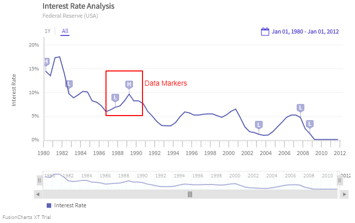
The image below shows the default data marker on a time series chart:
Create Data Markers
To create data markers, follow the steps given below:
Create a
dataMarkerobject in thedataSource.Within the
dataMarkerobject use thetimeattribute to set the time instance on which the data marker will be displayed.Within the
dataMarkerobject use thetimeFormatattribute to set the format of the date/time corresponding to the marker.Within the
dataMarkerobject use thetypeattribute to define the type of the marker asflag.Within the
dataMarkerobject use thevalueattribute to specify the y-axis label on which the data marker will be applied.Within the
dataMarkerobject use theidentifierattribute to set the character to be displayed within the marker.Within the
dataMarkerobject use thetooltextattribute to set the text to be displayed in the tooltip, when you hover the mouse pointer over the data marker.
Refer to the code given below:
dataMarker: [{
series: "Interest Rate",
time: "Mar-1980",
identifier: "H",
timeFormat: "%b-%Y",
tooltext: "As a part of credit control program, under the leadership of Paul Volcker, the Fed tightened the money supply, allowing the federal fund rates to approach 20 percent."
}, {
series: "Interest Rate",
time: "Aug-1982",
identifier: "L",
timeFormat: "%b-%Y",
tooltext: "The FED eases off the monetary brakes, allowing interest rates to fall and the economy to begin a strong recovery."
}, {
series: "Interest Rate",
time: "Oct-1987",
identifier: "L",
timeFormat: "%b-%Y",
tooltext: "The FED is forced to ease rate after the stock market crash."
}, {
series: "Interest Rate",
time: "May-1989",
identifier: "H",
timeFormat: "%b-%Y",
tooltext: "Liquidity problem forced the Fed to increase rate to nearly 10%."
}, {
series: "Interest Rate",
time: "Sept-1992",
identifier: "L",
timeFormat: "%b-%Y",
tooltext: "To fight the jobless economy growth the Fed had to reduce the interest rate to 3%."
}, {
series: "Interest Rate",
time: "Jun-2003",
identifier: "L",
timeFormat: "%b-%Y",
tooltext: "Struggling to revive the economy, the FED cuts it’s benchmark rate to 1%."
}, {
series: "Interest Rate",
time: "Sep-2007",
identifier: "L",
timeFormat: "%b-%Y",
tooltext: "Fed started reducing the Federal Fund Rate."
}, {
series: "Interest Rate",
time: "Dec-2008",
identifier: "L",
timeFormat: "%b-%Y",
tooltext: "Fed reduced the interest rates to sub 0.25% to manage the menace of longest economic downturn since World War 2"
}],The data marker created using the above code is shown below:
There are currently two types of data markers:
- Flag type (default)
- Pin type
The pin type data marker has been introduced in FusionTime v1.3.0.
The image below shows the pin type data marker on a time series chart:
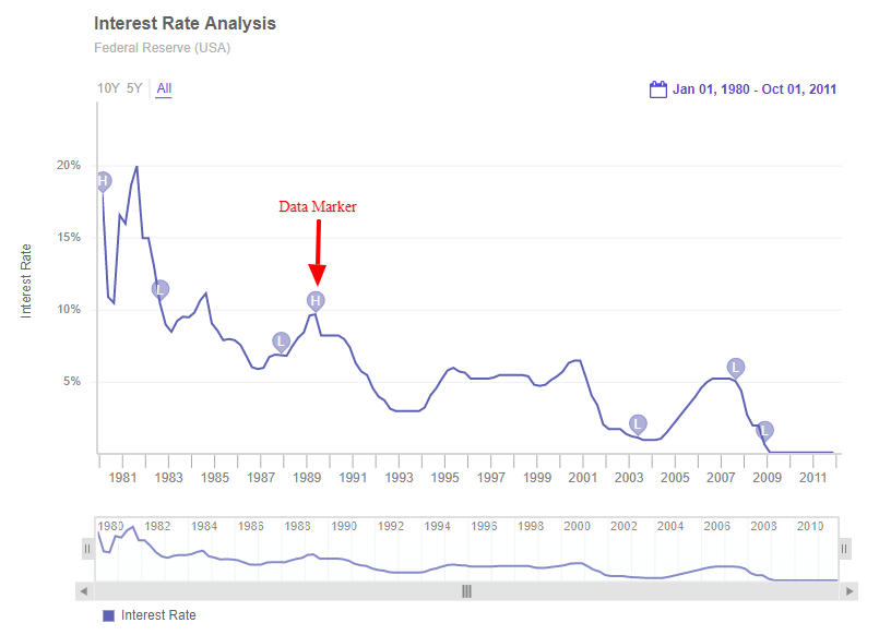
The code to render a time series chart with pin type data marker is shown below:
dataMarker: [
{
series: "Interest Rate",
time: "Mar-1980",
type: "pin", //data Marker set to pin
identifier: "H",
timeFormat: "%b-%Y",
tooltext: "As a part of credit control program."
}
];A time-series chart with pin type data marker looks like as shown below:
LIVE CHART
Data Markers in MultiVariate Chart
When representing time-series data, it is important to mark events which have happened on a particular set of data points at a specific time. In order to achieve this, FusionTime allows you to specify data markers for some specific canvases as well.
Let's take an example of the following data.
| Date | Item | Units Sold | Sales (USD) |
|---|---|---|---|
| 2020-1-1 | Cake | 188 | 1880 |
| 2020-1-1 | Cookie | 133 | 339 |
| 2020-1-1 | Candy | 121 | 84.7 |
| 2024-9-17 | Cake | 2 | 20 |
| 2024-9-17 | Cookie | 277 | 831 |
| 2024-9-17 | Candy | 219 | 153.3 |
| 2027-4-13 | Cake | 168 | 1680 |
| 2027-4-13 | Cookie | 227 | 681 |
| 2027-4-13 | Candy | 397 | 277.9 |
| 2029-12-31 | Cake | 46 | 460 |
| 2029-12-31 | Cookie | 105 | 315 |
| 2029-12-31 | Candy | 154 | 107.8 |
For the complete data click here.
Now, let’s add the events held on particular dates in the JSON using data markers. The code is shown below:
{
"caption": {
"text": "La petite boulangerie"
},
"subcaption": {
"text": "Units Sold and Sales over 10 years"
},
"series": "Item",
"dataMarker": [
{
"time": "2024-9-17",
"timeFormat": "%Y-%-m-%-d"
},
{
"time": "2027-4-13",
"timeFormat": "%Y-%-m-%-d"
}
]
}In the above code:
dataMarkerhas been set under thedataSource.- The
timeattribute specifies the date of the event held. - the
timeFormatattribute specifies the date/time format.
The chart looks as shown below:
In the above chart, the data markers have been marked on both the canvases of the chart. There can be a case, where you want to apply a data marker to a particular canvas of a multivariate chart.
For example:
- The event occured on 2024-9-17 affects both the canvases, i.e., Units Sold and the Sales of Cake.
- The second event occured on 2027-3-28 affects on the canvas of Units Sold on both the items, i.e., Candy and Cookie.
To apply data marker to the chart for the above scenerio, let's create the data markers one after the other. Follow the steps below:
Step 1
Data marker on 2024-9-17 will only shown on the series for Cake and the value will be derived from Units Sold.
Refer to the code:
{
"time": "2024-9-17",
"timeFormat": "%Y-%-m-%-d",
"value": "Units Sold",
"series": {
"Item": "Cake"
}
}Step 2
Data marker on 2024-9-17 will only be shown on the series for Cake and the value will be derived from Sales (USD).
Refer to the code:
{
"time": "2024-9-17",
"timeFormat": "%Y-%-m-%-d",
"value": "Sales (USD)",
"series": {
"Item": "Cake"
}
}Step 3
Data marker on 2027-4-13 will only be shown on the series for Cookie and the value will be derived from Units Sold.
Refer to the code:
{
"time": "2027-4-13",
"timeFormat": "%Y-%-m-%-d",
"value": "Units Sold",
"series": {
"Item": "Cookie"
}
}Step 4
Data marker on 2027-4-13 will only be shown on the series for Candy and the value will be derived from Units Sold.
Refer to the code:
{
"time": "2027-4-13",
"timeFormat": "%Y-%-m-%-d",
"value": "Units Sold",
"series": {
"Item": "Candy"
}
}The consolidated code of the above created data marker is:
{
"caption": {
"text": "La petite boulangerie"
},
"subcaption": {
"text": "Units Sold and Sales over 10 years"
},
"series": "Item",
"dataMarker": [
{
"time": "2024-9-17",
"timeFormat": "%Y-%-m-%-d",
"tooltext": "Lowest units of Cake sold since cake decorator was fired.",
"value": "Units Sold",
"identifier": "C",
"series": {
"Item": "Cake"
}
},
{
"time": "2024-9-17",
"timeFormat": "%Y-%-m-%-d",
"tooltext": "Lowest sales of Cake since cake decorator was fired.",
"value": "Sales (USD)",
"identifier": "C",
"series": {
"Item": "Cake"
}
},
{
"time": "2027-4-13",
"timeFormat": "%Y-%-m-%-d",
"tooltext": "Units of Cookie sold affected by Candy discount.",
"value": "Units Sold",
"identifier": "K",
"series": {
"Item": "Cookie"
}
},
{
"time": "2027-4-13",
"timeFormat": "%Y-%-m-%-d",
"tooltext": "Max units of Candy sold since Candy discount started.",
"value": "Units Sold",
"identifier": "D",
"series": {
"Item": "Candy"
}
}
]
}The chart looks as shown below:
Style Definition
You can add CSS styling to set the cosmetic properties of data markers. To set the styling, instead of creating a separate CSS file, you can define the styling using StyleDefinition object.
Now, let's define the styleDefinition object and set the color in an object. The code is given below:
styleDefinition: {
"colorstyle": {
"fill": "#ff0000",
"font-weight": "bold"
}
}Once the StyleDefinition is defined, you can refer it for the various components using colorstyle attribute.
The syntax to set the StyleDefintion to the data marker is given below:
{
"seriesName": String,
"time": String,
"timeFormat": String,
"type": String,
"identifier": Character
"tooltext": String,
"style": {
"text": colorStyle,
"marker": colorStyle
}
}In the above code, colorStyle object is called to set the color of the data marker.
The chart after applying the above attributes will look like as shown below:
In the above sample, font color of the y-axis label has been changed.