 Chart Image Chart Objects Functional Attributes Axis & Tick mark properties Chart Cosmetics Paddings and Margins Sample XML Data Data Plot properties Color Range Properties Number Formatting Font Properties Tooltip
| Quick Links (within this page) |
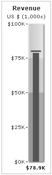
| Vertical Bullet Graph looks as under: |
 |
| Sample XML / JSON for Angular Gauge: |
<chart lowerLimit="0" upperLimit="100" caption="Revenue" subcaption="US $ (1,000s)" numberPrefix="$" numberSuffix="K" showValue="1"> {
"chart": {
"lowerlimit": "0",
"upperlimit": "100",
"caption": "Revenue",
"subcaption": "US $ (1,000s)",
"numberprefix": "$",
"numbersuffix": "K",
"showvalue": "1"
},
"colorrange": {
"color": [
{
"minvalue": "0",
"maxvalue": "50",
"code": "A6A6A6"
},
{
"minvalue": "50",
"maxvalue": "75",
"code": "CCCCCC"
},
{
"minvalue": "75",
"maxvalue": "100",
"code": "E1E1E1"
}
]
},
"value": "78.9",
"target": "80"
}
|
Back to top 
|
| Chart Objects | |||
|
Custom defined Styles can be applied to the chart objects listed below. The table contains the names of the chart objects, short descriptions, list of supported Styles and list of supported animation parameters. |
|||
| Object Name | Description | Features Supported | Animation Parameters Supported |
| BACKGROUND | Background refers to the background for entire chart. |
|
|
| CAPTION | Caption of the chart. |
|
|
| SUBCAPTION | Sub-caption of the chart. |
|
|
| PLOT | Fill bar indicating chart value. |
|
|
| TICKMARKS | Lines indicating tick marks. |
|
|
| TICKVALUES | Tick values on the chart. |
|
|
| LIMITVALUES | The starting and ending tick value (chart limits). |
|
|
| COLORRANGE | Color range (showing qualitative range) bars. |
|
|
| TARGET | Line showing target values. |
|
|
| TOOLTIP | Tooltip for the chart. |
|
|
|
Back to top |
|||
| <chart> element |
| Functional Attributes |
|
These attributes let you control a variety of functional elements on the chart. For example, you can opt to show/hide data labels, data values, y-axis values. You can also set chart limits and extended properties. |
| Attribute Name | Type | Description | |
| animation | Boolean (0/1) | This attribute lets you set the configuration whether the chart should appear in an animated fashion. If you do not want to animate any part of the chart, set this as 0. | |
| defaultAnimation | Boolean (0/1) | By default, each chart animates some of its elements. If you wish to switch off the default animation patterns, you can set this attribute to 0. It can be particularly useful when you want to define your own animation patterns using the Styles feature. | |
| clickURL | URL in FusionCharts format | The entire chart can now act as a hotspot. Use this URL to define the hotspot link for the chart. The link can be specified in FusionCharts Link Format. | |
| palette | Number (1-5) | Each chart has 5 pre-defined color palettes which you can choose from. Each palette renders the chart in a different color theme. Valid values are 1-5. | |
| paletteThemeColor | Color Code | If you want your own palette derived from a particular hex color, you can specify the same here. All other colors on the chart will automatically derive from that palette. | |
| annRenderDelay | Number (seconds) | If you've defined any annotation groups over chart, using this attribute you can set the duration after which they'll render on the chart. The timer starts from the time the chart has initialized. | |
| showPrintMenuItem | Boolean (0/1) | Whether to show "Print Chart" item in the context menu of the chart? Even if you opt to hide the item in context menu, you can still opt to invoke print() JavaScript method of the chart to print the same. | |
| showAboutMenuItem | Boolean (0/1) | Setting this to 1 displays a custom context menu in the chart; this can be customized to show your text and can be linked to your URL. For e.g., you can set the context menu of the chart to include "About your company name" and then link to your company home page. By default, the chart shows "About FusionCharts" when right clicked. | |
| aboutMenuItemLabel | String | The menu item label for the custom context menu item. | |
| aboutMenuItemLink | String | Link for the custom context menu item. You can specify the link in FusionCharts link format to be able to open the same in new window, pop-ups, frames or as JavaScript links. | |
| manageResize Since v 3.2 |
Boolean (0/1) | Setting this attribute to 1, you can allow the chart to automatically resize itself when the parent container of the chart is resized. | |
| useEllipsesWhenOverflow Since v 3.2
|
Boolean (0/1) | When enabled in auto mode, long data labels are truncated by adding ellipses to prevent them from overflowing the chart background. The default value is 1. | |
|
Back to top |
|||
| Axis & Tick mark properties | ||
|
The following attributes configures the Axis and the tick marks on the chart. |
||
| Attribute Name | Type | Description | |
| setAdaptiveYMin | Boolean (0/1) | This attribute lets you set whether the y-axis lower limit will be 0 (in case of all positive values on chart) or should the y-axis lower limit adapt itself to a different figure based on values provided to the chart. | |
| upperLimit | Number | This attribute helps you explicitly set the upper limit of the chart. If you don't specify this value, the chart automatically calculates the upper limit based on the data provided by you. | |
| lowerLimit | Number | This attribute helps you explicitly set the lower limit of the chart. If you don't specify this value, the chart automatically calculates the lower limit based on the data provided by you. | |
| upperLimitDisplay | String | If you want to display a string label instead of the chart upper limit, you can use this attribute. | |
| lowerLimitDisplay | String | If you want to display a string label instead of the chart lower limit, you can use this attribute. | |
| showTickMarks | Boolean (0/1) | Whether to show tick marks? | |
| showTickValues | Boolean (0/1) | Whether to show tick values? | |
| showLimits | Boolean (0/1) | Whether to show limit values (chart upper and lower limit)? | |
| ticksOnRight | Boolean (0/1) | Whether tick marks & values will appear at the left of graph or right side? | |
| tickValueStep | Number | If you want to skip showing every n-th tick value, you can specify it here. | |
| majorTMNumber | Number | Number of major tick marks on the chart. The tick marks of the upper and lower limit will always be displayed. | |
| majorTMColor | Color Code | Color of the major tick marks. | |
| majorTMAlpha | Number (0-100) | Alpha of the major tick marks. | |
| majorTMHeight | Number (Pixels) | Width of the major tick marks. | |
| majorTMThickness | Number (Pixels) | Thickness of the major tick marks. | |
| minorTMNumber | Number | Number of minor tick marks. Minor tick marks refer to the tick marks present in between two major tick marks. | |
| minorTMColor | Color Code | Color of minor tick marks. | |
| minorTMAlpha | Number (0-100) | Alpha of minor tick marks. | |
| minorTMHeight | Number (Pixels) | Width of minor tick marks. | |
| minorTMThickness | Number (Pixels) | Thickness of minor tick marks. | |
| tickMarkDistance | Number (Pixels) | Distance of tick mark from the color range. | |
| tickValueDistance | Number (Pixels) | Distance of tick value from tick marks/color range. | |
| adjustTM | Boolean (0/1) | Whether to automatically adjust number of major tick marks, so as to get best values? | |
|
Back to top |
|||
| Chart captions | ||
|
Using these attributes, you can set the various headings and titles of chart like caption, sub-caption. |
||
| Attribute Name | Type | Description | |
| caption | String | Caption of the chart. | |
| subCaption | String | Sub-caption of the chart. | |
|
Back to top |
|||
| Number Formatting Properties |
|
Using the attributes below, you can control a myriad of options like:
|
| Attribute Name | Type | Description | |
| formatNumber | Boolean (0/1) | This configuration determines whether the numbers displayed on the chart will be formatted using commas, e.g., 40,000 if formatNumber='1' and 40000 if formatNumber='0'. | |
| numberPrefix | String | Using this attribute, you could add prefix to all the numbers visible on the graph. For example, to represent all dollars figure on the chart, you could specify this attribute to ' $' to show like $40000, $50000. For more details, please see Advanced Charting > Number Formatting section. | |
| numberSuffix | String | Using this attribute, you could add suffix to all the numbers visible on the graph. For example, to represent all figure quantified as per annum on the chart, you could specify this attribute to ' /a' to show like 40000/a, 50000/a. For more details, please see Advanced Charting > Number Formatting section. | |
| decimals | Number | Number of decimal places to which all numbers on the chart will be rounded to. For more details see Advanced Charting > Number Formatting section. | |
| forceDecimals | Boolean (0/1) | Whether to add 0 padding at the end of decimal numbers? For example, if you set decimals as 2 and a number is 23.4. If forceDecimals is set to 1, the number will automatically be calculated to 23.40 (note the extra 0 at the end). For more details see Advanced Charting > Number Formatting section. | |
| formatNumberScale | Boolean (0/1) | Configuration whether to add K (thousands) and M (millions) to a number after truncating and rounding it - e.g., if formatNumberScale is set to 1, 1043 will become 1.04K (with decimals set to 2 places). Same with numbers in millions - an M will be added at the end. For more details, please see Advanced Charting > Number Formatting section. | |
| defaultNumberScale | String | The default unit of the numbers that you're providing to the chart. For more details, please see Advanced Charting > Number Formatting section. | |
| numberScaleUnit | String | Unit of each block of the scale. For more details, please see Advanced Charting > Number Formatting section. | |
| numberScaleValue | String | Range of the various blocks that constitute the scale. For more details, please see Advanced Charting > Number Formatting section. | |
| scaleRecursively | Boolean (0/1) | Whether to scale the number recursively? For more details, please see Advanced Charting > Number Formatting section. | |
| maxScaleRecursion | Number | How many recursions to complete during recursive scaling? -1 completes the entire set of recursion. For more details see Advanced Charting > Number Formatting section. | |
| scaleSeparator | String | What character to use to separate the scales that generated after recursion? | |
| decimalSeparator | String | This option helps you specify the character to be used as the decimal separator in a number. For more details, please see Advanced Charting > Number Formatting section. | |
| thousandSeparator | String | This option helps you specify the character to be used as the thousands separator in a number. For more details, please see Advanced Charting > Number Formatting section. | |
|
thousandSeparatorPosition Since v3.2 - SR1
|
Number | This option helps you specify the position of the thousand separator. For more details, please see Advanced Charting > Number Formatting > Basics page. | |
| inDecimalSeparator | String | In some countries, commas are used as decimal separators and dots as thousand separators. In XML/JSON, if you specify such values, it will give an error while converting to number. The chart accepts the input decimal and thousand separators from user, so that it can convert it accordingly into the required format. This attribute lets you input the decimal separators. For more details, please see Advanced Charting > Number Formatting section. | |
| inThousandSeparator | String | In some countries, commas are used as decimal separators and dots as thousand separators. In XML/JSON, if you specify such values, it will give an error while converting to number. The chart accepts the input decimal and thousand separators from user, so that it can convert it accordingly into the required format. This attribute lets you input the thousand separators. For more details, please see Advanced Charting > Number Formatting section. | |
|
Back to top |
|||
| Data Plot properties |
|
These attributes let you configure how your plot will appear on the chart. |
| Attribute Name | Type | Description | |
| showValue | Boolean (0/1) | Whether to show the value for the chart? | |
| plotAsDot | Boolean (0/1) | Whether to plot the value as bar or as dot? | |
| plotFillPercent | Number (0-100) | Width percent of the color range that the plot fill bar should occupy? | |
| targetFillPercent | Number (0-100) | Width percent of the color range that the target fill bar should occupy? | |
| plotFillColor | Color Code | Fill color for the plot bar. | |
| plotFillAlpha | Number (0-100) | Fill alpha for the plot bar. | |
| showPlotBorder | Boolean (0/1) | Whether to show border for the bar? | |
| plotBorderColor | Color Code | Border color for the bar. | |
| plotBorderThickness | Number (Pixels) | Border thickness for the bar. | |
| plotBorderAlpha | Number (0-100) | Border alpha for the bar. | |
| targetColor | Color Code | Color for the target line. | |
| targetThickness | Number (Pixels) | Thickness for the target line. | |
|
Back to top |
|||
| Color Range properties |
|
The <colorRange> element lets you define numeric ranges or categories and the colors associated with the numeric ranges. The properties used in the <colorRange> element are mentioned below: |
| Attribute Name | Type | Description | |
| colorRangeFillMix | String | Gradient fill formula for color range. | |
| colorRangeFillRatio | Numbers separated by comma | Ratio for each constituent color in the color range. | |
| showColorRangeBorder | Boolean (0/1) | Whether to show border for color range? | |
| colorRangeBorderColor | Color Code | Border color for the color range. | |
| colorRangeBorderThickness | Number (Pixels) | Border thickness for the color range. | |
| colorRangeBorderAlpha | Number (0-100) | Border alpha for the color range. | |
| roundRadius | Number (pixels) | If you want the color range to have rounded corners, you can specify round radius here. This feature in not supported in JavaScript Vertical Bullet graph. |
|
| showShadow | Boolean (0/1) | Whether to show shadow for color range? | |
|
Back to top |
|||
| Chart Cosmetics |
|
The following attributes let you configure chart cosmetics like background color, background alpha, canvas color & alpha etc. |
| Attribute Name | Type | Description | |
| bgColor | Color Code | This attribute sets the background color for the chart. You can set any hex color code as the value of this attribute. To specify a gradient as background color, separate the hex color codes of each color in the gradient using comma. Example: FF5904, FFFFFF. Remember to remove # and any spaces in between. For more details see Using Gradients. | |
| bgAlpha | Number (0-100) | Sets the alpha (transparency) for the background. If you've opted for gradient background, you need to set a list of alpha(s) separated by comma. For more details see Using Gradients. | |
| bgRatio | Numbers separated by comma | If you've opted for a gradient background, this attribute lets you set the ratio of each color constituent. For more details see Using Gradients. | |
| bgAngle | Number (0-360) | Angle of the background color, in case of a gradient. For more details see Using Gradients. | |
| showBorder | Boolean (0/1) | Whether to show a border around the chart or not? | |
| borderColor | Color Code | Border color of the chart. | |
| borderThickness | Number (Pixels) | Border thickness of the chart. | |
| borderAlpha | Number (0-100) | Border alpha of the chart. | |
| bgImage
or bgSWF - deprecated
|
String |
To place any image (JPG/PNG/GIF) or Flash movie (SWF) as background of the chart, enter the (path and) name of the background image or SWF file. It should be in the same domain as the chart. Loading of Flash movie is deprecated and is not supported by JavaScript charts. |
|
| bgImageAlpha
or bgSWFAlpha - deprecated
|
Number (0-100) |
Helps you specify the opacity for the loaded background image or Flash movie. Loading of Flash movie is deprecated and is not supported by JavaScript charts. |
|
|
bgImageDisplayMode Since v3.2 |
String (stretch, tile, fit, fill, center, none) |
Helps you specify the mode in which the background image is to be displayed.
|
|
|
bgImageVAlign Since v3.2 |
String (top, middle, bottom) | Helps you to vertically align the background image. | |
|
bgImageHAlign Since v3.2 |
String (left, middle, right) | Helps you to horizontally align the background image. | |
|
bgImageScale Since v3.2 |
Number (0-300) | Helps you magnify the background image. This attribute will only work when the attribute bgImageDisplayMode is set to none, center or tile. | |
| logoURL | String | You can load an external logo (JPEG/PNG/SWF) on the chart once it has rendered. This attribute lets you specify the URL of the same. Owing to Flash Player security settings, you can only specify logos that are on the sub-domain as the SWF file of the chart. | |
| logoPosition | String ( TL, TR, BL, BR, CC ) | Where to position the logo on the chart:
|
|
| logoAlpha | Number (0-100) | Once the logo has loaded on the chart, you can configure its opacity using this attribute. | |
| logoScale | Number (0-100) | You can also change the size of externally loaded logo at run-time by specifying a value for this parameter. | |
| logoLink | String | If you want to link the logo to an external URL, specify the link in this attribute. The link can be in FusionCharts link format, allowing you to link to new windows, pop-ups, frames etc. | |
|
Back to top |
|||
| Font Properties |
|
Using the attributes below, you can define the generic font properties for all the text on the chart. These attributes allow you a high level control over font properties. If you intend to specify font properties for individual chart elements (like Caption, sub-caption etc.), you'll need to use the Styles feature. Using Styles, you can also specify advanced font properties like Bold, Italics, HTML Mode etc. Using Styles you can also configure real-time values. |
| Attribute Name | Type | Description | |
| baseFont | Font Name | This attribute lets you set the font face (family) of all the text (data labels, values etc.) on chart. If you specify outCnvBaseFont attribute also, then this attribute controls only the font face of text within the chart canvas bounds. | |
| baseFontSize | Number | This attribute sets the base font size of the chart i.e., all the values and the names in the chart which lie on the canvas will be displayed using the font size provided here. | |
| baseFontColor | Color Code | This attribute sets the base font color of the chart i.e., all the values and the names in the chart which lie on the canvas will be displayed using the font color provided here. | |
|
Back to top |
|||
| Tooltip properties |
|
These attributes let you control the tooltip. You can set the background color, border color, separator character and few other details. |
| Attribute Name | Type | Description | |
| showToolTip | Boolean (0/1) | Whether to show tooltip for the chart? | |
| toolTipBgColor | Color Code | Background color for the tooltip | |
| toolTipBorderColor | Color Code | Border Color for the tooltip. | |
| showToolTipShadow | Boolean (0/1) | Whether to show shadow for tooltips. | |
|
Back to top |
|||
| Chart Paddings & Margins |
The following attributes help you control chart margins and paddings. FusionWidgets XT allows you manually customize the padding of various elements on the chart to allow advanced manipulation and control over chart visualization. Padding in FusionWidgets XT is always defined in pixels, unless the attribute itself suggests some other scale (like plotSpacePercent). You can also define the chart margins. Chart Margins refer to the empty space left on the top, bottom, left and right of the chart. It's not necessary for you to specify any padding/margin values. FusionWidgets XT automatically assumes the best values for the same, if you do not specify the same. |
| Attribute Name | Type | Description | |
| captionPadding | Number (Pixels) | This attribute lets you control the vertical space (in pixels) between the caption and top part of chart canvas. | |
| valuePadding | Number (Pixels) | Distance between the value box and chart canvas. | |
| chartLeftMargin | Number (Pixels) | Amount of empty space that you want to put on the left side of your chart. Nothing is rendered in this space. | |
| chartRightMargin | Number (Pixels) | Amount of empty space that you want to put on the right side of your chart. Nothing is rendered in this space. | |
| chartTopMargin | Number (Pixels) | Amount of empty space that you want to put on the top of your chart. Nothing is rendered in this space. | |
| chartBottomMargin | Number (Pixels) | Amount of empty space that you want to put on the bottom of your chart. Nothing is rendered in this space. | |
| canvasLeftMargin | Number (Pixels) | Left margin of canvas. Canvas will start from that position. | |
| canvasRightMargin | Number (Pixels) | Right margin of canvas. Canvas will end at that position. | |
|
Back to top |
|||
The XML API for the following features have not been discussed here:
|