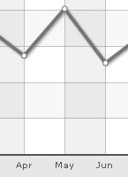
FusionCharts for Flex > Quick Chart Configuration > Vertical Division Lines
Vertical divisional lines are vertical lines running through the canvas in a line/area chart. They help in relating the data to its respective label, when there is large amount of data.
You can put vertical div lines in your chart by using the numVDivLines attribute.
<chart numVDivLines='10'>
Customizing the looks of the vertical divisional lines
You can customize the appearance of the vertical divisional lines using the following attributes:
| Attribute Name | Range | Description |
|---|---|---|
| vDivLineColor | Color of vertical axis division lines | |
| vDivLineThickness | In Pixels | Thickness of vertical axis division lines |
| vDivLineAlpha | 0-100 | Alpha of vertical axis division lines |
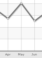
Dashed divisional lines
The vertical divisional line can be made dashed by setting vDivLineIsDashed='1'.
The dash properties - dash length and dash gap is customized using the vDivLineDashLen & vDivLineDashGap attributes respectively.
<chart numVDivLines='10' vDivLineIsDashed='1' vDivLineDashLen='2' vDivLineDashGap='2' ...>
The chart with the above properties would be displayed as shown below:
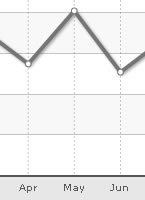
Alternate Vertical Grid Bands
The vertical grid bands appear alternately between the vertical divisional lines. They can be displayed by setting showAlternateVGridColor='1'.
<chart showAlternateVGridColor='1' ...>
The chart with the alternate vertical grid bands would look similar to the one shown below:
Customizing the vertical grid bands
The color and alpha of the alternate vertical grid bands is customized using the alternateVGridColor and alternateVGridAlpha attributes respectively.
<chart showAlternateVGridColor='1' alternateVGridColor='D9E5F1' alternateVGridAlpha='100'...>
Using Styles to animate alternate vertical grid bands
Animation effects can be applied to the alternate vertical grid bands using STYLES. The following XML would cause the y-Scale and the alpha of the horizontal grid bands to animate.
<chart caption='Quarterly Sales Summary' subcaption='Figures in $' xAxisName='Quarter' yAxisName='Sales'
	  showValues='0' numVDivLines='2' showAlternateVGridColor='1'>
    <set label='Qtr 1' value='420500' />
    <set label='Qtr 2' value='295400' />
    <set label='Qtr 3' value='523400' />
    <set label='Qtr 4' value='465400' />
    <styles>
        <definition>
            <style name='myAnim1' type='animation' param='_yScale' start='0' duration='1'/>
            <style name='myAnim2' type='animation' param='_alpha' start='0' duration='1'/>
        </definition>
        <application>
            <apply toObject='VGRID' styles='myAnim1, myAnim2' />
        </application>
    </styles>
</chart>