FusionCharts for Flex > Your First Widget > Simple Gauge
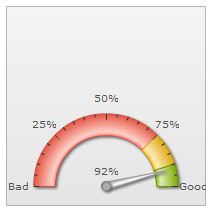
Let us now work on the previous sample to provide our own-real-life-data to the widget. In this section we will create a simple widget (an angular gauge) to display the average result of a customer-satisfaction-survey. The value will be plotted on a scale ranging from 0% to 100%. The average result is 92.
Note: You need to install FusionCharts for Flex before proceeding with this section. For information regarding installation see the installation types section.
Steps to build the Gauge
We would use the angular gauge to show the following aspects:
- The minimum and maximum values that form the end points of the rating scale. These are referred to as lower limit and upper limit of the gauge scale. We’ll set lower limit and upper limit to 0 and 100 respectively.
- Segmentation of the scale into 3 colored regions to indicate bad, Moderate and good outcome.
- The average satisfication value (which will be shown as a dial of the angular gauge).
Let us now build the XML data for the gauge.
XML for the Gauge
The following table describes the segmentation of the gauge scale:
| Range | What it means? | Color to be represented in |
|---|---|---|
| 0-75% | Bad customer satisfaction | Red |
| 75-90% | Moderate customer satisfaction | Yellow |
| 90-100% | Good customer satisfaction | Green |
Following is the XML code for creating the widget:
<chart lowerLimit='0' upperLimit='100' lowerLimitDisplay='Bad'  upperLimitDisplay='Good'
       numberSuffix='%' showValue='1'>
   <colorRange>
       <color minValue='0'  maxValue='75'   code='FF654F'/>
       <color minValue='75' maxValue='90'   code='F6BD0F'/>
       <color minValue='90' maxValue='100'  code='8BBA00'/>
   </colorRange>
   <dials>
       <dial value='92' />
   </dials>
</chart>
Enter the above code (you can even copy-paste the XML code) into a text editor (e.g. Notepad) and save it as Data.xml inside the src folder.
In order to check whether the XML is valid, open the file in your browser. If the XML is valid, it will be displayed in the browser in a formatted way.
And now, without wasting more time, let's quickly create the widget.
Building the Gauge
Create a new project - you'll notice that when a new project is created with MX + Spark component set. Flash Builder automatically generates the following code:
<?xml version="1.0" encoding="utf-8"?>
<s:Application xmlns:fx="http://ns.adobe.com/mxml/2009"
               xmlns:s="library://ns.adobe.com/flex/spark"
               xmlns:mx="library://ns.adobe.com/flex/mx"></s:Application>
Now, switch to the Design view. Here you'll find a custom component named FusionWidgets in the Components window. Next, follow the steps listed below.
- Drag the FusionWidgets custom component and drop it onto the stage. You will find that a control with FusionWidgets logo has been created on the stage.
- Next, switch to the
Propertieswindow, select theCategory Viewoption and then choose the FusionCharts group.
- Select 'AngularGauge' as the value of FCChartType from the drop-down list. The angular gauge is the chart type which will be used in this example.
- Set Data.xml as the value of FCDataURL. FCDataURL property sets the path of the XML file containing the data for the angular gauge (widget).
- Please note that unlike the first widget that we created in the previous page, we would NOT set FCUseDefaultData property. Now, we do not need dumy data. We would supply our own data.
Now, run the project and find your data getting reflected by the angular gauge.
So, you see how easy it is to create a chart using Flex. If you switch to the Source view, you will find that following code has been automatically generated:
<?xml version="1.0" encoding="utf-8"?>
<s:Application xmlns:fx="http://ns.adobe.com/mxml/2009"
               xmlns:s="library://ns.adobe.com/flex/spark"
               xmlns:mx="library://ns.adobe.com/flex/mx" xmlns:components="com.fusionwidgets.components.*">

  <components:FusionWidgets x="10" y="10" FCChartType="AngularGauge" FCDataURL="Data.xml"/></s:Application>
The highlighted sections in the code (above) are the attributes that have been set automatically. You can always avoid the Design View's drag-drop mechanism and build the chart by directly writing the code in the Source view.
Use script to create a chart
The code below shows how to use script to create the above gauge:
<?xml version="1.0" encoding="utf-8"?>
<s:Application xmlns:fx="http://ns.adobe.com/mxml/2009"
			   xmlns:s="library://ns.adobe.com/flex/spark"
			   xmlns:mx="library://ns.adobe.com/flex/mx"

			   initialize="application1_initializeHandler(event)"

			   >
	<fx:Script>
		<![CDATA[
			import com.events.FCEvent;
			import com.fusioncharts.components.*;
			import mx.events.FlexEvent;

			public var myGauge:FusionWidgets;

			protected function application1_initializeHandler(event:FlexEvent):void
			{
				myGauge = new FusionWidgets();
				myGauge.FCChartType = "AngularGauge";
				myGauge.FCDataURL ="Data.xml";
				myGauge.x = 10;
				myGauge.y = 10;
				myGauge.width = 200;
				myGauge.height = 200;

				addElement(myGauge);

			}

		]]>
	</fx:Script>
	<fx:Declarations>
		<!-- Place non-visual elements (e.g., services, value objects) here -->
	</fx:Declarations>
</s:Application>
Using FCDataXML
Apart from using an URL as our data source, we can also directly bind a Flex string as the data source for the widget. In order to use a String as a data source we will have to bind the string to the FCDataXML attribute. The code should be as follows:
<?xml version="1.0" encoding="utf-8"?>
<s:Application xmlns:fx="http://ns.adobe.com/mxml/2009"
               xmlns:s="library://ns.adobe.com/flex/spark"
               xmlns:mx="library://ns.adobe.com/flex/mx" xmlns:components="com.fusionwidgets.components.*">

  <components:FusionWidgets x="10" y="10" FCChartType="AngularGauge" FCDataXML="{dataXML}"/>

  <fx:Script>
      <![CDATA[

          [Bindable]
          private var dataXML:String = "<chart lowerLimit='0' upperLimit='100' lowerLimitDisplay='Bad'  " +
              "upperLimitDisplay='Good' numberSuffix='%' showValue='1'>" +
              "           <colorRange>" +
              "              <color minValue='0'  maxValue='75'  code='FF654F'/>" +
              "              <color minValue='75' maxValue='90'  code='F6BD0F'/>" +
              "              <color minValue='90' maxValue='100' code='8BBA00'/>" +
              "           </colorRange>" +
              "           <dials>" +
              "              <dial value='92' />" +
              "           </dials>" +
              "</chart>";
	    ]]>
  </fx:Script>
	  </s:Application>
You can clearly see from the above code that we bind the string dataXML to the FCDataXML property of our widget. The dataXML String contains the XML data for the widget. The XML declared here is the same as the one we created in the above discussed Data.xml file.
Understanding the XML
Let us now try to understand the XML that we have built for the gauge. First comes the <chart> element, it is the starting element for any chart/gauge created using FusionWidgets. Next, we define the lower limit and upper limit of the gauge scale by specifying lowerLimit and upperLimit attributes within the <chart> element.
Next, we set the number suffix (the character to be suffixed to the numbers showin in the gauge) and make the dial value visible on the gauge.
<chart lowerLimit='0' upperLimit='100' lowerLimitDisplay='Bad'
upperLimitDisplay='Good' gaugeStartAngle='180'
numberSuffix='%' showValue='1'>
There are many more attributes that can be declared within the <chart> element, these will be explained in the subsequent sections.
Next, we categorize the scale using color ranges. This is done using <colorRange> element which is the immediate child of the <chart> element. Each range of color is defined using <color> element (see code below).
  <colorRange>
      <color minValue='0'  maxValue='75'  code='FF654F'/>
      <color minValue='75' maxValue='90'  code='F6BD0F'/>
      <color minValue='90' maxValue='100' code='8BBA00'/>
  </colorRange>
After this we set the average satisfaction value. We set it to a dial. In angular gauge a dial is the object that points to a value.
<dials>
    <dial value='92' />
</dials>
The properties of the dial can be modified by declaring attributes within the <dial> element. For example, background color of the dial can be changed by means of the bgColor attribute. Similarly, the border color of the dial can be changed using borderColor attribute.
<dials>
    <dial value='92' bgColor='FF5904' borderColor='FF0000'/>
</dials>
To learn more on what XML elements and attributes each widget (gauge/charts) supports please refer to the sections and pages in FusionWidgets and XML > Widgets XML API section.
FusionWidgets allows you to incorporate multiple dials in a single angular gauge. In order to add extra dials, just add an extra <dial> element within the <dials> tag.
Run your application and Presto!! You just made an angular gauge. Simple, isn't it?