Using Various Chart Properties
- We can change chart's cosmetics like color, fonts etc. as per our needs.
- We can format values or numbers on chart, e.g. control decimal prcision etc.
- We can specify chart captions and axes names.
- We can add horizontal and vertical divisional zones of the chart ... and many more.
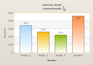
&chartParams=[caption=Sales by Week;subcaption=CurrentMonth;yAxisName=Revenue; xAxisName=Weeks;canvasbgColor=ffffff;canvasBorderThickness=1;
canvasBorderColor=eece8c;formatNumberScale=1]
&labels=Week 1;Week 2;Week 3;Week4&data=40800;31400;26700;55400
| Name | Type/Range | Description |
| animation | Boolean: 0/1 |
This parameter lets us set the configuration whether the chart should appear in an animated fashion. If we do not want to animate any part of the chart, set this as 0. |
| showLabels/ShowNames | Boolean: 0/1 | It sets the configuration whether the x-axis labels will be displayed or not. |
| labelDisplay | WRAP, STAGGER, ROTATE or NONE |
Using this parameter, you can control how your data labels (x-axis labels) would appear on the chart. There are 4 options: WRAP, STAGGER, ROTATE or NONE.
|
| rotateLabels | Boolean: 0/1 | This parameter lets you set whether the data labels would show up as rotated labels on the chart. |
| slantLabels | Boolean: 0/1 | If you've opted to show rotated labels on chart, this parameter lets you set the configuration whether the labels would show as slanted labels or fully vertical ones. |
| labelStep | Positive Number: >1 | By default, all the labels are displayed on the chart. However, if you've a set of streaming data (like name of months or days of week), you can opt to hide every n-th label for better clarity. This parameter just lets you do so. It allows to skip n X-axis labels to show 1 label. |
| staggerLines | Positive Number: >2 | If you've opted for STAGGER mode as labelDisplay, using this parameter you can control how many lines to stagger the label to. By default, all labels are displayed in a single line. |
| showValues | Boolean: 0/1 | Sets the configuration whether data values would be displayed along with the data plot on chart. |
| rotateValues | Boolean: 0/1 | Whether data values would show up in rotated manner or not. |
| placeValuesInside | Boolean: 0/1 | To place the data values inside data plot; e.g. inside Columns and Bars, set it to 1. |
| showYAxisValues | Boolean: 0/1 | If y-axis values should appear on the chart or not. |
| yAxisValuesStep | Positive Number: >1 | This parameter helps us set intervals at which y-axis values should appear. |
| yAxisMinvalue | Number | This parameter helps us explicitly set the lower limit of the chart. If we don't specify this value, it is automatically calculated by FusionCharts based on the data provided by us. |
| yAxisMaxValue | Number | This parameter helps us explicitly set the upper limit of the chart. If we don't specify this value, it is automatically calculated by FusionCharts based on the data provided by us. |
| rotateYAxisName | Boolean: 0/1 | Whether y-axis name would show up in a rotated style. |
| yAxisNameWidth | Number: In Pixels | Width of y-axis name. |
| setAdaptiveYMin | Boolean: 0/1 | This parameter lets you set whether the y-axis lower limit would be 0 (in case of all positive values on chart) or should the y-axis lower limit adapt itself to a different figure based on values provided to the chart. |
| adjustDiv | Boolean: 0/1 | FusionCharts automatically tries to adjust divisional lines and limit values based on the data provided. However, if you want to set your explicit lower and upper limit values and number of divisional lines, first set this parameter to false (0). That would disable automatic adjustment of divisional lines. |
| showLimits | Boolean: 0/1 | Whether to show chart limit values? |
| Name | Type/Range | Description |
| caption | String | Caption of the chart. |
| subCaption | String | Sub-caption of the chart. |
| xAxisName | String | X-Axis Title of the Chart. |
| yAxisName | String | Y-Axis Title of the Chart. |
| Name | Type/Range | Description |
| bgColor | Hex Color Code | This parameter sets the background color for the chart. We can set any hex color code as the value of this parameter. Remember to remove # and any spaces in between. |
| canvasBgColor | Hex Color Code | Sets Canvas background color. |
| canvasBgAlpha | Range: 0-100 | This parameter helps us set the alpha (transparency) of the canvas. |
| canvasBorderColor | Hex Color Code | This parameter helps us set the border color of the canvas. |
| canvasBorderThickness | Range: 0-100 | This parameter helps us set the border thickness (in pixels) of the canvas. |
| showBorder | Boolean: 0/1 | Whether to show a border around the chart or not. |
| borderColor | Hex Color Code | This parameter helps to define color of the chart border. |
| borderThickness | Number: In Pixels | Thickness of the chart border. |
| palette | Number: 1-5 | FusionCharts Pro for FileMaker introduces color palettes. Each palette renders charts with different color theme. There are 5 such palettes available. |
| Name | Type/Range | Description |
| baseFont | String: Valid Font Name | This parameter lets us set the font face (family) of all the text (data labels, values etc.) on chart. If we also specify outCnvBaseFont parameter, this parameter controls only the font face of text within the chart canvas bounds. |
| baseFontSize | Number: Font Size | This parameter sets the base font size of the chart i.e. all the values and the names in the chart which lie on the canvas will be displayed using the font size provided here. |
| baseFontColor | Hex Color Code | This parameter sets the base font color of the chart i.e. all the values and the names in the chart which lie on the canvas will be displayed using the font color provided here. |
| outCnvBaseFont | String: Valid Font Name | This parameter sets the base font family of the chart font which lies outside the canvas i.e. all the values and the names in the chart which lie outside the canvas will be displayed using the font name provided here. |
| outCnvBaseFontSize | Number: Font Size | This parameter sets the base font size of the chart i.e. all the values and the names in the chart which lie outside the canvas will be displayed using the font size provided here. |
| outCnvBaseFontColor | Hex Color Code | This parameter sets the base font color of the chart i.e. all the values and the names in the chart which lie outside the canvas will be displayed using the font color provided here. |
Pie, Doughnut, Logarithmic and Radar charts do not support these parameters.
| Name | Type/Range | Description |
| numDivLines | Number | Number of horizontal axis division lines that we want on the chart. |
| divLineColor | Hex Color Code | Color for divisional lines. |
| divLineThickness | Range: 1-5 | Thickness of divisional lines. |
| divLineAlpha | Range: 0-100 | Alpha of divisional lines. |
| showAlternateHGridColor | Range: 0/1 | Whether to show alternate colored horizontal grid bands? |
| alternateHGridColor | Hex Color Code | Color of the alternate horizontal grid bands. |
| alternateHGridAlpha | Range: 0-100 | Alpha (transparency) of the alternate horizontal grid bands. |
| showDivLineValues | Boolean: 0/1 | Whether to show div line values? |
| numVDivLines | Number | Sets the number of vertical divisional lines to be drawn. |
| vDivLineColor | Hex Color Code | Color of vertical axis division lines. |
| vDivLineThickness | Range: 1-5 | Thickness of vertical axis division lines. In Pixel |
| vDivLineAlpha | Range: 0-100 | Alpha of vertical axis division lines. |
| showAlternateVGridColor | Boolean: 0/1 | Whether to show alternate vertical colored grid bands? |
| alternateVGridColor | Hex Color Code | Color of alternate vertical colored grid bands. |
| alternateVGridAlpha | Range: 0-100 | Alpha (transparency) of the alternate vertical grid bands. |
| zeroPlaneColor | Hex Color Code | Color of the zero plane for the charts with negative data values. |
| zeroPlaneAlpha | Range: 0-100 | Alpha of the zero plane. |
| zeroPlaneThickness | Number: In Pixels | Thickness of the zero plane. Applicable to 2D charts only. |
| zeroPlaneShowBorder | Boolean: 0/1 | Whether zero plane border will be shown or not. Applicable ot 3D charts only. |
| zeroPlaneBorderColor | Number: In Pixels | Color of the zero plane border. Applicable to 3D charts only. |
| Name | Type/Range | Description |
| showToolTip | Boolean: 0/1 | Whether to show tool tip on chart? 0 sets the tool-tips off, while 1 sets the tool-tips on. |
| toolTipBgColor | Hex Color Code | Background color of the tool-tip box. |
| toolTipBorderColor | Hex Colo rCode | Border color of the tool-tip box. |
| toolTipSepChar | Character | The character specified as the value of this parameter separates the name and value displayed in the tool-tip box. The default value is a comma (,). |
| Name | Type/Range | Description |
| formatNumber | Boolean: 0/1 | This configuration determines whether the numbers displayed on the chart will be formatted using commas, e.g., 40,000 if formatNumber=1 and 40000 if formatNumber=0 |
| formatNumberScale | Boolean: 0/1 | Configuration whether to add K (thousands) and M (millions) to a number after truncating and rounding it - e.g., if formatNumberScale is set to 1, 1043 would become 1.04K (with decimals set to 2 places). Same with numbers in millions - a M will added at the end. For more details, please see Advanced Number Formatting section. |
| defaultNumberScale | Characters | The default unit of the numbers that you're providing to the chart. For more details, please see Advanced Number Formatting section. |
| numberScaleUnit | List of Units | Unit of each block of the scale. For more details, please see Advanced Number Formatting section. |
| numberScaleValue | Values for Scaling | Range of the various blocks that constitute the scale. For more details, please see Advanced Number Formatting section. |
| numberPrefix | Character | Using this parameter, you could add prefix to all the numbers visible on the graph. For example, to represent all dollars figure on the chart, you could specify this parameter to '$' to show like $40000, $50000. For more details, please see Advanced Number Formatting section. |
| numberSuffix | Character | Using this parameter, you could add suffix to all the numbers visible on the graph. For example, to represent all figure quantified as per annum on the chart, you could specify this parameter to ' /a' to show like 40000/a, 50000/a. For more details, please see Advanced Number Formatting section. |
| decimalSeparator | Character | This option helps you specify the character to be used as the decimal separator in a number. For more details, please see Advanced Number Formatting section. |
| thousandSeparator | Character | This option helps you specify the character to be used as the thousands separator in a number. For more details, please see Advanced Number Formatting section. |
| inDecimalSeparator | Character | In some countries, commas are used as decimal separators and dots as thousand separators. In FCQS, if you specify such values, it will give error while converting to number. So, FusionCharts accepts the input decimal and thousand separator from user, so that it can convert it accordingly into the required format. This parameter lets you input the decimal separator. For more details, please see Advanced Number Formatting section. |
| inThousandSeparator | Character | In some countries, commas are used as decimal separators and dots as thousand separators. In FCQS, if you specify such values, it will give error while converting to number. So, FusionCharts accepts the input decimal and thousand separator from user, so that it can convert it accordingly into the required format. This parameter lets you input the thousand separator. For more details, please see Advanced Number Formatting section. |
| decimals | Number: 0-10 | Number of decimal places to which all numbers on the chart would be rounded to. |
| forceDecimals | Boolean: 0/1 | Whether to add 0 padding at the end of decimal numbers? For example, if you set decimals as 2 and a number is 23.4. If forceDecimals is set to 1, FusionCharts will convert the number to 23.40 (note the extra 0 at the end) |
| yAxisValueDecimals | Number: 0-10 | If you've opted to not adjust divlines, you can specify the div line values decimal precision using this parameter. |
It's not necessary for you to specify any padding/margin values. FusionCharts automatically assumes the best values for the same, if you do not specify the same.
Pie and Doughnut charts support captionPadding, chartLeftMargin, chartRightMargin, chartTopMargin and chartBottomMargin parameters only.
| Name | Type/Range | Description |
| captionPadding | Number In Pixels | This parameter lets you control the space (in pixels) between the sub-caption and top of the chart canvas. If the sub-caption is not defined, it controls the space between caption and top of chart canvas. If neither caption, nor sub-caption is defined, this padding does not come into play. |
| xAxisNamePadding | Number In Pixels | Using this, you can set the distance between x-axis title and canvas end. |
| yAxisNamePadding | Number In Pixels | Using this, you can set the distance between the y-axis title and y-axis values. |
| yAxisValuesPadding | Number In Pixels | This parameter helps you set the vertical space between the canvas bottom edge and the y-axis values. This is particularly useful, when you want more space between your canvas and y-axis values. |
| labelPadding | Number In Pixels | This parameter sets the horizontal space between the labels and canvas left edge. If you want more space between the canvas and the x-axis labels, you can use this parameter to control it. |
| valuePadding | Number In Pixels | It sets the horizontal space between the end of bars and start of value textboxes. This basically helps you control the space you want between your bars and the value textboxes. |
| plotSpacePercent | Number: 0-80 (In Percent) | On a bar chart, there is spacing defined between two bar. By default, the spacing is set to 20% of canvas width. If you intend to increase or decrease the spacing between bars, you can do so using this parameter. For example, if you wanted all bars to stick to each other without any space in between, you can set plotSpacePercent to 0. Similarly, if you want very thin bars, you can set plotSpacePercent to its max value of 80. |
| chartLeftMargin | Number In Pixels | Amount of empty space that you want to put on the left side of your chart. Nothing is rendered in this space. |
| chartRightMargin | Number In Pixels | Amount of empty space that you want to put on the right side of your chart. Nothing is rendered in this space. |
| chartTopMargin | Number In Pixels | Amount of empty space that you want to put on the top of your chart. Nothing is rendered in this space. |
| chartBottomMargin | Number In Pixels | Amount of empty space that you want to put on the bottom of your chart. Nothing is rendered in this space. |
| canvasPadding | Number In Pixels | Allows you to set empty space on the top and bottom side of bars on the chart canvas. |
| legendPadding | Number In Pixels | Padding of legend from right/bottom side of canvas. Applicable to Multi Series and Combination Charts only. |