In previous examples, we have learned how to create Single series, Multi series, Stacked and Combination charts using the Sales Comparison data. Now, we will create two different kinds of charts namely, Scatter and Bubble charts.
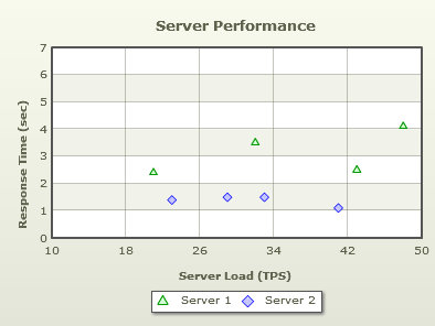
The XY or Scatter chart is used when there are two interdependent parameters to be shown on a chart. For example, to understand the variation of rainfall with temperature, the XY chart is an ideal choice. We have used data comparing the performance level of two servers. For our example, we will compare the performance level of two servers. We will compare the Response Time (in secs) vs. the Server Load (TPS). The final chart will look as under:
Follow the steps below to create a Scatter chart:
- Create a folder LearningFusionCharts on your hard-drive. We will use this folder as the root folder for building all FusionCharts XT examples.
- Create a folder named MyFirstChart inside the above folder. Inside the MyFirstChart folder, create a folder named FusionCharts.
- Copy Scatter.swf from Download Pack > Charts folder to the FusionCharts folder
- Copy FusionCharts.js, FusionCharts.HC.js, FusionCharts.HC.Charts.js and jquery.min.js files from Download Pack > Charts folder to the FusionCharts folder
- Create an XML file in the MyFirstChart folder with name ScatterData.xml. The data used to compare the performance of two servers is given below in the table:
Server 1 Server 2 Server Load(TPS) Response Time(Sec) Server Load(TPS) Response Time(Sec) 21 2.4 23 1.4 32 3.5 29 1.5 43 2.5 33 1.5 48 4.1 41 1.1 - Create the code given below, which is the XML-lized form of the sales data shown in the table (above). Copy the XML code to ScatterData.xml file. To know how the XML data for XY plot chart is formatted please read Scatter & Bubble Chart XML
<chart palette='2' caption='Server Performance' yAxisName='Response Time (sec)' xAxisName='Server Load (TPS)' yAxisMaxValue='7'>

	<dataset seriesName='Server 1' color='009900' anchorSides='3' anchorRadius='4' anchorBgColor='D5FFD5' anchorBorderColor='009900'>
		<set y='2.4' x='21' />
		<set y='3.5' x='32' />
		<set y='2.5' x='43' />
		<set y='4.1' x='48' />
	</dataset>

	<dataset seriesName='Server 2' color='0000FF' anchorSides='4' anchorRadius='4' anchorBgColor='C6C6FF' anchorBorderColor='0000FF'>
		<set y='1.4' x='23'/>
		<set y='1.5' x='29'/>
		<set y='1.5' x='33'/>
		<set y='1.1' x='41'/>
	</dataset>

</chart>
Note that you can also provide chart data in JSON format. View an example of JSON data here. Or, to learn more about FusionCharts XT JSON data format, please go through FusionCharts XT data formats > JSON section.
- Create an HTML file server-performance.html in the same folder and copy-paste the code given below:
<html>
  <head>
    <title>My First chart using FusionCharts XT</title>
    <script type="text/javascript" src="FusionCharts/FusionCharts.js">
    </script>
  </head>
  <body>
    <div id="chartContainer">FusionCharts XT will load here!</div>
    <script type="text/javascript"><!--

      var myChart = new FusionCharts( "FusionCharts/Scatter.swf",
      "myChartId", "400", "300", "0" );
      myChart.setXMLUrl("ScatterData.xml");
      myChart.render("chartContainer");

    // -->
    </script>
  </body>
</html>
Open the file server-performance.html in a Web browser and you will see an animated Scatter chart similar to the one below:
See it live!
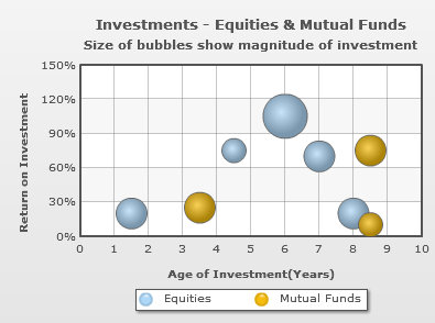
The bubble chart is used when there are three inter-dependent numeric parameters to be shown on a chart. For example, you can use the bubble chart to manage your investments better with age of the investments, its return on investment and the amount invested as the three parameters you plot. We will create a simple bubble chart that looks as under:
Follow the steps below to create a Bubble chart:
- Create a folder LearningFusionCharts on your hard-drive. We will use this folder as the root folder for building all FusionCharts XT examples.
- Create a folder named MyFirstChart inside the above folder. Inside the MyFirstChart folder, create a folder named FusionCharts.
- Copy Bubble.swf from Download Pack > Charts folder to the FusionCharts folder
- Copy FusionCharts.js, FusionCharts.HC.js, FusionCharts.HC.Charts.js, and jquery.min.js files from Download Pack > Charts folder to the FusionCharts folder
- Create an XML file in the MyFirstChart folder with name BubbleData.xmlThe data used here is to analyze age of the investment, return on investment and the amount invested in Equities and Mutual funds.
Equities Mutual Funds Age of Investment (Years) Return on Investment Amount Invested Age of Investment (Years) Return on Investment Amount Invested 1.5 20 15000 3.5 25 15000 4.5 75 10000 8.5 10 10000 6 105 30000 8.5 75 16000 7 70 16000 8 20 15000
- Create the code given below, which is the XML-lized form of the sales data shown in the table (above). Copy the XML code to BubbleData.xml file. To know how the XML data for XY plot chart is formatted please read Scatter & Bubble Chart XML
- Create an HTML file investment-analysis.html in the same folder and copy-paste the code given below:
<html> <head> <title>My First chart using FusionCharts XT</title> <script type="text/javascript" src="FusionCharts/FusionCharts.js"> </script> </head> <body> <div id="chartContainer">FusionCharts XT will load here!</div> <script type="text/javascript"><!-- var myChart = new FusionCharts( "FusionCharts/Bubble.swf", "myChartId", "400", "300", "0" ); myChart.setXMLUrl("BubbleData.xml"); myChart.render("chartContainer"); // --> </script> </body> </html>
<chart caption='Investments - Equities & Mutual Funds' subCaption='Size of bubbles show magnitude of investment' yAxisName='Return on Investment'
 xAxisName='Age of Investment(Years)' yNumberSuffix='%' yAxisMaxValue='150' xAxisLabelDisplay='auto' numVDivLines='9' >

   <dataset seriesName='Equities' >
      <set y='20' x='1.5' z='15000' />
      <set y='75' x='4.5' z='10000' />
      <set y='105' x='6' z='30000' />
      <set y='70' x='7' z='16000' />
      <set y='20' x='8' z='15000' />
   </dataset>

   <dataset seriesName='Mutual Funds' >
      <set y='25' x='3.5' z='15000'/>
      <set y='10' x='8.5' z='10000'/>
      <set y='75' x='8.5' z='16000'/>
   </dataset>

</chart>
Note that you can also provide chart data in JSON format. View an example of JSON data here. Or, to learn more about FusionCharts XT JSON data format, please go through FusionCharts XT data formats > JSON section.
Open the file investment-analysis.html in a Web browser and you will see an animated Bubble chart similar to the one below:
See it live!
Code examples discussed in this section are present in Download Package > Code > MyFirstChart folder.
What happens if Flash player is not available?
In case Flash Player is not available on certain devices (like iPad and iPhone), FusionCharts JavaScript library automatically renders the same chart using JavaScript. If you are running the sample from local file system, please note that you will need to provide the data using Data String method, that is, passing the data (XML/JSON) to the chart as String or JSON Object. Many browsers restrict JavaScript from accessing local file system owing to security reasons. In the above example, since you had provided data as a URL, the JavaScript charts will not be able to access the same, when running locally. If you run the files from a server, it will run absolutely fine, though. When running locally, however, if you provide the data as string (using the Data String method), it works fine.
If for any reason, you do not see a chart, run through the following checks:
If you see an endless loading progress bar in your browser, or if the right click menu (right click at the place where the chart is supposed to be) shows "Movie not loaded", check the following:
- Whether you have pasted the chart SWF files in the FusionCharts folder of the MyFirstChart folder?
- Whether you have provided the SWF path properly in your HTML page?
- Do you have Adobe Flash Player 8 (or above) installed for this browser?
- Whether you enabled your browser to show Active X and Plugin controls? Normally, all browsers are Flash-enabled, but sometimes security settings can disable execution of Active X and Plugin controls.
If you get an "Error in Loading Data" message, check the following:
- Whether the XML file is in the same folder as the HTML file?
- Whether the XML file is named as Data.xml and not Data.xml.txt? (as many basic text editors append .txt after the file name)
If you get an "Invalid XML Data" message, it means that the XML data document is malformed. Check it again for common errors like:
- Difference in case of tags. <chart> should end with </chart> and not </Chart> or </CHART>
- Missing opening/closing quotation marks for any attributes, for example, <chart caption=Weekly Sales Summary' should be <chart caption='Weekly Sales Summary'
- Missing closing tag for any element
To check whether your final XML is correct, open it in your browser and you will see the error.
If only the text "FusionCharts XT will load here!" is displayed, check with the following:
- Whether you pasted the FusionCharts.js, jquery.min.js, FusionCharts.HC.js and FusionCharts.HC.Charts.js files in FusionCharts folder of MyFirstChart folder?
- Whether you included and provided the path of FusionCharts.js properly in your HTML page?
- Are there any JavaScript syntax or runtime errors that might have halted the execution of FusionCharts functions?
- Whether you have given different names for the chart's JavaScript variable and chart's ID?