Loading
Data Labels
Data labels are the names of the data points that are displayed on the x-axis of a chart.
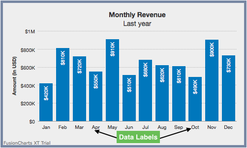
In the chart shown above Jan, Feb, Mar etc. are data labels.
This section explains:
-
Data label display modes
-
Displaying specific data labels
-
Label management: Line and area charts
Data Label Display Modes
With FusionCharts Suite XT, you can configure the arrangement and display properties for data labels depending on what suits your needs best. There are 5 different display modes to choose from.
The attribute used for setting the data label display mode is described below:
| Attribute Name | Description |
|---|---|
|
Used to customize the alignment of data labels (x-axis labels). There are 5 options: |
Auto Mode
In this mode, the chart automatically chooses the most appropriate display mode for data labels - depending on space availability. If the number of data labels is greater than the available space, then the data labels are either truncated (with ellipses to indicate truncation), wrapped, or rotated.
On hovering over a truncated data label, a tooltip showing the full label text is displayed. The auto mode is active by default, but can be disabled by switching to an alternative label display mode.
A column 2D chart with data labels in auto mode looks like this:
The list of attributes used to configure data labels in Auto mode is as follows:
| Attribute Name | Description |
|---|---|
|
Used to customize the alignment of data labels (x-axis labels). There are 5 options: |
|
When enabled in |
The data structure needed to set the data labels in auto mode, using the above attributes, is given below:
{
    "chart": {
        "caption": "Monthly Revenue",
        "subCaption": "Last year",
        "xAxisName": "Month",
        "yAxisName": "Amount (In USD)",
        "numberPrefix": "$",
        "theme": "fint",
        "labelDisplay": "auto"
    },
    "data": [
        {
            "label": "January",
            "value": "420000"
        },
        {
            "label": "February",
            "value": "810000"
        },
        {
            "label": "March",
            "value": "720000"
        },
        {
            "label": "April",
            "value": "550000"
        },
        {
            "label": "May",
            "value": "910000"
        },
        {
            "label": "June",
            "value": "510000"
        },
        {
            "label": "July",
            "value": "680000"
        },
        {
            "label": "August",
            "value": "620000"
        },
        {
            "label": "September",
            "value": "610000"
        },
        {
            "label": "October",
            "value": "490000"
        },
        {
            "label": "November",
            "value": "900000"
        },
        {
            "label": "December",
            "value": "730000"
        }
    ]
}
Wrap Mode
In this mode, you can wrap long x-axis labels into multiple lines. If enough space is not available in a chart, this mode will automatically trim labels, add ellipses at the end, and show tooltips for such labels.
A column 2D chart with the data labels in wrap mode look like this:
The attribute used to set the data label mode to wrap mode is described below:
| Attribute Name | Description |
|---|---|
|
Used to customize the alignment of data labels (x-axis labels). There are 5 options: |
In the chart above, the data structure used to set the data labels to wrap mode is given below:
{
    "chart": {
        "caption": "Monthly Revenue",
        "subCaption": "Last year",
        "xAxisName": "Month",
        "yAxisName": "Amount (In USD)",
        "numberPrefix": "$",
        "theme": "fint",
        "labelDisplay": "wrap"
    },
    "data": [
        {
            "label": "Jan, 2015",
            "value": "420000"
        },
        {
            "label": "Feb, 2015",
            "value": "810000"
        },
        {
            "label": "Mar, 2015",
            "value": "720000"
        },
        {
            "label": "Apr, 2015",
            "value": "550000"
        },
        {
            "label": "May, 2015",
            "value": "910000"
        },
        {
            "label": "Jun, 2015",
            "value": "510000"
        },
        {
            "label": "Jul, 2015",
            "value": "680000"
        },
        {
            "label": "Aug, 2015",
            "value": "620000"
        },
        {
            "label": "Sep, 2015",
            "value": "610000"
        },
        {
            "label": "Oct, 2015",
            "value": "490000"
        },
        {
            "label": "Nov, 2015",
            "value": "900000"
        },
        {
            "label": "Dec, 2015",
            "value": "730000"
        }
    ]
}
In horizontal bar charts, you can specify the maximum % of available width for data labels with the maxLabelWidthPercent attribute. This attribute takes a value between 5 and 80.
Rotate Mode
A column 2D chart with the data labels in rotate mode with slant labels look like this
The attributes used for rotating data labels is as follows:
| Attribute Name | Description |
|---|---|
|
Used to customize the alignment of data labels (x-axis labels). There are 5 options: |
|
In the |
The data structure used, for the chart above, to set the data labels to rotate mode is as follows:
{
    "chart": {
        "caption": "Monthly Revenue",
        "subCaption": "Last year",
        "xAxisName": "Month",
        "yAxisName": "Amount (In USD)",
        "numberPrefix": "$",
        "theme": "fint",
        "labelDisplay": "rotate",
        "slantLabels": "1"
    },
    "data": [
        {
            "label": "January",
            "value": "420000"
        },
        {
            "label": "February",
            "value": "810000"
        },
        {
            "label": "March",
            "value": "720000"
        },
        {
            "label": "April",
            "value": "550000"
        },
        {
            "label": "May",
            "value": "910000"
        },
        {
            "label": "June",
            "value": "510000"
        },
        {
            "label": "July",
            "value": "680000"
        },
        {
            "label": "August",
            "value": "620000"
        },
        {
            "label": "September",
            "value": "610000"
        },
        {
            "label": "October",
            "value": "490000"
        },
        {
            "label": "November",
            "value": "900000"
        },
        {
            "label": "December",
            "value": "730000"
        }
    ]
}
In case of Scatter and Bubble charts, when the attribute xAxisLabelMode is set to auto, slanting of the X-axis labels is not applicable
Staggered Mode with Stagger Lines
In this mode, data labels are distributed on multiple levels (default is 2) to increase the inter label space available on each level. For example, a column 2D chart with month labels in staggered mode looks like this:
Please reference attributes table from ‘Auto Mode’ section above.
| Attribute Name | Description |
|---|---|
|
Using this attribute, you can customize the alignment of data labels (x-axis labels). There are 5 options: |
|
Specifies the number of levels used for staggering labels. Set to |
The data structure used, in the chart above, to set the data labels to staggered mode is as follows:
{
    "chart": {
        "caption": "Monthly Revenue",
        "subCaption": "Last year",
        "xAxisName": "Month",
        "yAxisName": "Amount (In USD)",
        "numberPrefix": "$",
        "theme": "fint",
        "labelDisplay": "stagger",
        "staggerLines": "3"
    },
    "data": [
        {
            "label": "January",
            "value": "420000"
        },
        {
            "label": "February",
            "value": "810000"
        },
        {
            "label": "March",
            "value": "720000"
        },
        {
            "label": "April",
            "value": "550000"
        },
        {
            "label": "May",
            "value": "910000"
        },
        {
            "label": "June",
            "value": "510000"
        },
        {
            "label": "July",
            "value": "680000"
        },
        {
            "label": "August",
            "value": "620000"
        },
        {
            "label": "September",
            "value": "610000"
        },
        {
            "label": "October",
            "value": "490000"
        },
        {
            "label": "November",
            "value": "900000"
        },
        {
            "label": "December",
            "value": "730000"
        }
    ]
}
N-th Label Mode
If your data plot consists of values representing continuous quantities such as date, time, temperature etc. you can use the labelstep attribute to display every n-th label, instead of all labels on the x-axis.
A column 2D chart with the data labels using n-th label mode looks like this:
The list of attributes used to configure N-th Label Mode for data labels is as follows:
| Attribute Name | Description |
|---|---|
|
Used to customize the alignment of data labels (x-axis labels). There are 5 options: |
|
Setting this variable to |
The data structure used, for the example chart above, to set the data labels in N-th label mode is as follows:
{
    "chart": {
        "caption": "Monthly Revenue",
        "subCaption": "Last year",
        "xAxisName": "Month",
        "yAxisName": "Amount (In USD)",
        "numberPrefix": "$",
        "theme": "fint",
        "labelStep": "3"
    },
    "data": [
        {
            "label": "January",
            "value": "420000"
        },
        {
            "label": "February",
            "value": "810000"
        },
        {
            "label": "March",
            "value": "720000"
        },
        {
            "label": "April",
            "value": "550000"
        },
        {
            "label": "May",
            "value": "910000"
        },
        {
            "label": "June",
            "value": "510000"
        },
        {
            "label": "July",
            "value": "680000"
        },
        {
            "label": "August",
            "value": "620000"
        },
        {
            "label": "September",
            "value": "610000"
        },
        {
            "label": "October",
            "value": "490000"
        },
        {
            "label": "November",
            "value": "900000"
        },
        {
            "label": "December",
            "value": "730000"
        }
    ]
}
Displaying Specific Data Labels
You can display specific data labels with the help of the showLabels and the showLabel attributes. A column 2D chart showing only specific data label look like this:
Given below is a brief description of the attributes used to show specific data labels:
| Attribute Name | Description |
|---|---|
|
Whether to show or hide labels at chart / dataset level. Set it to |
|
Use this to show/hide labels of individual data values at the data level. This overrides the setting of the ‘showLabels’ attribute. |
The data structure used, in the chart example above, to set only specific data labels to be shown is as follows:
{
    "chart": {
        "caption": "Quarterly Revenue",
        "subCaption": "Last year",
        "xAxisName": "Quarter",
        "yAxisName": "Amount (In USD)",
        "numberPrefix": "$",
        "theme": "fint",
        "showLabels": "0"
    },
    "data": [
        {
            "label": "Quarter 1",
            "value": "1950000"
        },
        {
            "label": "Quarter 2",
            "value": "1450000",
            "showLabel": "1"
        },
        {
            "label": "Quarter 3",
            "value": "1730000"
        },
        {
            "label": "Quarter 4",
            "value": "2120000"
        }
    ]
}
Label Management: Line and Area Charts
With label management, you can adjust the canvas padding (the space between the canvas border and the position where the data plot begins and ends) to accommodate long labels in line and area charts. This ensures that the first and last x-axis labels are not rendered outside the canvas border and the labels don’t overlap each other.
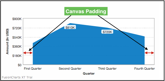
To accommodate long labels, the chart automatically adjusts the right and left canvas margins. A line 2D chart with automatic canvas padding set for label management look like this:
An Area 2D chart with canvasPadding attribute configured looks like this:
Given below is a brief description of the attributes used to set the canvas padding in a chart:
| Attribute Name | Description |
|---|---|
|
Lets you set the space between the canvas border and first (& last data plots). If you set it |
The data structure needed to set canvasPadding attribute for the above line chart is given below:
{
    "chart": {
        "caption": "Quarterly Revenue",
        "subCaption": "Last year",
        "xAxisName": "Quarter",
        "yAxisName": "Amount (In USD)",
        "numberPrefix": "$",
        "theme": "fint"
    },
    "data": [
        {
            "label": "First Quarter",
            "value": "420000"
        },
        {
            "label": "Second Quarter",
            "value": "810000"
        },
        {
            "label": "Third Quarter",
            "value": "720000"
        },
        {
            "label": "Fourth Quarter",
            "value": "550000"
        }
    ]
}
Advanced x-axis label management has been implemented to achieve the following objectives:
-
All x-axis labels should get centrally aligned to the respective data-plots (columns, points on line charts etc.)
-
X-axis labels should not overlap each other
-
X-axis labels should not overlap with other chart objects such as legends or x-axis name
-
Long labels should not go outside the chart
-
Optimized truncation of longer labels and putting ellipses at the end
Advanced label management is not applicable to Bar, Pie, Doughnut, Marimekko, Zoom Line and Multi-series Combination 3D charts.
Customizing Data Label Properties
You can customize the cosmetic properties of data labels such as font, border, background, and alpha. Let us understand each of them in detail.
Font Properties
A column 2D chart with custom font, font-color and font-size of data labels looks like:
Given below is the list of attributes used to customize the font for data labels.
| Attribute Name | Description |
|---|---|
|
Sets the font face for the data labels, e.g. |
|
Sets the font color for data labels, eg. |
|
Specifies the data label font size, with a range of |
|
Set to |
|
Set to |
|
Sets the transparency for text, background and border of the data labels. Value ranges from |
The data structure for the chart is shown below:
{
    "chart": {
        "theme": "fint",
        "caption": "Monthly Revenue",
        "subCaption": "Last year",
        "xAxisName": "Month",
        "yAxisName": "Amount (In USD)",
        "yAxisMaxValue": "1200000",
        "rotateValues": "0",
        "placeValuesInside": "0",
        "numberPrefix": "$",
        "labelFont": "Arial",
        "labelFontColor": "0075c2",
        "labelFontSize": "15"
    },
    "data": [
        {
            "label": "Jan",
            "value": "420000"
        },
        {
            "label": "Feb",
            "value": "810000"
        },
        {
            "label": "Mar",
            "value": "720000"
        },
        {
            "label": "Apr",
            "value": "550000"
        },
        {
            "label": "May",
            "value": "910000"
        },
        {
            "label": "Jun",
            "value": "510000"
        },
        {
            "label": "Jul",
            "value": "680000"
        },
        {
            "label": "Aug",
            "value": "620000"
        },
        {
            "label": "Sep",
            "value": "610000"
        },
        {
            "label": "Oct",
            "value": "490000"
        },
        {
            "label": "Nov",
            "value": "900000"
        },
        {
            "label": "Dec",
            "value": "730000"
        }
    ]
}
Border Properties
A column 2D chart with a dashed border around the data labels looks like:
Given below is the list of attributes used to customize the border for data labels.
| Attribute Name | Description |
|---|---|
|
Sets the border color of data label, eg. |
|
Sets the transparency of border of the data labels. Value ranges from |
|
Sets the padding between data labels and border. |
|
Sets the radius of border around the data labels (in pixels). |
|
Sets data label border thickness (in pixels). |
|
Set to |
|
Sets the gap between two consecutive dashes of data label border (in pixels). |
|
Sets the length of each dash in data label border (in pixels). |
The data structure needed to customize the data label borders is given below:
{
    "chart": {
        "theme": "fint",
        "caption": "Monthly Revenue",
        "subCaption": "Last year",
        "xAxisName": "Month",
        "yAxisName": "Amount (In USD)",
        "yAxisMaxValue": "1200000",
        "rotateValues": "0",
        "placeValuesInside": "0",
        "numberPrefix": "$",
        "labelFont": "Arial",
        "labelFontColor": "0075c2",
        "labelFontSize": "15",
        "labelBorderColor": "0075c2",
        "labelBorderPadding": "5",
        "labelBorderRadius": "2",
        "labelBorderDashed": "1"
    },
    "data": [
        {
            "label": "Jan",
            "value": "420000"
        },
        {
            "label": "Feb",
            "value": "810000"
        },
        {
            "label": "Mar",
            "value": "720000"
        },
        {
            "label": "Apr",
            "value": "550000"
        },
        {
            "label": "May",
            "value": "910000"
        },
        {
            "label": "Jun",
            "value": "510000"
        },
        {
            "label": "Jul",
            "value": "680000"
        },
        {
            "label": "Aug",
            "value": "620000"
        },
        {
            "label": "Sep",
            "value": "610000"
        },
        {
            "label": "Oct",
            "value": "490000"
        },
        {
            "label": "Nov",
            "value": "900000"
        },
        {
            "label": "Dec",
            "value": "730000"
        }
    ]
}
Background Properties
A column 2D chart with custom background for data labels is shown below:
Given below is the list of attributes used to customize the background for data labels.
| Attribute Name | Description |
|---|---|
|
Sets the background color of data labels, eg. |
|
Sets the transparency of background of the data labels. Value ranges from |
The data structure needed to customize the data labels background, is given below:
{
    "chart": {
        "theme": "fint",
        "caption": "Monthly Revenue",
        "subCaption": "Last year",
        "xAxisName": "Month",
        "yAxisName": "Amount (In USD)",
        "yAxisMaxValue": "1200000",
        "rotateValues": "0",
        "placeValuesInside": "0",
        "numberPrefix": "$",
        "labelFont": "Arial",
        "labelFontColor": "0075c2",
        "labelFontSize": "15",
        "labelBorderColor": "0075c2",
        "labelBorderPadding": "5",
        "labelBorderRadius": "2",
        "labelBorderDashed": "1",
        "labelBgColor": "eeeeee"
    },
    "data": [
        {
            "label": "Jan",
            "value": "420000"
        },
        {
            "label": "Feb",
            "value": "810000"
        },
        {
            "label": "Mar",
            "value": "720000"
        },
        {
            "label": "Apr",
            "value": "550000"
        },
        {
            "label": "May",
            "value": "910000"
        },
        {
            "label": "Jun",
            "value": "510000"
        },
        {
            "label": "Jul",
            "value": "680000"
        },
        {
            "label": "Aug",
            "value": "620000"
        },
        {
            "label": "Sep",
            "value": "610000"
        },
        {
            "label": "Oct",
            "value": "490000"
        },
        {
            "label": "Nov",
            "value": "900000"
        },
        {
            "label": "Dec",
            "value": "730000"
        }
    ]
}
Configuring Data Label Height
Shown below is a chart with some very long data labels. As a result of this, the data plots get reduced to a fraction of the chart.
Using the maxLabelHeight attribute, you can limit the maximum height of the data labels. This will truncate the data labels (add ellipsis) according to the maximum height. Applying maxLabelHeight to the above chart yields the following result:
| Attribute Name | Description |
|---|---|
|
Sets the maximum height (in pixels) that data labels can occupy. |
The data structure needed to set the maximum data label height is given below:
{
    "chart": {
        "theme": "fint",
        "caption": "Monthly Revenue",
        "subCaption": "Last year",
        "xAxisName": "Month",
        "yAxisName": "Amount (In USD)",
        "yAxisMaxValue": "1200000",
        "rotateValues": "0",
        "placeValuesInside": "0",
        "numberPrefix": "$",
        "labelFont": "Arial",
        "labelFontColor": "0075c2",
        "labelFontSize": "15",
        "maxLabelHeight": "50"
    },
    "data": [
        {
            "label": "January [ Q1 ]",
            "value": "420000"
        },
        {
            "label": "February [ Q1 ]",
            "value": "810000"
        },
        {
            "label": "March [ Q1 ]",
            "value": "720000"
        },
        {
            "label": "April [ Q2 ]",
            "value": "550000"
        },
        {
            "label": "May [ Q2 ]",
            "value": "910000"
        },
        {
            "label": "June [ Q2 ]",
            "value": "510000"
        },
        {
            "label": "July [ Q3 ]",
            "value": "680000"
        },
        {
            "label": "August [ Q3 ]",
            "value": "620000"
        },
        {
            "label": "September [ Q3 ]",
            "value": "610000"
        },
        {
            "label": "October [ Q4 ]",
            "value": "490000"
        },
        {
            "label": "November [ Q4 ]",
            "value": "900000"
        },
        {
            "label": "December [ Q4 ]",
            "value": "730000"
        }
    ]
}
Adding Data Label Links
A column 2D chart with x-axis labels linked to http://www.fusioncharts.com/ is shown below:
| Attribute Name | Description |
|---|---|
|
Sets the link for each x-axis label. e.g. |
The constructor data for the above chart is given below:
{
    "chart": {
        "theme": "fint",
        "caption": "Monthly Revenue",
        "subCaption": "Last year",
        "xAxisName": "Month",
        "yAxisName": "Amount (In USD)",
        "yAxisMaxValue": "1200000",
        "rotateValues": "0",
        "placeValuesInside": "0",
        "numberPrefix": "$",
        "labelFont": "Arial",
        "labelFontColor": "0075c2",
        "labelFontSize": "15",
        "labelLink": "http://www.fusioncharts.com/"
    },
    "data": [
        {
            "label": "Jan",
            "value": "420000"
        },
        {
            "label": "Feb",
            "value": "810000"
        },
        {
            "label": "Mar",
            "value": "720000"
        },
        {
            "label": "Apr",
            "value": "550000"
        },
        {
            "label": "May",
            "value": "910000"
        },
        {
            "label": "Jun",
            "value": "510000"
        },
        {
            "label": "Jul",
            "value": "680000"
        },
        {
            "label": "Aug",
            "value": "620000"
        },
        {
            "label": "Sep",
            "value": "610000"
        },
        {
            "label": "Oct",
            "value": "490000"
        },
        {
            "label": "Nov",
            "value": "900000"
        },
        {
            "label": "Dec",
            "value": "730000"
        }
    ]
}