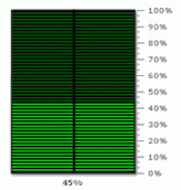
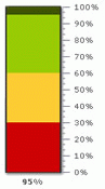
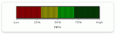
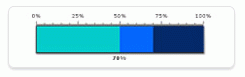
An LED Gauge is essentially similar to an angular gauge chart but with a horizontal/vertical scale instead of a circular one. It uses bars that change color, or marks out different regions in different colors to indicate whether data is within preset parameters. The colors can be selected to suit the application such as green for satisfactory, yellow for caution and red for alarm.
LED Gauges are of two types - horizontal and vertical. The horizontal LED gauge has the bar placed horizontally while the vertical LED has it vertically.
LED Gauges are used in financial applications like management dashboards, factory operation output reports etc.
A few outputs of FusionWidgets XT LED Gauge can be reproduced as under:
 |
 |
 |
 |
The chart is defined by minimum and maximum values. Within that scale you can create various ranges to classify your data. Its purpose is to classify that value as belonging to a predetermined range. For example, you might define a range called “Best” that consists of values between 60 and 100. Or you might create a range called “Weak” that consists of values between 30 and 60. For each range, you define a color, which helps visually distinguish the ranges from each other.
To create an LED Gauge, you need to:
- Decide the lower and upper limits of chart
- Decide the visual properties of the chart
- Decide the color range for the chart. That is, suppose you are plotting a volume meter chart, the color range could be:
0-60 dB – Faint – Green
60-90 dB – Moderate - Yellow
90-120 dB – Loud - Red - Decide the chart value
Let’s study the anatomy of an LED gauge before we move to the XML structure of the chart.