LED gauges are similar to the gauges used to display CPU Usage. The values are displayed in an LED gauge by filling up the LED box to that particular level, horizontally in the horizontal LED and vertically in the vertical LED gauge. In this sample that we are going to build, we will be using and referring to the horizontal LED throughout.
Now as a first LED gauge, we will be building a sound meter to show the sound produced by a particular equipment on a scale on 0-120dB. The final result will look something as under:
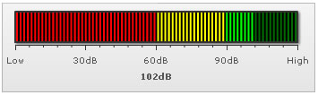
The various tasks involved in building this gauge are:
- Defining the minimum and maximum value which will be plotted on the gauge scale. They are termed as the lower and upper limits of the gauge scale and in this case, we will set them to 0 and 120 respectively. The limits are displayed at the starting and ending points of the gauge scale as in the image above.
- Dividing the gauge scale into 3 regions, the ones shown in red, yellow and green above which convey the various sound levels to be in the faint, moderate or loud bands respectively.
- Filling up the LED to indicate the required value, 102 in this case.
<chart lowerLimit="0" upperLimit="120" lowerLimitDisplay="Low" upperLimitDisplay="High" palette="1" numberSuffix="dB" chartRightMargin="20">
  <colorRange>
    <color minValue="0" maxValue="60" code="FF0000"/>
    <color minValue="60" maxValue="90" code="FFFF00"/>
    <color minValue="90" maxValue="120" code="00FF00"/>
  </colorRange>
  <value>102</value>
</chart>
{
  "chart": {
    "lowerlimit": "0",
    "upperlimit": "120",
    "lowerlimitdisplay": "Low",
    "upperlimitdisplay": "High",
    "palette": "1",
    "numbersuffix": "dB",
    "chartrightmargin": "20"
  },
  "colorrange": {
    "color": [
      {
        "minvalue": "0",
        "maxvalue": "60",
        "code": "FF0000"
      },
      {
        "minvalue": "60",
        "maxvalue": "90",
        "code": "FFFF00"
      },
      {
        "minvalue": "90",
        "maxvalue": "120",
        "code": "00FF00"
      }
    ]
  },
  "value": "102"
}
The LED gauge for the above data will look as under:
First of all comes the <chart> element which is the starting element for any chart/gauge/graph that you create using FusionWidgets XT. Now we define the lower and upper limits of the gauge scale. To define the limits, we use the lowerLimit and upperLimit attributes of the <chart> element. We've asked the gauge to show lower limit text as Low and upper limit text as High.
We also set the palette number using the palette attribute and number suffix as dB (the character which will show up at the end of the number) using the numberSuffix attribute.
<chart lowerLimit='0' upperLimit='120' lowerLimitDisplay='Low' upperLimitDisplay='High' palette='1' numberSuffix='dB' chartRightMargin='20' >
{
  "chart": {
    "lowerlimit": "0",
    "upperlimit": "120",
    "lowerlimitdisplay": "Low",
    "upperlimitdisplay": "High",
    "palette": "1",
    "numbersuffix": "dB",
    "chartrightmargin": "20"
  }
}
There are other attributes of the <chart> element which we will not be delving into now, because of this being a really basic gauge.
Next, we need to define our color range. As we had earlier seen, this gauge has 3 color ranges. To define the color range, we use the <colorRange> element, which is an immediate child of the <chart> element. Under each <colorRange> element, we place a <color> element specifying a single color range. The minValue attribute is used to define the lower limit of the color range and the maxValue attribute is used to define the upper limit of the color range. The label attribute is used to specify a name to the particular color range and the code attribute specifies the color of the range.
<colorRange>
  <color minValue="0" maxValue="60" code="FF0000"/>
  <color minValue="60" maxValue="90" code="FFFF00"/>
  <color minValue="90" maxValue="120" code="00FF00"/>
</colorRange>
"colorrange": {
    "color": [
      {
        "minvalue": "0",
        "maxvalue": "60",
        "code": "FF0000"
      },
      {
        "minvalue": "60",
        "maxvalue": "90",
        "code": "FFFF00"
      },
      {
        "minvalue": "90",
        "maxvalue": "120",
        "code": "00FF00"
      }
    ]
}For detailed explanation on JSON data format click here.