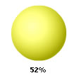
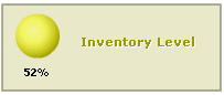
The bulb gauge is one of the simplest charts in all. It is used in a variety of applications including financial dashboards, machine controller screens etc., where a single value or state indicator is required.
Bulb Gauges are used to indicate a specific dataset utilizing a circle that changes color to indicate whether the monitored data is within defined limits and if it is, then which limit it is in. The colors can be selected to suit the application such as green for satisfactory, yellow for caution and red for alarm.
A few outputs of FusionWidgets XT Bulb Gauge can be reproduced as under:
 |
 |
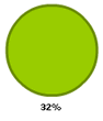 |
The gauge is defined by minimum and maximum values. Within that scale you can create various ranges to classify your data. Its purpose is to classify that value as belonging to a predetermined range. For example, you might define a range called “Best” that consists of values between 60 and 100. Or you might create a range called “Weak” that consists of values between 30 and 60. Now when the data value belongs to a particular range, the bulb is shown in the color specified for that range.
To create a FusionWidgets XT Bulb gauge, you need to:
- Decide the lower and upper limits of the gauge
- Decide the visual properties of the gauge
- Decide the color range for the gauge. That is, suppose you are plotting a chart to show the production output of a factory, the color range could be:
0-100 pieces/hr – Under Average – Red
100-200 pieces/hr – Average Production - Yellow
200-300 pieces/hr – Very good - Green - Decide the gauge value.
Let’s now move on to study the anatomy of a bulb gauge.